Showing posts with label NDX. Show all posts

Monday, June 29, 2015

Longest SPX Peak to Trough Pullback Since 2012

I have been quiet in this space as of late, but there is nothing like a 34% one-day spike in the VIX to inspire me to dust of the cobwebs and get this place humming again. I will start by updating an old favorite table that invariably is the subject of many requests whenever stocks begin to show signs of a meaningful pullback, as is the case today.

Note that the table below includes only pullbacks from all-time highs and only those that go back to the March 2009 bottom. Here 2.75% seems to be a natural cutoff, but I am more apt to include smaller numbers if it took a relatively large number of days to arrive at the bottom. Seen in this light, today’s 2.09% decline in the S&P 500 Index brings the aggregate peak-to-trough decline to 3.7%, but perhaps the most interesting number is that it took a full 27 trading days to realize that 3.7% drop. In fact, no peak-to-trough decline has taken longer to materialize since a pair of 43-day moves from late 2012 that resulted in 8.9% and 10.9% declines. Of course, there is no reason to believe that today is a bottom, but then again, there have been only four longer-lasting pullbacks since the current bull market started over five years ago.

SPX pullback chart as of 062915

[source(s): CBOE, Yahoo, VIX and More]

Depending upon whether one attributes the current pullback to China, Greece, Puerto Rico or more nebulous factors as valuation, time without a correction, etc. one might draw different conclusions about the path forward. Personally, I see China as the biggest culprit, followed (at least today) by Puerto Rico and then Greece. What concerns me most is that the issues in China and Puerto Rico are no less thorny or difficult to resolve than they are in Greece.

For what it is worth, while I think it is important to understand the age of a bull market as a partial proxy for vulnerability, I do not subscribe to the theory that a healthy market needs a 10% correction every x months or y years. Further, did the 9.8% peak-to-trough decline in the SPX really need another 0.2% to reset some sort of magical market-timing sundial? (Don’t forget that both the NASDAQ-100 [NDX] and Russell 2000 [RUT] did hit that threshold during the same period.)

In technical analysis, the time for a move to unfold is sometimes almost as important as the magnitude of the move. In another week or so, we should know whether the current price action is just a slow-motion, short and shallow dip or perhaps the first signs of a deeper and more painful countertrend – and the best part is that we don’t even need a referendum to decide the matter.

Related posts:

Disclosure(s): none

Tuesday, April 15, 2014

The Correction As Seen in the ETP Landscape

Since stocks bottomed in March 2009, I have periodically been publishing an SPX pullback table and occasionally a plot of all those pullbacks and their duration. The recent selloff in stocks, however, has been anything but an SPX pullback. I toyed with the idea of presenting comparable data for the NASDAQ Composite or NASDAQ-100 Index (NDX), but here again, the selling has been disproportionate in some areas of the NASDAQ universe, even though it has been hit harder than the SPX.

This time around I have opted instead for a chart that shows the peak-to-trough drawdown across the equity ETP universe, focusing on sector groups that I believe are among the most important to watch.

ETP Landscape 2014 DDs 041514

[source(s): Yahoo, VIX and More]

The data above cover only 2014 and indicate the maximum drawdown since the 2014 peak. While many of these maximum drawdowns are from earlier today, there are quite a few instances in which the maximum drawdown was established earlier in the year.

Note that while the NASDAQ gets most of the attention, it is the small caps (IWM) that have suffered the most among the major market index ETPs.

Not surprisingly, biotechnology (IBB), social media (SOCL) and Russia (RSX) have seen the largest declines, but among cyclicals, defensive stocks and European country ETPs, there is very little to choose from.

Finally, just for fun I have added four alternative ETPs with an equity flavor (SPLV, PBP, CWB and PFF) to show how low volatility, covered call, convertible bond and preferred stock ETPs have fared.

Related posts:

Disclosure(s): none
Sunday, July 19, 2009

Chart of the Week: SPX and NDX

In reviewing previous chart of the week graphics, I was surprised to see that I have featured a chart of the SPX only once in the past five months (Chart of the Week: Lack of Volume and Breadth Threatens Bull Move) and decided that this most important of indices needs to take center stage more often.

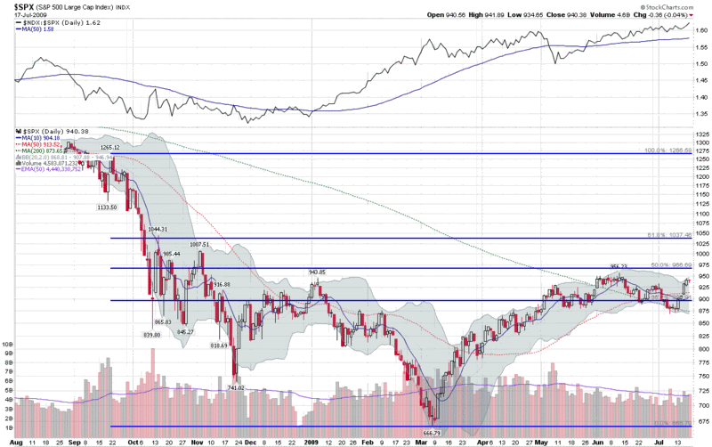
Alas, this week’s chart of the week shows a year of SPX daily bars, with some standard moving averages and Bollinger Bands, as well as a set of Fibonacci retracement lines that have generated considerable discussion in the past (SPX and Fibonacci Resistance at 966.) The new twist on this chart is a simple ratio of the NASDAQ-100 (NDX) to the SPX, which is included as a study above the main graph. The NDX:SPX ratio shows that while the SPX was retreating from its June 12th high, the NDX was outperforming the SPX on a relative basis, as has been the case for the past two months. Spurred on by a very strong earnings report from Intel (INTC) the NDX:SPX ratio is currently at its highest level since early 2001 and the NDX is now comfortably above its June high.

It is worth noting that outside of technology, the only other major sector to have topped its June high is health care (XLV) with consumer staples (XLP) just 0.03 below that high water mark. With the leadership role of technology should be considered a positive sign for bulls, the high relative strength of defensive sectors such as health care and consumer staples might be considered a warning sign.

For a related prior chart of the week post, see: Chart of the Week: The Resurgent NASDAQ-100 (4/5/2009)

[graphic: StockCharts]

Monday, June 8, 2009

Banks, Large Cap Tech and Leadership

One month ago today in The Banks vs. Technology, I mentioned the divergence between technology and financials and noted, “so far the financials (XLF) have done a better job of leading the market up than technology stocks (XLK) have done of inspiring the bears.”

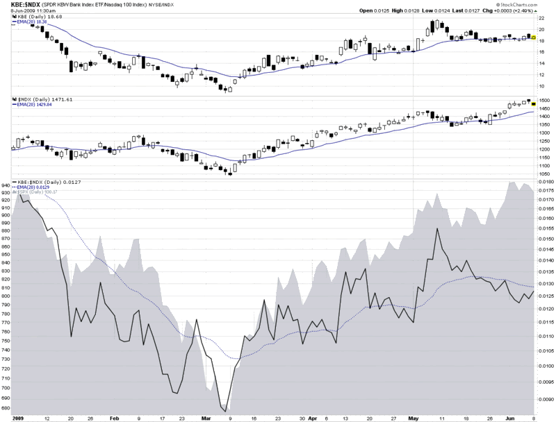
Fast forward one month and the divergence has turned upside down. In the chart below, I focus on financials in the form of the KBE banking ETF and large cap technology as exemplified by the NASDAQ-100 or NDX.

As it turns out, May 8th, the day of the original post, was the top in the banking ETF. Since that date, banks have slowly trended lower (top graphic), even while large cap technology (middle graphic) and the S&P 500 index (gray area chart at bottom) have been making new highs. The change in leadership is perhaps best illustrated by the solid black line in the bottom portion of the chart, which tracks a ratio of KBE to the NDX. In March, April and the early part of May, the ratio quite accurately mirrored the movement in the SPX.

During the course of the past four weeks, however, leadership flipped from banks to large cap technology and the ratio began to decline – all while the SPX continued to make new highs.

I find it particularly interesting that it is not just the relative performance of banks that has declined, but it is also becoming increasingly common for banks and technology to move in different directions on the same day. This has been the case today and has been true for five of the past six days.

I am not surprised to see leadership being passed from financials to large cap technology, but as I said a month ago, I do not expect the market to make any significant additional gains unless the two sectors are able to move up in unison.

[source: StockCharts]

Thursday, May 14, 2009

Lagging Semiconductor Index Suggests Caution

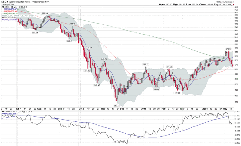
Last Wednesday, the NASDAQ-100 index (NDX), which had been relatively weak compared to the SPX, put in a top and began to decline. The weakness in the NDX was one of the reasons I wondered aloud SPX 915 As a Top? – only to discover that while I had indeed found a top, it was in the NDX, not in the S&P 500.

On Thursday, the Philadelphia Semiconductor Index, also known as the SOX, put in a top of its own before reversing hard and declining precipitously. The SOX ended the day down 5.6% and dragged down the NDX and the rest of the technology sector with it. Technology has been in a tailspin ever since the steep drop in the SOX.

The banks were successful in keeping the broader markets in a bullish mode on Friday without the help of the SOX and technology (see The Banks vs. Technology), but starting on Monday, the weakness in technology began to spread to other sectors, even the financials.

The SOX has long been considered a leading indicator, not just for technology firms but also for the market in general. Semiconductors are early cycle technology stocks and an unhealthy semiconductor sector does not bode well for economic recovery.

Going forward, a healthy rally should include the participation of semiconductors, as measured by the SOX and ETFs such as SMH. In an ideal rally, semiconductors should show strong absolute gains and also outperform the SPX on a relative basis. Until we see more strength from semiconductors, I am likely to have a bearish bias.

[source: StockCharts]

Friday, May 8, 2009

The Banks vs. Technology

I was going to put up a post about the recent negative divergence in technology, particularly the large cap technology companies that dominate the NASDAQ-100 (NDX), but I noticed that Cam Hui at Humble Student of the Markets already beat me to the punch yesterday morning in an excellent Weak Leadership Imperils Market Advance.

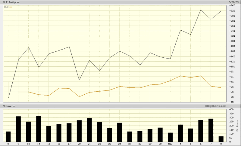
Interestingly, since Cam’s post, the divergence between financials and technology has accelerated as the banks have continued to rise in advance of and in response to the release of the stress test results, while large cap technology has been trending down since Monday.

So far the financials (XLF) have done a better job of leading the market up than technology stocks (XLK) have done of inspiring the bears. Until these two sectors start to move in unison, though, I suspect we will have a stalemate.

[source: BigCharts]

Wednesday, May 6, 2009

SPX 915 as a Top?

I have a strong feeling that the 915 level on the SPX hit in the first half hour of trading today will hold up for awhile. Of course, anything is possible with the bank stress tests and the employment report on deck, but I am betting on 915 holding, especially if the NDX (NASDAQ-100 continues to be relatively weak)

Friday, April 24, 2009

XLY and XHB Move Above 200 Day Moving Averages

Two important ETFs, XLY (consumer discretionary) and XHB (homebuilders) have moved above their 200 day simple moving averages today for the first time since early October.

Among other important indices and ETFs that are closing in on their 200 day SMAs are the NASDAQ-100 index (NDX), semiconductor index (SOX) and emerging markets ETF (EEM).

If the current bullishness holds, we may see widespread moves above the 200 day SMA – and the possibility of renewed buying interest…or an opportunity to take profits.

I am cautious as the SPX approaches 875, but am not interested in a substantial short position until there is some sort of bearish momentum.

Sunday, April 5, 2009

Chart of the Week: The Resurgent NASDAQ-100

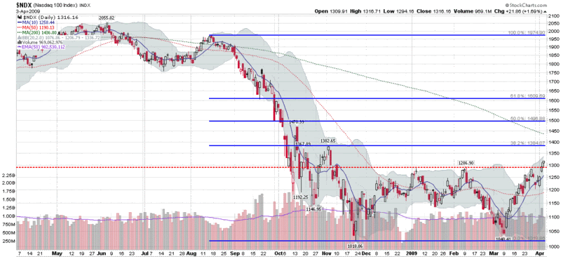
Technology is back and large cap technology is helping to lead the recent rebound in equities.

Even after a four week rally, 2009 has been mostly a sea of red. In fact, the two headline indices, the Dow Jones Industrial Average and S&P 500 index, are down 8.65% and 6.73% so far in 2009. Neither large caps nor small caps are performing particularly well, with the large cap S&P 100 (OEX) down 8.27% and the small cap Russell 2000 (RUT) down 8.67% year to date.

The technology-heavy NASDAQ has been a very different story, with both the NASDAQ composite index (+2.84%) and NASDAQ-100 (+8.63%) in the green.

In the chart of the week below, I have highlighted the NASDAQ-100 index (NDX), which closed at its highest level since early November on Friday, following a strong earnings report and increased guidance from Research in Motion (RIMM). The NDX is a weighted index of the largest 100 companies in the NASDAQ, as measured by market capitalization. As such, the largest weightings read like a who’s who list of large technology companies: Microsoft (MSFT); Google (GOOG); Cisco (CSCO); Apple (AAPL); Oracle (ORCL); Intel (INTC); Qualcomm (QCOM); etc.

Whether or not the resurgent NDX can continue to rally and retrace its steep drop from September and October will go a long way toward determining if the broader markets will be able to gain enough momentum to also finish 2009 in the green.


[source: StockCharts]

Thursday, January 22, 2009

VIX (and VXN) After Hours

I recently received a question about large movements in the VIX at the end of the day.

Before I answer this question, it is important to recall that trading hours for index options are 9:30 a.m. – 4:15 p.m. ET.

As I see it, this question about late day movements in the VIX spans two very different time frames:

  • the last 15 minutes or so of the regular equities trading day (3:45 – 4:00 p.m. ET)
  • the 15 minutes following the close of trading of equities, during which stock index products are still traded (4:00 – 4:15 p.m. ET)

Looking at the earlier period first, during the last 15 minutes of regular trading on the NYSE and NASDAQ, high volume program trading often kicks in and includes or sometimes triggers a large volume of SPX options trades. These situations are relatively easy for retail trader to spot on the tape and are generally consistent with sharp moves in the SPX.

The fifteen minutes of index trading following the close of the equities market are more often associated with unusual large moves in the VIX. Part of the reason for this is the large volume of news that is announced just after the market close. Included in these announcements, of course, are earnings reports, such as today’s eagerly anticipated report from Google (GOOG).

In an announcement that crossed the wires at 4:01 p.m. ET, Google beat analyst estimates for both revenues and earnings, sending the stock up over 2% in the 15 minute twilight zone while index trading was still open.

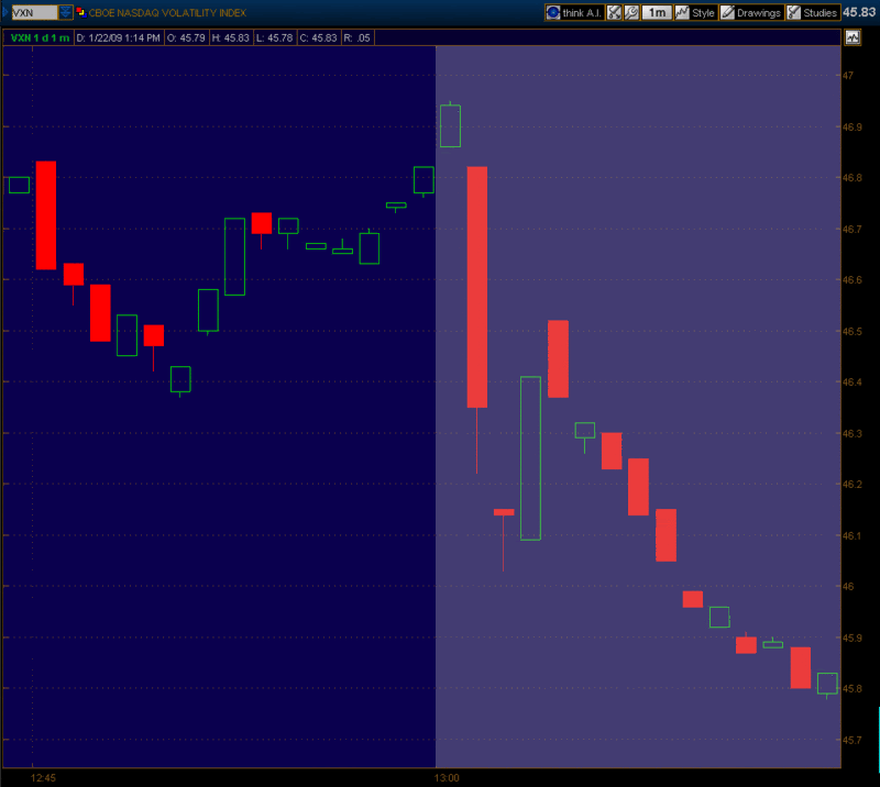
Google is the second largest component of the NDX (NASDAQ-100), so the obvious place to see Google’s impact on the volatility indices is the VXN. The chart below, courtesy of thinkorswim, shows the VXN during the last 16 minutes of today’s regular equities trading session (using my local PT time stamp), as well as during the 4:00 – 4:15 end of the index trading session. The chart shows the positive surprise in Google helped to push VXN down 0.99 (2.1%) in the 15 minutes after the close of trading in the NYSE and NASDAQ regular session. Had Google beaten analyst expectations by a larger amount – or had a significant miss – I would not have been surprised to see the VXN move 5-10% during the twilight zone.

[source: thinkorswim]

Monday, September 15, 2008

VIX Spikes and the 2002 Market Bottom

With the VIX spiking over 30 this morning and investors wondering if the markets will ever find a bottom, this seems like a good time to talk about VIX spikes and market bottoms. Specifically, I want to dispel the myth that bear markets have to end in some grand capitulation climax that includes a dramatic volatility spike.

A perfect counter example to the VIX spike requirement can be found in the bear market that followed the NASDAQ boom which crested in March 2000. In fact, with the exception of the current bear market, the 2000-2002 bear market is the only bear market since the launch of the VIX back in 1993 or the historical reconstruction of VIX data by the CBOE that dates back to 1990.

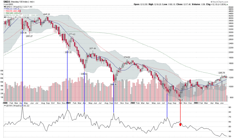
Rather than use the SPX and the VIX to demonstrate my point, the chart below uses the NASDAQ-100 index (NDX) and its companion volatility index, the VXN. The reason I chose the NDX is that from the March 24, 2000 peak (4816.35) to the October 8, 2002 bottom (795.25), the NDX lost an astonishing 83.5% of its value. If there was ever an opportunity to witness a dramatic drop and capitulation, this was the market and index in which to see it happen.

If one looks at a chart of the NDX and the VXN for the period 2000-2002, five distinct VXN spikes stand out. I have highlighted these with a blue vertical line for easy reference in the chart below. It turns out that those who went long at the time of these volatility spikes saw anywhere from two weeks of a bounce to several months of mostly sideways action. None of these spikes signaled a lasting market bottom.

When the NDX finally hit bottom (marked by the red vertical line and arrow), the VXN barely moved at all. Yes, the nastiest bear market of the last two decades ended with a volatility whimper. I like to call this type of bottoming action a "stealth bottom."

Capitulation comes in all shapes in sizes. Most bottoms are marked by a VIX spike. If, however, you assume that volatility spikes will mark the bottoms and bottoms cannot form without a VIX spike, you will be overlooking an important lesson from perhaps the most important recent bear market.

[source: StockCharts, VIX and More]

Monday, July 14, 2008

Volatility and Sentiment Tidbits…and Today Doesn’t Matter

Some semi-random thoughts inspired by today’s market action:

  • The VIX:VXV ratio spiked up to 1.12 at 1:12 p.m. EDT (I’m not superstitious, but that’s an interesting bullish signal)

  • The underappreciated VXN (volatility index for the NDX or NASDAQ-100) spiked over 34 on Friday and made it as high as 33.76 earlier today. That’s not enough to satisfy the “VIX must spike over 30!” purists, but it is an interesting data point, particularly because the VXN and NDX excludes financials

  • My VIX algebra says that two medium to large VIX spikes on Friday and today do not equal one large capitulation-friendly VIX spike

  • The CBOE equity put to call ratio – an excellent market timing indicator – is looking bullish

When all is said and done, I don’t think we can have a serious market rally until the tone of the news flow changes, regardless of market technicals and sentiment data. There must be several bullish macroeconomic and/or fundamental data points which collectively give the bulls a reason not to be so skittish. At a minimum, the markets need to navigate the PPI, CPI, industrial production and capacity utilization data due out tomorrow and Wednesday, then weather the flood of earnings reports (with strong representation from some key financial institutions) on Thursday. Even then, there is the Citigroup (C) earnings story on Friday morning.

Whatever happens to the rest of today’s session, the balance of the week will tell the story.

Friday, June 27, 2008

NDX Drops 4% and IBD Bag Indicator Is Yellow…

Earlier this month I talked a little bit about the mean reverting bounce associated with a 3% one day drop in the SPX in VIX Spikes and SPX Drops Are Not Necessarily Two Sides of the Same Coin.

Yesterday, we had a 4% drop in the NASDAQ-100 (NDX) and, not surprisingly, the 33 year historical record of 4% drops in the NDX suggests that a bounce is again likely to follow yesterday’s pain. What I found particularly interesting is that the bounce following a 4% NDX drop has a lifespan of only a month or so before any incremental gains revert back to the historical norm. In fact, the maximum post-bounce advantage peaks at about ten trading days, then slowly starts to erode. Looking at data from all 108 of those 4% drops, average performance begins to drop after the tenth day and is decidedly bearish during the period of 2-6 months after that 4% drop.

Part of the reason for this statistical bull trap is the relatively high number of 4% drops in the NDX that occurred during the 2000-2003 period (accounting for 75% of all 4% drops during the 33 year period under study), which lends a bearish cast to the data.

So what about the IBD bag? Well…someone decided to start me on a trial subscription to Investor’s Business Daily about a week or two ago. I scanned the paper for the first few days and noted with a smile that it came wrapped in a green plastic bag. Yesterday the paper arrived in a yellow bag and I wondered if this was some sort of signal from Bill O’Neil or God or perhaps both. Of course, the markets proceeded to plummet on that yellow bag day. So today I look outside in eager anticipation to see what color the bag is and it’s yellow again. This time the markets are only down about 0.7%, but the day is young. I wonder what it means when the paper arrives in a red bag?

Wednesday, February 27, 2008

The VIX and Going Short

A reader asked about the feasibility of the declining VIX providing an entry signal for new short positions. Specifically, he noted that his weekly chart of the VIX, which utilizes a 43 week simple moving average, has contained all the action in the VIX over the past year or so, with that 43 week SMA acting as support. Ultimately, his question concerns whether I believe that the 43 week SMA is likely to hold.
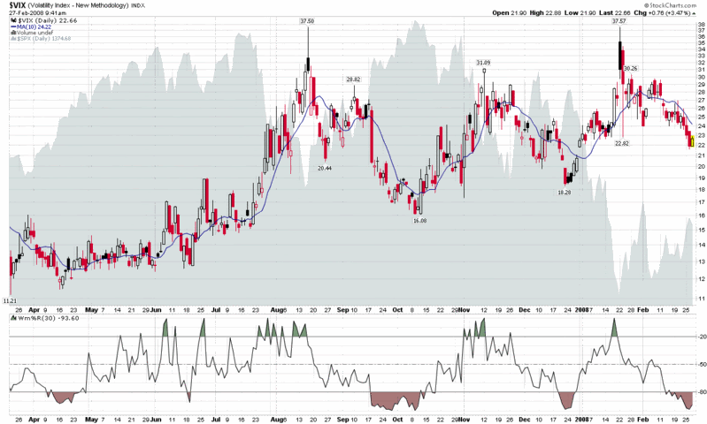
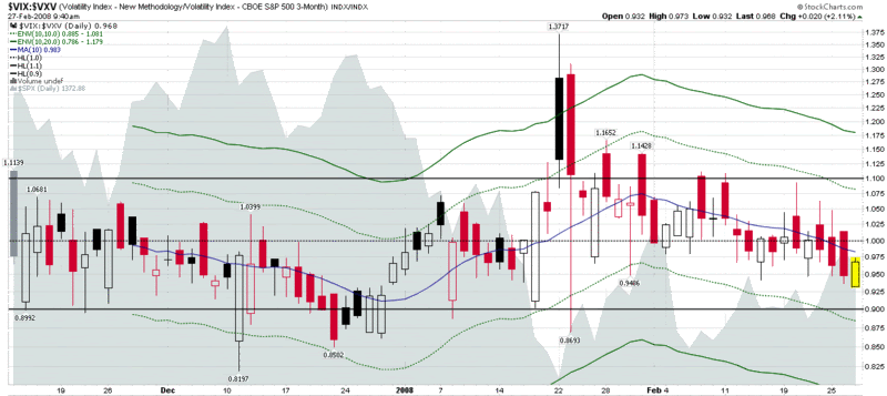
Before I get to the details of that question, let me reiterate my general thinking about using traditional technical analysis on the VIX. In a nutshell, I believe that because the VIX is a derivative (more accurately a derivative of a derivative), traditional technical analysis has only limited validity. This is particularly noteworthy when it comes to support and resistance. If the VIX hits 20, for instance, nobody can rush in and buy the VIX to support it at that level, because one cannot buy and sell the cash VIX. Sure, some may use a VIX of 20 as a rationale for starting to buy VIX options or futures, but the impact of these transactions on the cash VIX is indirect and weak. The impact becomes a little stronger if traders use VIX signals to buy SPX options, but I still prefer to think of the VIX as more of a thermometer than an actual weather phenomenon. Even a major deity would have trouble adjusting the sunshine, clouds and other factors to make the temperature read exactly 60 °F on your back porch.

So my bias is generally against moving averages as providing meaningful support and resistance for the VIX, given that I believe an arithmetic mean of a derivative of a derivative is not a meaningful number. I do believe, however, that previous intermediate and long-term highs and lows in the VIX (e.g., January’s 37.57), round numbers (20, 25, 30, etc.), and deviations of significant magnitude from various moving average (% of 10 day SMA, etc.) can signal (or perhaps even trigger) important psychological milestones and provide high probability entries.

My conclusion, therefore, is that the 43 week SMA is more likely to hold if coincides with a previous low, round number or distance from certain critical SMAs. Given the current numbers, I would say that strong support in the VIX is mostly likely to be found in the 19-20 range.

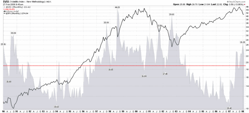
Just for fun, I have included three charts that provide three very different perspectives on the VIX. The top chart is a basic chart of the VIX going back about a year. As with the major indices, consolidation in the form of a triangle pattern is obvious, but with the VIX, the pattern reaches back to August. The VIX:VXV ratio chart shows the volatility expectations for the next 30 days (VIX) vs. the next 93 days (VXV) – and these are middling at best. The final chart shows a lifetime of the VIX graphed against the SPX, with a horizontal line showing the lifetime mean of the VIX (19.03) thrown in for good measure. There are a number of potential conclusions to draw from these charts, but when I add them all together I come out neutral on the VIX, at least for the short to medium term time frame.

As an aside, when it comes to initiating new short positions, I don't like getting short until at least the third trading day of a new month, particularly with so much worried money sitting on the sidelines. Finally, in terms of support and resistance, I prefer to use the broad equity indices instead of the VIX to time entries and would watch SPX 1410 and NDX 1900 more closely than the VIX, but keep a weather eye on a VIX of 19.


Wednesday, January 23, 2008

NDX Fails Briefly, Other Indices Hold Bottoms

Bottoms are an interesting species. They are almost impossible to call in advance and surprisingly difficult to identify with a little hindsight. Typically, by the time you have enough hindsight to say, “Hey that was a bottom back there!” you have already missed a good portion of the move up from that point.

A number of indicators can help raise the probability of calling a bottom, the VIX among them, but we are still in the meteorological realm in terms of accuracy – and very much in the pre-Doppler era at that.

Most students of market bottoms agree that evidence of widespread capitulation is the best way to identify a market bottom. The reasoning is essentially that it is ‘better’ to have one day of extreme investor panic than a number of days in which the cumulative losses add up to one big drop while the psyche of the investor is able to digest the grief on the installment.

According to the reasoning above, yesterday had some elements of extreme investor panic at the open, but the ease with which the markets rallied from that point suggest that there may not have been enough panic or pain to account for a traditional capitulation bottom. This morning’s open was also relatively low in terms of panic and pain – at least on the capitulation scale – so there will be many who will wait for another strong retest of yesterday’s lows (and of investor fortitude) before committing to new bullish positions.

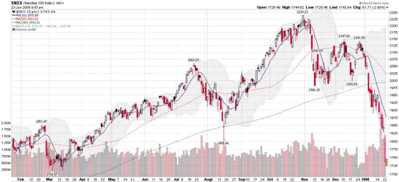
It is worth noting that one major index had yesterday’s low breached this morning: the NASDAQ-100 (NDX). Thanks to AAPL’s weak guidance yesterday after the bell, the stock opened dramatically lower and pulled the NDX down with it. The NDX has since recovered, but it and AAPL should be watched closely, as their support levels will likely be tested before those of the other more widely followed indices.

Tuesday, November 13, 2007

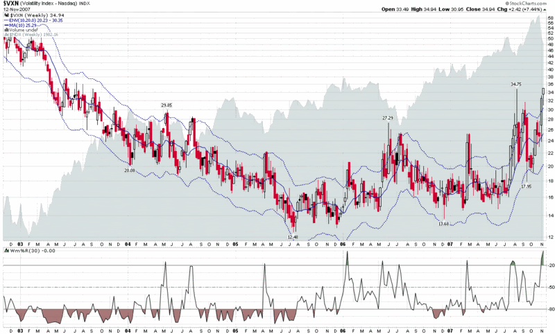
VXN Reversal Signal

The attached chart shows the VXN (volatility index for the NASDAQ-100 or NDX) over the past five years, with a 10 day simple moving average, flanked by dotted lines representing 20% above and below the 10 day SMA.

Anybody who has been paying attention knows that the last several days have been highly unusual. As the chart shows, the VXN, which rarely closes outside of those 20% bands, is currently 38.2% above the 10 day SMA. This is about as extreme as it gets for volatility outliers and suggests a high probability of a sharp reversion to the mean in the VXN, coincident with a bounce back in the NDX.

For the record, the same market bottom signal is coming from the VIX and SPX, but without the extreme reading that is characterized by the VXN and NDX. By contrast, the signal from the RXV and RUT is substantially weaker and only marginally tradeable.

Volatility signals with this level of confidence are extremely rare, so if you are looking for an excuse to get long in a big way for the short term, or to trade VIX along the lines recently suggested by Brian Overby, today is an excellent opportunity to try to time the markets.

Monday, November 12, 2007

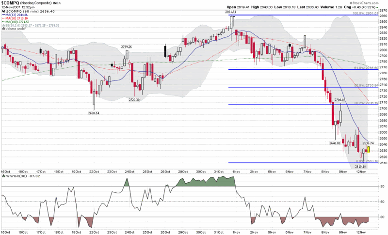
NASDAQ Chart with Hourly Bars

On Friday I posted a weekly chart of the NASDAQ going back six years. Today I am swapping the wide angle lens for a telephoto one and focusing on hourly bars for the past month. I am emphasizing the NASDAQ Composite (and the NDX) because that is where a good deal of the speculative activity has been as of late and where the correction was most severe last week.

The graph below shows four semi-arbitrary simple moving averages for the NASDAQ Composite Index: 13 bars; 20 bars (the faint dotted gray line in the middle of the Bollinger Bands); 30 bars (the same as the Williams %R time frame); and 100 bars. All this spans roughly a period of 1 ½ days to about 3 weeks. With the aforementioned Bollinger Bands and Williams %R data, as well as the Fibonacci retracement lines, there are many ways to keep score. As much as anything, however, I will be looking at the intensity and duration of the bull rallies off of the bottom. Given that many indicators point to the current situation as significantly oversold, the absence of a compelling bull rally may provide as much information as what is actually happening. In other words, a draw should favor the bears.

Finally, I still haven’t seen much in the way of fear yet…

Friday, October 26, 2007

NASDAQ 100 Taking NASDAQ Composite for a Ride

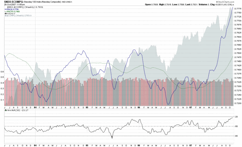
This is probably just stating the obvious, but in keeping with the recent theme of a handful of generals and market breadth analysis, I thought I should highlight a comment from yesterday by Ben Bittlrolff who points to a recent observation by Mike Shedlock that half of the gains in the NASDAQ so far this year are from only three stocks: AAPL, RIMM, and GOOG.

Expanding a little on that thought, I have constructed a weekly chart of the ratio of the NASDAQ-100 (NDX) to the NASDAQ Composite. For visual simplicity, I have eliminated the weekly values and included only the four week and 39 week simple moving averages. The storyline is fairly straightforward: ever since the February 27th selloff, the NASDAQ-100 [listing of the components of the NASDAQ-100] has been pulling the broader composite along for the ride. Scroll back to Mike Shedlock’s comments about the big three horses and it appears that these three en fuego large caps have been pulling both the NASDAQ-100 and the 3000+ stock composite index.

As I see it, one of two things is about to happen: either some other fresh horses are about to appear to help pull the sled or AAPL, RIMM and GOOG are going to run out of energy trying to get up one of these upcoming hills. Be sure to watch the ratio of the NASDAQ-100 to the NASDAQ composite for some clues on how this story is developing.

DISCLAIMER: "VIX®" is a trademark of Chicago Board Options Exchange, Incorporated. Chicago Board Options Exchange, Incorporated is not affiliated with this website or this website's owner's or operators. CBOE assumes no responsibility for the accuracy or completeness or any other aspect of any content posted on this website by its operator or any third party. All content on this site is provided for informational and entertainment purposes only and is not intended as advice to buy or sell any securities. Stocks are difficult to trade; options are even harder. When it comes to VIX derivatives, don't fall into the trap of thinking that just because you can ride a horse, you can ride an alligator. Please do your own homework and accept full responsibility for any investment decisions you make. No content on this site can be used for commercial purposes without the prior written permission of the author. Copyright © 2007-2023 Bill Luby. All rights reserved.
 
Web Analytics