Chart of the Week: SPX and NDX
In reviewing previous chart of the week graphics, I was surprised to see that I have featured a chart of the SPX only once in the past five months (Chart of the Week: Lack of Volume and Breadth Threatens Bull Move) and decided that this most important of indices needs to take center stage more often.
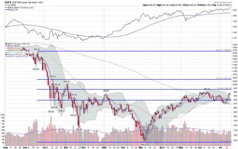
Alas, this week’s chart of the week shows a year of SPX daily bars, with some standard moving averages and Bollinger Bands, as well as a set of Fibonacci retracement lines that have generated considerable discussion in the past (SPX and Fibonacci Resistance at 966.) The new twist on this chart is a simple ratio of the NASDAQ-100 (NDX) to the SPX, which is included as a study above the main graph. The NDX:SPX ratio shows that while the SPX was retreating from its June 12th high, the NDX was outperforming the SPX on a relative basis, as has been the case for the past two months. Spurred on by a very strong earnings report from Intel (INTC) the NDX:SPX ratio is currently at its highest level since early 2001 and the NDX is now comfortably above its June high.
It is worth noting that outside of technology, the only other major sector to have topped its June high is health care (XLV) with consumer staples (XLP) just 0.03 below that high water mark. With the leadership role of technology should be considered a positive sign for bulls, the high relative strength of defensive sectors such as health care and consumer staples might be considered a warning sign.
For a related prior chart of the week post, see: Chart of the Week: The Resurgent NASDAQ-100 (4/5/2009)
[graphic: StockCharts]

