Showing posts with label XLP. Show all posts

Wednesday, February 27, 2013

Beyond SPLV: The Expanding Universe of Low Volatility ETPs

The spike in volatility that hit a climax on Monday has apparently passed with the swiftness of a summer thunderstorm. Of course, as I explained more than six years ago in What My Dog Can Tell Us About Volatility, things are never really quite the same after the storm passes, which is why we often encounter a phenomenon I call echo volatility.

Most investors – and I know I am the exception here – do not like volatility and actively seek out strategies that minimize the volatility of their portfolios. This low volatility approach has a great deal of merit and a fair amount of academic studies to support the rationale behind low volatility investing. For those who might not be interested in wading through the academic literature, the chart below shows how SPLV has significantly outperformed SPY since its launch, with substantially less volatility along the way.

Since the exchange-traded revolution began, investors have been blessed with a variety of low volatility sector ETPs, such as utilities (XLU) and consumer staples (XLP) as well as a strong selection of value-oriented ETPs (e.g., IWD and VTV) and dividend-focused ETPs (e.g., VIG, DVY and SDY), but it was not until May 2011 that there was an exchange-traded product that specifically target low volatility holdings. Enter the PowerShares S&P 500 Low Volatility Portfolio ETN (SPLV), which immediately began attracting a following and now has $3.4 billion of assets. SPLV had the benefit of being first to market, but its success has prompted the launch of many similar products, of which the most successful has probably been the iShares MSCI USA Minimum Volatility ETF (USMV). Since then, PowerShares and iShares have expanded their product line of low volatility ETPs to cover international stocks (EFAV,ACWV, IDLV) and emerging markets (EEMV, EELV).

The newest battleground in the low volatility race is a U.S. market cap focus, with the launch by PowerShares of the PowerShares S&P Mid Cap Low Volatility Portfolio (XMLV) ETN and the PowerShares S&P Small Cap Low Volatility Portfolio (XSLV) ETN earlier this month. I mention these two new entrants because the distinction between these two and SPLV is much more than the market cap. Indeed, the differences in sector weighting are at least as substantial as the differences in market cap. Starting with SPLV as a benchmark, here the current sector weightings are 31% utilities, 24% consumer staples and 15% financials. In contrast, XMLV is weighted with 51% financials, 24% utilities and no other sector representing more than 8% of the portfolio. Not too dissimilar is XSLV, which is weighted 50% in financials and 16% in utilities. The bottom line is that these two new products are not just smaller cap versions of SPLV, but portfolios with a strong financial component, very little exposure to consumer staples and more exposure to sectors such as information technology and industrials, so the redundancy between SPLV and either XMLV or XSLV is smaller than one might expect.

Aggressive and conservative investors alike should make an effort to have a portion of their portfolio dedicated to lower volatility instruments. While more traditional sector, value and dividend approaches still make some sense, the expanding menu of targeted low volatility products certainly deserve a long look as well – preferably before the next big volatility storm.


[source(s): ETFreplay.com]

Related posts:
Disclosure(s): none

Wednesday, January 18, 2012

SPLV vs. XLP

The more I think about it, the less I understand the need for even more low volatility ETPs. Sure, I understand that in high volatility markets many investors want a more conservative portfolio that is insulated against sharp moves in the wrong direction.

In that respect, I can somewhat understand the appeal of the hugely popular PowerShares S&P 500 Low Volatility Portfolio ETN (SPLV), which has now attracted more than $1 billion in assets in the eight months since it launched. Just last week, in Comparing SPLV and VQT, I noted that SPLV’s approach to lower volatility “is heavy on defensive stocks, with the current top sector allocations in utilities, consumer staples and health care stocks.” In fact, following its recent quarterly rebalancing, SPLV currently has approximately 31% of its portfolio invested in utilities, with another 30% in consumer staples. [see SPLV’s top holdings here]

So what is it that SPLV offers over and above an investment in a utilities ETF like XLU or a consumer staples ETF like XLP? Not much, as far as I can tell. I terms of performance, XLU trounced SPLV throughout 2011 and as the chart below shows, finding a distinction between the performance of SPLV and XLP since the former’s launch last May looks a lot like splitting hairs – though to be fair the gap may become more obvious with the recent rebalancing.

One can argue that other approaches which use low volatility stocks (e.g., XLU) are at least as effective in lowering volatility, as are those ETPs that use a dynamic hedging allocation based on an evaluation of market volatility and risk. I touched on two of these in Comparing SPLV and VQT, notably VQT and VSPY.

As I see it, jumping on the low volatility bandwagon is a lot like shunning air travel because of a fear of turbulence. While that is understandable, that cross-country train is going to make it a much longer trip to get to the same destination.

Considering the differences across the investment universe, I realize that not everyone embraces market volatility as a period in which enhanced opportunities arise, so in 2012 one of the themes I will periodically address in this blog will be how to reduce risk, hedge and generate income – though not necessarily all at the same time.

In the meantime, consider for a moment a personal motto, “In volatility, there is opportunity!

Related posts:

[source(s): ETFreplay.com]

Disclosure(s): none

Sunday, October 11, 2009

Chart of the Week: Two Bull Legs and Counting…

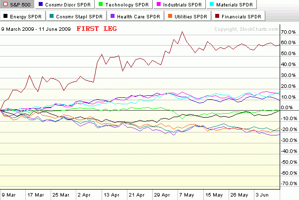
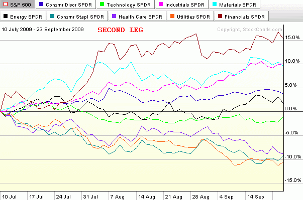
In the seven months since stocks bottomed and rallied some 61% (in the SPX) to current levels, there have been two distinct bull legs. The first leg began with the low close on March 9th (or intraday low on March 6th) and lasted just a little more than three months until the high close on June 11th. After a one month downturn, the second bull leg was launched on July 10th and persisted almost two and one half months until September 23rd. This time the pullback appears to have been more short-lived and has a provisional end date of October 2nd.

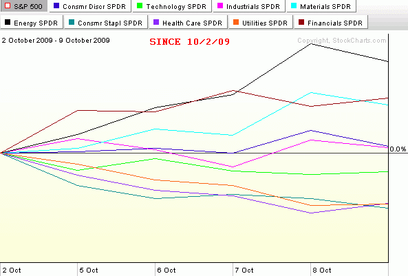
The three charts below – which collectively form this week's chart of the week – capture the sector performance relative to the SPX (the numbers are not in absolute terms) for the first two bull legs and also throws in the first week of what may turn out to be a third bull leg.

Note that in the first two bull legs, financials (XLF) were easily the top performing sector in both instances. Also, on both occasions it was the materials (XLB) and industrial (XLI) sectors that had clear separation from the rest of the sectors and were almost neck and neck for second and third. These three sectors clearly represent a top tier in terms of performance during the most pronounced 2009 bull moves. A second tier of consumer discretionary (XLY), technology (XLK) and energy stocks (XLE) has generally performed slightly above the baseline SPX. The bottom tier consists of three defensive sectors that typically only outperform the SPX in market downturns. In fact, these three sectors, health care (XLV), consumer staples (XLP) and utilities (XLU), were the top three performers during the June 11th to July 10th pullback.

Just for fun, I have added the last week of performance in the bottom chart. It is too early to draw conclusions for one week of upward movement, but so far the leading sector for October is energy. If the markets are to continue to set new highs for 2009, a big question will be whether the same sectors continue to lead or whether new leadership emerges. Personally, I do not expect that the same performance hierarchy that has characterized the last two bull legs to continue during the next month or two of upward moves. In fact, I would expect leadership to shift to the second tier in the form of technology, energy or consumer discretionary stocks. No matter what happens, it will be interesting to see how the broader market performs if financials start to lag the other sectors.

[source: StockCharts]

Sunday, July 19, 2009

Chart of the Week: SPX and NDX

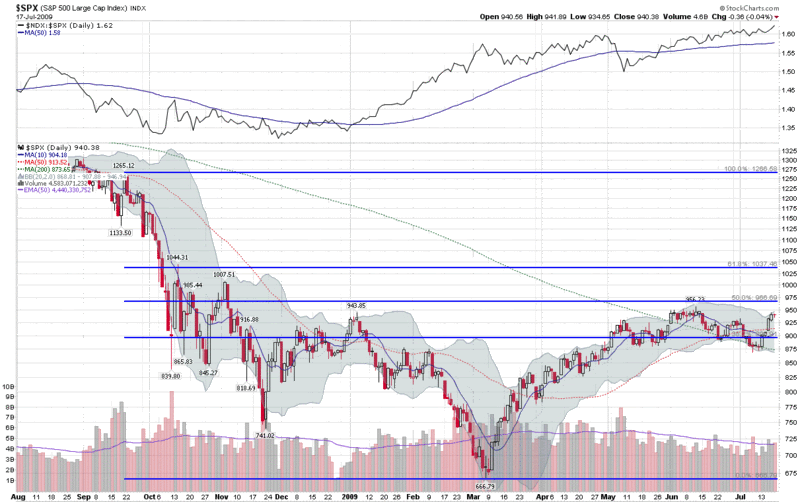
In reviewing previous chart of the week graphics, I was surprised to see that I have featured a chart of the SPX only once in the past five months (Chart of the Week: Lack of Volume and Breadth Threatens Bull Move) and decided that this most important of indices needs to take center stage more often.

Alas, this week’s chart of the week shows a year of SPX daily bars, with some standard moving averages and Bollinger Bands, as well as a set of Fibonacci retracement lines that have generated considerable discussion in the past (SPX and Fibonacci Resistance at 966.) The new twist on this chart is a simple ratio of the NASDAQ-100 (NDX) to the SPX, which is included as a study above the main graph. The NDX:SPX ratio shows that while the SPX was retreating from its June 12th high, the NDX was outperforming the SPX on a relative basis, as has been the case for the past two months. Spurred on by a very strong earnings report from Intel (INTC) the NDX:SPX ratio is currently at its highest level since early 2001 and the NDX is now comfortably above its June high.

It is worth noting that outside of technology, the only other major sector to have topped its June high is health care (XLV) with consumer staples (XLP) just 0.03 below that high water mark. With the leadership role of technology should be considered a positive sign for bulls, the high relative strength of defensive sectors such as health care and consumer staples might be considered a warning sign.

For a related prior chart of the week post, see: Chart of the Week: The Resurgent NASDAQ-100 (4/5/2009)

[graphic: StockCharts]

Tuesday, January 6, 2009

Market Rewind on Risk

Since Joe Nocera, Michael Lewis and David Einhorn all had a chance to talk about risk in yesterday’s Required Reading segment, I thought it was timely of Jeff Pietsch at Market Rewind to pick this morning to offer up some of his thoughts on the subject of risk.

In ETF Risk in Review, Pietsch draws on data from his ETF Rewind tool to tackle the subject of risk-adjusted performance and ranks the 2008 performance of various ETFs within their grouping according to a Sortino Ratio (similar to the more familiar Sharpe Ratio, but the Sortino Ratio not penalize performance for upside volatility.) Not surprisingly, consumer staples (XLP) and health care (XLV) turn in the some of the best risk-adjusted performance numbers for 2008, while financials (XLF), emerging markets (EEM) and real estate (IYR) are notable laggards.

One key take away from the analysis is the value of thinking of ETFs in terms of miniature portfolios whose performance can be evaluated on a risk-adjusted basis. We witnessed history in 2008 and as painful as some of that history may have been to live through, hopefully we all enter 2009 with the benefit of a healthier and more sophisticated perspective on volatility and risk.

Tuesday, September 2, 2008

August Sector Recap

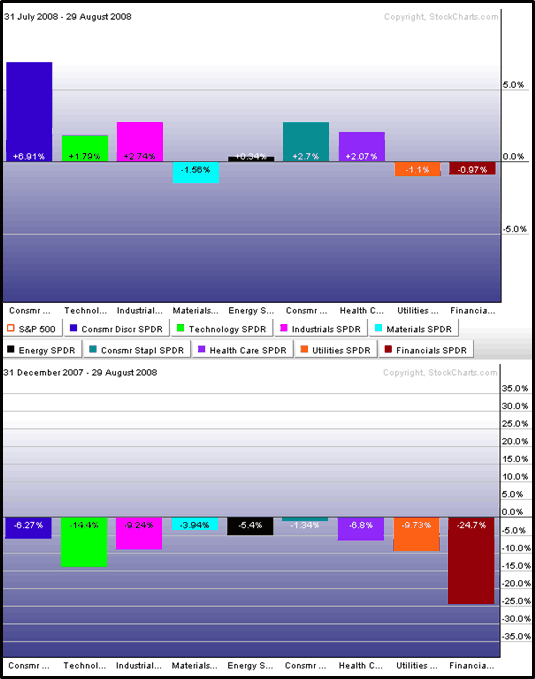
August was a month in which the S&P 500 largely drifted sideways, but there was a good deal going on in the various sectors that make up the index. The graphic below shows sector performance for the nine sector SPDRs for the first eight months of 2008 (bottom) and for the month August (top).

On the plus side, the turnaround in the consumer discretionary sector (XLY) is clearly responsible for much of the recent positive momentum in the SPX. Also worth noting is that four other sectors outperformed the index in August: consumer staples (XLP), health care (XLV), industrials (XLI), and technology (XLK).

As has often been the case during the past few months, when the SPX has been moving up, energy (XLE) and materials (XLB) have been moving in the opposite direction. In August, the financial sector (XLF) was also pulling the index in the wrong direction.

Watch the consumer for more clues about sector leadership and overall market strength in the month of September.


[source: StockCharts]

Thursday, April 17, 2008

Zooming Out on Consumer Spending

By now the news that the University of Michigan Consumer Sentiment Report for April was at the lowest level since March 1982 has been almost fully digested. A number of bloggers have done an excellent job pointing out that lows in this index often coincide with lows in the stock market. Babak at Trader’s Narrative , for instance, has an excellent graph of sentiment and stocks in Consumer Sentiment Always Darkest Before the Dawn. Don Fishback’s Market Update has a similar chart up today.

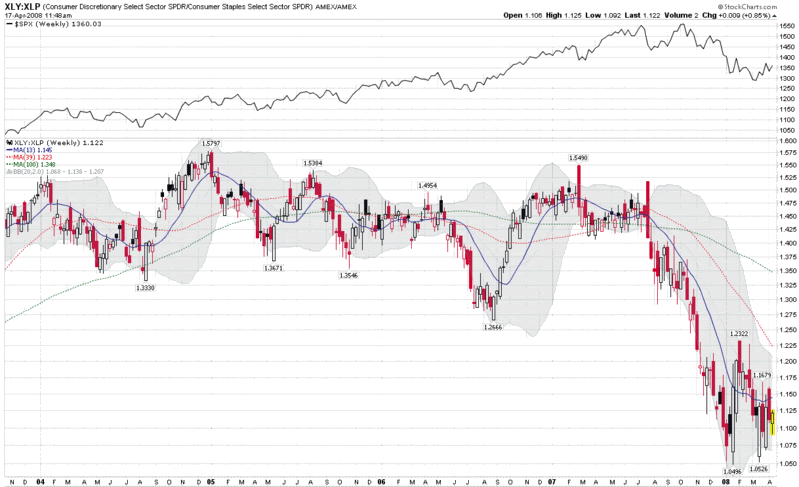
The upcoming Pennsylvania primary notwithstanding, I am going to set aside poll data for the moment and focus on one of my favorite consumer sentiment indicators: a comparison of consumer discretionary stocks to consumer staples stocks. This can easily be done with two sector ETFs, XLY (Consumer Discretionary Select Sector SPDR Fund) and XLP (Consumer Staples Select Sector SPDR Fund.) Keeping in mind that stocks are supposed to lead the economy by 6-9 months, the XLY:XLP ratio should tell us something about how stocks are pricing in expected consumer spending patterns over the next 2-3 quarters.

The XLY:XLP chart below is a weekly chart, which provides a sense of the recent ebbs and flows of consumer spending patterns. The chart demonstrates that when the ratio trends down and/or makes a significant low, these events usually coincide with market bottoms. It remains to be seen whether this pattern will hold in the current economic environment, but there are signs that the consumer discretionary ratio, like equities, is starting to move off of the recent bottom. This is an important ratio, not just for what it suggests about future consumer spending patterns, but also for flagging the extent to which investors feel compelled to favor the more defensive consumer staples stocks or the more speculative consumer discretionary ones.

Thursday, August 23, 2007

What’s Working? A Sector Overview

Now that the broad indices have pulled back 10% or so and retraced about half of that drop, it is a good time to evaluate what is working in the current market environment.

One of the first places I look for clues is in sector and industry performance. With ETFs it is now possible to take the temperature of just about any micro-segment of the market you can think of, but for today I will stick to broader market segments.

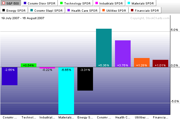
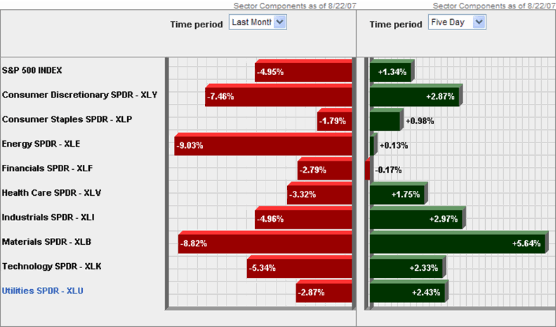
Looking at the peak to trough from July 19 to August 16, you can see that it is the materials sector (XLB) that suffered the most dramatic losses, dragged down by WY, IP, AA and the like.


In the five days since the market has bounced, the materials have been leading the bullish charge, with energy and financials lagging. Given the change in expectations about interest rates, it is not surprising to also see that utilities have had a much better week relative to the past month than the other sectors.


Going forward, look at the relative performance of materials, industrials (XLI) and technology (XLK) to provide some clues about global economic conditions and consumer discretionary (XLY) vs. consumer staples (XLP) to tell us something about the health of the consumer. If energy (XLE) and financials (XLF) can also start to rally, this may help us to discern the difference between a short-term bounce and the resumption of the bull market.

DISCLAIMER: "VIX®" is a trademark of Chicago Board Options Exchange, Incorporated. Chicago Board Options Exchange, Incorporated is not affiliated with this website or this website's owner's or operators. CBOE assumes no responsibility for the accuracy or completeness or any other aspect of any content posted on this website by its operator or any third party. All content on this site is provided for informational and entertainment purposes only and is not intended as advice to buy or sell any securities. Stocks are difficult to trade; options are even harder. When it comes to VIX derivatives, don't fall into the trap of thinking that just because you can ride a horse, you can ride an alligator. Please do your own homework and accept full responsibility for any investment decisions you make. No content on this site can be used for commercial purposes without the prior written permission of the author. Copyright © 2007-2023 Bill Luby. All rights reserved.
 
Web Analytics