Showing posts with label XLK. Show all posts

Sunday, April 29, 2012

Chart of the Week: Sector Winners and Losers

While there was a lot going on in the sector space during the rally from October to April and the pullback earlier in the month, I have yet to see any sort of detailed explanation of what happened during these two periods.

This week’s chart of the week below attempts to bridge this gap, with a four-chart comparison of the bull move from October 4, 2011 to April 2, 2012 as well as the bear pullback from April 2 to April 10, 2012. The top two charts cover the bull move, with the left chart capturing absolute sector performance and the right chart capturing sector performance relative to the changes in the S&P 500 index as a whole. The bottom two charts also have absolute sector performance on the left and relative sector performance on the right, but this time during the April 2-10 pullback.

The absolute data show that all sectors moved up during the bull move and fell during the bear move. The relative data allow for a more nuanced analysis that shows financials (XLF) were the main engine behind the bull move and also the largest contributor to the pullback. While financials shared some of the credit with consumer discretionary stocks (XLY), industrials (XLI) and technology (XLK) on the way up, it was materials (XLB), energy (XLE) and industrials that helped to pull the broader index down. Only two sectors have outperformed the S&P 500 index on the way up and on the way down: technology and consumer discretionary stocks. Conversely, energy has been the only laggard in both directions.

While not reflected in these charts, in the three weeks since the April 10th bottom, consumer discretionary, materials and industrials have been the biggest contributors to bullish moves. Interestingly, technology has now flipped to being the biggest drag on performance.

One could make a fairly good case that the ability of the S&P 500 index to make a run at 1500 (take a bow, James Altucher) will in large part be a function of the degree to which technology returns to a leadership role.

Related posts:

[source(s): StockCharts.com]

Disclosure(s): long XLY at time of writing

Sunday, September 19, 2010

Chart of the Week: Looking for Sector Leadership

Stocks have rallied impressively since the beginning of July, but during that period, that has not been a particular sector which has led the rally. The lack of strong sector leadership can be seen on the one hand as a potential impediment to further bullish moves, but also as a sign of broad-based support for stocks and a potential inhibitor to a correction.

In the chart of the week below, I show the performance of the nine AMEX sector SPDRs since the market’s July 2nd lows. Note that materials (XLB) and industrials (XLI) have been the top two performing sectors during the past 2 ½ months, reflecting the relative strength in manufacturing. The other two sectors that have outperformed the SPX during this period, consumer discretionary (XLY) and technology (XLK), both showed signs of coming to life last week.

Going forward, materials and industrials can conceivably continue to lead a bull leg, but the rally will benefit substantially if one or more of the others sectors rises to meet the challenge. For now at least, my money is on technology to step up. That being said, the consumer and financial sectors cannot afford to be a significant drag on stocks or the current rally will likely run out of steam.

Related posts:


[source: StockCharts.com]

Disclosure(s): none

Sunday, December 13, 2009

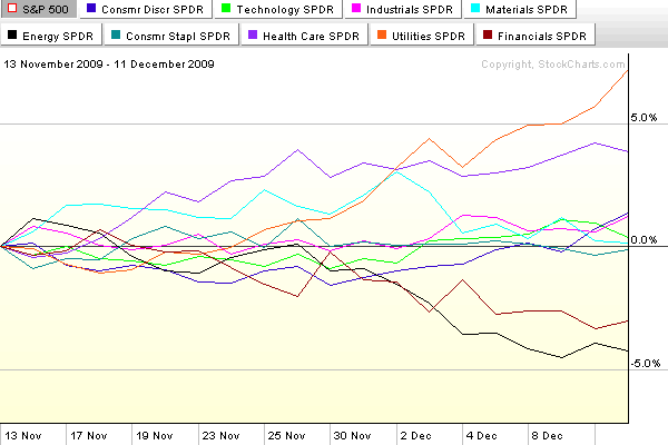
Chart of the Week: A Month of New Sector Leadership

During the course of the past month or two, stocks have drifted sideways, lacking buying conviction and strong leadership.

In this week’s chart of the week below, I have tracked the performance of the nine AMEX sector SPDRs over the course of the past month. Note that former leaders financials (XLF) and energy (XLE) are now lagging, while defensive sectors such as utilities (XLU) and health care (XLV) are leading the way. Now I have nothing against utilities and health care, but the next time these two sectors lead a significant bull rally will be the first time in my memory. One or more of technology (XLK), consumer discretionary (XLY), materials (XLB) or perhaps financials needs to take a leadership role to give the next bullish leg the type of strength that portfolio managers can believe in.

A good defense may win championship, but it will not light a fire under potential buyers.

For more on related subjects, readers are encouraged to check out:

[source: StockCharts]

Disclosure: none

Sunday, October 11, 2009

Chart of the Week: Two Bull Legs and Counting…

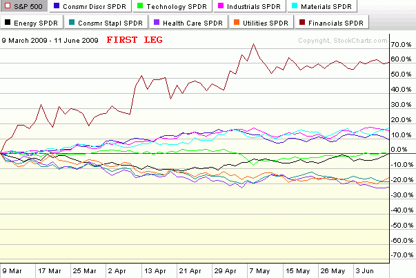
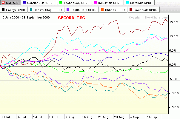
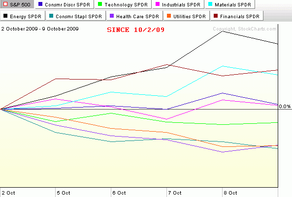
In the seven months since stocks bottomed and rallied some 61% (in the SPX) to current levels, there have been two distinct bull legs. The first leg began with the low close on March 9th (or intraday low on March 6th) and lasted just a little more than three months until the high close on June 11th. After a one month downturn, the second bull leg was launched on July 10th and persisted almost two and one half months until September 23rd. This time the pullback appears to have been more short-lived and has a provisional end date of October 2nd.

The three charts below – which collectively form this week's chart of the week – capture the sector performance relative to the SPX (the numbers are not in absolute terms) for the first two bull legs and also throws in the first week of what may turn out to be a third bull leg.

Note that in the first two bull legs, financials (XLF) were easily the top performing sector in both instances. Also, on both occasions it was the materials (XLB) and industrial (XLI) sectors that had clear separation from the rest of the sectors and were almost neck and neck for second and third. These three sectors clearly represent a top tier in terms of performance during the most pronounced 2009 bull moves. A second tier of consumer discretionary (XLY), technology (XLK) and energy stocks (XLE) has generally performed slightly above the baseline SPX. The bottom tier consists of three defensive sectors that typically only outperform the SPX in market downturns. In fact, these three sectors, health care (XLV), consumer staples (XLP) and utilities (XLU), were the top three performers during the June 11th to July 10th pullback.

Just for fun, I have added the last week of performance in the bottom chart. It is too early to draw conclusions for one week of upward movement, but so far the leading sector for October is energy. If the markets are to continue to set new highs for 2009, a big question will be whether the same sectors continue to lead or whether new leadership emerges. Personally, I do not expect that the same performance hierarchy that has characterized the last two bull legs to continue during the next month or two of upward moves. In fact, I would expect leadership to shift to the second tier in the form of technology, energy or consumer discretionary stocks. No matter what happens, it will be interesting to see how the broader market performs if financials start to lag the other sectors.

[source: StockCharts]

Monday, June 8, 2009

Banks, Large Cap Tech and Leadership

One month ago today in The Banks vs. Technology, I mentioned the divergence between technology and financials and noted, “so far the financials (XLF) have done a better job of leading the market up than technology stocks (XLK) have done of inspiring the bears.”

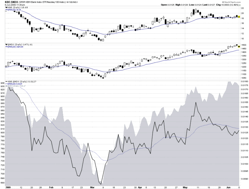
Fast forward one month and the divergence has turned upside down. In the chart below, I focus on financials in the form of the KBE banking ETF and large cap technology as exemplified by the NASDAQ-100 or NDX.

As it turns out, May 8th, the day of the original post, was the top in the banking ETF. Since that date, banks have slowly trended lower (top graphic), even while large cap technology (middle graphic) and the S&P 500 index (gray area chart at bottom) have been making new highs. The change in leadership is perhaps best illustrated by the solid black line in the bottom portion of the chart, which tracks a ratio of KBE to the NDX. In March, April and the early part of May, the ratio quite accurately mirrored the movement in the SPX.

During the course of the past four weeks, however, leadership flipped from banks to large cap technology and the ratio began to decline – all while the SPX continued to make new highs.

I find it particularly interesting that it is not just the relative performance of banks that has declined, but it is also becoming increasingly common for banks and technology to move in different directions on the same day. This has been the case today and has been true for five of the past six days.

I am not surprised to see leadership being passed from financials to large cap technology, but as I said a month ago, I do not expect the market to make any significant additional gains unless the two sectors are able to move up in unison.

[source: StockCharts]

Friday, May 8, 2009

The Banks vs. Technology

I was going to put up a post about the recent negative divergence in technology, particularly the large cap technology companies that dominate the NASDAQ-100 (NDX), but I noticed that Cam Hui at Humble Student of the Markets already beat me to the punch yesterday morning in an excellent Weak Leadership Imperils Market Advance.

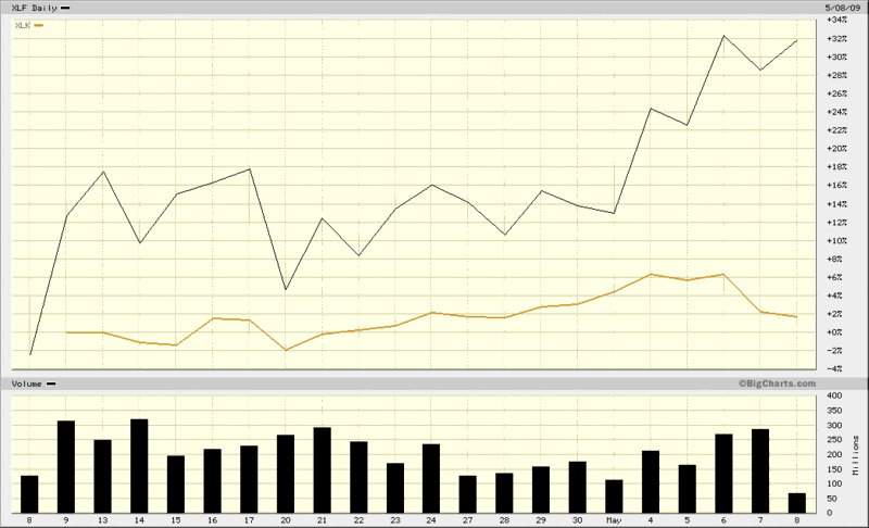
Interestingly, since Cam’s post, the divergence between financials and technology has accelerated as the banks have continued to rise in advance of and in response to the release of the stress test results, while large cap technology has been trending down since Monday.

So far the financials (XLF) have done a better job of leading the market up than technology stocks (XLK) have done of inspiring the bears. Until these two sectors start to move in unison, though, I suspect we will have a stalemate.

[source: BigCharts]

Tuesday, September 2, 2008

August Sector Recap

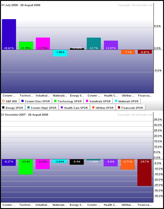
August was a month in which the S&P 500 largely drifted sideways, but there was a good deal going on in the various sectors that make up the index. The graphic below shows sector performance for the nine sector SPDRs for the first eight months of 2008 (bottom) and for the month August (top).

On the plus side, the turnaround in the consumer discretionary sector (XLY) is clearly responsible for much of the recent positive momentum in the SPX. Also worth noting is that four other sectors outperformed the index in August: consumer staples (XLP), health care (XLV), industrials (XLI), and technology (XLK).

As has often been the case during the past few months, when the SPX has been moving up, energy (XLE) and materials (XLB) have been moving in the opposite direction. In August, the financial sector (XLF) was also pulling the index in the wrong direction.

Watch the consumer for more clues about sector leadership and overall market strength in the month of September.


[source: StockCharts]

Thursday, July 10, 2008

Implied Volatility of Top Three SPX Sectors

Yesterday, in The Impact of Financial and Energy Stocks on the VIX, I talked about the low (and sometimes negative) correlation between the SPX and some of the sectors represented in the index.

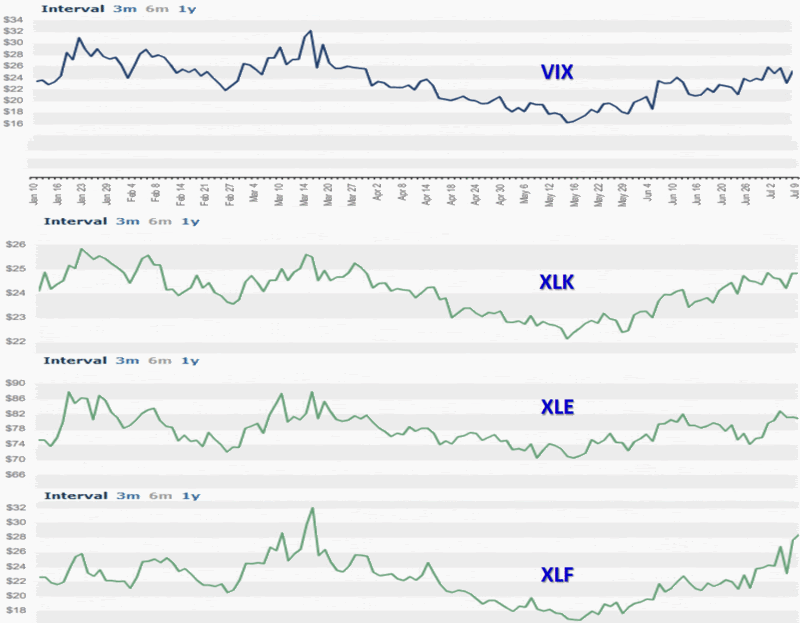
Today I am posting a graphic of the top three sectors (per the Sector SPDR breakdown) in the SPX: technology (XLK: 19.7%); energy (XLE: 15.3%); and financials (XLF: 14.2%). The graph shows a strong correlation between the implied volatility of the SPDR sectors. This should come as no surprise.

Some readers have expressed confusion about correlations between prices and implied volatility. The key takeaway is that SPX implied volatility is not cumulative. The net implied volatility of the SPX is a function of not just the implied volatility of the components or sectors, but also of the directional pull. Let’s take a simplified example. Consider a hypothetical situation in which XLK and XLE are both 18% of the total SPX and both have an implied volatility of 40. If both are perfectly correlated, then 36% of the SPX should have an implied volatility of 40. If, on the other hand, XLK has a correlation of +1.0 (100% positive correlation) and XLE has a correlation of -1.0 (100% negative correlation), then the two sectors cancel each other out and the ‘net implied volatility’ for this 36% slice of the SPX is an even zero.

As a general rule, the higher the correlation among the sectors and individual stocks, the higher the net implied volatility. High implied volatility combined with low or negative correlations generally translates into lower net implied volatility.

For some more detailed individual research into this topic, I recommend Don Fishback’s Index Implied Volatility Is Based on Correlation and Time – It’s Not Just Magnitude!

Wednesday, June 4, 2008

The VIX and Sectors: A One Day Snapshot

I collect a lot of strange and unusual data in the course of trying to be “Your One Stop VIX-Centric View of the Universe…” and it makes sense to share some of those chunks of data from time to time, even when I don’t think it will change the way anyone looks at the market.

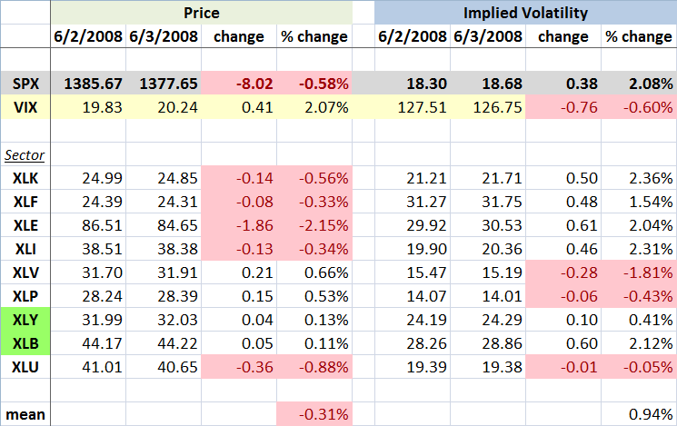
Now that I’ve lowered your expectations, I call your attention to the graphic below, which captures the movements in the various sector SPDRs over the course of Monday to Tuesday, a day in which rumors of persistent difficulties at Lehman Brothers (LEH) helped to drag down the financial sector ETF (XLF) to its lowest level since March. The sectors are ordered with the highest weighted ETF at the top (XLK - technology) and the lowest weighted (XLU - utilities) at the bottom. With any luck, the balance of the graphic is self-explanatory.

From a sector and volatility perspective, I found a few interesting tidbits from the graphic. First of all, the change in the VIX and the change in the SPX implied volatility were almost identical, which is what you would expect. I did find it interesting that the VIX jumped more than twice the percentage change in the mean IV across the nine sector ETFs. Drilling down a little more, only three of the sectors had an increase in IV that was higher than the jump in the VIX -- and in each instance this was just barely the case.

I have highlighted in green the two sectors in which the price of the ETF increased at the same time that implied volatility increased. For the consumer discretionary sector (XLY), the change is not particularly dramatic, but for the materials sector (XLB), there is a substantial jump in IV on the heels of increasing price. Needless to say, this is unusual.

Part of the explanation for the large increase in the VIX (and SPX IV) relative to the individual sectors may come from the fact that the four most heavily weighted sector ETFs all had a substantial rise in IV, but even when taking this into consideration, the change in the VIX exceeds the change in the sum of the weighted parts.

Finally, for anyone who followed my fearogram and SPX-VIX correlation analysis last year, you may recall that the median daily percentage move in the VIX is -4.2x of the daily move in the SPX. For the record, yesterday the VIX moved 3.6x in the opposite direction of the SPX. In percentage terms, this is a fairly typical negative daily correlation number. [Disclosure: Long LEH at time of writing.]

Wednesday, April 23, 2008

Financials Struggle to Establish Momentum

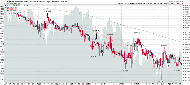
Further to my recent comments in The Energy and Materials Rally, I thought it might be interesting to show the relative performance of the financial sector (XLF) versus the SPX. The chart below shows that while the financials helped to drag down the SPX over the past six months or so, it also reveals that any gains that the SPX has been able to make over the past 2-3 weeks have been without the participation of the financial sector.

I am of the opinion that while the technology (XLK) and industrial (XLI) sectors can provide leadership in any bull move up from current levels, such a move will be severely hampered and likely short-lived without the participation of the financial (XLF) and consumer discretionary (XLY) stocks.

Monday, April 21, 2008

The Energy and Materials Rally

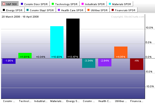
While Google (GOOG), Caterpillar (CAT), and other big technology and industrial names have recently helped push stocks to their best levels in three months, the rally off of the March 20th bottom may not have the kind of sector composition behind it that is conducive to an extended move. In fact, so far the bull run has been largely the result of strong performance in the energy and materials sector – a good portion of which can be attributed to the search for a hedge against inflation.

The chart below shows the performance of the nine AMEX Select Sector SPDRs relative to the S&P 500 index since the March 20th bottom. The sectors normally associated with an economic turnaround – technology (XLK), industrials (XLI), and consumer discretionary (XLY) – have heretofore not been leading the charge. On the other hand, the leading sectors over the past month – energy (XLE) and materials (XLB) – are not the sectors that typically are able to lead a sustainable rally. In the next week or two, look for other sectors to start outperforming the energy and materials group. If this fails to happen, there will probably not be sufficient market breadth to keep the current rally alive.

Friday, December 28, 2007

Technology, Energy and Bulls

Conventional wisdom – which usually strikes me as something like 95% convention and 5% ‘wisdom’ – holds that returns on technology stocks and energy stocks are largely a function of the business cycle. The theory is that technology stocks generally outperform in the early stages of a bull market, while energy stocks deliver their best returns at about the time that the broad markets peak
I should note that while I have chosen to focus on technology and energy for the moment, the full sector rotation/business cycle theory spans all sectors. For those interested in further reading, the CXO Advisory Group has an excellent discussion of a comprehensive business cycle approach to sector rotation (they are skeptical about trading on the theory) and a variety of sources, including Fidelity and Optionetics, have good summary articles.

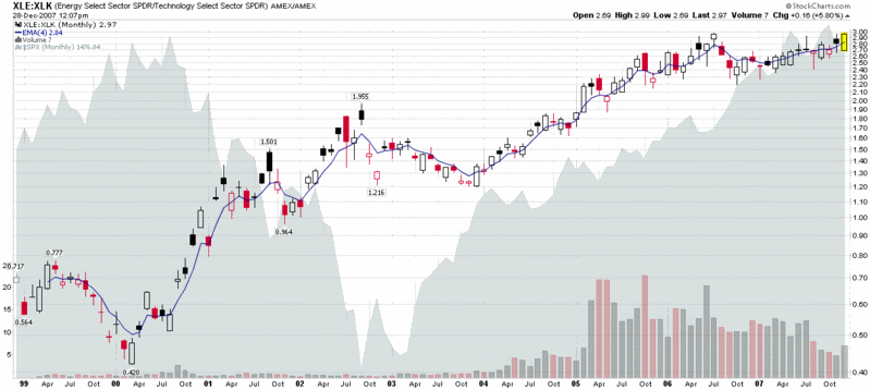
Getting back to energy and technology, I have included below a ratio chart of the AMEX Select SPDRs for the energy (XLE) and technology (XLK) sectors going back to their 1998 launch. The graph shows an almost perfect negative correlation between the ratio of energy to technology sector performance and the SPX from 1998 through the end of 2003. This time frame is reasonably representative as well, as it includes two bull periods of about 1 ½ years each, as well as a bear market of a little more than two years.

From the beginning of 2004 to the present, however, the correlation between the energy to technology ratio and the SPX flips from negative to positive, as energy starts to outperform technology at the same time the markets begin a long bull run. For the past four years, up to and including the current month, energy has generally had the upper hand or at least been the equal of the more ballyhooed technology sector.

I find it interesting that the last time the XLE:XLK ratio was this high was July 2006, when the markets were selling off over uncertainty about whether Bernanke would continue to raise the Fed discount rate. Now I won’t go as far as to say that the bull market is officially over if the XLE:XLK ratio gets over 3.0, but keep an eye on this ratio. As US consumers get accustomed to $100/barrel oil and $3.50/gallon gas, any number of things are possible, but I don’t believe the broader markets will continue to rise if energy outperforms technology going forward.

Tuesday, November 6, 2007

SPDR Check: Technology and Financials

Back in August, I posted about some interesting divergences in implied volatility in the technology and financial sectors. Fast forward two and a half months and with Citigroup (C), Merrill Lynch (MER) and their brethren in the dog house while Google (GOOG), Research in Motion (RIMM) and the most of the other large cap tech stocks on a tear, the story has morphed from diverging implied volatility to diverging performance and future expectations.
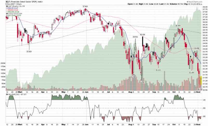
So this seems like a good time to look at my favorite AMEX Select Sector SPDRs again to see what has happened. In the chart below, I compare the plight of XLF, the financial sector SPDR (XLF top holdings), to XLK, the technology sector SPDR (XLK top holdings.) Where I see the big divergence in performance is following the second week in October, from which point the financials have been beaten down almost as badly as they were during the dramatic July-August drop. The interesting part this time around is technology stocks, which fell in sympathy with financials during the summer, yet have been almost unassailable during the past three weeks.

I am skeptical that the market can continue to remain in a bullish mode without the participation of the financials, yet, on the other hand, the fundamentals of technology stocks do not seem to warrant that they join financials on the bear side of the ledger. For now at least, the bears will have to be content with claiming victory in the financial, consumer discretionary and real estate sectors, while the bulls control the majority of the remaining sectors. Eventually, I expect all the bulls or all the bears to capitulate in a dramatic major move. I’m not sure whether the move will be up or down, but each sector skirmish will provide some additional clues.

Thursday, August 23, 2007

What’s Working? A Sector Overview

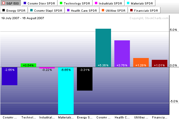
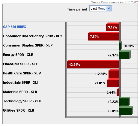
Now that the broad indices have pulled back 10% or so and retraced about half of that drop, it is a good time to evaluate what is working in the current market environment.

One of the first places I look for clues is in sector and industry performance. With ETFs it is now possible to take the temperature of just about any micro-segment of the market you can think of, but for today I will stick to broader market segments.

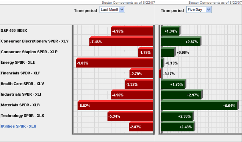
Looking at the peak to trough from July 19 to August 16, you can see that it is the materials sector (XLB) that suffered the most dramatic losses, dragged down by WY, IP, AA and the like.


In the five days since the market has bounced, the materials have been leading the bullish charge, with energy and financials lagging. Given the change in expectations about interest rates, it is not surprising to also see that utilities have had a much better week relative to the past month than the other sectors.


Going forward, look at the relative performance of materials, industrials (XLI) and technology (XLK) to provide some clues about global economic conditions and consumer discretionary (XLY) vs. consumer staples (XLP) to tell us something about the health of the consumer. If energy (XLE) and financials (XLF) can also start to rally, this may help us to discern the difference between a short-term bounce and the resumption of the bull market.

Tuesday, August 21, 2007

VIX:VXN Ratio Extremes

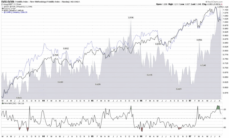
Earlier this morning, Adam Warner at Daily Options Report posted a chart and commentary about the VIX:VXN ratio, which volatility groupies will recall compares the implied volatility of the S&P 500 to that of the NASDAQ 100.

The interesting factoid is that the VIX:VXN ratio is at an all-time high, which the chart below highlights (while the VXN was launched by the CBOE in early 2001, StockCharts.com only has VXN data back to February 2003.)


The key question is why the VIX:VXN ratio is printing such extreme numbers at the present. Adam concludes the following:

“Best guess is that there's a perception out there that tech is relatively *safe* now. And I suppose it is given that it's not the focus of the periodic poundage.”

This take makes a lot of sense, as various ratios of technology stocks to financials (e.g., XLK:XLF and XCI:XBD) reflect that the current environment is one of those rare instances where technology is considered less risky than financials.

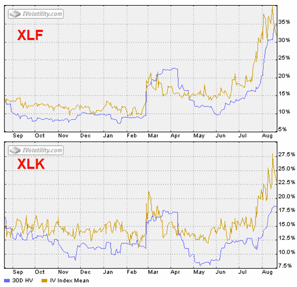
A look at two SPDRs tells the story even better, in my opinion. XLF, the financial sector SPDR (XLF top holdings), shows a 160% spike in IV from mid-June, while XLK, the technology sector SPDR (XLK top holdings), shows an IV spike of about 120%. Even more interesting, at least to my eye, is that following the February 27th VIX spike, XLK retraced all of its IV spike, while XLF only retraced half of that spike before starting to rise in mid-June. Was the half-hearted XLF implied volatility spike retracement in March through June a warning of what was lurking under the surface? For those who may be interested, of the nine AMEX Select Sector SPDRs, four of the sectors – financials, consumer discretionary (XLY), industrial (XLI), and utilities (XLU) – did not retrace their February IV spike; and these sectors do not correlate with relative sector performance over the past month.


DISCLAIMER: "VIX®" is a trademark of Chicago Board Options Exchange, Incorporated. Chicago Board Options Exchange, Incorporated is not affiliated with this website or this website's owner's or operators. CBOE assumes no responsibility for the accuracy or completeness or any other aspect of any content posted on this website by its operator or any third party. All content on this site is provided for informational and entertainment purposes only and is not intended as advice to buy or sell any securities. Stocks are difficult to trade; options are even harder. When it comes to VIX derivatives, don't fall into the trap of thinking that just because you can ride a horse, you can ride an alligator. Please do your own homework and accept full responsibility for any investment decisions you make. No content on this site can be used for commercial purposes without the prior written permission of the author. Copyright © 2007-2023 Bill Luby. All rights reserved.
 
Web Analytics