VIX:VXN Ratio Extremes
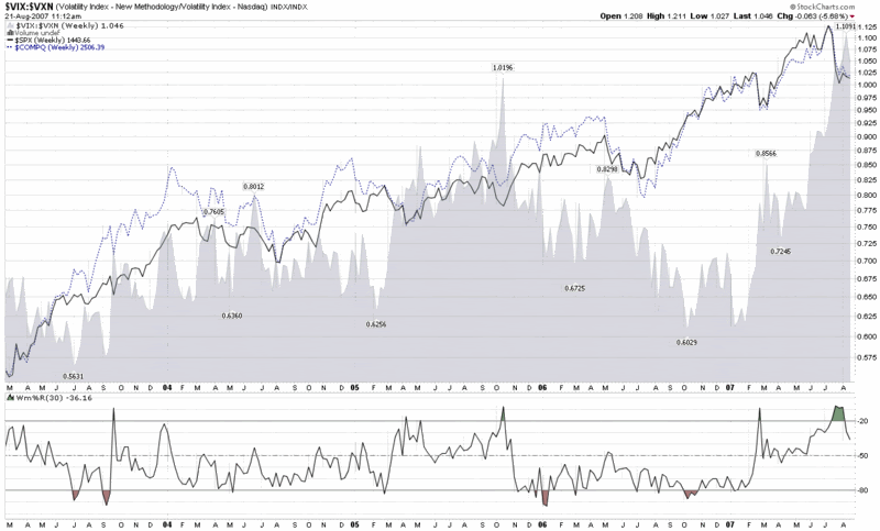
Earlier this morning, Adam Warner at Daily Options Report posted a chart and commentary about the VIX:VXN ratio, which volatility groupies will recall compares the implied volatility of the S&P 500 to that of the NASDAQ 100.
The interesting factoid is that the VIX:VXN ratio is at an all-time high, which the chart below highlights (while the VXN was launched by the CBOE in early 2001, StockCharts.com only has VXN data back to February 2003.)

The key question is why the VIX:VXN ratio is printing such extreme numbers at the present. Adam concludes the following:
“Best guess is that there's a perception out there that tech is relatively *safe* now. And I suppose it is given that it's not the focus of the periodic poundage.”
This take makes a lot of sense, as various ratios of technology stocks to financials (e.g., XLK:XLF and XCI:XBD) reflect that the current environment is one of those rare instances where technology is considered less risky than financials.
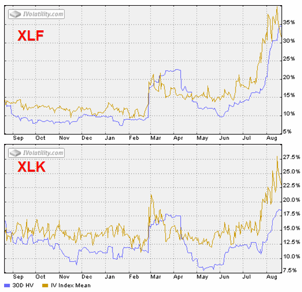
A look at two SPDRs tells the story even better, in my opinion. XLF, the financial sector SPDR (XLF top holdings), shows a 160% spike in IV from mid-June, while XLK, the technology sector SPDR (XLK top holdings), shows an IV spike of about 120%. Even more interesting, at least to my eye, is that following the February 27th VIX spike, XLK retraced all of its IV spike, while XLF only retraced half of that spike before starting to rise in mid-June. Was the half-hearted XLF implied volatility spike retracement in March through June a warning of what was lurking under the surface? For those who may be interested, of the nine AMEX Select Sector SPDRs, four of the sectors – financials, consumer discretionary (XLY), industrial (XLI), and utilities (XLU) – did not retrace their February IV spike; and these sectors do not correlate with relative sector performance over the past month.


0 comments:
Post a Comment