Showing posts with label financials. Show all posts

Sunday, August 30, 2009

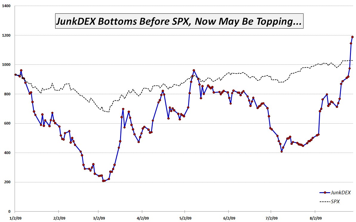
Chart of the Week: JunkDEX Tracks Speculative Frenzy in Junk Financials

Back in September 2007, when I thought the markets were a little too frothy, I created a list of Overripe High Fliers. A few weeks later, in From Overripe to Vulnerable? I took the current list of 14 overripe high flier stocks that had been drawing a great deal of speculative attention into something I called the OHFDEX – an index based on those overripe high fliers.

Not only was the timing of the OHFDEX impeccable, but the post became so popular that it spawned a number of follow-up posts, including, OHFDEX One Year Later.

In the spirit of the original OHFDEX, I have been watching closely the recent speculative frenzy in some stocks that have come to be known as “junk financials.” These are financial firms that were the recipients of government bailout funds during the financial crisis and now sell at valuations substantially below 2007 levels. They include American International Group (AIG), Fannie Mae (FNM), Freddie Mac (FRE), Citigroup (C), CIT Group (CIT) and Bank of America (BAC). In the last few weeks, these stocks have routinely accounted for 30% or more of the total volume on the NYSE and on Friday alone the group of six traded 2.53 billion shares.

While I find the transition from risk-averse behavior to risk-tolerant behavior on the part of investors to be an important step in the healing process, the recent headlong rush into risk-seeking behavior has me more than a little concerned. How healthy can the markets be when speculation in six companies that were all but bankrupt a few months ago now accounts for one out of every three shares traded each day?

In order to track the speculative interest in junk financials, I have created what I am calling the JunkDEX, which consists of equally weighted positions (as of 1/2/09) in AIG, FNM, C, CIT and BAC (I elected to omit FRE due to the strong similarities with FNM.) I scaled the JunkDEX so that it had the same value as the SPX at the beginning of the year. As this week's chart of the week below shows, the JunkDEX led the S&P 500 index down from January through March, bottomed two days earlier and rallied impressively through the middle of May. From May through early August, the JunkDEX lagged the SPX significantly, before spiking dramatically during the past 3 ½ weeks.

The JunkDEX looks as if it may be approaching a blow-off top. If this turns out to be the case, I expect it will signal an imminent top in the broader markets, just as the OHFDEX did.

Going forward, I will keep an eye on speculative activity in the junk financials and in the JunkDEX for clues about the sustainability of the recent bull leg. I will update the performance of the JunkDEX, as appropriate and suggest that traders treat these stocks with extra caution, whether long or short.
[graphic: VIXandMore]

[Disclosure: short AIG at time of writing]

Tuesday, January 20, 2009

Financials Account for Half of Loss in S&P 500 Index in Past Month

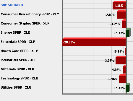
While this should come as no surprise to anyone holding bank stocks, I find it interesting to note half of the losses in the S&P 500 index over the course of the past month can be attributed to the financial sector (XLF).

The chart below shows that while financials have fallen almost 21% during the last month, the other major industry sectors have come close to breaking even. Remove financials from the equation and only industrials (XLI) have lost 3% during this period.

The market is not healthy right now, but the collateral damage inflicted by financials on other sectors may have already peaked. This is not to say the market can rally without financials, but it is becoming increasingly difficult for the financial sector to drag the entire market down.

[source: AMEX, VIX and More]

Friday, July 25, 2008

Sector Performance in the Last Two Bull Moves

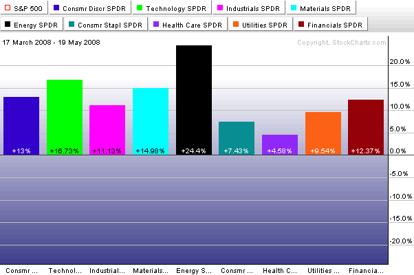
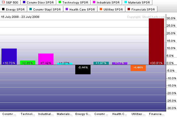
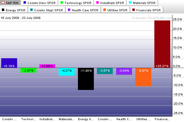
I have been fielding a bunch of questions about sectors, particularly oil and energy, over the past few days. Included in most of my responses has been a comparison of the March to May bull move and the most recent move that came off of the July 15th bottom. Since I rarely repost content from my subscriber newsletter, I thought it might be a good excuse to cut and a paste a section from Wednesday’s newsletter on sectors:

Let me reflect on the nature of the March to May rally from SPX 1256 to SPX 1440, a gain of 184 points. As shown in the sector breakdown (top graph), there was strong sector participation across the board. Interestingly enough, energy was the top performing sector, followed by technology and materials. Financials fell in the middle of the pack.

Fast forward to the past six trading days and we have the SPX now 82 points above the low. This is not quite half the move of the March to May rally, but an impressive showing for a little more than one week of work. Note how the sector breakdown looks quite different in the current rally (middle graph). The extent to which financials have powered the recent move is impressive, if a little lopsided. Note that only financials are the only sector to have made larger percentage gains in the current rally than in the March to May move. In fact, besides financials, only the industrial and consumer discretionary sectors have made at least half of the gains from the earlier rally in the more recent rally. All the other sectors have made gains of 3% or less, with energy and utilities showing losses.

The bottom chart uses the same data as the middle chart, except that percentage gains and losses are net of the performance of the S&P 500 index. This confirms that the financials are the only sector really responsible for moving the SPX. The consumer discretionary sector has provided a small lift and the industrials are just narrowly beating the SPX, but without participation from financials, this rally would have a much different look and feel.


Wednesday, July 9, 2008

The Impact of Financials and Energy Stocks on the VIX

The rapidly changing fortunes of financial institutions and energy stocks have been widely chronicled – so much so that there is no need to repeat the details here.

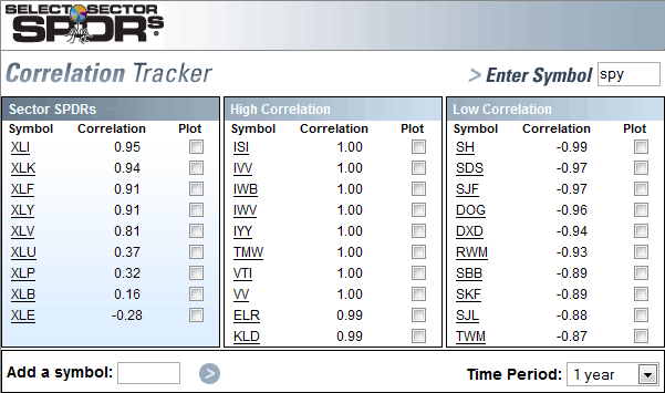
The implications of the shift away from financials and toward energy touch upon several issues that I have not yet seen addressed in the media. One of the obvious ones is the composition of various stock indices. In the S&P 500 index (SPX), for instance, just from 2007 to the present, financials have dropped from 22% of the index to 14% of the index, while energy stocks have surged from 10% to 16% of the index. The change is particularly important when one considers that financials (XLF) have historically been highly correlated to the SPX (0.91 over the course of the past year), while the energy sector (XLE) has typically had the lowest correlation to the SPX (-0.28 for the past year).

Consider that in the past year, the index has been tilting away from financials and toward energy stocks, essentially swapping a positive 0.91 correlation for a negative 0.28 correlation. Given that the VIX is based on SPX options, there can be little wonder why the VIX has been moving more lethargically as of late: an increasingly dominant sector – the energy group – is pulling in the opposite direction of the other sectors. The result? Sector gridlock is dampening the movements of the SPX and of SPX derivatives, like the VIX.

[Hat tip to Adam at Daily Options Report and Don at Don Fishback's Market Update for jump starting some of my thinking on this subject.]

Tuesday, July 8, 2008

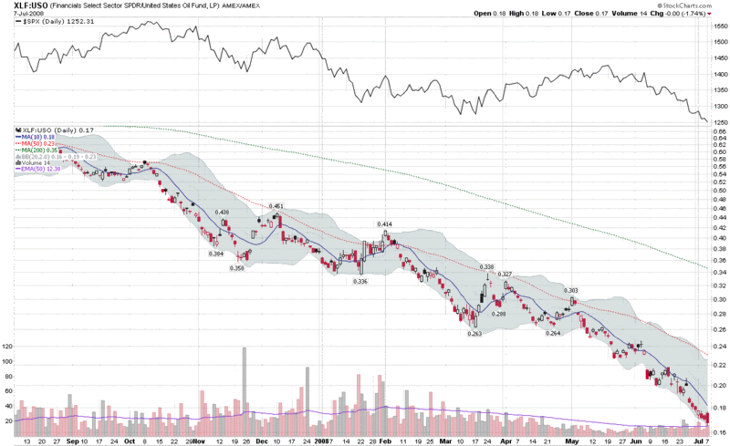
Headwinds Index: Financials (XLF) vs. Oil (USO)

Two numbers have been moving consistently in the wrong direction for the US economy during the past few months: oil prices and bank loan portfolio quality.

The chart below, which reflects a ratio of the valuation of financials (XLF) to crude oil prices (per the USO ETF), neatly captures the recent double threat posed by trends in these two sectors.

You can make an excellent argument that a bottom will not be in until at least one of the two trends, probably both, have reversed. My thinking is that the XLF:USO ratio chart is an excellent tool to monitor those two trends and pinpoint the turnaround. At the very least, I consider the XLF:USO ratio to be a reasonable proxy for two of the major headwinds that the markets are grappling with.

Thursday, April 24, 2008

Implied Volatility Suggests Risk in Financials at Six Month Low

Just yesterday, in Financials Struggle to Establish Momentum, I expressed some concern that the recent relatively weak performance of the financial sector (XLF) did not bode well for any sustainable bull moves. Perhaps the sector overheard me, as today the XLF is up 2% in an otherwise flat market as I type this.

While the price action is ultimately what matters most, there is more to the story than just the prices of the financial stocks. In particular, I am watching the implied volatility of XLF, the financial sector’s bellwether ETF. As depicted in the chart below, the implied volatility (which has a significant fear and anxiety component in it) for XLF is approaching levels not seen since the first week in November.

I consider option traders to be a fairly savvy bunch; if they think that the risk premium in the financial sector is lower than any time in the past six months, I am going to listen – and watch to see what happens to the price.

Wednesday, April 23, 2008

Financials Struggle to Establish Momentum

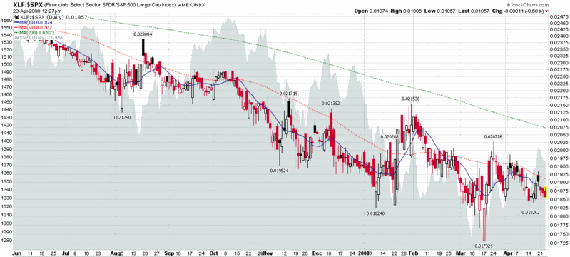
Further to my recent comments in The Energy and Materials Rally, I thought it might be interesting to show the relative performance of the financial sector (XLF) versus the SPX. The chart below shows that while the financials helped to drag down the SPX over the past six months or so, it also reveals that any gains that the SPX has been able to make over the past 2-3 weeks have been without the participation of the financial sector.

I am of the opinion that while the technology (XLK) and industrial (XLI) sectors can provide leadership in any bull move up from current levels, such a move will be severely hampered and likely short-lived without the participation of the financial (XLF) and consumer discretionary (XLY) stocks.

Tuesday, August 21, 2007

VIX:VXN Ratio Extremes

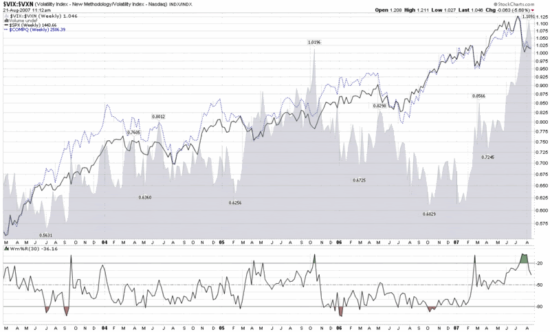
Earlier this morning, Adam Warner at Daily Options Report posted a chart and commentary about the VIX:VXN ratio, which volatility groupies will recall compares the implied volatility of the S&P 500 to that of the NASDAQ 100.

The interesting factoid is that the VIX:VXN ratio is at an all-time high, which the chart below highlights (while the VXN was launched by the CBOE in early 2001, StockCharts.com only has VXN data back to February 2003.)


The key question is why the VIX:VXN ratio is printing such extreme numbers at the present. Adam concludes the following:

“Best guess is that there's a perception out there that tech is relatively *safe* now. And I suppose it is given that it's not the focus of the periodic poundage.”

This take makes a lot of sense, as various ratios of technology stocks to financials (e.g., XLK:XLF and XCI:XBD) reflect that the current environment is one of those rare instances where technology is considered less risky than financials.

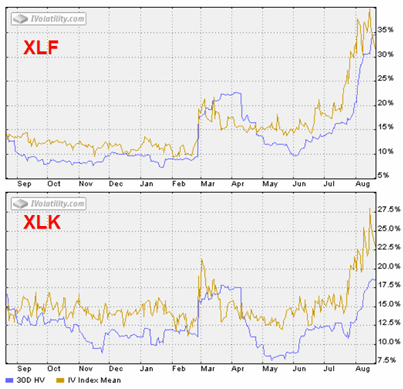
A look at two SPDRs tells the story even better, in my opinion. XLF, the financial sector SPDR (XLF top holdings), shows a 160% spike in IV from mid-June, while XLK, the technology sector SPDR (XLK top holdings), shows an IV spike of about 120%. Even more interesting, at least to my eye, is that following the February 27th VIX spike, XLK retraced all of its IV spike, while XLF only retraced half of that spike before starting to rise in mid-June. Was the half-hearted XLF implied volatility spike retracement in March through June a warning of what was lurking under the surface? For those who may be interested, of the nine AMEX Select Sector SPDRs, four of the sectors – financials, consumer discretionary (XLY), industrial (XLI), and utilities (XLU) – did not retrace their February IV spike; and these sectors do not correlate with relative sector performance over the past month.


DISCLAIMER: "VIX®" is a trademark of Chicago Board Options Exchange, Incorporated. Chicago Board Options Exchange, Incorporated is not affiliated with this website or this website's owner's or operators. CBOE assumes no responsibility for the accuracy or completeness or any other aspect of any content posted on this website by its operator or any third party. All content on this site is provided for informational and entertainment purposes only and is not intended as advice to buy or sell any securities. Stocks are difficult to trade; options are even harder. When it comes to VIX derivatives, don't fall into the trap of thinking that just because you can ride a horse, you can ride an alligator. Please do your own homework and accept full responsibility for any investment decisions you make. No content on this site can be used for commercial purposes without the prior written permission of the author. Copyright © 2007-2023 Bill Luby. All rights reserved.
 
Web Analytics