Showing posts with label SPDRs. Show all posts

Friday, July 25, 2008

Sector Performance in the Last Two Bull Moves

I have been fielding a bunch of questions about sectors, particularly oil and energy, over the past few days. Included in most of my responses has been a comparison of the March to May bull move and the most recent move that came off of the July 15th bottom. Since I rarely repost content from my subscriber newsletter, I thought it might be a good excuse to cut and a paste a section from Wednesday’s newsletter on sectors:

Let me reflect on the nature of the March to May rally from SPX 1256 to SPX 1440, a gain of 184 points. As shown in the sector breakdown (top graph), there was strong sector participation across the board. Interestingly enough, energy was the top performing sector, followed by technology and materials. Financials fell in the middle of the pack.

Fast forward to the past six trading days and we have the SPX now 82 points above the low. This is not quite half the move of the March to May rally, but an impressive showing for a little more than one week of work. Note how the sector breakdown looks quite different in the current rally (middle graph). The extent to which financials have powered the recent move is impressive, if a little lopsided. Note that only financials are the only sector to have made larger percentage gains in the current rally than in the March to May move. In fact, besides financials, only the industrial and consumer discretionary sectors have made at least half of the gains from the earlier rally in the more recent rally. All the other sectors have made gains of 3% or less, with energy and utilities showing losses.

The bottom chart uses the same data as the middle chart, except that percentage gains and losses are net of the performance of the S&P 500 index. This confirms that the financials are the only sector really responsible for moving the SPX. The consumer discretionary sector has provided a small lift and the industrials are just narrowly beating the SPX, but without participation from financials, this rally would have a much different look and feel.


Thursday, July 24, 2008

Headwinds Again?

I was traveling today and missed all of the market action. It certainly looks like it was an interesting day, as the headwinds index showed a turn back toward the old long energy and short financials trade. True the energy sector did not rise today (all nine of the AMEX sector SPDRs were down), but it did show some signs of stabilizing.

When I need to get caught up on the best of blogland, the first place I visit is Abnormal Returns, which has a knack for consistently cherry picking the best of what is out there.

For those who need a VIX fix, look no further than Adam of Daily Options Report in That Old VIX Magic, and long-time favorite Michael Stokes of MarketSci.com, whose The VIX Isn’t Magical is a can’t miss article today.

Note that Michael Stokes is one of many to weigh in on the question I posed on Monday: Does the VIX Have Market Timing Value? Check out the comments section for some interesting give and take from a wide variety of ably articulated perspectives, including a recent take from the highly skewed Kurt Osis…

I should be back at it tomorrow, same time, same channel, probably long natural gas and short the banks, maybe even nibbling on a few more VIX calls.

Thursday, July 10, 2008

Implied Volatility of Top Three SPX Sectors

Yesterday, in The Impact of Financial and Energy Stocks on the VIX, I talked about the low (and sometimes negative) correlation between the SPX and some of the sectors represented in the index.

Today I am posting a graphic of the top three sectors (per the Sector SPDR breakdown) in the SPX: technology (XLK: 19.7%); energy (XLE: 15.3%); and financials (XLF: 14.2%). The graph shows a strong correlation between the implied volatility of the SPDR sectors. This should come as no surprise.

Some readers have expressed confusion about correlations between prices and implied volatility. The key takeaway is that SPX implied volatility is not cumulative. The net implied volatility of the SPX is a function of not just the implied volatility of the components or sectors, but also of the directional pull. Let’s take a simplified example. Consider a hypothetical situation in which XLK and XLE are both 18% of the total SPX and both have an implied volatility of 40. If both are perfectly correlated, then 36% of the SPX should have an implied volatility of 40. If, on the other hand, XLK has a correlation of +1.0 (100% positive correlation) and XLE has a correlation of -1.0 (100% negative correlation), then the two sectors cancel each other out and the ‘net implied volatility’ for this 36% slice of the SPX is an even zero.

As a general rule, the higher the correlation among the sectors and individual stocks, the higher the net implied volatility. High implied volatility combined with low or negative correlations generally translates into lower net implied volatility.

For some more detailed individual research into this topic, I recommend Don Fishback’s Index Implied Volatility Is Based on Correlation and Time – It’s Not Just Magnitude!

Wednesday, June 4, 2008

The VIX and Sectors: A One Day Snapshot

I collect a lot of strange and unusual data in the course of trying to be “Your One Stop VIX-Centric View of the Universe…” and it makes sense to share some of those chunks of data from time to time, even when I don’t think it will change the way anyone looks at the market.

Now that I’ve lowered your expectations, I call your attention to the graphic below, which captures the movements in the various sector SPDRs over the course of Monday to Tuesday, a day in which rumors of persistent difficulties at Lehman Brothers (LEH) helped to drag down the financial sector ETF (XLF) to its lowest level since March. The sectors are ordered with the highest weighted ETF at the top (XLK - technology) and the lowest weighted (XLU - utilities) at the bottom. With any luck, the balance of the graphic is self-explanatory.

From a sector and volatility perspective, I found a few interesting tidbits from the graphic. First of all, the change in the VIX and the change in the SPX implied volatility were almost identical, which is what you would expect. I did find it interesting that the VIX jumped more than twice the percentage change in the mean IV across the nine sector ETFs. Drilling down a little more, only three of the sectors had an increase in IV that was higher than the jump in the VIX -- and in each instance this was just barely the case.

I have highlighted in green the two sectors in which the price of the ETF increased at the same time that implied volatility increased. For the consumer discretionary sector (XLY), the change is not particularly dramatic, but for the materials sector (XLB), there is a substantial jump in IV on the heels of increasing price. Needless to say, this is unusual.

Part of the explanation for the large increase in the VIX (and SPX IV) relative to the individual sectors may come from the fact that the four most heavily weighted sector ETFs all had a substantial rise in IV, but even when taking this into consideration, the change in the VIX exceeds the change in the sum of the weighted parts.

Finally, for anyone who followed my fearogram and SPX-VIX correlation analysis last year, you may recall that the median daily percentage move in the VIX is -4.2x of the daily move in the SPX. For the record, yesterday the VIX moved 3.6x in the opposite direction of the SPX. In percentage terms, this is a fairly typical negative daily correlation number. [Disclosure: Long LEH at time of writing.]

Monday, April 21, 2008

The Energy and Materials Rally

While Google (GOOG), Caterpillar (CAT), and other big technology and industrial names have recently helped push stocks to their best levels in three months, the rally off of the March 20th bottom may not have the kind of sector composition behind it that is conducive to an extended move. In fact, so far the bull run has been largely the result of strong performance in the energy and materials sector – a good portion of which can be attributed to the search for a hedge against inflation.

The chart below shows the performance of the nine AMEX Select Sector SPDRs relative to the S&P 500 index since the March 20th bottom. The sectors normally associated with an economic turnaround – technology (XLK), industrials (XLI), and consumer discretionary (XLY) – have heretofore not been leading the charge. On the other hand, the leading sectors over the past month – energy (XLE) and materials (XLB) – are not the sectors that typically are able to lead a sustainable rally. In the next week or two, look for other sectors to start outperforming the energy and materials group. If this fails to happen, there will probably not be sufficient market breadth to keep the current rally alive.

Friday, December 28, 2007

Technology, Energy and Bulls

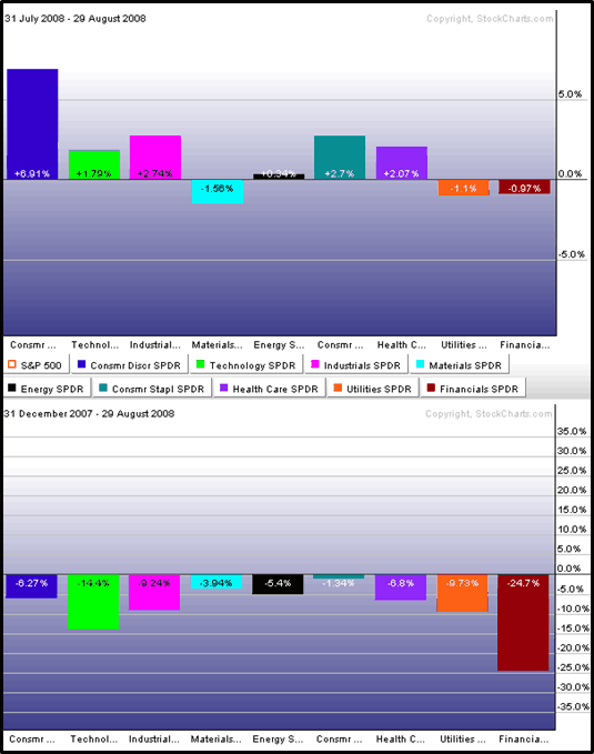
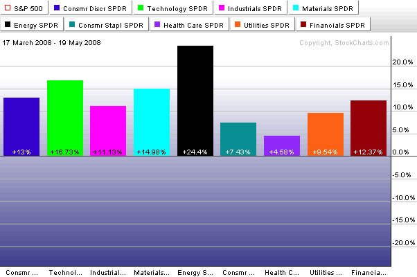
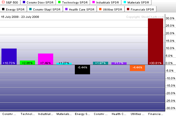
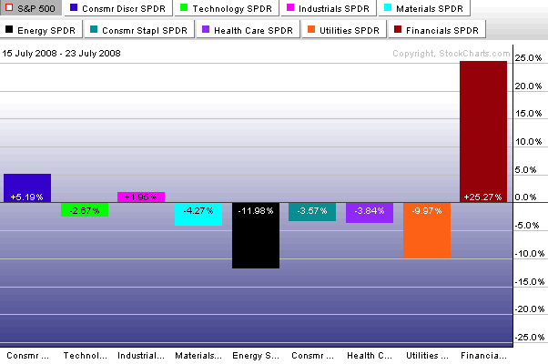
Conventional wisdom – which usually strikes me as something like 95% convention and 5% ‘wisdom’ – holds that returns on technology stocks and energy stocks are largely a function of the business cycle. The theory is that technology stocks generally outperform in the early stages of a bull market, while energy stocks deliver their best returns at about the time that the broad markets peak

I should note that while I have chosen to focus on technology and energy for the moment, the full sector rotation/business cycle theory spans all sectors. For those interested in further reading, the CXO Advisory Group has an excellent discussion of a comprehensive business cycle approach to sector rotation (they are skeptical about trading on the theory) and a variety of sources, including Fidelity and Optionetics, have good summary articles.

Getting back to energy and technology, I have included below a ratio chart of the AMEX Select SPDRs for the energy (XLE) and technology (XLK) sectors going back to their 1998 launch. The graph shows an almost perfect negative correlation between the ratio of energy to technology sector performance and the SPX from 1998 through the end of 2003. This time frame is reasonably representative as well, as it includes two bull periods of about 1 ½ years each, as well as a bear market of a little more than two years.

From the beginning of 2004 to the present, however, the correlation between the energy to technology ratio and the SPX flips from negative to positive, as energy starts to outperform technology at the same time the markets begin a long bull run. For the past four years, up to and including the current month, energy has generally had the upper hand or at least been the equal of the more ballyhooed technology sector.

I find it interesting that the last time the XLE:XLK ratio was this high was July 2006, when the markets were selling off over uncertainty about whether Bernanke would continue to raise the Fed discount rate. Now I won’t go as far as to say that the bull market is officially over if the XLE:XLK ratio gets over 3.0, but keep an eye on this ratio. As US consumers get accustomed to $100/barrel oil and $3.50/gallon gas, any number of things are possible, but I don’t believe the broader markets will continue to rise if energy outperforms technology going forward.

Tuesday, November 6, 2007

SPDR Check: Technology and Financials

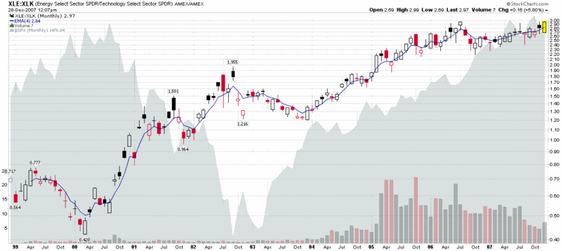
Back in August, I posted about some interesting divergences in implied volatility in the technology and financial sectors. Fast forward two and a half months and with Citigroup (C), Merrill Lynch (MER) and their brethren in the dog house while Google (GOOG), Research in Motion (RIMM) and the most of the other large cap tech stocks on a tear, the story has morphed from diverging implied volatility to diverging performance and future expectations.

So this seems like a good time to look at my favorite AMEX Select Sector SPDRs again to see what has happened. In the chart below, I compare the plight of XLF, the financial sector SPDR (XLF top holdings), to XLK, the technology sector SPDR (XLK top holdings.) Where I see the big divergence in performance is following the second week in October, from which point the financials have been beaten down almost as badly as they were during the dramatic July-August drop. The interesting part this time around is technology stocks, which fell in sympathy with financials during the summer, yet have been almost unassailable during the past three weeks.

I am skeptical that the market can continue to remain in a bullish mode without the participation of the financials, yet, on the other hand, the fundamentals of technology stocks do not seem to warrant that they join financials on the bear side of the ledger. For now at least, the bears will have to be content with claiming victory in the financial, consumer discretionary and real estate sectors, while the bulls control the majority of the remaining sectors. Eventually, I expect all the bulls or all the bears to capitulate in a dramatic major move. I’m not sure whether the move will be up or down, but each sector skirmish will provide some additional clues.

Monday, October 15, 2007

Correlation Ideation

Let’s say, for the sake of argument, that you are intrigued by the 71% gains that MOS has logged in the past eight weeks in Portfolio A1, but for whatever reason do not want to own that particular stock. Perhaps you have an opinion that the fertilizer stocks are overbought or that a supercycle is just beginning in this sector. Which stocks should you be looking at? I recommend visits to three free web sites that can help you answer this and other related questions: Market Topology; Sector SPDR Correlation Tracker; and DeepMarket.com’s correlation tool. Each of these sites has some particular strengths that I discuss below.

My first stop to evaluate correlation data is usually at MarketTopology.com. Once there, you need to click on the Equities Markets: USA link to arrive at their “i-work” page. From here, just enter the ticker and either click on the ‘Calculate’ button to return data in a table (usually the better choice) or try ‘Map’ to see a graphical representation of the securities with the highest correlation. There are several other boxes you can use to filter the results; these should be self-explanatory and ripe for experimentation. In the case of MOS, the four highest correlations returned are POT, CF, AGU, and TRA – all companies in the fertilizer sector. The next two most correlated securities are both materials ETFs: VAW, the Vanguard Materials ETF; and IYM, the iShares Dow Jones Basic Materials Sector Index Fund. It is these types of discoveries that make tangential company and sector research more fun and interesting. Note also that the table also has a column for ‘Average Daily Volatility’ for those interested in identifying highly correlated stocks or ETF that are significantly more or less volatile than the baseline security.

Among the three sites discussed here, the ease of use award would probably go to the Sector SPDR Correlation Tracker, which simply asks for a ticker and generates three lists: highest correlation sector SPDRs; highest correlation stocks/ETFs; and lowest correlation stocks/ETFs. As an added bonus, you can generate java comparison charts for any four securities on these lists for additional analysis. Let’s say you are interested in the FXI, but prefer to take a position in an individual stock instead of the ETF. Using the Sector SPDR correlation tracker, you would be pointed in the direction of CHL, CEO, LFC, and BIDU.

At the bottom of the list is DeepMarket.com, which scores high for content, but low for aesthetics. Their correlation tracking tool lists the top 5 highest positive correlations and (lowest) negative correlations for the past 10, 30, 100, and 200 day trading periods. The site provides the correlation coefficient and a rudimentary line chart, but little else. What I do like is the ability to slice and dice correlations over four different time periods (the longer time periods probably provide the most value,) but apart from that feature, the other two sites are to be preferred.

I should mention that while I have focused on positive correlations here, each site provides a list of the most extreme negative correlations as well. While these generally are not as strong correlations as the positive correlations, they do provide and excellent jumping off point for someone looking to add securities to a portfolio that may be inversely correlated to some of the portfolio’s riskier holdings. This type of approach is admittedly more art than science at the individual security level, but for those unable to evaluate portfolio level correlation data, it is a substitute worth exploring.

Friday, August 24, 2007

Drilling Down on Sector Performance

Yesterday I talked about sectors in the context of the nine AMEX Select Sector SPDRs. While these are excellent high level buckets for analyzing macro sector performance, when you lift the hood on these SPDRs (click on any one for details), you jump down to the individual stock level, without the benefit of sub-sectors to analyze.

Fortunately, there are many other excellent free resources where one can drill down on sector performance. Four great places to start are:

I should probably devote an entire post to Prophet.net, which does many interesting things with sectors. The tools I find of particular value are sortable performance for 214 sectors from 2 days to 5 years; and historical sector ranks from 3 months to 5 years in a helpful graphical format (see below), complete with a drill down capability that pops up the charts for all the individual stocks in a particular sector. Also, from the I-just-couldn’t-help-myself category, while the pull down menu only allows for a minimum historical performance of 3 months, if you manually edit the URL, you can produce some interesting charts for shorter time frames. For example, where the URL for the 3 month graphic ends in “…period=3m” it can be edited to “...period=1m” to generate a particularly interesting one month historical chart. Try it!


MarketGauge.com has an industry group summary that is an excellent graphical tool covering multiple time frames, but also offers four fundamental analysis options for analyzing the top and bottom sectors. I particularly like a feature they have that highlights the stocks driving the strongest/weakest groups higher and a perhaps even more valuable leading stocks in today’s top groups page that includes fundamental data and charts on one handy page.

For a different take on sector performance and momentum, you might want to try ETFInvestmentOutlook.com. Two of their features that I get the most use out of are the McClellan breadth ETF rankings and the high-low breadth ETF rankings.

In addition to the above, there are a number of interesting sector-related heat maps available, including two sites of particular note:

Finally, in the event that you have not been there in awhile, Yahoo has beefed up their Industry Center a little. A good place to start surfing there is in the leaders and laggards section.

Thursday, August 23, 2007

What’s Working? A Sector Overview

Now that the broad indices have pulled back 10% or so and retraced about half of that drop, it is a good time to evaluate what is working in the current market environment.

One of the first places I look for clues is in sector and industry performance. With ETFs it is now possible to take the temperature of just about any micro-segment of the market you can think of, but for today I will stick to broader market segments.

Looking at the peak to trough from July 19 to August 16, you can see that it is the materials sector (XLB) that suffered the most dramatic losses, dragged down by WY, IP, AA and the like.


In the five days since the market has bounced, the materials have been leading the bullish charge, with energy and financials lagging. Given the change in expectations about interest rates, it is not surprising to also see that utilities have had a much better week relative to the past month than the other sectors.


Going forward, look at the relative performance of materials, industrials (XLI) and technology (XLK) to provide some clues about global economic conditions and consumer discretionary (XLY) vs. consumer staples (XLP) to tell us something about the health of the consumer. If energy (XLE) and financials (XLF) can also start to rally, this may help us to discern the difference between a short-term bounce and the resumption of the bull market.

Tuesday, August 21, 2007

VIX:VXN Ratio Extremes

Earlier this morning, Adam Warner at Daily Options Report posted a chart and commentary about the VIX:VXN ratio, which volatility groupies will recall compares the implied volatility of the S&P 500 to that of the NASDAQ 100.

The interesting factoid is that the VIX:VXN ratio is at an all-time high, which the chart below highlights (while the VXN was launched by the CBOE in early 2001, StockCharts.com only has VXN data back to February 2003.)


The key question is why the VIX:VXN ratio is printing such extreme numbers at the present. Adam concludes the following:

“Best guess is that there's a perception out there that tech is relatively *safe* now. And I suppose it is given that it's not the focus of the periodic poundage.”

This take makes a lot of sense, as various ratios of technology stocks to financials (e.g., XLK:XLF and XCI:XBD) reflect that the current environment is one of those rare instances where technology is considered less risky than financials.

A look at two SPDRs tells the story even better, in my opinion. XLF, the financial sector SPDR (XLF top holdings), shows a 160% spike in IV from mid-June, while XLK, the technology sector SPDR (XLK top holdings), shows an IV spike of about 120%. Even more interesting, at least to my eye, is that following the February 27th VIX spike, XLK retraced all of its IV spike, while XLF only retraced half of that spike before starting to rise in mid-June. Was the half-hearted XLF implied volatility spike retracement in March through June a warning of what was lurking under the surface? For those who may be interested, of the nine AMEX Select Sector SPDRs, four of the sectors – financials, consumer discretionary (XLY), industrial (XLI), and utilities (XLU) – did not retrace their February IV spike; and these sectors do not correlate with relative sector performance over the past month.