Showing posts with label fearogram. Show all posts

Thursday, August 11, 2011

VIX Suggests Investors Don’t Believe Rally Is Sustainable

Back in 2007 and 2008 I had a shipload of posts talking about the SPX:VIX correlation, its implications for stocks and the like. I even came up with a plot that I called a “fearogram” to map how changes in the VIX relative to the SPX compared with historical norms and recently dove into the subject of VIX convexity and the movements of the VIX relative to the SPX in a June 2011 Expiring Monthly article, VIX Convexity.

I mention all this because in the recent downturn the VIX has moved much faster to the upside than the SPX has to the downside, given the historical rule of thumb that for every 1% change in the SPX the VIX moves approximately 4% in the opposite direction. For instance, from August 3 to August 8 the SPX lost 11% over the course of three trading days. During the same period the VIX more than doubled, gaining 105%, considerably more than the 44% or so one would have expected. One could argue that much of the move in the VIX over and above the anticipated 44% gain represented fear and irrationality flooding into the markets.

As I write this the S&P 500 index is up 5.2%. At the same time, the VIX is down about 11.8%, close to half of the anticipated -4x move.

So to recap, the VIX rose more than twice as fast as one would expect and is falling almost half as fast it has over the course of its history. That, in a nutshell, is the fear in the market. Another way of looking at the stubbornly high VIX is that investors do not believe the current rally is likely to be sustained, so options sellers are not marking down options prices with any sense of urgency, estimating that continued high implied volatility will persist.

Related posts:


Disclosure(s): short VIX at time of writing

Wednesday, September 10, 2008

VXN:QID Ratio Reflects Unusual Complacency

With the Fannie/Freddie bailout getting no better than mixed reviews, the U.K., Germany, and Spain apparently headed for a recession, and continuing turmoil in emerging markets, sometimes I am surprised to see any green at all on my screen.

On the other hand, I’m sure some are wondering how close we can be to a collapse in the world’s financial system if the VIX is trading in the 24s.

It’s a valid question – and one I have addressed in the past on the blog with the benefit of several indicators which help evaluate how much complacency is in the market. One of these is a ‘fearogram,’ which measures the ratio of changes in the VIX to changes in the SPX. A similar tool is the VIX:SDS ratio, which compares the relative movements of the VIX and SDS (the double inverse ETF for the SPX) to historical patterns.

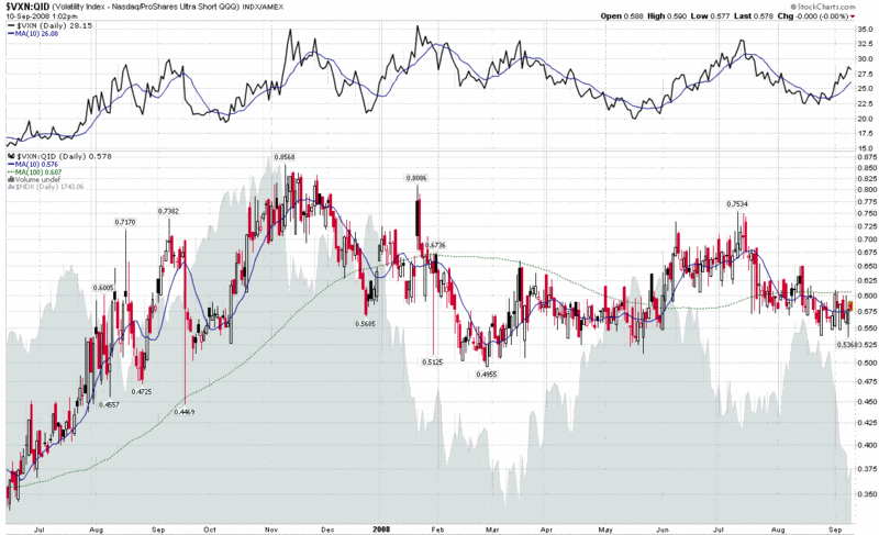
Below I have created a chart of the VXN:QID ratio, a sister to the VIX:SDS ratio. This chart compares volatility in the NASDAQ-100 index (NDX) to the double inverse ETF for the NDX. There are (at least) three ways to think about complacency in this chart:

  1. the absolute level of the ratio
  2. the level of the ratio relative to the 10 day simple moving average
  3. the level of the ratio relative to the 100 day simple moving average

Looking at the chart, consider that lower readings generally correspond to lower levels of complacency (i.e., less volatility and fear per unit of decline). The current ratio is moderately low on an absolute scale, but is lodged neatly between the 10 and 100 day SMAs. What I find particularly interesting about the chart is that in those instances in which the VXN has experienced a sustained rise over a period of several weeks or more (see top section of graphic), the current situation is the first time the ratio has not risen on par with the VXN. This development is a divergence worth watching and one which appears to favor the bears.

[source: StockCharts, VIX and More]

Thanks to all who responded to my call for help about creating blog posts in Word and publishing them to Blogger. For the record, this is my first post using Windows Live Writer, which has been up to the task so far...

Tuesday, July 1, 2008

Fearogram Maps Recent VIX Complacency

There has been so much talk about complacency in the VIX that I thought I should dust off the old fearogram and see just how complacent the VIX has been as of late.

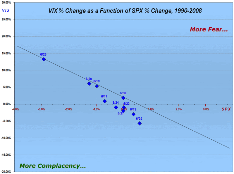
For those who are new to the concept of the fearogram (a term I hatched last October), it is essentially a chart of the daily change in the VIX vs. the daily change in the SPX. (For more background on the fearogram concept, try previous posts with the fearogram label.)

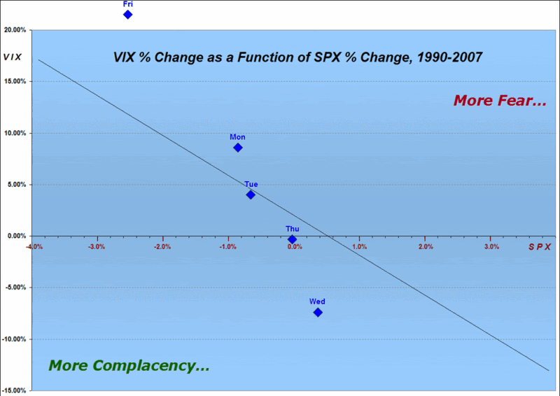
The chart below plots a best fit diagonal black line which represents a ratio of the daily percentage change in the VIX to the daily percentage change in the SPX for every trading day going back to 1990. Essentially, the larger the distance between individual data points and the fearogram best fit line, the more extreme the level of fear or complacency. For data points above and to the right of the best fit line, the VIX is increasing out of proportion to the drop in the SPX, indicating more fear. For data points below and to the left of the best fit line, the relatively muted reaction of the VIX suggests more complacency. Data points that hug the best fit line are indicative of a VIX that is consistent with typical historical relationships between the VIX and the SPX.

In the chart below, the blue diamonds are plots of individual daily ratios of VIX and SPX percentage changes for each day during the past two weeks. In studying the chart, note that during the past two weeks, the VIX has never once shown more fear than is reflected in the average daily ratio.

Of course, today is looking like it could be the day the tide finally turns.

Wednesday, June 4, 2008

The VIX and Sectors: A One Day Snapshot

I collect a lot of strange and unusual data in the course of trying to be “Your One Stop VIX-Centric View of the Universe…” and it makes sense to share some of those chunks of data from time to time, even when I don’t think it will change the way anyone looks at the market.

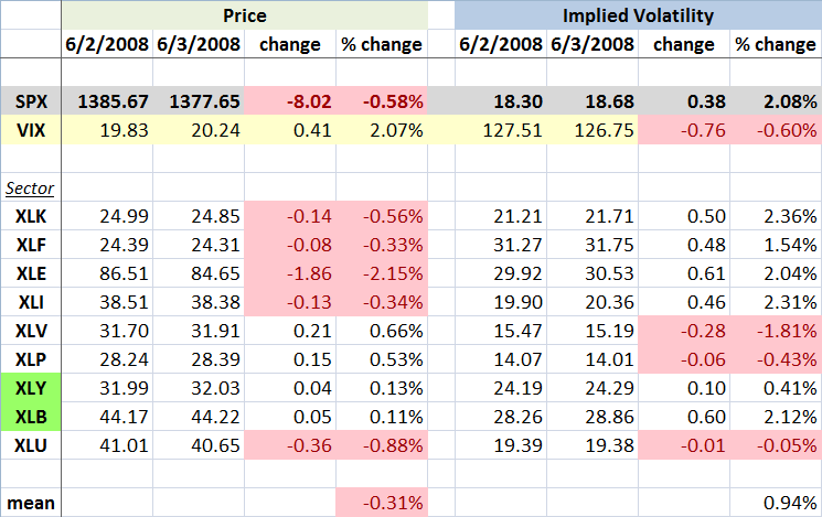
Now that I’ve lowered your expectations, I call your attention to the graphic below, which captures the movements in the various sector SPDRs over the course of Monday to Tuesday, a day in which rumors of persistent difficulties at Lehman Brothers (LEH) helped to drag down the financial sector ETF (XLF) to its lowest level since March. The sectors are ordered with the highest weighted ETF at the top (XLK - technology) and the lowest weighted (XLU - utilities) at the bottom. With any luck, the balance of the graphic is self-explanatory.

From a sector and volatility perspective, I found a few interesting tidbits from the graphic. First of all, the change in the VIX and the change in the SPX implied volatility were almost identical, which is what you would expect. I did find it interesting that the VIX jumped more than twice the percentage change in the mean IV across the nine sector ETFs. Drilling down a little more, only three of the sectors had an increase in IV that was higher than the jump in the VIX -- and in each instance this was just barely the case.

I have highlighted in green the two sectors in which the price of the ETF increased at the same time that implied volatility increased. For the consumer discretionary sector (XLY), the change is not particularly dramatic, but for the materials sector (XLB), there is a substantial jump in IV on the heels of increasing price. Needless to say, this is unusual.

Part of the explanation for the large increase in the VIX (and SPX IV) relative to the individual sectors may come from the fact that the four most heavily weighted sector ETFs all had a substantial rise in IV, but even when taking this into consideration, the change in the VIX exceeds the change in the sum of the weighted parts.

Finally, for anyone who followed my fearogram and SPX-VIX correlation analysis last year, you may recall that the median daily percentage move in the VIX is -4.2x of the daily move in the SPX. For the record, yesterday the VIX moved 3.6x in the opposite direction of the SPX. In percentage terms, this is a fairly typical negative daily correlation number. [Disclosure: Long LEH at time of writing.]

Sunday, November 11, 2007

VWSI Hits -9 as VIX Spikes

In a week where technology stocks were hit harder than financials for the first time in a long time, the VXN rose 30.1% while the VIX rose 23.9% or 5.49 points. Coming on the heels of last week’s 17.6% jump in the VIX, this marks only the third time this decade that the VIX has risen 15% or more in two consecutive weeks, with the two previous instances being two weeks in the middle of May 2006 and the two weeks spanning 9/11.

Even with the VIX printing a rare -9 reading (the third -9 in four months, but only the fifth in the past six years) and the NASDAQ registering the biggest weekly drop in five years, the selloff had a relatively orderly feel to it – at least so far. The fact that the VIX is still ten points below its mid-August high suggests a lack of panic, as does the below average fearogram readings for the SPX:VIX ratio on both Thursday and Friday.

In addition to the extra spice of options expiration, next week’s government data includes a hearty broth of October retail sales data (Wednesday), October consumer prices (Thursday), and October’s industrial production and capacity utilization figures. Earnings season continues, with a healthy does of retail and technology earnings on tap as well.

For a comprehensive look back on last week and a glance at what the coming week may have to offer, I recommend the following links from Barry Ritholtz at The Big Picture:

While the -9 VWSI reading suggests a likely bounce in the coming week, my Where’s Waldo analysis tells me that long red candles in the NASDAQ rarely trigger bounces in the following week. Given that history, the relative lack of fear in the SPX:VIX ratio, the failure of the ISEE to drop below 100 last week, and several other factors, I enter the week by carrying over my bearish bias. I will be watching closely to see what sort of enthusiasm the bulls put into efforts to establish a bottom and threaten yet another quick retracement. This time around I expect it to be at least as difficult as it was in the summer of 2006 for the bulls to push the markets back to new highs, but…this selloff is still early.

(Note that in the above temperature gauge, the "bullish" and "bearish" labels apply to the VIX, not to the broader markets, which are usually negatively correlated with the VIX.)

Wine pairing: For a VWSI of -9, I continue to recommend carmenere as an ideal pairing. The last time around, I sugested a Concha y Toro 2003 Terrunyo Carmenere, some favorite carmeneres listed at Cellar Tracker, and an American effort at Dover Canyon. For ideas about varietals I do not have a lot of experience with, I often check out what is selling at one of San Francisco’s best wine stores, K&L Wine Merchants. A quick search on their site yields a good number of carmenere blends, as well as several selections where carmenere is the dominant varietal.

Thursday, November 8, 2007

The Week in Fear

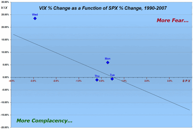
Since I’m going to have to give a name to this concoction, I’m going to call it my weekly fearogram. Why not? "Fear plot" sounds a little too Halloween for my taste.

In any event, in the chart below, just like its October 22nd and October 3rd predecessors, I attempt to show how the daily SPX:VIX ratio compares to the median ratio for 18 years of data. Interestingly, the chart shows a surprising amount of fear on Monday, followed by middling sentiment on Tuesday, before an atypical amount of fear kicked in yesterday. Perhaps because the market opened in a relatively benign fashion today compared to some early futures projections, fear is actually below normal for the trading day so far.

In between bouts of intensive trading, I am back-testing this fearogram data and hoping to provide an appropriate interpretive framework soon. My initial hypothesis is that the absence of fear will make it easier for the current pullback to continue.

Monday, October 22, 2007

How Fearful Were We Last Week?

Wild weeks sometimes call for wild graphs. By the same token, what fun would it be to have a bunch of VIX data lying around if you didn’t have an opportunity to force it to play Twister at gunpoint from time to time?

So…with those two thoughts placed firmly tongue in cheek, I set out to find yet another way to show just how fearful the markets were – or were not – this past week. This time around I have plotted a diagonal black line that represents a best fit of all VIX and SPX daily changes since 1990. Above and to the right of that line represents more fear per unit move in the SPX; below and to the left of that line represents more complacency per unit move in the SPX. The blue diamonds are the end of day plots for the changes in the VIX and SPX for last week

A look at the graph shows a notable lack of fear from Monday through Thursday, with Friday’s market selloff generating a spike in the VIX that was out of proportion to a typical VIX move for a -2.56% drop in the SPX. Going forward, I will keep track of how much time the SPX-VIX relationship spends on the fear side of the best fit line and the magnitude of that divergence. Today, for instance, we are back on the complacency side of the line with the Dow down 91 points and the SPX off 8.5 points.

For more information on the relationship between daily changes in the VIX and SPX, see my previous post, “SPX-VIX Daily Correlation.”

Wednesday, October 3, 2007

SPX-VIX Daily Correlation

Yesterday I offered up some numbers to help describe the relationship between daily moves in the SPX and the VIX. I hear quite a few observers comment along the lines of “the SPX was up(down) X% and yet the VIX was only down(up) Y%.” Typically, the next action is to wonder aloud whether the corresponding VIX movement is ‘normal’ and whether any divergences might provide clues about the future direction of the markets.

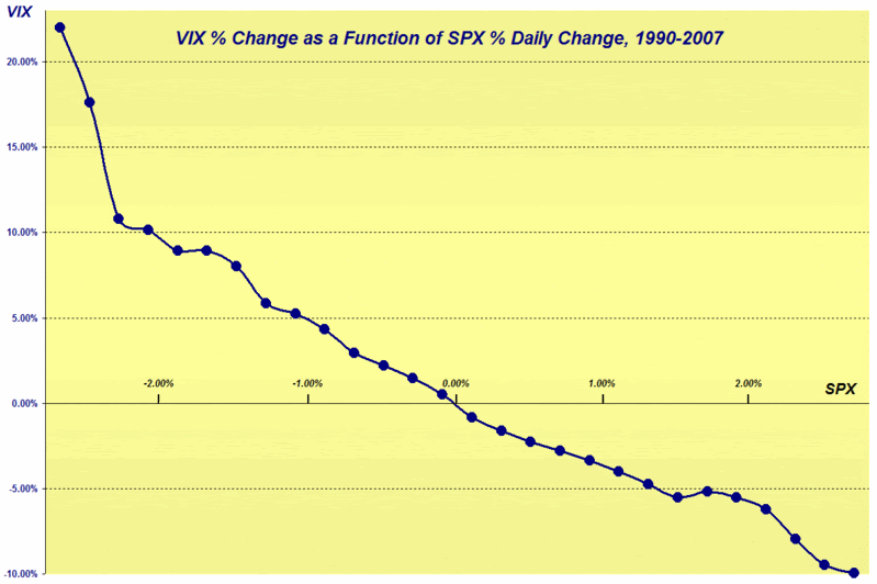
Naturally, I’ll take the easy part of that equation first and offer the reader two ways to look at this. The graph below plots daily percentage changes in the VIX against daily percentage changes in the SPX. From the graphic, you can see that the relationship between the two is fairly linear for a SPX moving +/- 1.5% in a day. Once the SPX moves outside of those bounds, however, the equations get a little messier. Part of this, of course, is the accelerating fear factor that comes with extreme market moves.


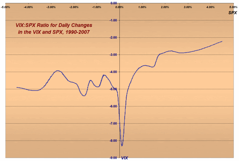
The next graph ignores the absolute numbers and focuses on the magnitude of the typical VIX movement versus the SPX movement. Readers are encouraged to ignore the valley around the zero (where strange things happen when you try to divide by zero) and focus instead on the fairly predictable ratio of the VIX to SPX that varies from about -2.5x to about -5.0x, depending upon the daily change in the SPX.


As for the remaining question about whether divergences from the normal relationship provide reliable clues about the future direction of the market, I am going to address this more difficult question over the course of the lifetime of this blog. I will offer this though: if I think I can simplify the answer in one concise post, I will do the best I can to communicate my thinking here.

DISCLAIMER: "VIX®" is a trademark of Chicago Board Options Exchange, Incorporated. Chicago Board Options Exchange, Incorporated is not affiliated with this website or this website's owner's or operators. CBOE assumes no responsibility for the accuracy or completeness or any other aspect of any content posted on this website by its operator or any third party. All content on this site is provided for informational and entertainment purposes only and is not intended as advice to buy or sell any securities. Stocks are difficult to trade; options are even harder. When it comes to VIX derivatives, don't fall into the trap of thinking that just because you can ride a horse, you can ride an alligator. Please do your own homework and accept full responsibility for any investment decisions you make. No content on this site can be used for commercial purposes without the prior written permission of the author. Copyright © 2007-2023 Bill Luby. All rights reserved.
 
Web Analytics