Showing posts with label Bollinger band width. Show all posts

Wednesday, February 8, 2012

What the VIX Kitchen Sink Chart Says

One of the more interesting developments of 2012 has been to watch the diminution of the strident bearish narrative that has been focused largely on the collision course between a preponderance of debt and low or negative growth. The bullish beginning to 2012, however, has not prompted many in the way of converts to the bullish camp. Instead, there have been whispers of “…overbought…” that have turned into a soft murmur and are now verging on becoming a loud chorus. Suddenly the general consensus seems to be that stocks just do not deserve their current lofty valuation.

In this type of environment, many investors become particularly susceptible to confirmation bias and scramble to find one or more indicators which will tell them what they have already begun to believe: that a major correction is likely just around the corner.

For better or for worse, a look at the VIX is often one of the first stops for those who are looking for evidence of a market reversal.

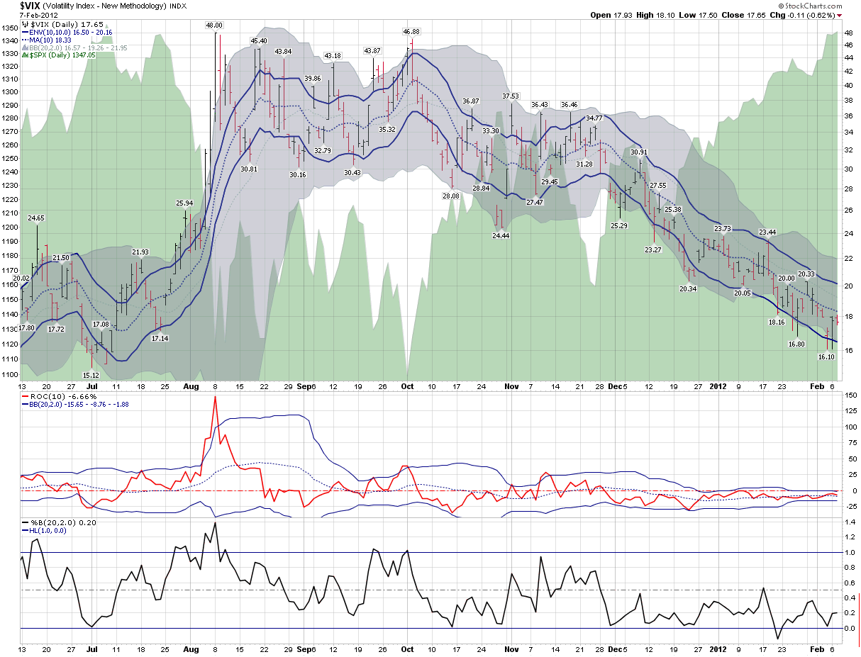
In the chart below, I have updated and extended a chart from three years ago that I call my “VIX kitchen sink chart” – as it pokes and prods the VIX in a number of different ways. Standard VIX analysis attempts to determine whether the VIX has strayed too far from historical norms, whether this be in the form of moving averages, Bollinger bands or other mechanisms. I have even included a separate rate of change study (with its own Bollinger bands) and a Bollinger band width study below the main chart in order to provide a couple of additional analytical twists.

The bottom line, however, is this:  if stocks are overbought and a correction is indeed just around the corner, the VIX does not appear to be aware of any such inevitability. Instead, it looks a lot more like business as usual in the land of the CBOE Volatility Index.

Related posts:

[source(s): StockCharts.com]

Disclosure(s): none

Wednesday, September 2, 2009

VIX Spikes Above Bollinger Bands

Yesterday’s 12% jump in the VIX lifted the volatility index to 13.8% above its 10 day simple moving average. As noted on a number of occasions here, when the VIX is at least 10% above its 10 day SMA, this is usually a good time to initiate a short-term mean reversion play and go long the SPX and/or short the VIX.

While I have not discussed it as often in this space, another useful VIX mean reversion signal can be derived from using Bollinger bands to determine when the VIX is overextended and likely to snap back. The simplest approach is to monitor when the VIX closes above the upper band of a 20 day, 2 standard deviation lookback period.

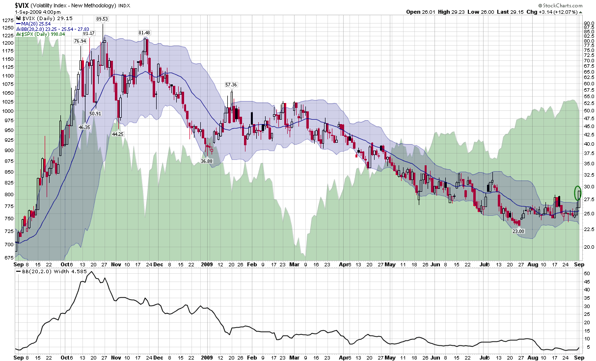
The chart below uses the standard 20 day, 2 standard deviation Bollinger bands to evaluate the moves in the VIX during the past year. Note that following the largest sustained VIX spike ever – during September and October of last year – it has been relatively rare for the VIX to close above the upper band. There was one instance of a close well above the upper band in January that marked a short-term bullish move, then there were two closes above the upper band at the end of February and the beginning of March that preceded the market bottom and strong bounce.

By historical standards, yesterday’s close 4.7% above the upper band is a fairly substantial breach and suggests a short-term bullish bias. Given the narrowing Bollinger band width (bottom study), however, it obviously took a much smaller move to penetrate the upper band than it did in January, when the VIX was hovering around 50.

It seems as if lately everyone has been looking for a pullback. The big question is how much of a pullback it will take to satisfy the bears and how soon it will be until the buy-on-the-dip mentality begins to dominate again.

For some related posts, try:

[graphic: StockCharts.com]

Wednesday, July 22, 2009

More Questions About Bollinger Bands

Yesterday’s post, StockCharts.com Charts on the Blog, triggered several questions from readers about the nature of the Bollinger Bands data and the usefulness of these bands to traders.

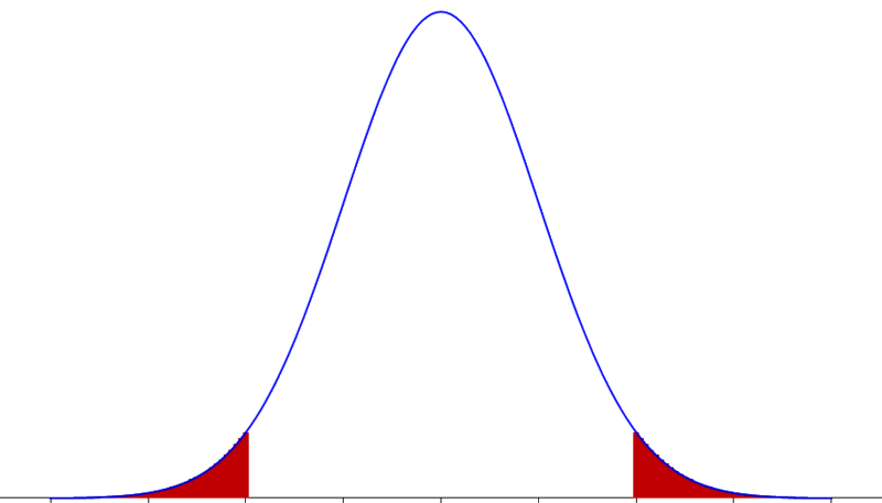
One reader asked whether I intended to say that the two standard deviations should contain 95.45%. While this is what would expect from a Gaussian or normal distribution, the distribution of stock prices does not follow a normal distribution. In fact, they tend to have fat tails or what statisticians call positive kurtosis.

In Bollinger on Bollinger Bands, John Bollinger talks about the extensive research he did which demonstrated that Bollinger Bands do not capture as much of the data as would be expected from statistics associated with a normal distribution.

Bollinger describes his findings as follows:

Only approximately 89 percent of the data is contained within 2 standard deviation bands when we would expect 95 percent.

There are two possible reasons why we don't get as high as a level of containment as we would expect -- near 95 percent with 2 standard deviation bands. First, we are using the population calculation, which results in slightly tighter bands than the sample calculation. Second, the distribution of stock prices is not normal -- there are more observations at the extremes than one would expect -- so there are more data points outside the bands too. There are undoubtedly more factors, but these appear to be the main ones.”

Another reader offered the following critique of Bollinger Bands:

“I've never understood the value of Bollinger bands. They don't provide a measure of volatility since as the chart gets more volatile the bands expand. One might look at the width of the band to estimate volatility. But that seems like a very imprecise measure. It doesn't really stand out. A graph of historical volatility would be much more useful.

Nor do they help with estimating when regression to the mean might occur. For again, as the item moves farther from the mean, the bands expand. There are many instances in which the chart touched the extreme of the band only to continue on farther -- with the band following along.”

While not trying to sound like an apologist for Bollinger Bands, it is important to note that these are one way of measuring historical volatility (albeit not the standard approach) and they have the benefit of providing a visual shorthand for those who wish to eyeball the ebb and flow of relative volatility.

In fact, Bollinger Band width is a way to measure one type of historical volatility statistically rather than to rely on a chart and I have used this measure on the blog (see link above for examples) on several occasions to measure volatility.

Regarding predictive value of Bollinger Bands, I find that they can be a useful indicator – notably with the VIX – and increase in their predictive the more standard deviations the VIX is from the mean. While October and November 2008 were not good times to employ this strategy, for the most part, I believe Bollinger Bands usually provide some helpful information about the likelihood of mean reversion.

Finally, there are some traders who prefer to play the volatility trend instead of using a mean reversion approach. Volatility trend traders might do something opening and maintaining long positions when a stock is trading between +1.0 and +2.0 standard deviations above the mean and closing those positions when the Bollinger Band lines are violated.

For those who are interested in learning more about Bollinger Bands, Bollinger’s own book on the subject (see above) is a probably the last word on the matter. Readers are also encouraged to check out a three-part series on three important parameters of Bollinger Bands that I posted a little over a year ago:

  1. Bollinger Bands: Why 20 Days?
  2. Bollinger Bands and the Standard Deviation Setting
  3. Bollinger Bands and the Percent B Setting

Tuesday, August 28, 2007

The Relationship Between Volatility and Market Returns

Hans Wagner (not pictured) has an article with the title “Volatility as a Stock Market Indicator” up on Financial Sense. Posted yesterday, the Wagner article examines the relationship between volatility and market performance from a monthly and yearly perspective. In his analysis, Wagner leans heavily on the research of Ed Easterling of Crestmont Research, whose relevant book, Unexpected Returns: Understanding Secular Stock Market Cycles, I confess not to have read.

Using S&P 500 index data going back to 1962, Easterling notes that when the average daily range (in percentage terms) of the S&P 500 is lowest, it corresponds to a higher likelihood of monthly gains in the index. So…calmer waters make for easier sailing.

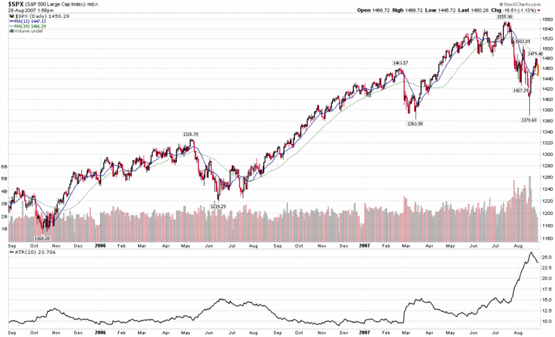
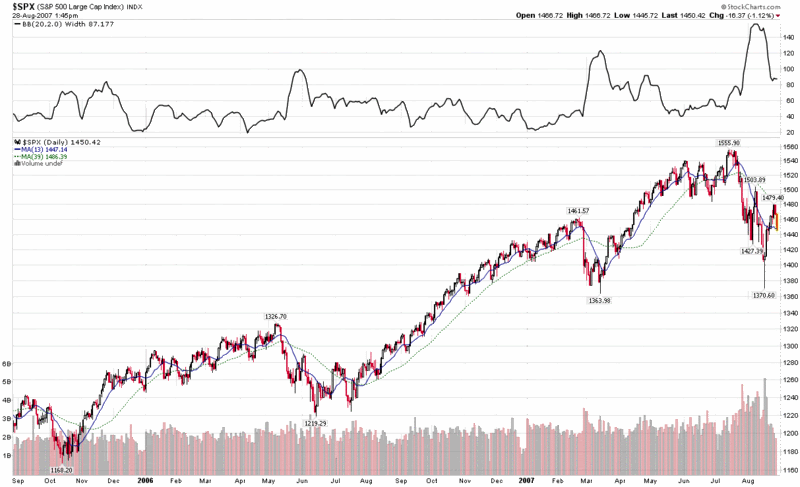
A quick and dirty way to monitor these types of opportunities is with a 20 day Average True Range or 20 day Bollinger Band width indicator. As you can see from the charts below, both ATR and BB width provide an excellent means by which to evaluate market volatility graphically, with fairly reliable and easily measurable signals of volatility extremes, not unlike the information provided by the VIX.


Wednesday, June 13, 2007

Three Out of Four, Unlucky or More

You will have to excuse me for using a title that sounds like a nursery rhyme, but one of the things that I discovered during the Trivial Pursuit fad years was that my childhood was seriously deficient in nursery rhymes.
Fortunately, the condition is relatively benign, but it has been know to manifest itself in my adult life via the occasional lapse into Seuss meter and some silly sounding blog post titles…

But enough about me; volatility is the real star here.

How volatile has volatility been lately?
That’s never an easy question to answer, but with Excel Ginsu, I am always able to come up with at least two or three different answers. Try this one on for size: three out of the past four days have seen changes in the VIX of 13% or more…and this has only happened two other times in the last 15 years. You probably know those other two instances well: February 27 – March 2, 2007 and June 12 – 16, 2006. Each of these instances fell just prior to an important bottom.

Does this mean a bottom is just around the corner? Hardly…but I crunched some more numbers just to be on the safe side. It turns out that these three days out of four volatility clusters are generally associated with intermediate market bottoms and not market topping action. So while this action may look toppy to some, historically it is much more bullish than bearish.

Of course, now I am left to ponder how to best identify a toppy market through the eyes of the VIX. My hunch is that Bollinger band width may be a key here, but I’ll give this one some more thought and report back when I have something of interest to say.

Wednesday, June 6, 2007

The VIX and Bollinger Bands

I’m not sure how I managed to fritter away five months on this blog and spend so little time talking about Bollinger Bands (BBs) and the VIX, but today seems like as good a time as any to dive right in.

First, for anyone who needs a brief refresher on what Bollinger Bands are or how they are calculated, I refer you to the StockCharts.com overview; for some thoughts on how to apply BBs to trading, OnlineTradingConcepts.com has a good summary. The best detailed source of information on Bollinger Bands comes, not surprisingly, from John Bollinger’s own site, BollingerBands.com. Unfortunately, John does not provide a lot of his thoughts on BBs for free, but you can get a good idea of his thinking from a 2001 list of his 15 basic rules.

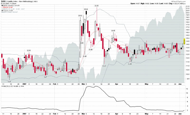
I have included a six month chart of the VIX below, with the default (20,2,0) BB settings in addition to a BB width indicator and an overlay of the SPX. For today, I am only going to offer a handful of observations (based on this chart and some research going back past the six month cutoff):

  • When the VIX tags its Bollinger Bands, it is usually a good time to think about a VIX mean reversion play
  • When the VIX tags its Bollinger Bands, it often signals a short-term change in the SPX trend
  • VIX closes outside of the Bollinger Bands (which we are on target for today) are almost always associated with dramatic market moves and/or changes in the trend
  • When the VIX BB width drops below 1.8, it frequently signals that consolidation is ending and a sharp move is just around the corner
  • Looking back to late-March, a VIX close above 15 would definitely be significant in terms of support and resistance (we are currently trading at 14.76)

DISCLAIMER: "VIX®" is a trademark of Chicago Board Options Exchange, Incorporated. Chicago Board Options Exchange, Incorporated is not affiliated with this website or this website's owner's or operators. CBOE assumes no responsibility for the accuracy or completeness or any other aspect of any content posted on this website by its operator or any third party. All content on this site is provided for informational and entertainment purposes only and is not intended as advice to buy or sell any securities. Stocks are difficult to trade; options are even harder. When it comes to VIX derivatives, don't fall into the trap of thinking that just because you can ride a horse, you can ride an alligator. Please do your own homework and accept full responsibility for any investment decisions you make. No content on this site can be used for commercial purposes without the prior written permission of the author. Copyright © 2007-2023 Bill Luby. All rights reserved.
 
Web Analytics