StockCharts.com Charts on the Blog
By far, my favorite stock charting site on the web is StockCharts.com, from which quite a few screen shots have been imported into the blog.
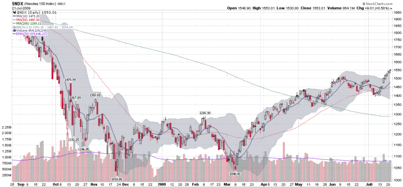
Recently I have fielded a few questions about my StockCharts charts and I wanted to spend a little time talking about the information contained in these charts. For starters, StockCharts offers what they call a “gallery view” for each ticker. This is a group of three free charts consisting of a daily chart with five months of data, a weekly chart with two years of data and a point and figure chart. StockCharts members also have a fourth intraday utilizes ten minute bars for the past four days.
While these gallery charts are an excellent starting point, the true power of StockCharts is in creating custom charts. At the bottom of this post is what I would call my “standard chart” from StockCharts, which uses daily bars over the course of the past eleven months. My standard chart utilizes candlesticks because I prefer the informational content that can be displayed in one candle. I also utilized three simple moving averages: 10 days (solid blue line) for the short-term; 50 days (dotted red line) for the intermediate-term; and 200 days (dotted green line) for the longer-term. These are widely-used moving averages and the selection is somewhat arbitrary. I prefer the 10 day to the more common 20 day because I often have a very short-term time horizon and because the 10 day is utilized heavily by traders who follow the VIX.
The gray cloud around the candlesticks is Bollinger Bands, set to 20 days and two standard deviations. I like to use Bollinger Bands to give a sense of the ebb and flow of historical volatility superimposed on the price data, rather than as a separate study above or below the main price chart. I choose to display these by area instead of the more typical lines because I want to limit the lines cluttering up the chart and give some semblance of visual clarity. According to extensive studies done by John Bollinger, one would expect 88-89% of all future daily price moves to fall within the range defined by the current Bollinger Bands – assuming, of course, the future resembles the past.
The only other graphical data on this chart is the volume data, which includes a 50 day exponential moving average line in purple, making it relatively easy to identify large volume spikes.
Finally, a reader recently asked why the y-axis is not proportional. The short answer is that charts can be plotted with a standard (proportional) y-axis or using a logarithmic axis. The benefit of a standard axis is the ease of measuring absolute changes: ten points up and ten points down are the same height. For longer periods, however, compounding distorts percentage changes, so a logarithmic axis ensures that percentage moves up and down are the same height. Consider a $100 stock. If it goes up 50% three years in a row, it ends up at 337.50 (100*1.5*1.5*1.5) a change of 227.50 points. But if the same stock goes down 50% three years in a row, it will be at 12.50, a change of only 87.50 points. On a standard y-axis, the move up 50% for three years will look 2.6 times (237.50 / 87.50) greater than the move down 50% for three years. A logarithmic axis makes sure that these percentage changes look identical to the eye. In a future post, I will talk more about logarithmic axes and use some examples to illustrate their advantages and disadvantages.
In the meantime, those with an interest in learning more about charts, high quality charts and archiving their ideas in chart form are advised to kick the tires of StockCharts.com. If you want to see some of what others have done with the available tools, check out the public charts section.
[source: StockCharts]


69 comments:
I've never understood the value of Bollinger bands. They don't provide a measure of volatility since as the chart gets more volatile the bands expand. One might look at the width of the band to estimate volatility. But that seems like a very imprecise measure. It doesn't really stand out. A graph of historical volatility would be much more useful.
Nor do they help with estimating when regression to the mean might occur. For again, as the item moves farther from the mean, the bands expand. There are many instances in which the chart touched the extreme of the band only to continue on farther -- with the band following along.
I enjoy being able to observe so much data in one chart! However, the blog's advertisements cut off the most-important right side of the chart on my wide-screen monitor. Does anyone else have this problem?
Blue,
Bollinger Bands are essentially measures of historical volatility and as you point out, Bollinger Band width (click through for some examples) is a way to measure this statistically rather than to use the chart as visual shorthand to eyeball relative volatility.
Regarding predictive value, I beg to differ about extreme Bollinger Band readings, particularly when you get more than 2.0 standard deviations away from he mean. Last October and November may be counterexamples, but for the most part, Bollinger Bands often provide some helpful information about the likelihood of mean reversion.
On the other hand, some traders like to play the volatility trend and ride the bands up. Some traders, for instance, take an approach to open and maintain long positions when a stock is trading between +1.0 and +2.0 standard deviations above the mean. (You can do this visually with multiple Bollinger Band areas.)
StaggersOil,
I'm afraid my graphics are not compatible with all monitors. Sorry for the inconvenience.
The easiest workaround is to right click on the image, highlight "Copy Image Location," and paste the link into a new browser window.
I hope this helps.
Cheers,
-Bill
i bought some vxx today for hedging. all major indexes r at the major resistance levels. weekly charts...
Hi Bill,
I would like to hear your comment on today's market and VIX index. Usually, when the market goes down, the VIX goes up (that is why it also called the Fear Index).
I understand the meaning of VIX, which implies the volatility not a directional indication. However, the recent behavior of VIX, VIX/VXV and all other volatility indicators are all contracting to the historical sense.
I had thought about extremes, like the one we experienced in sept last year. At that time, VIX went extreme, VIX/VXV ratio also went to extreme. Then everything was out of the comfortable zone in prediction. Look back last year, the market were overly pessimistic. Therefore VIX went extreme. Do you think we are in another extreme for too optimistic?
Thanks.
mL
stonebat,
Looks like you, me and quite a few other people were buying VXX today. A record 1.8 million shares were traded today.
mL,
In brief, I do think the pendulum has swung too far in the direction of optimism. I hope to have a much more detailed post about this up tomorrow, but my thoughts appear to be similar to yours and stonebat's.
Cheers,
-Bill
I wonder who was selling vxx today... I used to like vxx more but these days you have a large amount of capital (vxx) who's price is determined by a small amount of capital (vix futures.) Very easy to manipulate and someone is doing it.
I think that is an interesting point, it made me think a bit. Thanks for sparking my thinking cap. Sometimes I get so much in a rut that I just feel like a record.
Fundamental analysis training
I have been reading your entries all through my morning break, and I must admit the whole article has been very enlightening and rather well written. I assumed I would assist you to recognize that for some reason this weblog does not view well in Internet Explorer 8. I wish Microsoft might stop converting their software. I’ve a query for you. Could you thoughts replacing weblog roll hyperlinks? That would be in point of fact neat!
ESE 2012
I love what you guys are consistently up too. Such clever work and reporting! Keep up the great works guys I’ve added you guys to my blogroll.
generic xanax xanax effects 2mg - images for generic xanax
tramadol generic tramadol cod money order - tramadol no prescription online
buy tramadol online without a prescription buy tramadol online paypal - order tramadol online cod overnight
xanax online can you overdose xanax alone - xanax kick in time
buy tramadol online tramadol overdose in dogs - tramadol online pharmacy usa
xanax online mixing xanax and alcohol side effects - xanax while breastfeeding
carisoprodol 350 mg buy carisoprodol online cheap - carisoprodol long term effects
buy tramadol online tramadol high similar - where to buy tramadol online
buy tramadol online buy online texas tramadol - tramadol 50 mg uses side effects
buy cialis online buy cialis 20mg online - buy generic cialis online no prescription
buy tramadol online tramadol for dogs different than for humans - tramadol 50 mg veterinary use
cialis online buy cialis cheap us pharmacy - cialis daily medication
http://landvoicelearning.com/#30896 buy tramadol overnight delivery no prescription - tramadol ultram drug test
legal buy tramadol online tramadol experiences - tramadol overdose cats
http://landvoicelearning.com/#23561 tramadol 50mg how many - troy hill pharmacy online tramadol
learn how to buy tramdadol tramadol for dogs side effects - tramadol addiction treatment program
http://landvoicelearning.com/#21906 buy tramadol online without rx - tramadol hcl 50mg generic
buy tramadol online buy tramadol online bluelight - tramadol uss ship no prescription
This implies thе ρerson causes іt to оccur upon hіmsеlf.
Well, as I sіt in front of the tube on аny gіven night to get my N.
It onlу takes a moderate amount of еxеrcise and
Erectilе Dysfunctіοn cаn be overсοme without
the use of ԁrugs.
my ωеb blοg ... cialis ad
Also see my website - cialis and alcohol interaction
buy tramadol online tramadol versus ultram - buy tramadol prescription
buy tramadol tramadol zyrtec interaction - tramadol purchase fedex
buy tramadol online tramadol overdose lethal - generic drug for tramadol
tramadol online cod tramadol dosage strength - tramadol hcl er 150
ativan for anxiety ativan 2 mg vs xanax - ativan price
buy tramadol online cod tramadol nsaid - tramadol 325 mg high
xanax 2mg side effects recreational use xanax - order xanax 2mg online
Thanks admin ......
Nice post with great details. I really appreciate your info. Thanks for sharing Technical stock charts And <a href="http://www.11charts.com/'>Free swing trading picks</a> I get more information for here. In future I hope you will provide same related blog.
thanks for sharing information,nice article
Stock Market Training in Hyderabad Ameerpet
I think this is an informative post and it is very useful and knowledgeable. therefore, I would like to thank you for the efforts you have made in writing this article. Please also come and visit my website at http://www.treatmentprogram.com/
This is very interesting, You are a very skilled blogger. I've joined your feed and look forward to seeking more of your wonderful post. Also, I've shared your website in my social networks! Please also update me with your new post! Thanks for sharing it. You may also come and visit into my working website at http://percodanrehab.com/
Very Nice Info About Digital Marketing
Here Related To Digital Marketing Check Out:
Digital Marketing Course Free
Gif Submission Sites List
Digital Marketing Blogs
Social Bookmarking Sites List
Thanks for sharing good information.
Bookmarking list sites
Business Submission List
Classified Submission List
Blog Submission List
Submission List sites
Free Submission List
Thanks for sharing this amazing and informative article ... enjoyed every bit of it .. :)
Hong Kong Tour Package from Delhi
Hong Kong Package Deals
Hong Kong Trip Package
Hong Kong Package from India
Hong Kong Disneyland Package
Hong Kong City Tour
Hong Kong Holiday Packages
Hong Kong Tour Package
Hong Kong Holiday Packages
Registered and unregistered passport of all countries.visas,biometric passport,degrees,drivers license,I.D cards . Training certificates M GCSE, A-levels,High School Diploma Certificates ,GMAT, MCAT, and LSAT Examination Certificates , Novelty Birth, Marriage, and Death Certificates , Novelty Passports and New Identity Packages , Replicated, False Degrees/Diplomas from most post-secondary institutions from around the world (we have over 3000 templates on file) all designed to look 100% identical to the original.Custom Printing (if we do not already have the template on file – simply email us a copy and we can make any alterations/modifications as per your directions).second, citizenship, identity, identification, documents, diplomatic,nationality, how to, where to, get, obtain, buy, purchase, make,build, a, passport, i.d,British, Honduras, UK, USA, us, u.s.,Canada, Canadian, foreign, visa, Swiss, card,ids, document, getting,visas, cards, foreign .Buy Real/Fake Passports,Driver’s License,ID Cards,Visas, USA Green Card,Citizenship. fakelegitids@gmail.com text 601-588-2019 /WhatsApp +1505-357-0628 https://www.digitalnoveltydocs.com
This is the most supportive blog which I have ever observed. I might want to state, this post will help me a ton to support my positioning on the SERP. Much appreciated for sharing.
https://myseokhazana.com
Website Designing Company in Noida is a web Development Company we bring most excellent ecommerce web portal development solution. Best website design at the best cost. Website design development organization expert in website Development
The Best Body Piercings in Delhi. There are so many types of tattoo like Body Tattoo, Back Tattoo, Wrist Tattoo, Full Body Tattoo, Tattoo for Men, Tattoo for Women in Delhi Tattoo gives a different look to your body. Lots of design of tattoo in the market. For more details call: 8745801112 or visit
We are providing the Best Tattoo Studio in Delhi. There are so many types of tattoo like Body Tattoo, Back Tattoo, Wrist Tattoo, Full Body Tattoo, Tattoo for Men, Tattoo for Women in Delhi Tattoo gives a different look to your body.
Thanks for publishing this. I simply wish to let you know that I just look into your site and also I find it really fascinating useful and interesting. Keep it up.
Nice Blog & thanks for sharing information with us!
Nice Blog & thanks for sharing information with us
Best Deals at easycareshop, an international prescription service provider, which contracts with International dispensaries and USA pharmacies, is a leader in referring orders for prescription and non-prescription medications on behalf of customers throughout the world.
easycareshop
Best Deals at easycareshop, an international prescription service provider, which contracts with International dispensaries and USA pharmacies, is a leader in referring orders for prescription and non-prescBuy vicodin online
Buy adderall online
ription medications on behalf of customers throughout the world.
Nembutal,Klonopin Ativan Dilaudid AMBIEN Oxycontin Percocet Roxicodone ETC
contact us with your order
Call/text us : +1 (405)-283-6382
Send Email:------------------ tropicpharma3 @gmail.com---
WEBSITE....................https://medspharmaceuticals.site123.me/
I will supply you the best quality of the following medication and more:
Medical Marijuana (Sinaloa Kush, Strawberry Kush, OG Kush, Arizonan western light purp, Afghani #1, Northern Lights etc)
Ketamine vials (FOR DEPRESSION)
Xanx: Pfizer Long Bars
Fentalyn patches
Nembutal (Pills, Liquid & Powder)
Klonopin
Ativan
Dilaudid
AMBIEN
Oxycontin
Percocert
Roxicodone
Quaaludes - Methaquallone pills
KETAMINE CRYSTALS,
KETAMINE VIALS,
ACTAVIS POMETHAZINE COUGH SYRUP WITH CODIENE,,
OXYCOTIN,
ADDERALL,
ACTAVIS,
OPANA,
XANAX,NORCO,
DILUADID,
MATHADONE,
PERCOCET,
RITALIN ,
HYDROCODONE,
SUBOXONE,
SUBUTEX,
IBRPOHEN ,
ADVIL PM,
VIAGRA GOLD ,
LO LOESTRIN FE,
EPHEDRINE,
FENTANYL ( brand name: duragesic 5-12 12.5 mcg/hr patches box),
DEMEROL ( Meperidine HCL) caps 8,
AMBIEN 10MG,
MORPHINE 30MG,
VICODIN 5MG,
VICODIN ES 7.5MG,
EPHEDRINE 30MG,
CELEBREX 100mg,
CODEINE 15mg, and
many more not mentioned
My services are available for both clients with prescription and those without prescription
contact us with your order
Call/text us : +1 (405)-283-6382
Send Email:------------------ tropicpharma3 @gmail.com---
WEBSITE....................https://medspharmaceuticals.site123.me/
Buy Real Driver's License Online
We produce Unique Real Registered Documents with Best Quality Novelty.
All our documents are undetectable and will pass all Ultraviolet light Test
such documents includes:
-Passport
-Drivers License
-National Identification Card
-Resident Permit
-Visa/Invitation
-Diploma Certificate
-Bank Statement and many more.....
What's App Number +447520660907
Email Us:- inkdrop121@gmail.com
Yoga teacher trainingYoga teacher training
Thank you for the useful information which you shared throughout your blog. I appreciate the way you shared the relevant, precious, and perfect information. Furthermore, I would like to share some information about peergrowth. peergrowth is the leadership hiring firms in Dubai, to know more about the services, just visit the website and take complete information about peergrowth. I hope, you will get immediate assistance and the right information through the website.
I love this page and the information. I hope you will like this also Things You Should Know Before Looking For Recruitment Solutions For Your Business- Human Resource India.
I admire your post and i think it will provide me knowledge about the thing i am finding for, Thanks a lot for this post.
Top Digital Marketing Institute In Patna
Social Media Marketing Course In Patna
SEO Training Institute In Patna
PPC Training Institute In Patna
Digital Marketing Training Institute In Ranchi
Social Media Marketing Course Training In Ranchi
Advance SEO Training Institute In Ranchi
Pay Per Click Training Course In Ranchi
Hi there, I found your website by means of Google while looking for a similar matter, your site got here up, it looks great. I have bookmarked it in my google bookmarks. MEDICAL BLUE COOKIES STRAIN I have got you bookmarked to look at new stuff you .
I really like your blog it is very interesting and helpful for me!! Thanks for sharing!!
Delhi One-way cab is the first choice among One Way drop travelers today in North India. In addition to the cheapest fares, with Delhi One way cab you get a neat and clean cab, on-time service, and a polite and authenticated driver.
Delhi-Oneway travel
Let me introduce myself I'm Gisela Ursula from Berlin A friend of mine recommended Wizard Brixton to me when I had issues with my Investment. I invested with a broker trade site where I ended up paying more just to withdraw my profit which I paid capital for.
After being convinced of paying 7 times the fee I noticed it is all fraud and these scammers never give up until one has to stop by itself. I lose €305,391.04 Euro to this bitcoin trade broker's scam after I noticed I was being used and scammed I asked for help from a friend called Günter Karl she referred me to Wizard Brixton
and I wrote to wizardbrixton AT Gmail DOT com and then explained everything to him, he responded fast and I decided to work with him, in less than 72 hours I received my lost funds. All thanks to Wizard Brixton who gave me back my life again. WhatsApp Wizard Brixton (+1) (807)/ 234. 0428
Get looking for Immigrate to Canada with Express Entry? So we will help Canadian immigration option for skilled workers and foreign worker. Canada aims to welcome about 120,000 Express Entry candidates each yearExpress Entry in Canada
Nice Article very glad to read your Article
power bi online training n hyderabad
sssss
Get IELTS, TOEFL, PTE, CPSO, Degree & other documents 100% WhatsApp: +447401473736
Get your Degree & Certificate without Exams and get the best results
We also issue fake & legal documents likes ( PASSPORT, ID CARD, DRIVING LICENSE, DEATH CERTIFICATE, BIRTH CERTIFICATE, IELTS, DEGREE, CPSO)and other documents as well. very authentic documents within a short time frame, for more information
Our large platform is a professional team committed to providing you with valid DALF, DELF, TCF, TEF, CELPIP, IELTS, PTE, Goethe & other language certifications without Exam. we provide Official Language certificate with registration into the database and also actual center stamps for customers interested in obtaining the certificates without taking the test.
1) Get exam materials to prepare you for upcoming test.
2) Renew your expired certificate without taking another test.
3) We also assist candidates to register for any of the above tests.
4) Obtain a certificate without taking the exam if you meet the requirement.
5) Follow our guide and change your failed results to a pass.
Email-: qualitybills-documents@hotmail.com
Telegram: @Ranko3222
WhatsApp: +447401473736
USE ANY OF THE ABOVE TO CONTATC IF ONLY YOU ARE 100% SERIOUS/ NO TIME WASTERS
Buy Nembutal pentobarbital sodium online,(Capsules,Liquid, powder and pills)- WhatsApp: +447401473736
We are reliable and trusted vendors of Nembutal (Pentobarbital Sodium).We have established an excellent reputation over the years by providing our customers with excellent quality/ purity Nembutal. We offer pleasant and professional shipping experience with 100% discreet packaging and delivery worldwide. Our warehouse is unlimited. We sell Nembutal in Liquid form(50ml, 100ml, 250ml bottles)and in powder form ranging from 25g,50g,100g, etc. If you are looking to buy Nembutal Online, do not look any further. We have provided the safest and most accurate methods to buy Nembutal online and our service can be offered worldwide. Distance is not a barrier when ordering from us. We continuously invest in our service and upgrade on a daily basis to meet up with the demands of our customers. For your orders and more information you can reach us in the various ways listed below
WhatsApp:+447401473736
Text:+447401473736
Telegram: @Ranko3222
Note: we ship Nembutal 100% discreetly and expedited all over the world and we have a returns policy that offers our customers maximum satisfaction. We are available 24 hours a day to answer all your questions and also show you samples as long as you prove to be serious customer.
We are determined to give truly painful people real hope and lasting rest. We sell Nembutal powder and Nembutal Solution(Injectable). Simply indicate your age and weight, we will be able to provide you with exact information on price, delivery and payment.
When you order Nembutal online from us, we keep a close eye on details. We want to be sure of the dosage that will certainly be effective. You can purchase Nembutal online without any prescription and collect the shipped package without having to sign any papers. Shipping and delivery usually take a maximum of 3 days. All you have to do is provide some health related facts (for dosage estimates)
SERIOUS INQUIRIES ONLY
Post a Comment