Showing posts with label confirmation bias. Show all posts

Wednesday, March 14, 2012

Third Steepest First-Second Month VIX Futures Contango Ever

For a variety of reasons, investors seem unwilling to embrace the current rally and with each day the market rises, I see a scramble in the indicator forest to find some sort of proof that stocks are finally, inevitably going to correct…and soon. I need to give this phenomenon a name, so I am going to call it indicator hunting and define it as a companion to confirmation bias.

I discussed this subject a little over a month ago in What the VIX Kitchen Sink Chart Says (it hasn’t said much lately, but I’m trying to teach it sign language), when I noted:

“One of the more interesting developments of 2012 has been to watch the diminution of the strident bearish narrative that has been focused largely on the collision course between a preponderance of debt and low or negative growth. The bullish beginning to 2012, however, has not prompted many in the way of converts to the bullish camp. Instead, there have been whispers of ‘…overbought…’ that have turned into a soft murmur and are now verging on becoming loud chorus. Suddenly the general consensus seems to be that stocks just do not deserve their current lofty valuation.

In this type of environment, many investors become particularly susceptible to confirmation bias and scramble to find one or more indicators which will tell them what they have already begun to believe: that a major correction is likely just around the corner.”

Not surprisingly, the clamoring has only become more strident as stocks have continued to rise.

One of the current targets of indicator hunting is the huge contango in the VIX futures term structure. Some are saying it is steeper than it has ever been before (it isn’t) and others are convinced that this means the presumably omniscient SPX options traders are foretelling something between a steep selloff and a market crash just around the corner.

While selling fear is a proven media strategy and sometimes an attractive investment strategy, I submit that these pundits are giving SPX options traders too much credit and are substantially off the mark in their analysis.

In next week’s issue of Expiring Monthly: The Option Traders Journal, I analyze the VIX term structure as a predictor of future changes in stocks and volatility. Let’s just say that, at a minimum, that these same pundits are going to be surprised by the results.

To illustrate my point, consider that yesterday’s close marked the third steepest contango reading for the first and second month VIX futures. The chart below highlights the first and second steepest (front month and second month) VIX futures contango readings on record, which date back to July 2004, some 3 ½ months after the CBOE launched VIX futures. Looking at the chart, those two consecutive days appear almost to have been selected at random, coming at a time in which the SPX was 3.5% below a high from two weeks earlier and four weeks prior to a cycle low that would see the SPX decline another 4.2%. In the bigger picture, however, the record VIX futures contango came at a time when stocks were taking a breather before embarking on another huge bull leg. Ironically, the VIX was also hovering at about 15.00 when the VIX futures contango established the record, but five months later it would be trading in the 11s and one year later we even saw a sub-10 VIX.

Now I would be foolish to rule out the possibility of another sharp pullback, but I think it is even more foolish to stubbornly stick to preconceived notions, ignore the market action and confirmation bias and indicator hunting (perhaps even availability bias and disaster imprinting as well) drag down your portfolio.

Related posts:

[source(s): StockCharts.com]

Disclosure(s): the CBOE is an advertiser on VIX and More

Thursday, February 9, 2012

Implications of a Positively Correlated SPX and VIX

For those who missed today’s market action and just looked at the post-mortem reports, today probably looked like just another in a series of uneventful days. For those who were paying attention to the likes of the VIX futures and ETPs based on VIX futures such as TVIX (+10.7%) and VXX (+5.2%), however, the tension in the air was obvious.

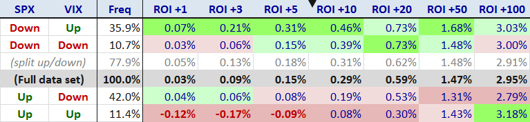
But the SPX, DJIA and NASDAQ composite indices were all up today, so what’s the big deal? It turns out that investors are easily spooked if the VIX (+2.6%) and the SPX (+0.1%) both move in the same direction. As the graphic below shows, the VIX and the SPX move in the same direction about 22% of all trading days. I think the real issue behind the concern about the direction of the VIX and the SPX is related to a hypothesis I laid out yesterday in What the VIX Kitchen Sink Chart Says:

“…the general consensus seems to be that stocks just do not deserve their current lofty valuation.  In this type of environment, many investors become particularly susceptible to confirmation bias and scramble to find one or more indicators which will tell them what they have already begun to believe: that a major correction is likely just around the corner.”

The last time I crunched the numbers for VIX and SPX daily correlations, was in May 2007 and in looking at data from 1990-2007, I concluded that a High Positive Correlation Between VIX and SPX Often Signals Market Weakness. When I ran the numbers this time around, it turns out that the market gyrations surrounding the financial crisis of 2008 and subsequent bullish rebound did little to change the overall conclusions.  The full data set (1990-2012) now shows that when both the VIX and SPX are up on the same day, the mean returns for the next 1-100 trading days trail the typical returns for the full data set by a substantial margin and are negative through the first five trading days.

In terms of key takeaways, it now appears that stocks perform best following days when the SPX is down and the VIX is up (the ROI +1 column refers to the performance of the SPX one day hence) and worst on days like today when the SPX is up and the VIX is up.  I have sorted the rows according to ROI +10 and in looking at the date, it is clear to me that some mean reversion is responsible for a good portion of the performance characteristics following the various VIX-SPX daily return permutations.  [For the record, the data in the table below includes Fridays and Mondays, so it is possible that calendar reversion may have had an impact on the results.]

Now I will be the first to admit that stocks are overdue for a pullback, but just because the VIX and SPX both advanced on two consecutive days does not necessarily mean the planets are aligning for an Aquarian selloff. If investors are looking for that market reversal silver bullet, the SPX-VIX correlation data, while bearish, fall short of hinting at a major reversal.

Below is a larger than usual set of links for those who may be interested in digging into the history of some of the SPX-VIX correlation themes in this space.

Last but not least, thanks to sharp-eyed reader Lee, whose sleuthing helped me uncover an errant spreadsheet formula that led to some bad data in an earlier version of this post.

Related posts:

[source(s): CBOE, Yahoo]

Disclosure(s): short TVIX and VXX at time of writing

Wednesday, February 8, 2012

What the VIX Kitchen Sink Chart Says

One of the more interesting developments of 2012 has been to watch the diminution of the strident bearish narrative that has been focused largely on the collision course between a preponderance of debt and low or negative growth. The bullish beginning to 2012, however, has not prompted many in the way of converts to the bullish camp. Instead, there have been whispers of “…overbought…” that have turned into a soft murmur and are now verging on becoming a loud chorus. Suddenly the general consensus seems to be that stocks just do not deserve their current lofty valuation.

In this type of environment, many investors become particularly susceptible to confirmation bias and scramble to find one or more indicators which will tell them what they have already begun to believe: that a major correction is likely just around the corner.

For better or for worse, a look at the VIX is often one of the first stops for those who are looking for evidence of a market reversal.

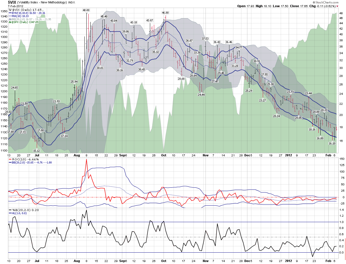
In the chart below, I have updated and extended a chart from three years ago that I call my “VIX kitchen sink chart” – as it pokes and prods the VIX in a number of different ways. Standard VIX analysis attempts to determine whether the VIX has strayed too far from historical norms, whether this be in the form of moving averages, Bollinger bands or other mechanisms. I have even included a separate rate of change study (with its own Bollinger bands) and a Bollinger band width study below the main chart in order to provide a couple of additional analytical twists.

The bottom line, however, is this:  if stocks are overbought and a correction is indeed just around the corner, the VIX does not appear to be aware of any such inevitability. Instead, it looks a lot more like business as usual in the land of the CBOE Volatility Index.

Related posts:

[source(s): StockCharts.com]

Disclosure(s): none

Thursday, October 25, 2007

Two Thoughts on the McClellan Summation Index

For the most part, my trading time horizon is one of hours and days, yet I do have a long-term portfolio that helps motivate me to periodically check out trends and themes that may take months or years to play out.

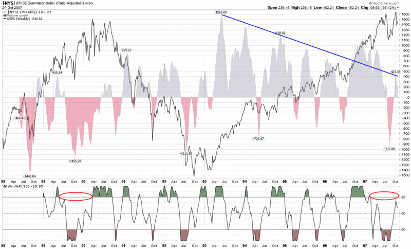
One of my favorite indicators to assist in looking at intermediate and long-term trends is the McClellan Summation Index, which I have talked about here on several occasions in the past. Lately I have been looking at a weekly version of the chart that goes back to 1998 (the farthest StockCharts.com has to offer) and two things have been gnawing at me.

(Of course I should probably preface my remarks by noting I have some concern that once my gut starts to go bearish – which it does not do very often, but has done lately – I wonder whether my chart reading starts to suffer from confirmation bias.)

The first concern I have is the possibility that the trend of lower highs in chart (represented by the blue line that conveniently ignores the data from late 2006 through early 2007) may turn out to be significant, particularly if the relatively low peak of 421 earlier this month cannot be surpassed in the near future.

The second concern I have is the amount of time that the Williams %R indicator has spent below the -20 line. Looking back at the chart, the only other time I can see that the Williams %R failed to generate these high values for at least nine months or so was in the last nine months of the 1999-2000 bull market top.

It seems like a long shot, but each of these two observations continues to bother me.

DISCLAIMER: "VIX®" is a trademark of Chicago Board Options Exchange, Incorporated. Chicago Board Options Exchange, Incorporated is not affiliated with this website or this website's owner's or operators. CBOE assumes no responsibility for the accuracy or completeness or any other aspect of any content posted on this website by its operator or any third party. All content on this site is provided for informational and entertainment purposes only and is not intended as advice to buy or sell any securities. Stocks are difficult to trade; options are even harder. When it comes to VIX derivatives, don't fall into the trap of thinking that just because you can ride a horse, you can ride an alligator. Please do your own homework and accept full responsibility for any investment decisions you make. No content on this site can be used for commercial purposes without the prior written permission of the author. Copyright © 2007-2023 Bill Luby. All rights reserved.
 
Web Analytics