Two Thoughts on the McClellan Summation Index
For the most part, my trading time horizon is one of hours and days, yet I do have a long-term portfolio that helps motivate me to periodically check out trends and themes that may take months or years to play out.
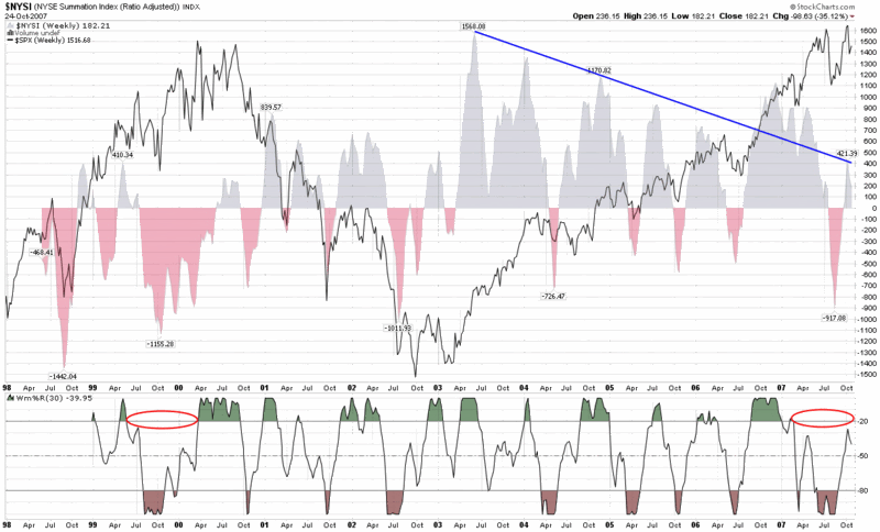
One of my favorite indicators to assist in looking at intermediate and long-term trends is the McClellan Summation Index, which I have talked about here on several occasions in the past. Lately I have been looking at a weekly version of the chart that goes back to 1998 (the farthest StockCharts.com has to offer) and two things have been gnawing at me.
(Of course I should probably preface my remarks by noting I have some concern that once my gut starts to go bearish – which it does not do very often, but has done lately – I wonder whether my chart reading starts to suffer from confirmation bias.)
The first concern I have is the possibility that the trend of lower highs in chart (represented by the blue line that conveniently ignores the data from late 2006 through early 2007) may turn out to be significant, particularly if the relatively low peak of 421 earlier this month cannot be surpassed in the near future.
The second concern I have is the amount of time that the Williams %R indicator has spent below the -20 line. Looking back at the chart, the only other time I can see that the Williams %R failed to generate these high values for at least nine months or so was in the last nine months of the 1999-2000 bull market top.
It seems like a long shot, but each of these two observations continues to bother me.


6 comments:
Mish has a great post on market breadth as well: http://globaleconomicanalysis.blogspot.com/2007/10/bad-breadth-and-smelly-sox.html
TheFinancialNinja
Thanks for flagging this, Ben. I agree this is excellent work by Mish here.
Cheers,
-Bill
Market breadth is a problem all around - money piling onto anything with a pulse, I suppose. But somehow last spring's upside breakout in interest rates, short lived as it was, became a licence to go speculating again.
The SOX look awful! That cannpt be good.
The breath is getting worse too. How far can the market get on AAPL and MSFT and RIMM??
I follow the Bullish Percent Index. The NASDAQ BPI has been hitting lower highs all year. Fewer and fewer stocks have been driving this market higher. That's the same thing that happened in 1999. Look at the QQQQ chart vs the other index charts. Very odd.
But I don't try to predict. I take what I can get from the market right now, but I'm ready to switch gears on a dime.
You pretty much nailed the top there, good job. I hope you acted on your suspicions.
Post a Comment