A Small Pimple
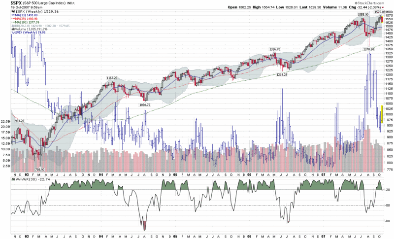
If you ever desire a better picture of what is really going on in the markets, just zoom out in time a little. This means that if you spend almost all of your time looking at daily charts and intra-day charts, step back and look at some weekly charts.
Take this week, for instance. It certainly has been a painful one for longs, particularly those who have been adhering to buy-on-the-pullback strategies. At some time, however, the bulls need to ask themselves when a pullback may be turning into a full blow bear market. We aren’t there yet – in fact it's not even close – and a glimpse at the weekly chart makes this week’s action look like little more than a pimple on a bull’s butt. More importantly, it’s just one week and a lone week of action is rarely decisive enough to mark a turning point with any degree of confidence – even if it generates three Hindenburg Omen signals.
Things will get interesting if and when some of the recent market leaders start to roll over in their short-term moving averages. With the exception of perhaps Mastercard (MA), I haven’t seen this happen yet, but I have my eyes on a few of the China stocks just in case, most notably: China Mobile (CHL); China Southern Airlines (ZNH); China Life Insurance (LFC); and, of course, Baidu (BIDU).


9 comments:
"your time looking at daily charts and intra-day charts, step back and look at some weekly charts"
Um, I really hate that misnomer. The operative measurement of timeframe isn't the length of time in a bar or candle, or between points on a line graph. The operative measurement is the width of the chart. If one typically looks at daily candlestick charts, then usually their chart is 3-6 months wide. If one typically looks at intra-day charts, then usually their chart is a few days or maybe a week wide. Your five-year chart would essentially look the same regardless of daily, weekly, or even monthly candlestick length. The essential function is that the chart shows five years, and not just a recent period. Of course, Hussy would call five years "recent" and "not long enough to evaluate fund performance," but that is another matter.
That said, I agree with the sentiment. A week isn't much time at all, and a lot of folks need a reality check if they're reacting to it.
Point taken, Bill. I tend look at a lot of daily candlestick charts of 6-12 months in duration, then start zooming in...but I always find that weekly or monthly charts going back at least a couple of bull and bear markets is needed to get a good handle on the current market.
For what it's worth, I had this to say about time frames in a recent post:
"I have never seen anyone articulate this, but my personal experience is that the charting time horizon for support, resistance, moving averages, recognition of common patterns, etc. ought to be something on the order of 20-50x your typical holding period. Most of my trades are of the 2-10 day variety, so most of the charts I look at are in the 20 day to 1 year range. I like to look at charts of 2 years or more for historical perspective on candidates I have already screened and I sometimes to go down as low as 1 minute bars for intra-day charts to fine tune entries and exits, but for the most part, I live in the 1-6 month charting world. Typically the longer term charts identify the opportunity and the shorter term charts trigger the timing of the entry."
Cheers and good trading/blogging,
-Bill
VIX:SDS pop today, fear is back.
For individual trades, 20-50x average holding period just seems long to me. I would think that many "value investors" and day-traders would think so, too.
I do agree with Bill as it is the width of the chart with relation to the timeframe. A trader once said (in mMarket Wizards): Print out a large, long term chart of the market and place it on the floor and look at while standing on your desk. It will be then when the true trend will appear). Doing that shows us exactly what you call a pimple at this point in time.
If that very small pimple is in the wrong spot it can still hurt.....lol.
is there something similar to VIX for bonds?
Anon,
Regarding a VIX-type measure for bonds, I usually refer people to the Markit CDX Indices (which I have permanently linked in my "VIX & Sentiment Links" in the upper right hand corner of the blog.) These do not measure bond volatility, per se, but instead the spread between various risk classes and treasuries. I wrote about this in some detail back in March in "The Credit Default Swap Canary."
Regarding actual bond volatility, you can get that type of information via iVolatility if you are a little creative. For instance, TLT is the iShares Lehman 20+ Years Treasury Bond ETF. Fortunately there are options available on this ETF, so iVolatility has an implied volatility chart for TLT and thus for bonds of this duration.
Substitute the ticker for any bond-related ETF (or commodity or anything else there is an ETF for) and if there are options available, you can pull up a volatility chart from iVolatility.com.
I hope this helps.
Cheers,
-Bill
Hi I gone through your blog.thanks for sharing information about haute her tips for face at
home
Post a Comment