Showing posts with label McClellan Summation Index. Show all posts

Tuesday, March 30, 2010

Some Favorite ETF Sites

Since last week’s mention of ETFreplay.com as one of my favorite up-and-coming ETF sites, a couple of readers have inquired about my other favorite ETF sites.

When I think about web sites which are dedicated to ETFs, two sites immediately come to mind. Keeping in mind that these lists are highly subjective, my favorite source for information and analysis of ETFs is probably ETFdb.com, where Michael Johnston and others cover the breaking stories, but more importantly offer up some finely crafted analysis of various ETFs and some of the issues surrounding these securities. The second site is ETF Rewind, which I discussed in Some Approaches to Trading ETFs. I rarely bother with subscription services, but I find the Excel-based data and analytics packed into Jeff Pietsch’s ETF Rewind Pro to be indispensible.

Once you get past the first cut of news and analysis sources and a data analysis tool, the incremental value added for each ETF web site starts to diminish. Gary Gordon at ETFExpert.com provides some valuable commentary and does a good job of linking to other ETF-related content around the web. If you like ETFreplay.com, you should also check out ETFScreen.com. In addition to the screening tools, there is also an excellent set of performance data, some trend information derived from relative strength analysis and an ability to build a correlation matrix for any group of ETFs.

For a different way of analyzing ETFs, try Arthur Hill’s ETFInvestmentOutlook.com, which focuses on the breadth and volume of each ETFs component. This site incorporates McClellan oscillator and summation index data, McClellan volume oscillator analysis, advance-decline volume, high-low analysis and related breadth tools to come up with a bottoms-up approach to evaluating ETFs strength and weakness.

In terms of mainstream media resources, Morningstar has an ETF section that has a solid screener and set of performance data. Not surprisingly, their profiles of the ETFs are among the most comprehensive on the web. The Wall Street Journal’s ETF Research center is also a good source for similar information.

Two other sites on the periphery of the ETF universe are CEFA.com, home of the Closed-End Fund Association and an excellent source for closed-end fund information; and Roger Nusbaum’s Random Roger blog, where the not-so-random one frequently, but not exclusively, opines about ETFs and related subjects.

Readers, please chime in and flag some of your favorites in the comments section.

For more on related subjects, readers are encouraged to check out:


Disclosure(s):
Morningstar is an advertiser on VIX and More; ETF Rewind and the VIX and More Subscriber Newsletter are available as part of a bundle (with Quantifiable Edges) in Blogger Triple Play

Sunday, November 15, 2009

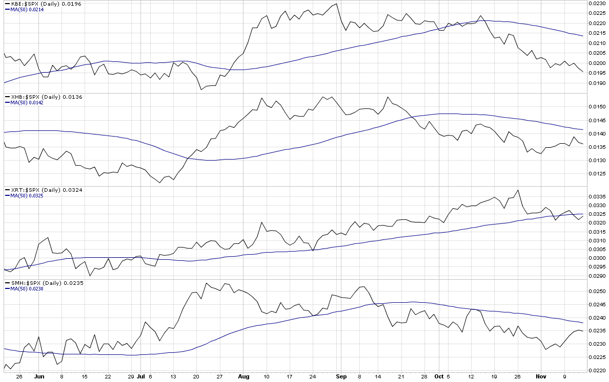
Chart of the Week: Four Key Sectors Struggle

While I still have at least one and a half feet placed firmly in the bull camp, I am increasingly concerned with a number of signs from some key technical indicators. Near the top of my list of concerns is market breadth, as measured by the McClellan Summation Index and other similar market breadth indicators. The bottom line is that if the indices continue to advance on the strength of a narrow base of rising stocks while the majority of issues move sideways or decline, then the rally will have trouble sustaining itself.

During the last few weeks, several key sectors have been underperforming the S&P 500 index, notably banks (KBE); homebuilders (XHB); retailers (XRT); and semiconductors (SMH). This week’s chart of the week shows the performance of the four sectors relative to the S&P 500 index over the course of the last six months. In all four instances, these critical sectors are below the 50 day average of their ratio to the SPX and in the case of the banks, the relative performance gap is increasing almost on a daily basis.

Going forward, I would expect that the major market indices such as the SPX will have difficulty making new highs if all four of these sectors continue to underperform on a relative basis. For this reason, I will keep an eye generally on market breadth and specifically on these four key sectors.

For additional posts on related subjects, readers are encouraged to check out:

[source: StockCharts]

Tuesday, October 13, 2009

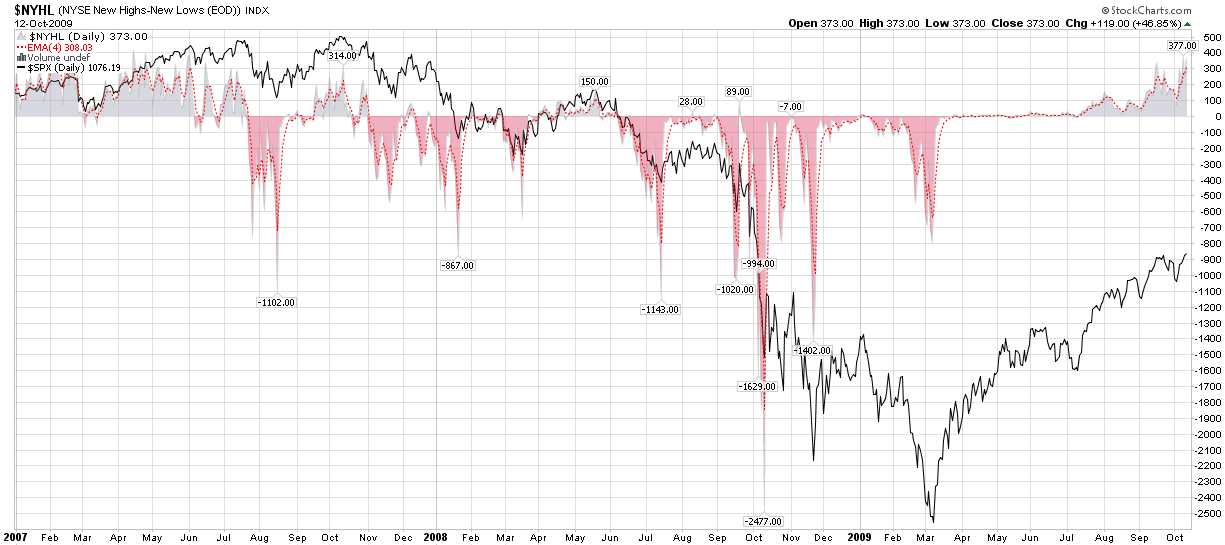
The 52 Week Lookback Period and New Highs - New Lows

Market breadth is a great tool. It can be used to evaluate momentum and also as a contrarian indicator to help identify potential market reversals. Various breadth indicators range from simple advance-decline indicators like the McClellan Summation Index, to measures of new highs and new lows, and beyond.

As I have seen a fair amount of comments related to new 52 week highs and lows in recent weeks, I wanted to point out what I hope is obvious to everyone looking at these charts. First, in many respects that 52 week time frame is an arbitrary lookback period. One could easily use a lookback period of 3 months, 6 months, 2009 year-to-date, 2 years or whatever. As it happens, 52 weeks is the conventional lookback period that is baked into almost all of the new high and new low data.

I mention all this because from October 1, 2008 to October 10, 2008 the SPX was in a free fall and dropped from 1167 to 839. As a result, a large number of stocks are making 52 week highs right now only because the lookback period no longer captures the values prior to the free fall.

So…keep a close eye on market breadth, but be wary of an artificial jump in new highs that shows new highs surging since the beginning of October. For the most part, this is a function of an arbitrary lookback period. Said another way, if you are going to be a student of technical analysis, but sure to study not just the recent data, but also the data that is scrolling off of the radar.

[graphic: StockCharts]

Sunday, June 21, 2009

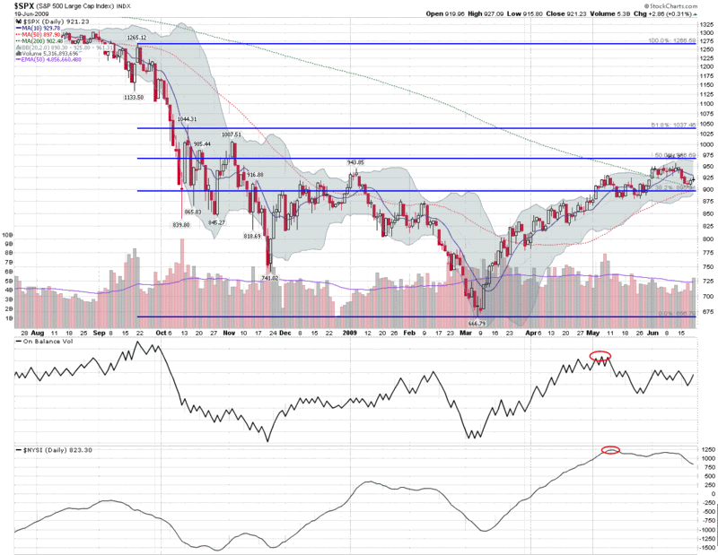
Chart of the Week: Lack of Volume and Breadth Threatens Bull Move

In the last few weeks, stocks have struggled to add to recent gains, suffering even more from a lack of buying interest than from selling pressure.

The chart of the week below is an attempt to use two basic indicators to capture the lack of volume and market breadth that has undermined the March to mid-June rally. As a measure of market volume, I have chosen to highlight on balance volume (OBV), which is a running total of the volume on up days minus the volume on down days. This indicator is excellent at highlighting trends which are at risk due to declining volume, which is exactly what the warning suggested when there was a peak in OBV during the first two weeks of May.

In a similar vein, the McClellan Summation Index (aka the NYSE Summation Index or NYSI) shows market breadth as derived from the net daily advancing stocks minus declining stocks. The McClellan Summation Index did turn up at the end of February, just before the March bottom and is generally an excellent tool for gauging trends in market breadth.

In addition to the May highs, note that both OBV and the McClellan Summation Index have recently made lower highs as well. While OBV shows some indications of steadying at current levels, the larger concern is the decline in market breadth issues highlighted by the McClellan Summation Index.

Like all indicators, these two are far from perfect, but they often provide important information about the decline in strength and potential for reversal in major trends.

For additional information on the subjects above try:


[graphic: StockCharts]

Friday, February 29, 2008

McClellan Summation Index Turns Positive

It may seem like the height of folly to be talking about an upturn in the market on a day when the DJIA is down 230 points, but I’m not going to let that stop me.

Apart from the recent bump in the markets, I see several factors that lead me to believe that the markets are poised to continue to go up from current levels. The first of these, as highlighted by J.J. McGrath on his MackTheKnife blog, is that money formerly on the sidelines is starting to flow back into mutual funds. It may not be a flood yet, but it is a toe in the water. The second factor is the persistent extreme readings in put to call ratios that are evident in the ISEE and the CBOE equity only numbers. These numbers indicate that while some institutional money is coming back into the market, many retail investors are still sitting on the sidelines or have a short bias.

A third way to think about pent-up demand is to look at the McClellan Summation Index, a chart of which I have appended below. As can be seen in the chart, the index just turned positive for the first time since late October. While this is by no means a guarantee that the markets are moving up, this signal has historically been a bullish one. Perhaps more importantly, one way to think about the size of the red areas under the zero line is that these represent bearish periods in which pent-up demand continued to accumulate under the surface, roughly proportionate to the duration and magnitude of the red spike.

To summarize my thinking here, two bullish signals are mutual funds moving cash into the market and advance decline data turning positive, suggesting that the tide has turned. At this stage, only options sentiment data needs to normalize to indicate that the retail investor is once again comfortable going long and helping to push the market out of the recent trading range.


[source:  StockCharts.com]

Monday, February 11, 2008

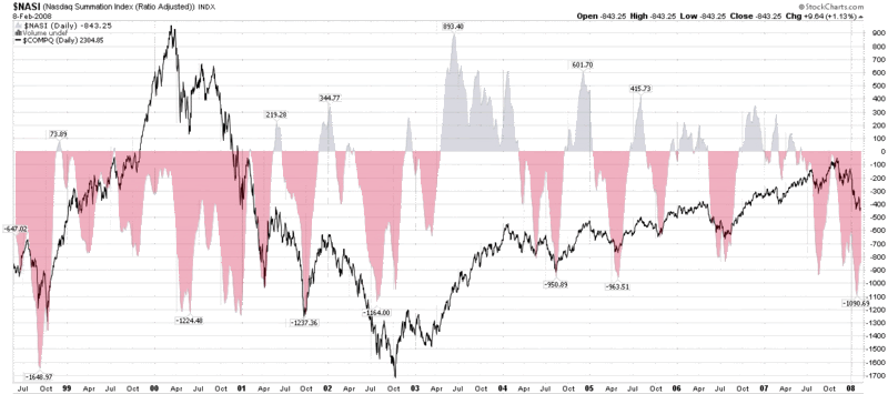
NASDAQ Summation Index

When it comes to market breadth indicators, I have particular fondness for the McClellan Summation Index, which I have discussed in this space several times in the past year. While the McClellan Summation Index draws upon NYSE advance decline data, I am actually a little bit partial to the NASDAQ variant. For those who use StockCharts.com, the ticker for the NASDAQ summation index is NASI and the NYSE/McClellan version is the NYSI.

So here is the big question: is the historically low NASI advance decline data a buying opportunity or a warning sign?

In order to best answer that question, I have included a chart below that plots NASI data going back ten years. It clearly shows that buying on any significant NASI dip (say -900 or lower) since the October 2002 bottom has been an excellent investment tactic, as was the run up to the 2000 market top. The graph also shows, however, that during the 2000-2002 bear market, this was a risky strategy that tried to capture short bounces which were brief countertrends against a falling tide. It was possible to be successful, but tight stops and/or a narrow time horizon were needed to control risk.

When all is said and done, we are back to a discussion about whether it makes sense to buy on the dips. In a well defined uptrend, there is not doubt that this is a winning strategy. In a bear market, one can still make money on the bullish countertrend, but these need to be surgical strikes. There isn’t much in the way of sideways action evident in this long-term chart, but it is safe to conclude that buying on the dips in a non-trending market – classic oscillator-based trading – is less profitable than trading with the trend, but offers more substantially opportunity than trying to trade against it.

My current reading of the NASI is that we are more likely than not to get a bounce off of current levels; if it turns out we are in a bear market, these gains will be short-lived, but if we are putting in a bottom of at least intermediate-term length, there is considerable opportunity to the upside.

Wednesday, February 6, 2008

Mean Reversion After Big Drops

Eddy Elfenbein at Crossing Wall Street has a nice little graphic and commentary up today: How the Market Behaves on Big Down Days.

After researching the 37 instances in which the S&P 500 index dropped 3.2% or more (as it did yesterday), Elfenbein draws the following conclusions:

“The average loss for the sell-off is 5.01%. After that, nearly every day is an up day. By the ninth day, the S&P 500 is down 3.48%, which is indeed, a retracement of about one-third. The market still trends higher to the 17th day where it's down just 3.01%, or about a 40% retracement. At that point, the linger effects of the sell-off seem to dissolve.”

Elfenbein’s findings should come as no surprise to those who pay attention to the TRIN and ISEE, as well as the VIX, various market breadth indicators, etc. While volatility has been on the tame side lately, the TRIN, ISEE, and McClellan Summation Index have all been suggesting a strong oversold situation and a high probability mean reversion bullish entry.

The duration of the retracement pattern identified by Elfenbein is also worth noting, as it hearkens back to some work on VIX spike retracements I published last April in Lessons from the Post-2/27 VIX Price Action, where the optimal retracement window was determined to be about eight days.

Wednesday, November 28, 2007

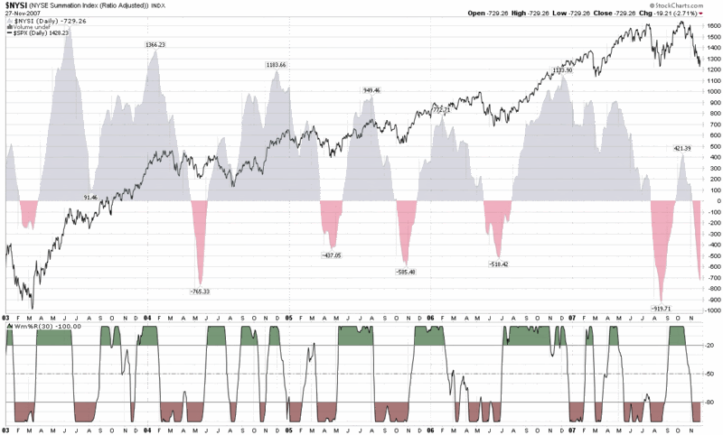
McClellan Summation Index Looking Bullish

A lot has been written about weakness in market breadth in the past week or so. With storm clouds looming over advances and declines, new highs and new lows, volume, etc., one might conclude that the breadth story is uniformly negative. Part of that interpretation depends upon whether you look at the ‘bad news’ in market breadth as confirmation of the breakdown in the broad market indices or whether you consider market breadth extremes to be contrarian indicators – at least in the short-term.

I fall into the contrarian indicator camp, but tend to focus on the intermediate term when it comes to highs and lows. Short-termers may be partial to the McClellan Oscillator; I am more interested in the McClellan Summation Index.

When I last posted about the McClellan Summation Index, it was October 25th and I was concerned about two technical aspects of the index that I interpreted as bearish. It certainly has been a bearish month since then, but now the index suggests that we are coming out of an extreme oversold condition that should provide a bullish foundation for at least the next few weeks…so I’m back on the bull side of the fence for now.

Thursday, October 25, 2007

Two Thoughts on the McClellan Summation Index

For the most part, my trading time horizon is one of hours and days, yet I do have a long-term portfolio that helps motivate me to periodically check out trends and themes that may take months or years to play out.

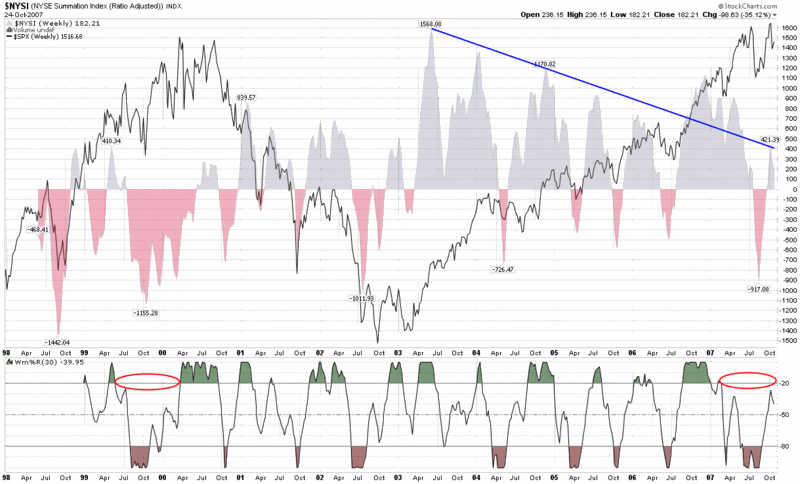
One of my favorite indicators to assist in looking at intermediate and long-term trends is the McClellan Summation Index, which I have talked about here on several occasions in the past. Lately I have been looking at a weekly version of the chart that goes back to 1998 (the farthest StockCharts.com has to offer) and two things have been gnawing at me.

(Of course I should probably preface my remarks by noting I have some concern that once my gut starts to go bearish – which it does not do very often, but has done lately – I wonder whether my chart reading starts to suffer from confirmation bias.)

The first concern I have is the possibility that the trend of lower highs in chart (represented by the blue line that conveniently ignores the data from late 2006 through early 2007) may turn out to be significant, particularly if the relatively low peak of 421 earlier this month cannot be surpassed in the near future.

The second concern I have is the amount of time that the Williams %R indicator has spent below the -20 line. Looking back at the chart, the only other time I can see that the Williams %R failed to generate these high values for at least nine months or so was in the last nine months of the 1999-2000 bull market top.

It seems like a long shot, but each of these two observations continues to bother me.

Wednesday, July 11, 2007

New Highs and New Lows for Market Timing

The McClellan Summation Index, the subject of yesterday’s market sentiment post, examines the difference between advancing and declining issues to help divine the future direction of the markets.

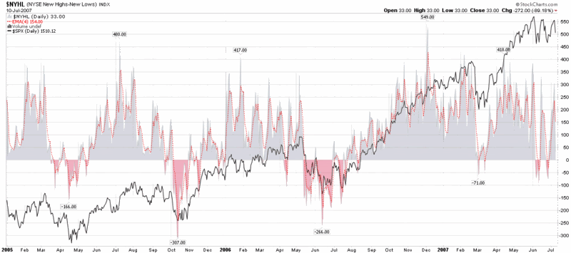
Today I am going to make the leap from daily advances and declines to daily new highs and lows covering a trailing 52 week period.

Before I dive in, I want to highlight the consistently excellent work of Headline Charts, a blog that regularly addresses issues such as advances and declines, new highs and new lows, as well as other market sentiment metrics. Today is no exception, as Headline Charts examines the ratio of new highs to new lows as well as the rarely seen inverse ratio, new lows to new highs.

I have also recently had the benefit of reading the encyclopedic and aptly titled market breadth tome, The Complete Guide to Market Breadth Indicators: How to Analyze and Evaluate Market Direction and Strength by Gregory L. Morris. This is obviously a labor of love and an indispensable resource for thinking not only about market breadth, but indicators of all types. Think of it more as a reference book than something to curl up with and you can get a better sense of its ideal application.

Spurred on by Morris’ research and analysis, I have been evaluating a number of market breadth indicators and am currently favoring a rather simple one for the intermediate term: new highs minus new lows, with a 4 day EMA smoother. One simple rule is to be long when the EMA is positive and short when it is negative. You can use a longer EMA or a SMA to smooth out the values a little more and cut down on whipsaws, but I like the 4 day EMA and will be adding this indicator to my short list of favorites.

You will note that the new high – new low indicator is currently recommending a long position in the markets, with a considerable cushion before it is likely to reverse.

Tuesday, July 10, 2007

Good News from the McClellan Summation Index

The last time I talked about the McClellan Summation Index, I used a weekly chart to demonstrate how this indicator can provide some advance notice of market tops and bottoms.

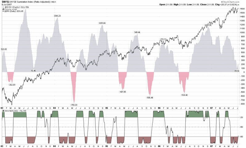
Today my focus is more on the Williams %R momentum indicator that I have included with the daily chart of the McClellan Summation Index (which StockCharts.com codes as the $NYSI or NYSE Summation Index.) In this chart, which spans from 2003 to the present, I use 30 bars for the Williams %R indicator instead of the more common 14 bars in order to minimize some of the choppiness and provide more reliable signals.

In terms of a strong intermediate term bullish signals, what I look for in the chart below is for the Williams %R to cross the -50 center line, which is usually does shortly after moving above the -80 level. While I will generally wait for the official confirmation at the -50 level, you can usually anticipate that event when the %R rises above -80. With yesterday’s close of -77, I would expect that we would get another bullish signal from the McClellan Summation Index – Williams %R (30) very soon.

For those interested in checking the reliability of this indicator, you can eyeball the chart to determine that this center line crossover approach gave 9 highly profitable bullish readings, 1 neutral to unprofitable reading (May ’04), and 2 readings (February ’05 and February ’07) that were unprofitable – all of which one assumes a minimum holding period of 1-2 months.

Tuesday, April 3, 2007

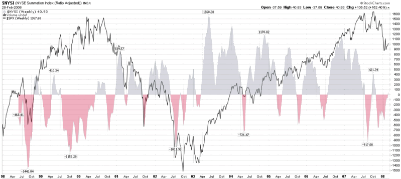
The McClellan Summation Index

The McClellan Summation Index is named after its originators, Sherman and Marion McClellan, who developed this indicator in 1969. This index and its counterpart, the McClellan Oscillator, are tools for evaluating trends in market breadth (advancing issues minus declining issues) and should be in every investor’s toolbox.
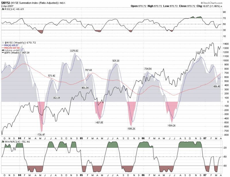
The Summation Index and the Oscillator are derived from the same set of calculations, with the Oscillator data presented in a manner better suited to short and intermediate term trading and the Summation Index targeted at identifying changes in the longer term trend. For a more detailed discussion of the specific calculations involved, see DecisionPoint or Stockcharts.com.

For an excellent 12 month chart of the McClellan Summation Index, the Oscillator, and the NYSE composite index, I recommend the DecisionPoint combined chart that is available at Stockcharts.com.

With this indicator, I prefer to take a longer term view of the markets and therefore have included below a weekly chart of the McClellan Summation Index (also generically know as the NYSE Summation Index) going back to 2003. A glance at the chart shows that in the rally from the 2002 lows, the Summation Index has done an excellent job of calling both highs and lows in advance of market turns, with a 2-3 month warning for market highs and a much tighter warning period for lows. Also note that these highs and lows have tended to fall into a pattern of 7-12 month cycles over the past few years.

My thinking is that when an indicator is working, stay with it, especially if it is doing a good job of calling market turns.

As for the current Summation Index readings and what it augurs for the markets in the second quarter and beyond, the fact that the Summation Index is sitting right at the 39 week SMA tells me that we are more likely to be range-bound at least in the short term than moving sharply higher or lower.

Remember, we all stand on the shoulders of giants; it pays to know a little about these giants.


[source:  StockCharts.com]

DISCLAIMER: "VIX®" is a trademark of Chicago Board Options Exchange, Incorporated. Chicago Board Options Exchange, Incorporated is not affiliated with this website or this website's owner's or operators. CBOE assumes no responsibility for the accuracy or completeness or any other aspect of any content posted on this website by its operator or any third party. All content on this site is provided for informational and entertainment purposes only and is not intended as advice to buy or sell any securities. Stocks are difficult to trade; options are even harder. When it comes to VIX derivatives, don't fall into the trap of thinking that just because you can ride a horse, you can ride an alligator. Please do your own homework and accept full responsibility for any investment decisions you make. No content on this site can be used for commercial purposes without the prior written permission of the author. Copyright © 2007-2023 Bill Luby. All rights reserved.
 
Web Analytics