Showing posts with label ADX. Show all posts

Tuesday, May 1, 2012

An Aroon Stalemate for S&P 500 Index

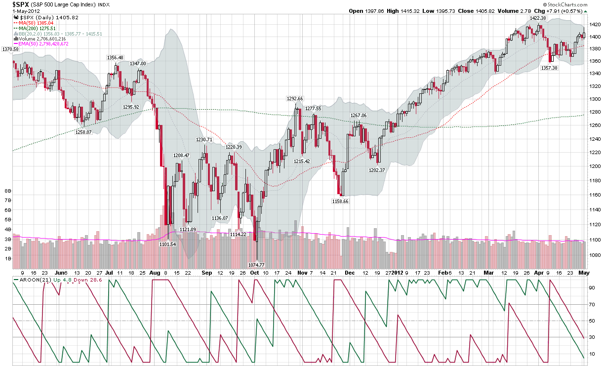
While the bias in stocks for the past three years and two months has definitely been upward, the S&P 500 index (SPX) has struggled to remain above 1400 ever since making a post-2008 high of 1422 on April 2nd.

There are many ways to determine the strength of a trend and one that has a very strong following is the Average Directional Indicator (ADX), which was developed by Welles Wilder and first published in 1978 classic, New Concepts in Technical Trading Systems.

While the ADX has a great deal to recommend it, I am somewhat partial to another trend evaluation tool, the Aroon indicator, which was developed by Tushar Chande. The Aroon is actually two measures in one, an Aroon Up (green line in study below main chart) and an Aroon Down (red line). Essentially, the Aroon Up and Down lines measure the proximity of N-period highs and lows to the most recent trading period, on a 0-100 scale, with 100 indicating that the high or low for the period was made during the most recent trading day and 0 indicating that the high or low was made on the first day of the N-period window.

The default time frame for the Aroon indicator is usually represented as 25 periods, but in some charting software, the default is 14 periods. Since I tend to look at the investing world in months that average 21 trading days, the chart below uses my favored default Aroon setting of 21 days.

The chart shows the SPX over the course of the past year, with a strong uptrend (green line above 50 or 70) since the second week in December that has recently begun to show signs of fatigue on the part of the bulls as it has now been 20 days since that high of 1422. On the other hand, the red line shows that it has now been 15 days since the SPX made its 21-period low of 1357. In other words, the last three weeks have seen neither the high or the low of the 21-day lookback period, as the SPX has meandered in a 65-point range. The result is that both the green line and red line have dipped below 30, signaling the absence of any meaningful bullish or bearish momentum.

The Aroon indicator is effective as a trend-following tool partly because it usually waits for 1/3 to 1/2 of the lookback window to elapse before signaling a change in trend – which is generally represented by either the green or red line crossing the horizontal lines at 50 or 70.

As it looks now, if stocks were to continue to tread water for the next four days, Monday would likely signal an ascendant green line, but Friday’s employment report, the European Central Bank and other factors make it unlikely that stocks continue to trade in a narrow range for another week or so.

Related posts:

[source(s): StockCharts.com]

Disclosure(s): none

Friday, June 12, 2009

SPX and Fibonacci Resistance at 966

At the height of yesterday’s run up to SPX 956, a commenter took me to task for having a bearish bias in the face of a bull stampede. At the time, I was ready to close out most of my short positions, but this decision was conditional on how the market closed. As it turns out, the bearish momentum at the close was enough for me to leave my short positions on.

When it comes to rising markets, there are two things I know for certain:

  1. It is very difficult to predict where a strong bull move will run out of steam

  2. Few things in life are more frustrating/expensive than being short when the bulls are pushing stocks to new highs

Combine the two above ideas and the smart play is to wait for a top to be established and at least one lower high to follow before thinking about establishing short positions. There is, however, a case to be made for anticipating some market reversals and the current situation has three important ingredients: resistance; declining momentum; and a large magnitude move that is ripe for reversal.

The chart below highlights some of these issues. I have added Fibonacci retracement lines in blue that utilize the late September post-Lehman highs as their starting point. The key post-Lehman Fibonacci resistance is 966 in the SPX, which represents halfway between the 1265 high and 666 low. In terms of declining momentum, in addition to the obvious recent range-bound trading, the Average Directional Indicator (ADX) shows trend strength (black line in bottom portion of graph) stalling below the 25 level, which signals a weak trend. Further, the positive directional indicator (+DI, green line) is showing an even more rapid loss of positive momentum. Finally, the move from 666 to 956 was a little over 43% and was accomplished in the absence of any meaningful pullback along the way. In other words, this is a large move that is ripe for a retracement.

Of course there are a number of other technical factors that can support the bear case, but this is an outline of the basic premise.

Right now I am short, but it is a relatively small position. Should the bears demonstrate an ability to gain some traction, I will add to that position quickly.

If the SPX closes above 967, I will exit my short positions and return to a more bullish posture.

[source: StockCharts]

Tuesday, March 31, 2009

Introducing the Parabolic Stop and Reverse (SAR)

Yesterday, a reader asked about the usefulness of the parabolic stop and reverse indicator, sometimes called the PSAR or SAR. Since this is one of my favorite not-quite-mainstream indicators, I thought I would take a moment and mention some of the reasons why I am a fan of the SAR. One thing led to another and before I knew it, my simple response had grown to Tolstoyan proportions. For that reason, I am going to address the SAR over the course of several posts.

The SAR was unveiled by Welles Wilder as part of the groundbreaking 1978 classic, New Concepts in Technical Trading Systems. Even after more than three decades, the achievements in this book still boggle the mind. In one fell swoop, Wilder launched the RSI (relative strength index), ATR (average true range), ADX (average directional indicator) and SAR, along with several lesser known indicators (e.g., commodity selection index, swing index, etc.) that probably deserve much more attention.

When it comes to adding more indicators to one’s TA toolbox, I am always a little hesitant to do so, as I prefer to keep things simple rather than make them too complex. This bias for “less is more” when it comes to indicators is partly due to the fact that so many of the indicators share some computational ancestry that the value added is often a lot less than meets the eye.

With those caveats in mind, I consider the SAR to be an exception. Specifically, the SAR is a unique combination of price and time. It works particularly well in trending markets and perhaps best suited to being implemented as a trailing stop mechanism.

This time around, I will not delve into the details of the calculations of the SAR; instead, I will provide a quick overview of how the SAR works. In the chart below, I have captured data in XLF, the financial ETF, going back one year. The SAR values are represented by the purple dots that are overlays on the price chart. When the purple dots are below the candlesticks, this indicates rising prices; when the purple dots are above the candlesticks, this indicates falling prices. Each time a change in trend is signaled, the purple dots flip from the bottom to the top or the top to the bottom. To make these reversal signals easier to identify, I have added green and red arrows to indicate trend reversals.

The SAR assumes traders are always in the market. Very simply, when the trend reverses, the SAR signals a new position should be initiated. To get a sense of how the SAR values move, review the new short signal from the second week in December. Note that the SAR is a good distance above the initial short entry signal, but as time passes, the SAR continues in the direction of the original signal, regardless of whether the market follows the trend or not. This brings the SAR close to the price at the beginning of the year. Take note also that as XLF begins to move sharply down in the beginning of January, the SAR accelerates down with it and stays close to the price action. When XLF finally reverses in the last week in January, the trailing stop is so tight that one bullish gap up day triggers an exit. This is the essence of the SAR: it gives gradual trends some time to gather momentum, hugs sharp trends closely, and acts as a tight stop should the trend begin to change direction.

Now study the balance of the chart. Notice that when XLF was in a persistent trend (May, June, October, etc.), the SAR performed quite well. When XLF traded sideways, however, as it did in August, the SAR was responsible for quite a few whipsaws.

In the next article in this series, I will delve deeper into the calculations behind the SAR and discuss some of the preferred approaches for applying this indicator.

[source: StockCharts]

DISCLAIMER: "VIX®" is a trademark of Chicago Board Options Exchange, Incorporated. Chicago Board Options Exchange, Incorporated is not affiliated with this website or this website's owner's or operators. CBOE assumes no responsibility for the accuracy or completeness or any other aspect of any content posted on this website by its operator or any third party. All content on this site is provided for informational and entertainment purposes only and is not intended as advice to buy or sell any securities. Stocks are difficult to trade; options are even harder. When it comes to VIX derivatives, don't fall into the trap of thinking that just because you can ride a horse, you can ride an alligator. Please do your own homework and accept full responsibility for any investment decisions you make. No content on this site can be used for commercial purposes without the prior written permission of the author. Copyright © 2007-2023 Bill Luby. All rights reserved.
 
Web Analytics