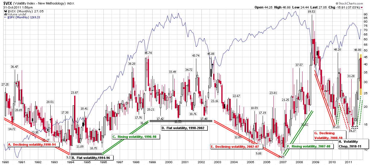
Shrinking VIX Macro Cycles
Staring at the VIX from the 30,000 foot level, it looks much different than it does from the trenches of daily trading. In the monthly chart below, one can see that from 1990 through 2008, the VIX moved in fairly regular ‘VIX macro cycles’ of 2-4 years in duration, with relatively gentle trends and transition points.
Seen in terms of monthly bars, the financial crisis of 2008 changed the nature of those VIX cycles, with the result that in the last three years the VIX cycles have been short and steep. Unlike the VIX movements through 2008, the more recent VIX movements seem to defy a traditional directional label, so for now at least I have attached a provisional label of “volatility chop” to characterize the VIX movements since the April 2010 low of VIX 15.23. Note that this low coincides with the euro zone approval of $40 billion in bailout funds to Greece. In many respects, the volatility of the last 1 ½ years can be seen as a slow escalation of the European sovereign debt crisis and the evolution of investor opinion regarding the magnitude of the risk and the ability of the euro zone to get ahead of the problem.
Volatility has indeed been qualitatively different since the 2008 financial crisis. You can see the differences on a daily, weekly and monthly basis. Even more interesting for the academician and perhaps problematic for the trader is that distinguishing between volatility regimes is more difficult now that it was for the first decade and a half of the life of the VIX – at least from 30,000 feet.
Related posts:
- Chart of the Week: VIX Macro Cycles and a New Floor in the VIX (9/27/09)
- The New VIX Macro Cycle Picture (4/23/09)
- Recent Volatility and VIX Macro Cycles (10/30/08)
- VIX Macro Cycle Update (3/19/08)
- Was 2007 the Beginning of a New Era in Volatility? (12/24/07)
- VIX Macro Cycles (9/10/07)

Disclosure(s): none
[sources: Stockcharts.com]

