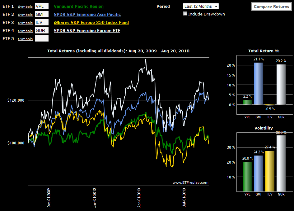
Chart of the Week: Rethinking Geography
I have a tendency to look at the world through ETFs and when thinking globally, often in terms of country ETFs. I find that regional ETFs too often dilute some of the trends and ideas I am looking to capture. Further compounding the problem is that I have a tendency to think in terms of emerging markets and developed markets more than, say, broad geographic boundaries such as Europe and Asia.
Even with this bias, I was surprised to see in this week's chart of the week that if one looks at the performance of emerging and developed markets ETFs for both Europe and Asia over the course of the past year, the strong correlation is not between the geographies, but across the emerging/developed distinction. In spite of all the sovereign debt problems in Europe, emerging Europe (GUR) has generally been the top performer of the group, but this performance has been closely matched by emerging Asia (GMF). Not surprisingly, developed markets in Europe (IEV) have been more volatile and slight underperformers when compared to their developed market counterparts in Asia (VPL), but the margin has been a relatively slim one.
For me at least, the key takeaway is that emerging Asia looks a lot more like emerging Europe than developed Asia. Perhaps it is time to start rethinking our investing geography…
Related posts:
- Chart of the Week: Emerging Markets
- BRIC Update: China a Leader or Outlier?
- The Emerging Markets Engine

Disclosure(s): none

