Chart of the Week: July Nonfarm Payrolls
Any week the employment report is on the schedule, the big story is likely to be the nonfarm payrolls and this week was no exception.
While the census employment cycle has lately skewed the headline number, the private payroll data, hours worked and average hourly earnings indicate that there are continued signs of improvement, small though they may be.
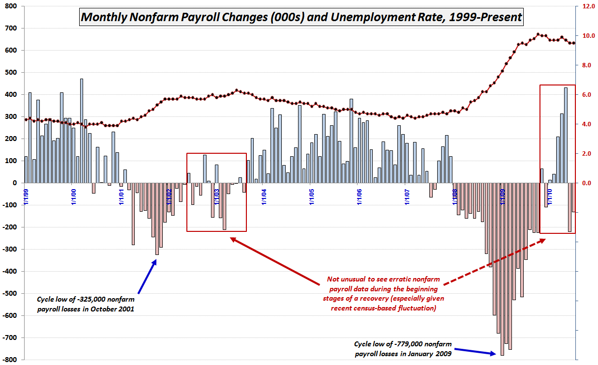
The chart of the week graphic below tracks the headline net monthly nonfarm payroll change (blue and red columns) as well as the unemployment rate (red and black line) going back to 1999.
It is worth observing that even without the fluctuations caused by the census employment situation, it is not unusual for the net payroll changes to see a significant degree of monthly noise in the short term and/or exhibit some pattern of starts and stops over the longer term as the economy lurches forward into a more coherent recovery mode.
Finally, it is important to note that in order for the employment situation to cease being a drag on the economy, merely breaking even on payrolls from month to month is not enough. Most estimates indicate that 100,000 – 125,000 new jobs need to be created each month just to accommodate the demographics of a growing labor force.
For more on related subjects, readers are encouraged to check out:
- Nonfarm Payrolls and Backsliding
- Chart of the Week: Updated Nonfarm Payrolls and Unemployment Rate
- Chart of the Week: Nonfarm Payrolls, Unemployment Rates and Time
- Chart of the Week: Putting Nonfarm Payrolls in Context
- Nonfarm Payrolls Before and After Recessions
- Chart of the Week: Economists Try to Predict Payroll Losses

Disclosure(s): none

