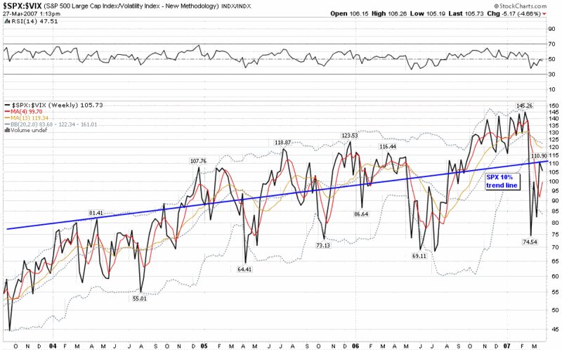
SPX:VIX Back to Predicted Level
A week before the February 27th VIX spike, I talked about the ratio of the SPX to the VIX and posited that the best way to think about that relationship would be to look at the oscillating VIX number in the context of a SPX that is trending approximately 10% over the long term.
The day after the February 27th spike, I revisited the SPX:VIX ratio, which had dropped precipitously from 138 to 76 (on the monthly chart) and commented that I considered a ‘neutral range’ for this ratio to be in the area of 105-115.
This seems like as good a time as any to update the SPX:VIX ratio, which rebounded all the way to 111 on the weekly chart (below) and now sits at 106. In other words, the SPX:VIX ratio is now just about exactly at the midpoint between the extremes of pre-2/27 complacency and post-2/27 panic – and also very close to the long-term SPX trend line that reflects a 10% annual increase.
If it feels like the forces of bullishness and bearishness are at a standstill at the moment, then it is perhaps because at the current levels, the battle is a draw.


26 comments:
Bill,
Keep up the great work! This stuff is very interesting.
Just FYI, I have my computer resolution at work set to 1024x768. With this resolution, the right side of this chart gets cut off. I can't see anything past about 1/1/2007. When it's set to 1280 horiz, the chart looks fine.
Brian
Thanks for your support and the heads up on the resolution problem, Brian. The original image is here.
Shelly,
Go right ahead. I'd be delighted if you were to add this blog to your directory.
Good health to you and your family!
-Bill
Hire assignment writer UK from students assignment help in a very cheap price for taking the advantage of expert's written assignments.
Best piece of info ever looking forward for more, having a sparkling clean concrete surface can be difficult at times. It requires a lot of effort and time to clean the tough stains and dirt. However, the cleaning of this stubborn dirt and stains can become easier when you are cleaning with the best concrete cleaner. Get one from Best Concrete Cleaner for Pressure Washer
Thank you for this wonderful information looking forward for more, if you live in an area with some hills and slopes and you are planning to buy an electric scooter to climb the hills when commuting or enjoying the beautiful view of the landscape, you need to choose the best electric scooter for climbing hills around your area. All from Electric Scooter that can Climb Hills
Interpages
Guest Blogger
Guest Blogging Site
Guest Blogging Website
Guest Posting Site
Helpful posts What you write in this article is good, เว็บพนันบอล ดีที่สุด2019 so I can learn a lot. Thanks for the article.
Thank you very much for this news blog area. I like your blog content
vegus168 โปรโมชั่น
MyBlogger Club
Guest Posting Site
Best Guest Blogging Site
Guest Blogger
Guest Blogging Site
928bet เราได้เปิดให้บริการให้แก่นักเดิมพันทั่วโลกที่รักในการเสี่ยงโชค เรามีเกมการเดิมพันต่างๆ รวบรวมอยู่ที่นี้ 928bet แทงบอล เรามีคาสิโนชั้นนำมากมาย เช่น sexy baccarat , slotcity , sa gaming , vevo casino , joker gaming , allbet asia รวมถึงการพนันกีฬาออนไลน์ ทั้ง บอล บาส มวย ม้า เทนนิส และอื่นๆอีกมากมาย
Outlook is essential for sending and receiving emails from many websites that you have linked to. However, many Outlook users have reported that the error message [pii_email_5df70dfa05d9b2c10f6d] continues displaying on the screen when they try to send an email.
FliXanity is a free online video streaming service that allows users to watch and enjoy HD versions of newly released and box office films. The site can be accessed in two ways: via an app or via a streaming site. Both companies provide the same number of services as well as a diverse range of outputs to their consumers.
Technically there is no solution to lose weight in just one part of your body. When a person loses weight it occurs simultaneously in all parts of the body, in some it is accentuated more than in others. Fortunately, there are ways to make your face look slimmer nedik tells you how.
tips to lose facial fat
The new report by Expert Market Research titled, ‘Global Agro Textiles Market Report and Forecast 2022-2027’, gives an in-depth analysis of the global Agro Textiles Market, assessing the market based on its segments like product growth, applications, and major regions. This report according to the latest trends and strategy in the industry and studies their impact on the overall market upcoming years. The growing stress to increase agricultural yield to cater to the rising demand from the rising population worldwide is driving the industry growth of agro textiles.
Thanku for posting I will also refer this to someone, to know more about Best Hrms software in india
Thanks for sharing your observations here. The graphical representation will help to know more about the current status and its progress.
Interior fit out company in Dubai | Interior fit out company Dubai
Fly Ash Louisiana is a widely utilized material construction industry, known for its numerous benefits. It serves as a supplementary cementitious material, enhancing the strength and durability of concrete structures. By incorporating fly ash, Louisiana promotes sustainable construction practices and reduces environmental impact.
chocolate gift in Dhahran with the exquisite joy of chocolate, the perfect gift to sweeten their day and create unforgettable moments. Explore a delightful selection of chocolates that will delight their taste buds and bring smiles to their faces.
Thankful to you for sharing your insight on this topic. Keep sharing your perspective.
Ayurveda Clinic in Dubai | Ayurvedic center in Dubai
Ramma Foundation Repair is a trusted Foundation Repair Edmonton, offering reliable solutions for various foundation issues. With their experienced team and dedication to quality, Ramma Foundation Repair ensures the stability and durability of residential and commercial properties. Trust them to provide expert foundation repair services tailored to your specific needs.
Cmolds is a top app development company, renowned for its innovative solutions and exceptional designs. With a dedicated team of experts, Cmolds crafts cutting-edge apps that cater to diverse business needs, ensuring excellence and customer satisfaction. Elevate your app aspirations with Cmolds, the ultimate destination for top-tier app development.
Indulge in the finest quality with Monster Rabbit, offering authentic rabbit Turkish sex honey in UAE. Experience heightened pleasure and vitality with our premium products. Explore the ultimate satisfaction with Monster Rabbit today.
The SPX
ratio's rebound to 111 shows improving market sentiment, though caution remains as it sits at 106. Just like monitoring market trends, choosing the right fit out contractor ensures precision and quality in any project.
Analyzing the SPX to VIX ratio provides valuable insights into market trends, especially when considering the VIX's fluctuations against a steadily rising SPX. Just as this financial relationship offers clarity, the expertise of top interior fit out companies in Dubai brings precision and vision to transforming spaces in a dynamic environment.
I recently used their Water Mains Replacement service and I’m really impressed. They handled my domestic water mains replacement quickly and professionally with minimal disruption. If you need commercial water mains replacement or modern trenchless water mains replacement, they’re a great choice. I even found them while searching for burst water main repair near me, and they responded fast. They also provide expert new water pipe installation Wirral. Honestly, the service was so good — I highly recommend them to anyone needing reliable water main solutions.
Post a Comment