Showing posts with label subprime mortgage. Show all posts

Monday, February 27, 2012

The Biggest VIX Spike Ever: A Retrospective

Here is a thought experiment: when was the biggest one day VIX spike ever recorded? If you said February 27, 2007 – five years ago today – then I imagine you are in the distinct minority, even among active traders of VIX products.

There were a number of factors which helped to trigger the mostly forgotten record VIX spike back in 2007 – and with it a 3.5% decline in the S&P 500 index. Most media reports at the time focused on a drop in Chinese stocks. In fact, as I noted later, concerns about the Chinese government raising interest rates to discourage speculation helped to trigger an 8.8% loss in the Shanghai Composite Index and a 9.9% loss in the FTSE/Xinhua China 25 index that is the basis for the popular Chinese ETF, FXI. Various other news reports pointed to concerning U.S. economic data and there were some who were apparently spooked by a Taliban suicide bombing attack in Afghanistan that targeted Vice President Dick Cheney.

Interestingly, concerns about a sub-prime crisis or a real estate bubble were almost nowhere to be found at the time.

Of course the world was a lot different back in 2007. I had just started blogging one month before the VIX spike and in a world where a sub-10 VIX was common, I added the tongue-in-cheek tagline to the blog: “Your One-Stop VIX-Centric View of the Universe…” Twitter was in its infancy, CNBC hadn’t even thought about the idea of running a VIX ticker across your TV screen and most people didn’t even know what the VIX was at that time.

For those who may be interested in a little financial archeology, I put up eight posts that day to chronicle the magnitude of the move and offer an interpretive wrapper for those who were looking for more information:

…and added some trading ideas in another post prior to the next day’s open:

Note also that the blogging world was much smaller and more intimate in those days, so I was not surprised to see that David Merkel, Trading Goddess, Option Pundit, Jim Kingsland, Headline Charts, Lauriston Letter and other blogging luminaries of that era dropping by to add their thoughts in the comments section.

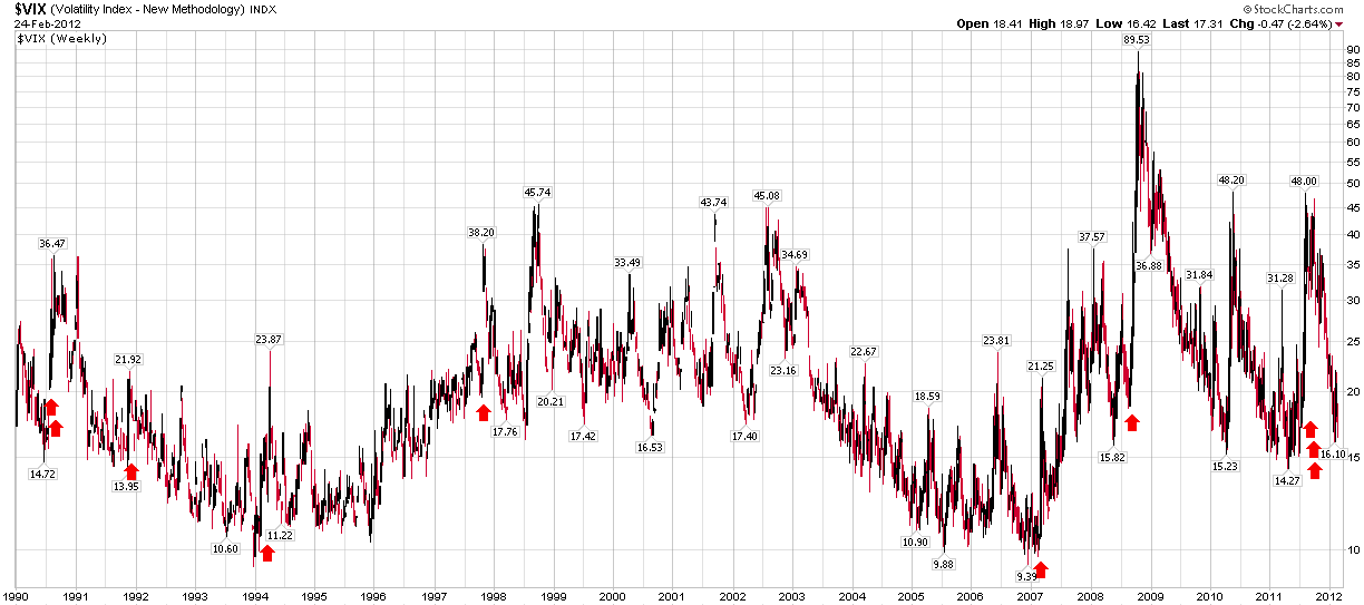
Of course this is where I typically get peppered with dozens of, “So what does a big one day spike in the VIX mean?” questions, so I have taken the liberty of highlighting the ten largest single day VIX spikes over the last 22 years (which includes reconstructed VIX calculations). As I see it, these one day spikes are typically instances in which a number of investors suddenly get their first glimpse of a dark gray swan and they panic, not knowing what is around the corner. For the most part, the panic turns out to be an overreaction. Of course, occasionally the big spike can look like a precursor of doom in retrospect, as was the case on September 29, 2008, when the VIX spiked 34.5%, just before stocks went into their plunge. When I see a big VIX spike, however, the first thing I do is get out my mean reversion trading kit.

Related posts:

[source(s): StockCharts.com]

Disclosure(s): long FXI at time of writing

Sunday, May 9, 2010

Chart of the Week: The Weekly VIX

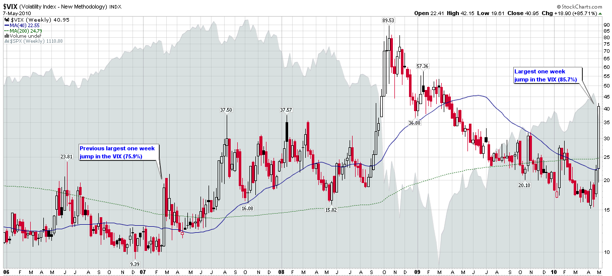
There were so many fascinating developments in the financial markets during the week, that it is difficult to single one chart out as this week’s chart of the week. As this blog has the VIX in the title, however, it seems sacrilegious to potentially overlook the fact that the VIX spiked more last week than in the entire history of the VIX, even including reconstructed VIX data going back to the beginning of 1990. The 85.7% jump in the VIX last week easily surpassed the previous record of 75.9%, which was from the week of February 27, 2007, when the Shanghai Stock Exchange composite index fell 8.8% in one day.

The chart below captures weekly bars of the VIX going back to the beginning of 2006. The chart highlights the fact that most VIX spikes are a 2-3 week phenomenon. As I see it, the record VIX spike of September-November 2008 is the type of extended VIX spike one only expects to encounter every two or three generations.

The difficulty in dismissing the current crisis is that as volatility has a tendency to cluster, so do financial crises. For example, the Asian financial crisis of 1997 helped to sow the seeds for the Russian financial crisis and Long-Term Capital Management crisis of 1998. Several years later, the 2000-2002 bear market in technology stocks – and the government response – helped to sow the seeds for the housing bubble that began as the 2007 subprime mortgage crisis and eventually blossomed into the 2008 financial crisis. The current European sovereign debt crisis certainly has many of its roots in the crises of 2007 and 2008.

So while I do not expect the VIX to remain over 40 in the days and weeks ahead, I am aware that the current crisis will leave deep economic and pschological scars on the landscape that will take months and years to heal in full. More importantly, the governmental response to the current European sovereign debt crisis could easily extend the cycle of current volatility or send ripples through history that will amplify the effects of future financial crises.

When it comes to the VIX and volatility, watching history in the making is typically gut wrenching and expensive, with very few spectators able to enjoy the entertainment value of new records.

For more on related subjects, readers are encouraged to check out:


[source: StockCharts.com]

Disclosure(s): short VIX at time of writing

Friday, June 26, 2009

VIX Convergence Zone in Mid-20s

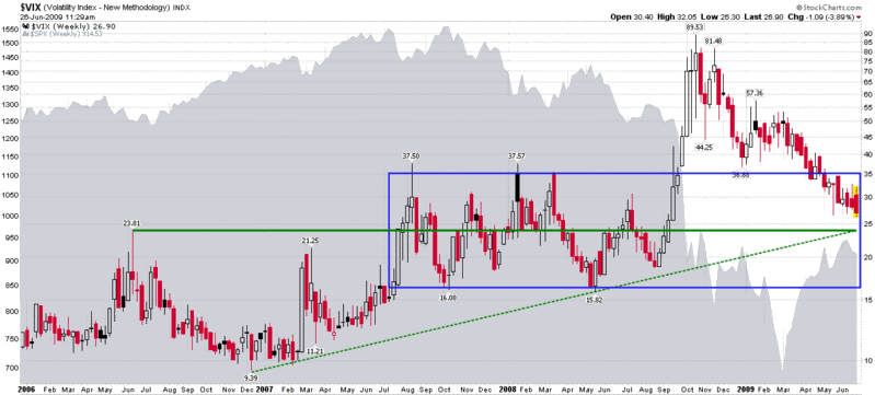
Since Fridays are days in which recent VIX lows are often tested, I thought this might be a good time to step back from the typical VIX daily chart and look at a weekly chart. In the chart below, I have elected to go back to the beginning of 2006 to capture the details of what was arguably the lowest volatility year on record so it could be compared with the most volatile year we have witnessed, 2008.

While volatility first began to spike in February 2007, it was not until July 2007 that investors began to come to terms with the potential magnitude of the damage should the subprime mortgage crisis morph into a global financial contagion. From July 2007 to September 2008, volatility was elevated, but seemingly contained in the 16-35 range represented by the blue box in the chart. It just so happens that the midpoint of that range roughly coincides with the 2006 VIX high of 23.81 that is represented by the horizontal green line.

To complete the picture, I have added a dotted green trend line that connects the December 2006 low to the May 2008 low. Like the 2006 high and the median for the blue box, it projects to about the 24-25 range.

This is not to say that the VIX cannot go below 24-25, but given the 3.06% drop in the SPX on Monday and the 2.14% gain yesterday, the current 26.65 level in the VIX does seem inconsistent with recent single day volatility.

[source: StockCharts]

Disclosure: Long VIX at time of writing.

Wednesday, June 18, 2008

Regional Banking Woes Worsen

If you subscribe to the cockroach theory of investing (where there is one cockroach, there is an army; where there is one piece of bad news, there is likely to be more in the pipeline), then the recent regional banking turmoil should come as no surprise. Fundamentally, it was just a matter of time before the subprime>housing>credit crisis started to manifest itself on the balance sheets of those regional banks in the areas that have been hardest hit by the recent economic problems.

Two quickly recap, Cleveland-based National City Corp (NCC) made the biggest headlines in late April when it received a $7 billion capital infusion from an investment group led by Corsair Capital. Just a week ago, NCC acknowledged that is operating essentially in a probationary mode governed by the contents of two memoranda of understanding with the Office of the Comptroller of the Currency and the Federal Reserve Bank of Cleveland. The details of these MOUs have not been made public.

Among the many other regional banks that have stumbled, KeyCorp (KEY), which is also headquartered in Cleveland, has been one of the more spectacular examples. Toward the end of May, KeyCorp doubled it estimates for write-offs for mortgages, HELOCs and educational loans just one month after raising write-off estimates when it reported earnings. More recently, KeyCorp announced plans to raise $1.5 billion in new capital and slash its dividend 50%.

A third Ohio bank, Cincinnati-based Fifth Third Bancorp (FITB), is dominating the headlines today, with news that the company will raise $2 billion in capital and slash its dividend 66%.

In terms of stock performance, NCC is down 75% from its December levels, while both KEY and FITB are down more than 50% since the beginning of May.

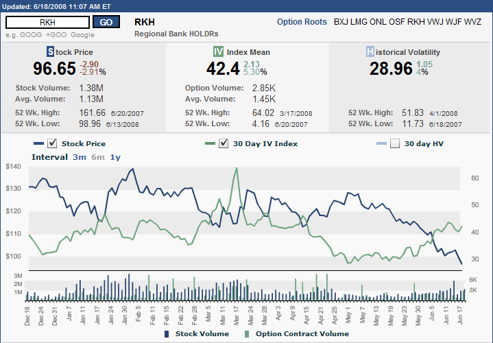
With all the turmoil in the regional banking market, I am tempted to swap out Lehman Brothers (LEH) as my official financial sector fear indicator and replace it with one of the regional banking indices. Better yet, why not make that a regional banking ETF, such as RKH (Regional Bank HOLDRS Trust), whose options status make it easy not only to keep track of price trends, but implied volatility trends (see chart below) as well.

Finally, I would be remiss in not pointing out that Ohio is the classic swing state in Presidential elections and voters go to the polls in less than five months…

Friday, February 1, 2008

What Fell and What’s Bouncing

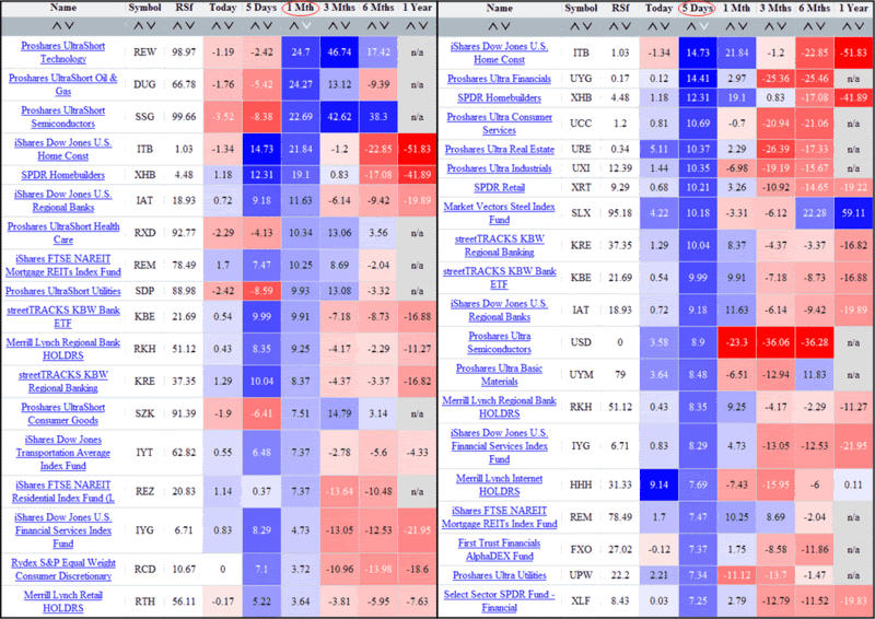
The chart below shows two different performance sorts of sector ETFs. On the left are the top ETF sector performers during the past month; on the right are the top ETF sector performers during the past five days. For the record, these graphics were generated by ETFScreen.com and can be sorted by any time frame specified in the columns.

Not surprisingly, the big winners for the month were the ultrashort ETFs, particularly in technology and energy sectors. On the long side, real estate and finance-related ETFs showed well during the month, an indication that these sectors may be attracting a fair amount of bottom feeding activity.

Switching to performance data for the last five days, one can clearly see the strong buying action in the real estate and financial sectors, with retail and basic materials ETFs also supporting the recent bounce. So far, the bullish action following last week’s bottom has been driven largely by sectors sensitive to interest rates and cyclical growth. The technology sector, which had a nice bounce pre-FOMC, has been largely absent from the party during the past few days.

Wednesday, January 30, 2008

Strength in Financials

I am of the opinion that there is a fine line between bravery and stupidity – and when it comes to front running any FOMC announcements, stupidity often rules the day.

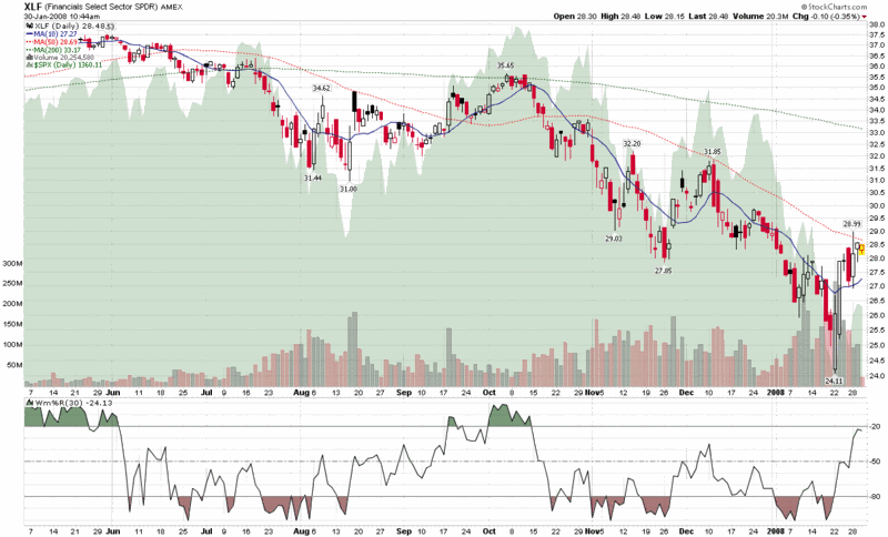
With that in mind, consider the action in the financial sector over the past week or so. Looking at the XLF SPDR, we have an impressive two day bottom put in last Tuesday and Wednesday, with a pop of 20% from a bottom of 24.11 and a potential cross of the 50 day SMA less than 1% away from current levels. The volume at the bottom was impressive and has held up fairly well on the way up. Certainly a cross of the 50 day SMA and a turning up of the 20 day counterpart must bode well for that sector and increase the likelihood that this month’s plunge will ultimately turn out to be the bottom.

All of this is predicated, of course, on the markets having confidence that the Fed is doing the right things to shore up our financial systems, provide appropriate liquidity, and keep the dominoes from getting any wobblier. Presumably, the markets have priced in a 50 basis point move by the Fed today and have valued the financial sector on the assumption that solutions to the current situation – though they may be slow to take root and turn out to be expensive – are going to ultimately resolve the current credit crisis.

I won’t be front running the Fed today, but if the financial sector turnaround means anything – and it usually does – it could mean that there is still a lot of easy money to be made cherry picking some of the stronger names that have beaten down with the rest of the sector.

Monday, January 14, 2008

Checking for Atheists

One of the things I like to do when I see the markets bounce is what I call my “atheist check.” Essentially, I take a look at the current and recent numbers for the ISEE to see if there are many believers who are flocking to buy call options. The lower the number, the more atheists there are that are still out there (or ‘undecideds’ if you prefer the political metaphor to the religious one), and therefore the larger number of potential converts available. Contrarians love potential converts, as they are the future fuel for subsequent bull legs. Generally, when I see an ISEE number (they use a call to put ratio, not a put to call ratio like the CBOE does) of 120 or below, I consider this to be a bullish signal. An ISEE of under 100, which signifies more people opening new put positions than call positions, is very bullish.
As a rule, an ISEE of under 100 is relatively rare, particularly over extended periods. What I find noteworthy about the current market is that the ISEE has closed below 100 for five of the past six days and at 92 as of 12:50 EST today, is on target to make that six of seven. The only other time that the ISEE has registered six of seven sub-100 closes since the exchange began keeping records in October 2002 is in August 2007, at the very bottom of the selloff caused by the first iteration of a subprime panic.

As far as I am concerned, the current ISEE data is almost as compelling as the 37.50 VIX spike we had in August. While the VIX demonstrates how fearful the atheists are, the ISEE reveals how many of them are out there and reminds me of one of my favorite quotes, which comes from John Bender and appears in Jack Schwager’s Stock Market Wizards, “It's not the current opinion of the stock that matters, but rather the potential change in the opinion.”

Thursday, December 13, 2007

Implied Volatility as a Sector Drill Down Diagnostic

I have said relatively little about the crisis in the financial sector largely because there are so many others out there who are covering this story in much more detail than I have any desire to get into. Also, my trading is driven largely by technical analysis, charts and market sentiment, with fundamental analysis usually playing a prominent role only in my long-term holdings.

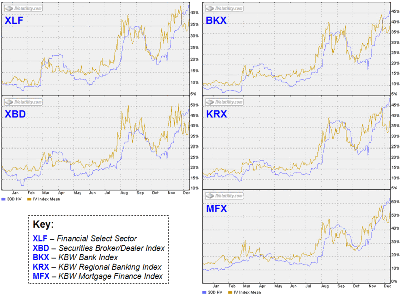
That being said, this blog has an emphasis on volatility and risk, so this morning I pulled up some implied volatility charts in the financial sector and drilled down from general to specific to see to what extent implied volatility might indicate vis-à-vis the possibility of the tide turning in investor fear. I have appended several of these charts below. On the left hand side, they include the generic large cap financial sector index, XLF (components), as well as the securities broker dealer index, XBD, whose volatility I analyzed back in August. On the right side, I have the banks. The BKX (components) is capitization-weighted and thus tilts toward money center banks; the KRX (components) has a strong regional and local focus; and the MFX (components), as the name suggests, includes banks and other financial companies that are heavily involved in the mortgage finance business. For comparison purposes, the BKX is down 18.7% on the year, the KRX is down 20.5% and the MFX is off 44.6%.

From an IV perspective (and yes, many of these companies could use some intravenous fluids) I generally glance at XLF only as a generic overview of the financial sector. The first finding of interest is that implied volatility in the XBD peaked in August and made a double top before Thanksgiving. This is consistent with the widespread belief that Goldman Sachs (GS) has dodged the subprime bullet and other players in this sector have had sufficient time and corporate agility – if not perhaps the ideal risk management policies – to limit any additional damage.

The banks are another story. Implied volatility in the money center banks and regional banks topped out at the end of November and is currently just below the August highs. Still more concerning, if not more surprising, is the performance of the mortgage finance sector, where implied volatility is above the August peak and in the process of challenging the late November high water mark. If I were a meteorologist looking at implied volatility, I would conclude that the storm has passed in the broker-dealer sector, but more thunderclouds are approaching in the regional banking and mortgage finance sectors.

Tuesday, November 27, 2007

Not a Lot of Fear or Volatility Lately

Given all the gloom and doom headlines across the mainstream media and blogging world (the lines are already blurring, it seems…) I am a bit surprised to see how little journalistic panic (embellishment?) has translated into market panic.
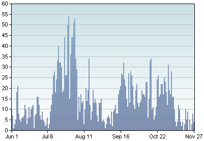
Starting with the graphic to the left, which depicts the frequency that the term “VIX” has appeared in blog posts with a certain minimum Technorati authority level over the past 180 days (see original tool), it almost appears as if the VIX is an idea whose time has come and gone. Lately, the talk is all about subprime, CDOs, SIVs, with interest rate spreads as the scorecard de jour. The markets may be down 10%, but with the VIX at 26 and change as I type this, the VIX is not part of the story.

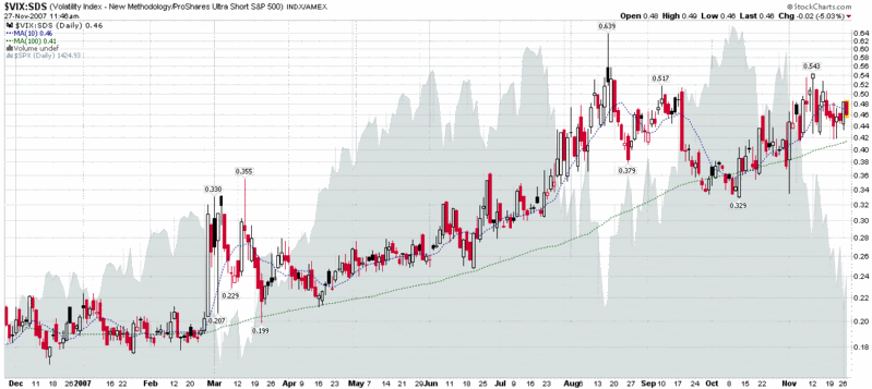
In my ongoing effort to attempt to differentiate between fear and volatility, I turn to the VIX:SDS ratio at moments like these to see how fear has waxed and waned while the markets have fallen rather dramatically. The one year chart of this ratio is below. Previous incarnations of the VIX:SDS ratio chart have all been of the 6 month variety, but I think it is important to look at the current market environment and be able to compare it to the February-March and July-August VIX spikes (the SDS inverse ETF only launched on 6/13/06, so it is not possible to capture the ratio during VIX spike from 5/12/06 to 6/13/06.)

There are many ways to think about this chart (keeping in mind, of course, that it compares an oscillating number with a beta of about -4.2 to a trending number with a target beta of -2.0), but what I keep coming back to is the distance between the current reading or 10 day SMA and the longer-term 100 day SMA. In some respects, this isolates the magnitude of the fear component of the VIX and in the chart below, it underscores how little fear there has been relative to the recent drop in the SPX, especially when compared to similar values in February-March and July-August. I am not sure exactly how to interpret this, but I suspect that either the market will recover to a level that is commensurate with the fear, or perhaps we will see a significant VIX spike well into the 30s that will likely signal a near-term bottom. And despite what you read elsewhere, not all market bottoms require a high volume capitulation session, with an accompanying VIX spike.

Thursday, November 15, 2007

The Other Bubble

I have visited 47 states (all except North Dakota, Arkansas and Oklahoma) and seen a lot more of this country than most will ever see, so when I look at the various foreclosure and subprime maps that have been making the rounds lately, it is easy for me to picture many of these places and the residents I have met there along the way.
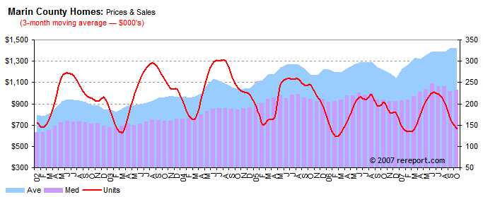
On the other hand, I live just north of San Francisco in Marin County, which in many ways, is like living in a completely different kind of bubble in terms of real estate values, disposable income, attitudes, politics, etc. When it comes to real estate in the area, starter homes in the $3 million range are not uncommon. For some additional context, a couple of years ago my wife and I looked at a local $8.5 million house that lacked a private master bedroom and was in need of a fair amount in the way of repairs.

In spite of the projections by the Marin Real Estate Bubble blog, local real estate has been surprisingly resilient. The Marin Real Estate Report tracks a variety of real estate data and is the source of the graphic below, which shows that for the past seven years, real estate has climbed fairly steadily, at least when adjusted for seasonal trends. The story is different in other parts of California, as comparable San Diego data show, but for now at least, the full extent of the Marin bubble seems to be intact.

Friday, August 31, 2007

Predicting an ISEE September Buy Signal

Among the many indicators that have been giving contrarian bullish readings as of late is the ISEE, which narrowly missed making a new record low for its 20 day SMA earlier this week. Long time readers (can I already have any of these after only 8 months?) may recall that when it comes to the ISEE, I have a preference for using the 50 day SMA and for using absolute readings as well as movement away from well-defined tops and bottoms for the best trading signals.
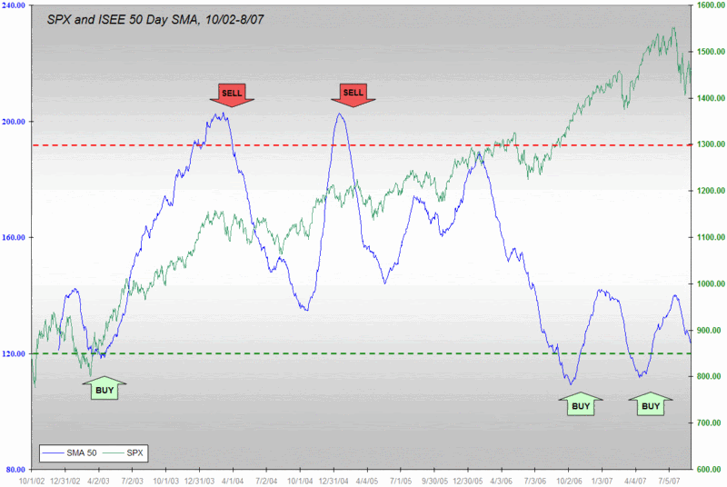
In March I anticipated an upcoming buy signal from the ISEE 50 day SMA in April and suggested that it was a good time to “get long, perhaps in a big way.” Thanks in part to the predictability generated by older numbers rolling out of the SMA calculations, I was also able to see a double bottom coming in April.

With a month of august volatility now in the books, it is becoming clear that September will also likely trigger an ISEE buy signal. My best guess right now is that the buy signal will become official during the second or third week of the month. Given that this a very high probability signal, I see no reason why not to flag it now and look to grab 2-3 extra weeks of upside.

As an aside, consider how surprising it is that given all the recent turmoil, the broad indices are up over 1% going into this three day weekend, with investors large and small apparently more concerned about missing a bull leg than seeing subprime headlines and red numbers on their screen Tuesday morning. We may be turning a corner…

Thursday, August 16, 2007

2007 vs. 1998 or Subprime vs. LTCM

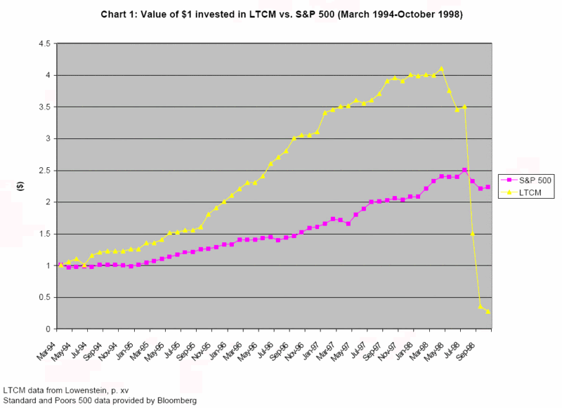
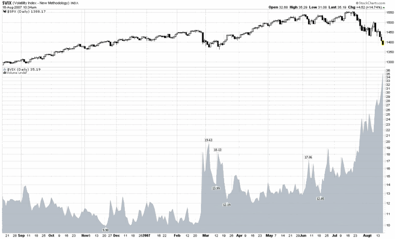
Those who were active in the markets in 1998 and anyone who is a student of the markets should be asking themselves how the current subprime mortgage mess compares with the Long-Term Capital Management failure of nine years ago.

If you haven’t already read Roger Lowenstein’s excellent When Genius Failed: The Rise and Fall of Long-Term Capital Management, it isn’t too late to do so. Among the events that Lowenstein recounts is the merciless squeezing of LTCM’s positions by Goldman, Salomon and others, activities that may have strong parallels to some of what is going on behind the scenes right now.

The purpose of today’s comparison is to contrast the magnitude of the volatility triggered by the failure of LTCM to what we have seen in the last two months. Keep in mind that according to Lowenstein, LTCM’s capital peaked in April 1998, as shown in the graphic below from Siddharth Prabhu, who utilizes Lowenstein’s data.


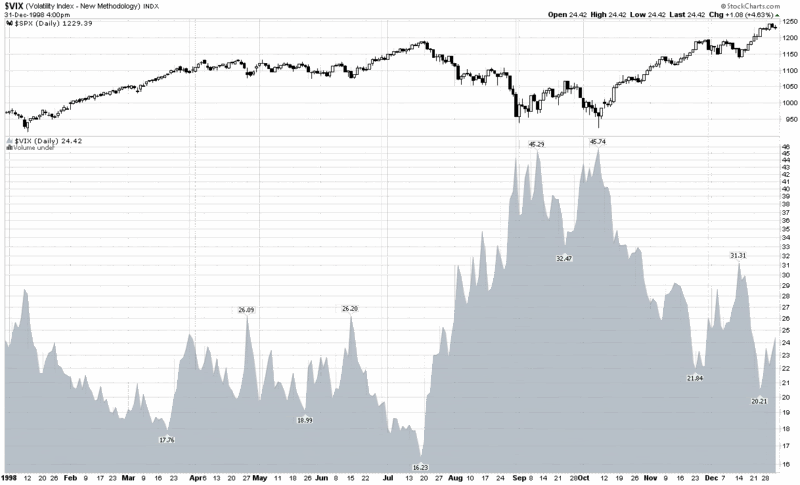
As the graph of VIX and SPX from 1998 toward the bottom demonstrates, LTCM’s small losses from April to July have very little impact on the markets, but as the losses grow (and the Russian financial crisis widens), the VIX nearly triples over the course of two months, while the S&P 500 loses approximately 20%. For more historical context, note that by the end of the year the SPX had recovered all of those losses and moved higher, while the VIX returned almost to the pre-crisis lows.

How does the current situation stack up? Looking at the chart at the bottom, once again, the VIX has almost tripled in two months (doubled in one month), while the SPX has lost closer to 10% of its value. For comparative purposes, this means more fear in the current situation, with less in the way of financial losses – at least at this stage.

With LTCM and Amaranth already in the books, you would think that those who are in a position to avert another similar crisis would be in a better position to do so. Keep an eye on the comparisons to 1998 going forward and don’t be so quick to conclude that this time it will be worse than it was nine years ago.


Thursday, March 8, 2007

The Credit Default Swap Canary

Raise your hand if you were following were watching the Bombay Sensex for clues about the future of the Chinese market or were wise to the unwinding of the Yen carry trade before it happened. Maybe you were tipped off to the subprime mortgage debacle. If so, you did a better job than most investors.

I won’t say that keeping a weather eye on the VIX would have guaranteed that you found yourself on the right side of the markets on 2/27, but it would have helped. Careful study of the equity put to call ratio would also probably have helped.

Let me nominate another canary to add to the investment coal mine: credit default swaps. I know, I’m not a bond guy either, but keeping an eye on how the markets are pricing default risk (the spread versus the US Treasury yield curve) is somewhat of a bond analog for how equity risk is priced in with the VIX.

I highly recommend watching the credit default swap index for high yield corporate bonds. A snapshot of this index is available at Yahoo, but much more information is available through Markit (click on the Dow Jones CDX.NA.HY link to pull up the graph below). Note that in the high yield graph, the market discounted 1/3 of the risk premium from September to Feburary and is now going through wild gyrations in an effort to re-price the risk premium to better match current expectations.

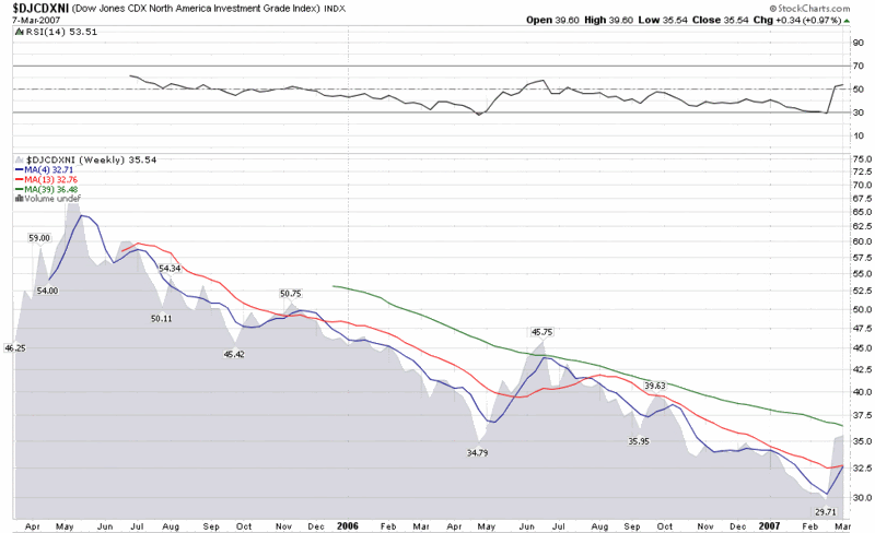
I should also note that while StockCharts.com does not provide charts for the high yield credit default index, they do offer charts for a sister index, the investment grade credit default index, whose weekly chart I have included below. The IG index chart suggests that the recent turmoil in the bond markets is less than what transpired during the May-July sell-off of last year and does little to reverse the 20 month trend of increasingly narrowing credit default spreads.

The bottom line is that it is always good to have a canary that you watch closely to help call market tops and bottoms. It can’t hurt to have several canaries, each with their own unique sensitivities.

DISCLAIMER: "VIX®" is a trademark of Chicago Board Options Exchange, Incorporated. Chicago Board Options Exchange, Incorporated is not affiliated with this website or this website's owner's or operators. CBOE assumes no responsibility for the accuracy or completeness or any other aspect of any content posted on this website by its operator or any third party. All content on this site is provided for informational and entertainment purposes only and is not intended as advice to buy or sell any securities. Stocks are difficult to trade; options are even harder. When it comes to VIX derivatives, don't fall into the trap of thinking that just because you can ride a horse, you can ride an alligator. Please do your own homework and accept full responsibility for any investment decisions you make. No content on this site can be used for commercial purposes without the prior written permission of the author. Copyright © 2007-2023 Bill Luby. All rights reserved.
 
Web Analytics