Friday, August 31, 2007

Predicting an ISEE September Buy Signal

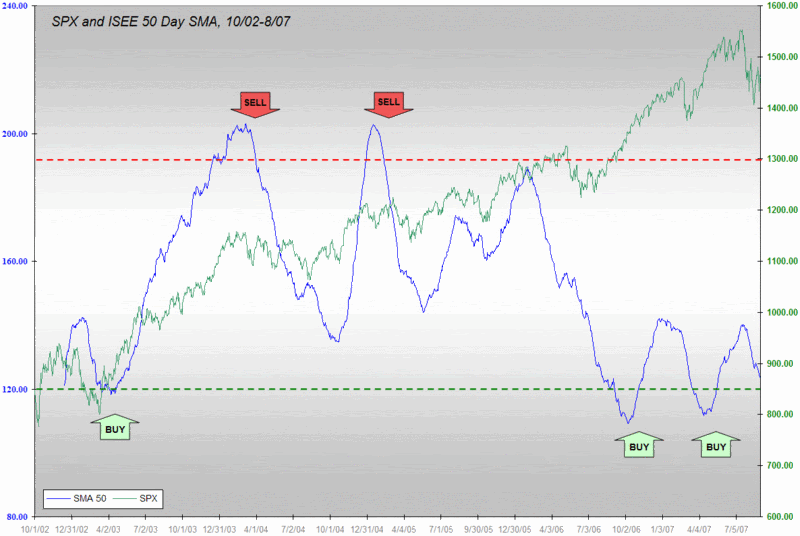
Among the many indicators that have been giving contrarian bullish readings as of late is the ISEE, which narrowly missed making a new record low for its 20 day SMA earlier this week. Long time readers (can I already have any of these after only 8 months?) may recall that when it comes to the ISEE, I have a preference for using the 50 day SMA and for using absolute readings as well as movement away from well-defined tops and bottoms for the best trading signals.

In March I anticipated an upcoming buy signal from the ISEE 50 day SMA in April and suggested that it was a good time to “get long, perhaps in a big way.” Thanks in part to the predictability generated by older numbers rolling out of the SMA calculations, I was also able to see a double bottom coming in April.

With a month of august volatility now in the books, it is becoming clear that September will also likely trigger an ISEE buy signal. My best guess right now is that the buy signal will become official during the second or third week of the month. Given that this a very high probability signal, I see no reason why not to flag it now and look to grab 2-3 extra weeks of upside.

As an aside, consider how surprising it is that given all the recent turmoil, the broad indices are up over 1% going into this three day weekend, with investors large and small apparently more concerned about missing a bull leg than seeing subprime headlines and red numbers on their screen Tuesday morning. We may be turning a corner…

Thursday, August 30, 2007

Echo Volatility, Day 10

Following the 2/27 VIX spike, I had a lot to say about echo volatility in this space.

My dog explains the concept best, but a good working definition of echo volatility is along the lines of “the tendency for markets to be more susceptible to volatility spikes in the wake of an initial volatility spike.” Some historical context is available at “VIX Spikes and Echo Volatility” and I looked back at post-2/27 echo volatility in “Lessons from the Post-2/27 VIX Price Action.”

Finally, in response to a reader question, I presented an important element of my thinking regarding echo volatility in “When Is Echo Volatility Safely Behind Us? Here I offered two key takeaways:

  1. The first ten days tell you very little about future VIX prices that you don’t already know by just applying ‘normal’ VIX mean reversion tools to the close on the day of the spike. By day 15, it is possible to predict future VIX price levels [30-60 trading days out] with considerably more accuracy and by day 20 I would say that I am ‘as comfortable as possible’ about making predictions about future VIX levels and the possibility of more echo volatility.

  2. One of the golden rules of VIX mean reversion is that if mean reversion does not play out over the course of 10-20 days, then we are likely headed for a period of extended volatility.

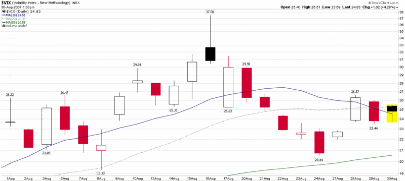
So, here we are on the tenth trading day after the August 16th 37.50 VIX spike top, with a very small echo volatility bounce that took the VIX from 20.44 to as high 26.67 in two days, still almost 30% below the VIX spike top. It is too early to discount the possibility of an another echo volatility VIX spike in the next week or two, but by the end of next week and particularly by the end of the 20 day window on September 14th, the window of opportunity should be closed and we should be able to put the 37.50 spike and any subsequent volatility spikes to bed.

Wednesday, August 29, 2007

Watch XBD’s Implied Volatility

With the DJIA up almost 100 points right out of the gate, I was curious to see GS and BSC quickly fade from green to red – and that weakness reflected in the XBD (Broker/Dealer Index.)

Of course, you probably don’t have to hedge the entire market too catastrophe-proof your portfolio these days. You can probably accomplish the same task by erecting a safety net under just one or two sectors, such as the home builders or financial institutions. So I looked at my favorite bellwether, Goldman Sachs, to see how their implied volatility has fared in the past month or so. While it makes for an interesting visual, I have not included the Goldman chart because the company has a history of slipping punches. A better chart is the XBD, whose components include 12 companies in the broker-dealer space.

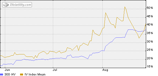
The iVolatility chart below shows implied and historical volatility for the XBD going back three months. Prior to July, the XBD IV spent 95% of the past year in a narrow 20-25 range. After topping 50 in mid-August, the XBD IV looked to be headed back down to 30 or so, until the recent spike left it over 40 yesterday.

While it is important to watch the price level of this index to see how it holds up at support levels such as 215 and 208, I also recommend keeping a weather eye on the XBD’s implied volatility to see what the trend and absolute levels of IV tell us about the thinking of options players. It is quite likely that the tip of the next iceberg may be found floating in the IV chart before it shows up on a price chart.

Tuesday, August 28, 2007

The Relationship Between Volatility and Market Returns

Hans Wagner (not pictured) has an article with the title “Volatility as a Stock Market Indicator” up on Financial Sense. Posted yesterday, the Wagner article examines the relationship between volatility and market performance from a monthly and yearly perspective. In his analysis, Wagner leans heavily on the research of Ed Easterling of Crestmont Research, whose relevant book, Unexpected Returns: Understanding Secular Stock Market Cycles, I confess not to have read.

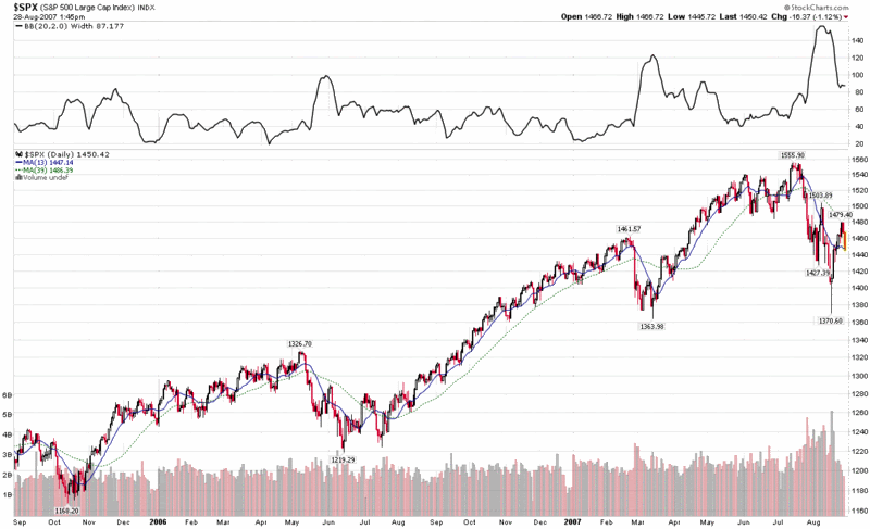
Using S&P 500 index data going back to 1962, Easterling notes that when the average daily range (in percentage terms) of the S&P 500 is lowest, it corresponds to a higher likelihood of monthly gains in the index. So…calmer waters make for easier sailing.

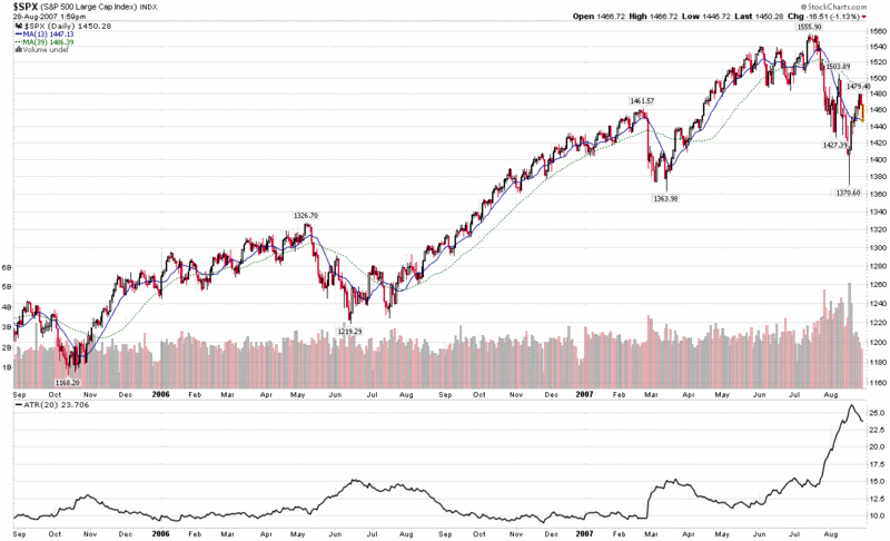
A quick and dirty way to monitor these types of opportunities is with a 20 day Average True Range or 20 day Bollinger Band width indicator. As you can see from the charts below, both ATR and BB width provide an excellent means by which to evaluate market volatility graphically, with fairly reliable and easily measurable signals of volatility extremes, not unlike the information provided by the VIX.


Monday, August 27, 2007

Another Look at the VIX:SDS Ratio

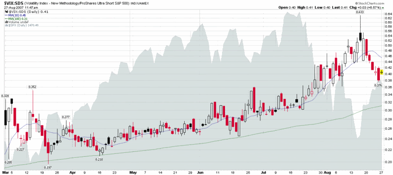
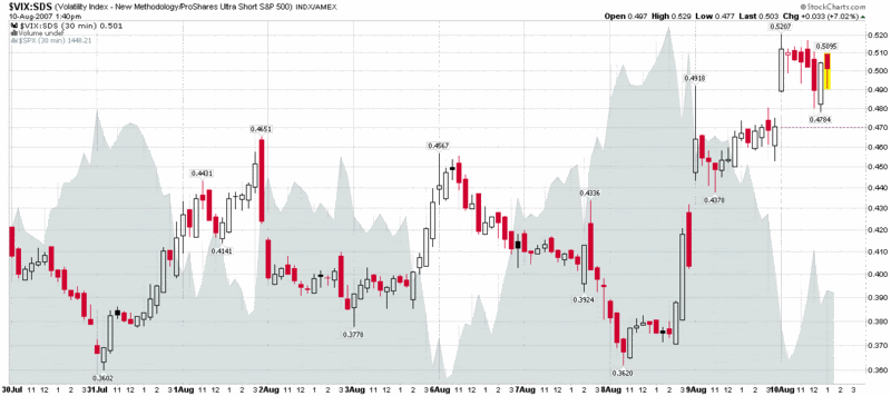
Back on August 10th, when the markets were testing the first set of lows, I toyed with several indicators that I thought might help me better separate fear from volatility. I published a 10-day chart of one of those, the VIX:SDS ratio.

I have been keeping an eye on this ratio during the past 2 ½ weeks and noticed that the extreme reading of .633 it did an excellent job of flagging the recent market bottom. I am still not sure how useful the VIX:SDS ratio may be going forward, but I thought a six month chart might be interesting analytical fodder for those who like to contemplate such matters. As always, comments are welcome.

As a quick reminder, SDS is an ETF that is intended to track at 2x the inverse of the SPX. More information is available from ProShares.

Portfolio A1 Appears to Find a Bottom

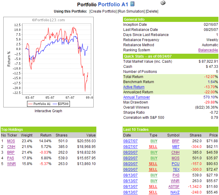
After four weeks of performance that you wouldn’t want to be downwind of, it seems appropriate that it took a new addition to the portfolio – and a fertilizer company at that – to turn around Portfolio A1. The fertilizer company, Mosaic (MOS), surged 14% last week, while the other portfolio newcomer, agricultural equipment maker CNH Global (CNH) posted a weekly return of 5.7%. For now at least, the agricultural theme is working.

The aggregate portfolio statistics are still on the ugly side, with the portfolio down 12% since the February 16th inception, well behind the benchmark S&P 500’s 1.6% gain during the same period. With a Sharpe ratio of -0.72, a winning percentage of 36%, and a maximum drawdown of 29.9%, one has to look long and hard to find a silver lining in the portfolio’s performance. Still, I will ride this portfolio out through the end of the year, at which time I will introduce a new portfolio with a strong discretionary component, as I outlined last week.

This week Portfolio A1 swaps BRIC telecoms by saying goodbye to Moscow-based Mobile TeleSystems OJSC (MBT) and replacing it with Brasil Telecom Participacoes (BRP), an ADR that the discretionary trader in me likes a great deal. There are no other changes to the portfolio this week.

A snapshot of the portfolio is as follows:

Sunday, August 26, 2007

Historic Weekly Drop in VIX; VWSI at +2

Last week I toned down my prose a little by noting “we have almost surely seen a top in volatility” and declaring “there is finally evidence that the laws of gravity have been reinstated, at least temporarily.” At least I didn’t hold back in my forward-looking commentary:
“I suspect most pundits will wait until after Labor Day before declaring that it is safe to go back in the water, but I tend to think that excessive caution will likely result in missing out on the first big leg of a post-panic bounce.”

One week does not mean it is safe to announce the resumption of the bull market, but clearly quite a few big players were caught leaning the wrong way as stocks moved up. Starting with the VIX, we saw a record drop of 30.9% from 29.99 to 20.72. This eclipsed the previous record weekly VIX drop of 28.4%, which came in March 1991, just after the end of the Gulf War. In retrospect, this also turned out to be an excellent time to go long the broad markets and short volatility.

The record drop in the VIX has pushed the volatility indicator into a deeply oversold level on a short-term basis, while it continues to remain overbought on a long-term basis. Check out Ron Sen’s blog, Technically Speaking, for a chart of the VIX relative to its 10 and 200 day SMAs. How does the VWSI sort out this divergence? By siding somewhat with the extremes of the short-term VIX readings, where a reading of 31.6% below the 10 day SMA has only happened three times previously (1/91, 3/91 and 12/98.) The bottom line is a VWSI of +2, which is slightly bullish for the VIX, but technically still neutral enough as to preclude a formal directional recommendation.

In the event I fail to blog about this tomorrow, it is also worth noting that the ISEE is flagging record levels of skepticism as well. Readings for this sentiment indicator have been extremely low for the month of August; and an ISEE of 95 of lower tomorrow will mean a new record in the 20 day SMA for this indicator – and contrarian bullish support for a continued bounce in the markets.

It’s no fun being just another cinder block in the wall of worry…

(Note that in the above temperature gauge, the "bullish" and "bearish" labels apply to the VIX, not to the broader markets, which are usually negatively correlated with the VIX.)

Wine pairing:
For the second week in a row, I find myself happily recommending a classic Spanish varietal. This time around it is albarino, also known as alvarinho in Portugal. Albarino is an excellent summer wine, with a zingy citrus delivery that will remind some of the best of Oregon’s pinot gris. Don’t limit albarino to just one season, though, as it has enough weight and body to be an excellent year round wine, with the high acid content making it an excellent food match. Albarino thrives in Rias Baixas region in northwest Spain. If you find yourself in a chardonnay rut – or even if you don’t – sample whatever your local wine store has to offer. My local wine store has a Burgans Albarino for $10. I am a big fan, as are the folks at winefoolery and elsewhere.

Finally, if you want to have some fun and learn about albarino at the same time, I recommend you watch the upstart Gary Vaynerchuk at Wine Library TV taste four albarinos. (If you really want some over the top wine-related entertainment, watch Gary teach Conan O’Brien how to train his palate.)

Friday, August 24, 2007

Drilling Down on Sector Performance

Yesterday I talked about sectors in the context of the nine AMEX Select Sector SPDRs. While these are excellent high level buckets for analyzing macro sector performance, when you lift the hood on these SPDRs (click on any one for details), you jump down to the individual stock level, without the benefit of sub-sectors to analyze.

Fortunately, there are many other excellent free resources where one can drill down on sector performance. Four great places to start are:

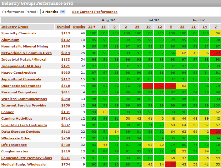
I should probably devote an entire post to Prophet.net, which does many interesting things with sectors. The tools I find of particular value are sortable performance for 214 sectors from 2 days to 5 years; and historical sector ranks from 3 months to 5 years in a helpful graphical format (see below), complete with a drill down capability that pops up the charts for all the individual stocks in a particular sector. Also, from the I-just-couldn’t-help-myself category, while the pull down menu only allows for a minimum historical performance of 3 months, if you manually edit the URL, you can produce some interesting charts for shorter time frames. For example, where the URL for the 3 month graphic ends in “…period=3m” it can be edited to “...period=1m” to generate a particularly interesting one month historical chart. Try it!


MarketGauge.com has an industry group summary that is an excellent graphical tool covering multiple time frames, but also offers four fundamental analysis options for analyzing the top and bottom sectors. I particularly like a feature they have that highlights the stocks driving the strongest/weakest groups higher and a perhaps even more valuable leading stocks in today’s top groups page that includes fundamental data and charts on one handy page.

For a different take on sector performance and momentum, you might want to try ETFInvestmentOutlook.com. Two of their features that I get the most use out of are the McClellan breadth ETF rankings and the high-low breadth ETF rankings.

In addition to the above, there are a number of interesting sector-related heat maps available, including two sites of particular note:

Finally, in the event that you have not been there in awhile, Yahoo has beefed up their Industry Center a little. A good place to start surfing there is in the leaders and laggards section.

Thursday, August 23, 2007

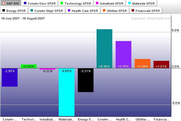
What’s Working? A Sector Overview

Now that the broad indices have pulled back 10% or so and retraced about half of that drop, it is a good time to evaluate what is working in the current market environment.

One of the first places I look for clues is in sector and industry performance. With ETFs it is now possible to take the temperature of just about any micro-segment of the market you can think of, but for today I will stick to broader market segments.

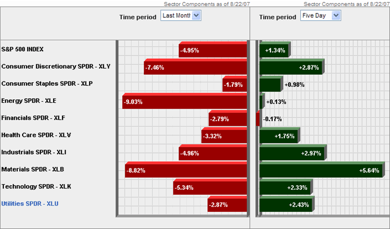
Looking at the peak to trough from July 19 to August 16, you can see that it is the materials sector (XLB) that suffered the most dramatic losses, dragged down by WY, IP, AA and the like.


In the five days since the market has bounced, the materials have been leading the bullish charge, with energy and financials lagging. Given the change in expectations about interest rates, it is not surprising to also see that utilities have had a much better week relative to the past month than the other sectors.


Going forward, look at the relative performance of materials, industrials (XLI) and technology (XLK) to provide some clues about global economic conditions and consumer discretionary (XLY) vs. consumer staples (XLP) to tell us something about the health of the consumer. If energy (XLE) and financials (XLF) can also start to rally, this may help us to discern the difference between a short-term bounce and the resumption of the bull market.

Wednesday, August 22, 2007

Which Gravity?

In my seemingly never ending quest to litter this space with obscure and occasionally relevant VIX trivia, I have today come across some numbers that I find particularly interesting.

First, let me point out that the VWSI is currently back to reading an even zero, with neither a bullish nor bearish bias. Part of the reason for this neutral reading is the current deadlock in the gravitational tug of war between short-term and long-term mean reversion. Not only that, but in the 17 year history of the VIX, the current 15% under the 10 day SMA and 43% over the 100 day SMA is the largest ever divergence between these two indicators. The question, of course, is whether the gravitational pull of the 10 day SMA (not pictured) will win out over that of the 100 day SMA – or even whether one mean reversion magnet will get the upper hand going forward.

For market historians, there are two instances of possible historical precedent which may be of interest.
In the end of July 2002, we had the largest previous divergence, with the VIX 17% under the 10 day SMA and 32% over the 100 day SMA. This set of circumstances followed the WorldCom bankruptcy filing and came close to signaling the bottom of the 2000-2002 bear market. In fact, in the days leading up to this divergence, the VIX fluctuated wildly to a peak of 48, then dropped to 31 just three days later. Within a week following the maximum divergence, the VIX was back over 45 again; and it remained elevated over the course of the next two months as the markets finally confirmed a bottom.

There is some similar historical precedent in the wake of 9/11, during which period the VIX hit 49, then dropped to 31 five days later, resulting in a VIX 16% under the 10 day SMA and 33% over the 100 day SMA. What followed was a temporary market bottom and VIX readings that went sideways for about five weeks, then began to subside for about nine months, before the July 2002 craziness noted above kicked in.

I am not sure what to conclude, if anything, about the historic divergence at present, other than it is the almost inevitable residue of an unprecedented VIX spike. In a few weeks we will all know whether the liquidity/credit crunch has swallowed up one or more of our trusted financial institutions or, as is usually the case, if investor fears just got a little too far ahead of the reality.

Tuesday, August 21, 2007

VIX:VXN Ratio Extremes

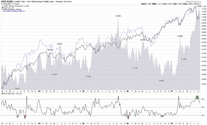
Earlier this morning, Adam Warner at Daily Options Report posted a chart and commentary about the VIX:VXN ratio, which volatility groupies will recall compares the implied volatility of the S&P 500 to that of the NASDAQ 100.

The interesting factoid is that the VIX:VXN ratio is at an all-time high, which the chart below highlights (while the VXN was launched by the CBOE in early 2001, StockCharts.com only has VXN data back to February 2003.)


The key question is why the VIX:VXN ratio is printing such extreme numbers at the present. Adam concludes the following:

“Best guess is that there's a perception out there that tech is relatively *safe* now. And I suppose it is given that it's not the focus of the periodic poundage.”

This take makes a lot of sense, as various ratios of technology stocks to financials (e.g., XLK:XLF and XCI:XBD) reflect that the current environment is one of those rare instances where technology is considered less risky than financials.

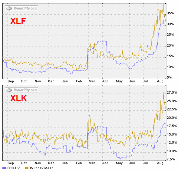
A look at two SPDRs tells the story even better, in my opinion. XLF, the financial sector SPDR (XLF top holdings), shows a 160% spike in IV from mid-June, while XLK, the technology sector SPDR (XLK top holdings), shows an IV spike of about 120%. Even more interesting, at least to my eye, is that following the February 27th VIX spike, XLK retraced all of its IV spike, while XLF only retraced half of that spike before starting to rise in mid-June. Was the half-hearted XLF implied volatility spike retracement in March through June a warning of what was lurking under the surface? For those who may be interested, of the nine AMEX Select Sector SPDRs, four of the sectors – financials, consumer discretionary (XLY), industrial (XLI), and utilities (XLU) – did not retrace their February IV spike; and these sectors do not correlate with relative sector performance over the past month.


Monday, August 20, 2007

Can the VIX See a Year Out?

Even before Adam Warner and I were humbled in our attempt to forecast the VIX one month out, I have been slow to warm up to the predictive value of the VIX looking out more than a month or two – all of which makes Eric Boughton’s “The Predictive Value of the VIX: Room for Divergent Opinions” particularly interesting reading.

First, the bad news: Boughton concludes that “knowing what the VIX is today is not likely to give you any aggregate useful information about whether returns will be high or low over the next year.” The good news is that the VIX does a reasonably good job of predicting future volatility over the course of the next 12 months.

While Boughton’s target time frame of one year may not be the best way to test the predictive value of the VIX, the tidbit I found most interesting was tucked away at the bottom of Boughton’s article, in which he notes that “buying the S&P on every day the VIX exceeded 30, and holding it for a year, resulted in an average return of 17.15% (as compared to the average return of 10.28% available for all twelve-month periods during the period in question).” His conclusion? Even if there is no correlation between the VIX and one year returns, “the market seems to pay an outsized return in exchange for the risk of buying when fear is high.”

My thinking continues to be that middling values in the VIX are generally not worth talking about. In the end, it is VIX spikes and mean reversion that matter most – and those factors are easiest to predict over the course of about 5-10 trading days.

Ticker Sense on VIX Spikes

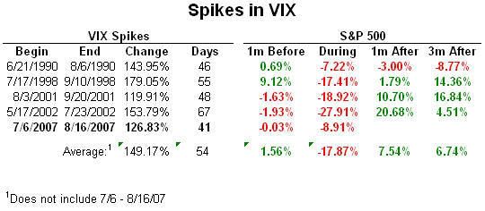
This morning Ticker Sense published an analysis of the four previous instances where the VIX has risen more than 100% in a three month period.

Among their findings is that the greater the drop in the SPX during this period, the greater the rebound in this index during the following month, as shown in the following chart, which is courtesy of Birninyi Associates / Ticker Sense:


An even more interesting finding – and one consistent with the capitulation theory – is that in each of the five instances (assuming last week’s VIX spike will turn out to be the top this time around), the largest move in the VIX came during the last 20% of the VIX run-up period.

Portfolio A1 Looks to Ag to Stop the Bleeding

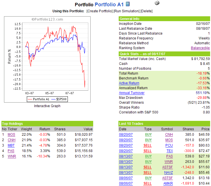
The big story for Portfolio A1 is the recent drawdown, which is now registering a peak to trough drop of 29.7%, approximately triple that of the S&P 500 index benchmark. Since its inception (2/16/07), Portfolio A1 is now down 18.2%, vs. a 0.7% drop for the S&P 500.

Clearly, this has not been the place to have your money during the liquidity crisis – and the performance of this portfolio has given me a fair amount to think about. First of all, I usually have target drawdowns beyond which a portfolio or trading system automatically gets consigned to the trash heap. As I am an aggressive investor, the drawdown threshold usually falls in the 30-40% range. With Portfolio A1 now hugging the 30% drawdown line, I am tempted to shut it down. The question, however, becomes what to replace it with or whether to even bother with this portfolio feature on my blog. Here is my thinking at the moment: I will keep Portfolio A1 up and running until 1/1/08 or it reaches a 40% drawdown, whichever comes first.

Starting 1/1/08, I will unveil a new portfolio that is a hybrid between an automated system like Portfolio A1 and a discretionary system. As a result, it will incorporate more of my contemporaneous thinking about the markets and about individual stocks. It should also be a portfolio for which I feel greater ownership and accountability.

I toyed with a bunch of other ideas about what to do with this space on the weekend, but I kept coming back to my desire to highlight a specific portfolio and specific stocks. I look forward to the transition and hope that in the remaining 4 1/3 months, Portfolio A1 can regain some respectability.

Note that Portfolio A1 has finally decided to drop former high fliers Terex (TEX) and Southern Copper (PCU), replacing them with two companies with a strong agriculture component: Mosaic (MOS), a fertilizer company; and CNH Global (CNH) a Dutch manufacturer of agricultural and construction equipment.

A snapshot of the portfolio is as follows:

Sunday, August 19, 2007

Normalcy Again? VWSI at -4

In spite of Warren Harding’s calls for a return to “normalcy” back in 1920, Americans – investors or otherwise – ended up with a decade that was anything but normal.

With the VIX a hair under the magic 30 barrier and Hurricane Dean taking aim at the Yucatan instead of the Texas refineries, we have almost surely seen a top in volatility. That being said, the VIX managed to close up on a weekly basis for the fifth time in the past six weeks, finishing the week at 29.99, up 6% (1.69) from the previous week. Is normalcy really just around the corner? My guess is that it is not too far away. The new high water mark in the VIX is now 37.50, which is the highest reading since October 2002, when the markets were just beginning to bottom, before turning up for the current five year bull run.

The VWSI continues in uncharted waters at -4 this week, but with the VIX already 25% off of the 37.50 spike top, there is finally evidence that the laws of gravity have been reinstated, at least temporarily. As the graphic below shows, the VWSI is now mildly bearish on the VIX, with mildly bullish implications for the overall markets. If you consider the strong possibility that the markets can no longer dwell on options expiration, a Fed with it’s head in the sand, or Hurricane Dean threatening the Texas-Louisiana oil infrastructure, then I suspect the coming week will more likely bring bullish surprises than bearish ones, especially given that it is a relatively slow week on the government data front.

I also suspect most pundits will wait until after Labor Day before declaring that it is safe to go back in the water, but I tend to think that excessive caution will likely result in missing out on the first big leg of a post-panic bounce.

(Note that in the above temperature gauge, the "bullish" and "bearish" labels apply to the VIX, not to the broader markets, which are usually negatively correlated with the VIX.)

Wine pairing: A VWSI of -4 comes along only a couple of times each year, so it is a good excuse to get off of the beaten varietal track. Also, it never hurts to diversify one’s portfolio internationally. With those thoughts in mind, I am recommending some tempranillo for a VWSI of -4. Tempranillo is the classic Spanish red grape that has long dominated the wine scene in Rioja and Ribera del Duero.

Americans looking to dive into tempranillo should recognize that the grape is not widely planted in the US and focus instead on Spain, which remains the center of world class tempranillo. For a good introduction to the grape and some affordable entry level recommendations, try Spain’s Early Ripener by Blake Gray in the San Francisco Chronicle. Considering that Spanish tempranillo is comparable in quality and stature to an Italian Super Tuscan, a French Bordeaux, or a American cabernet sauvignon, you should also be amenable to higher price points. Some excellent places to get ideas about premium tempranillos include the 2007 Shanghai Tempranillos al Mundo awards, the San Francisco Chronicle wine competition awards, and the tempranillo tasting notes on Cellar Tracker.

To read more about what is going on with this grape in Spain, I encourage you to check out Tempranillo, a blog about the Spanish wine industry.

Friday, August 17, 2007

How Healthy Is the Rally?

I don't have much to add to what has already been said about today's rally.

For what it's worth I am watching three indicators in particular to gauge the health and longer term potential of this rally:
XBD -- broker/dealer index (to a lesser extent XBD:SPX, GS, BSC, BKX, CFC, etc.)
RUT -- Reuters 2000 Small Cap Index (also RUT:SPX)
EEM -- iShares MSCI Emerging Markets (also EEM:EFA)

Right now, all three indicators are outperforming the broad market indices, so I feel as if the rally is on good footing. My biggest concern coming into the day was that would be traders worried about Monday's headline risk, but the longer the indicators noted above continue to do well, the less pressure there will be on the system.

For a little while earlier in the day the markets and the VIX were both up, as fear lingered in the face of a weekend of uncertainty, but for now, the fear component of the VIX seems to be slowly dissipating.

Before I finalize my positions going into the weekend, I will take one last look at Hurricane Dean.

Thursday, August 16, 2007

How Does the Recent VIX Spike Compare?

Frankly, it doesn’t:

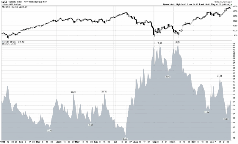
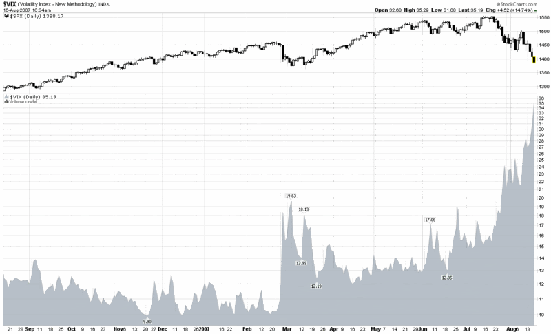
2007 vs. 1998 or Subprime vs. LTCM

Those who were active in the markets in 1998 and anyone who is a student of the markets should be asking themselves how the current subprime mortgage mess compares with the Long-Term Capital Management failure of nine years ago.

If you haven’t already read Roger Lowenstein’s excellent When Genius Failed: The Rise and Fall of Long-Term Capital Management, it isn’t too late to do so. Among the events that Lowenstein recounts is the merciless squeezing of LTCM’s positions by Goldman, Salomon and others, activities that may have strong parallels to some of what is going on behind the scenes right now.

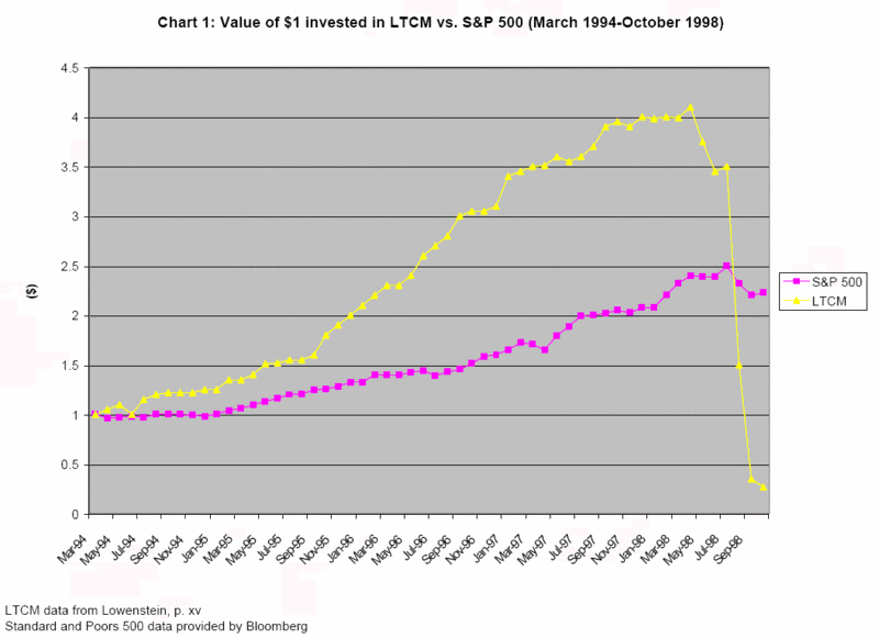
The purpose of today’s comparison is to contrast the magnitude of the volatility triggered by the failure of LTCM to what we have seen in the last two months. Keep in mind that according to Lowenstein, LTCM’s capital peaked in April 1998, as shown in the graphic below from Siddharth Prabhu, who utilizes Lowenstein’s data.


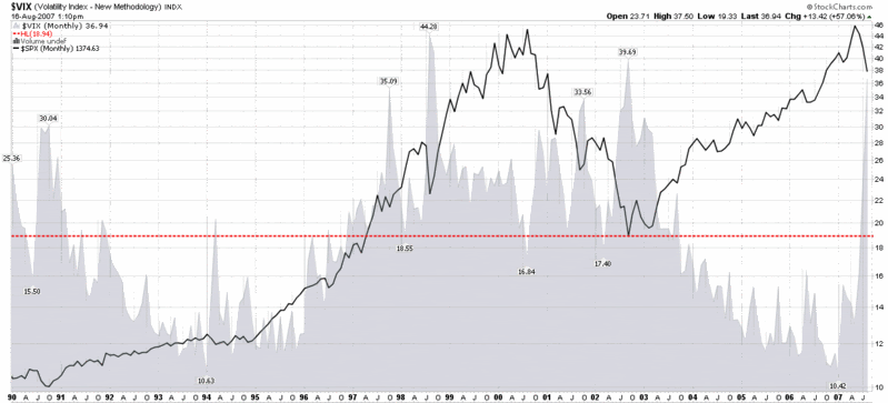
As the graph of VIX and SPX from 1998 toward the bottom demonstrates, LTCM’s small losses from April to July have very little impact on the markets, but as the losses grow (and the Russian financial crisis widens), the VIX nearly triples over the course of two months, while the S&P 500 loses approximately 20%. For more historical context, note that by the end of the year the SPX had recovered all of those losses and moved higher, while the VIX returned almost to the pre-crisis lows.

How does the current situation stack up? Looking at the chart at the bottom, once again, the VIX has almost tripled in two months (doubled in one month), while the SPX has lost closer to 10% of its value. For comparative purposes, this means more fear in the current situation, with less in the way of financial losses – at least at this stage.

With LTCM and Amaranth already in the books, you would think that those who are in a position to avert another similar crisis would be in a better position to do so. Keep an eye on the comparisons to 1998 going forward and don’t be so quick to conclude that this time it will be worse than it was nine years ago.


Wednesday, August 15, 2007

Hurricanes and the VIX

Lest anyone wonder, I was absolutely kidding when I decided to append the “Your one stop VIX-centric view of the universe…” tagline to this blog when I created it. That doesn’t mean, however, there might be more than a little truth embedded in the tagline.

I had planned to talk at considerable length about hurricanes and the VIX during the past month, recognizing that August is when tropical activity typically kicks in to high gear. Given all the non-weather volatility we’ve had, it looks like I’m going to need a lot more back burners to hold all those boiling pots.

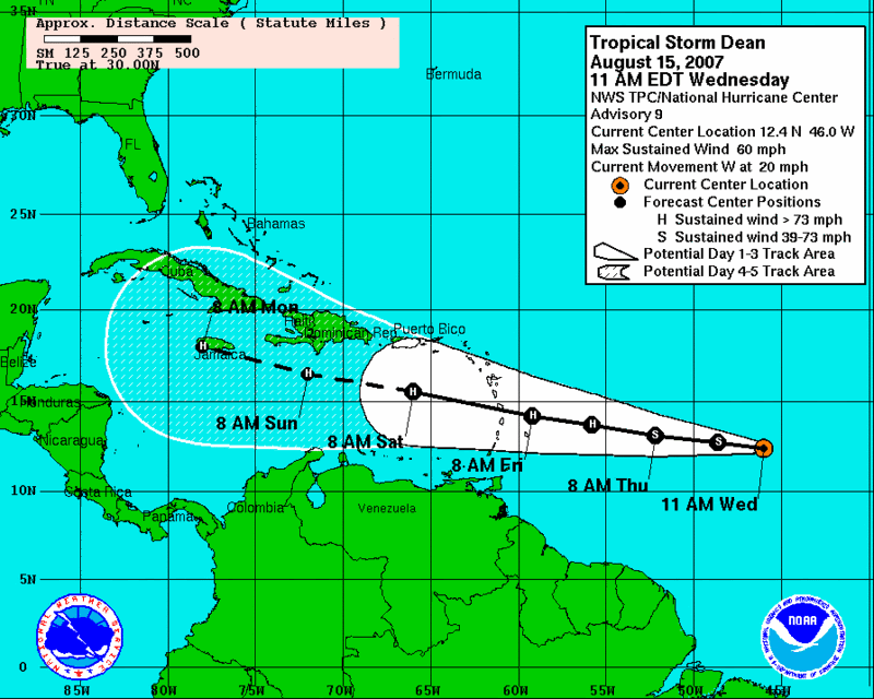
Speaking of which, we now we have tropical storm Dean bearing down on the Gulf of Mexico, apparently destined to become a hurricane force storm in the next 24 hours. I have included the current computer consensus path in the graphic below, but consider that the breadth of the ‘projected path’ is about 650 miles wide 5 days out before you start to draw any conclusions, then remember how fraught with uncertainty these projections can be.

As Dean approaches, I will opine more about the potential VIX and oil-related trades (I’m going to keep it simple and skip the insurance and other aspects of this gambit) that are possible with oncoming hurricanes. Keep in mind that while New Orleans is the landfall site that is most likely to garner the most press, there is a high concentration of refineries that span the Texas and Louisiana coast. If you want more detailed refinery information in map form, check out where the major vulnerabilities are in Texas and Louisiana. You want odds? Check out the probabilities table provided via Dr. Bob Sheets and Jack Williams in Hurricane Watch: Forecasting the Deadliest Storms on Earth.

Interested in a tool for viewing and evaluating hurricane tracks? Try the NHC archive of hurricane seasons.

Finally, consider that unlike most financial storms, the duration of the disruption caused by a hurricane strike is fairly easy to predict, which makes mean reversion plays all the more attractive. This is something to think about, anyway, as Dean whips up fears that will likely be out of proportion to the probabilities times the magnitudes of the various possible scenarios.

Tuesday, August 14, 2007

Watching the Broker-Dealer Index (XBD) Closely

...to see if the recent 208 low holds.

Touching Base with the PCEVXO

Given the current state of volatility, many market participants believe that the while the volatility indices are printing some extreme numbers, these are somewhat mitigated by the rather mild moves in various put to call ratio data.

Of course, it depends upon which data you are looking at. If you examine at the CBOE’s equity put to call ratio, you see that equity put volume set a new single day record back on 7/26 and the ratio itself peaked on 8/1. The ISEE shows more persistent put buying that did not peak until 8/7.

I have previously mentioned the PCVXO in this space, an index developed by Jay Kaeppel that combines the put to call and volatility data into one aggregate indicator. While I have no problem using the VXO, which is highly correlated to the VIX (as the OEX is to the SPX), I prefer two alternatives to Kaeppel’s recommended put to call ratio. Kaeppel uses the total put to call ratio, while I strongly prefer the CBOE’s equity put to call ratio or the ISEE. For the sake of clarity, I will refer to my refinements of the PCVXO as the PCEVXO and ISEEVXO, respectively, going forward.

Enough with the nomenclature. What are these indicators telling us?

Looking at the PCEVXO, it printed an all-time high on 8/6 and has been extremely overextended ever since, resulting in a very strong bullish signal for the markets. Not surprisingly, the VXO component of that indicator set new records on 8/9, 8/10 and 8/13. For comparison purposes, the PCE portion of the indicator set a new record on 8/6 and has been dropping slowly ever since. Interestingly, given the magnitude of the VXO readings, the divergence between the record VXO and merely very high PCE has also been at an all-time high for the last two sessions. As discussed back in May, when there is a strong divergence, this is also a bullish signal.

In summary, while you should never ignore all the red numbers on your screen, volatility and put to call data indicate that the current situation is the best contrarian buying opportunity during the four years for which there is PCEVXO data. That being said, stops and protective puts are always a good idea, particularly in skittish markets.

I suspect that those who are profiting from fear and panic can keep up the negative news flow through Friday’s options expiration. After that, the back to school sale should be over.

Monday, August 13, 2007

Commercials Get Long the VIX in a Big Way

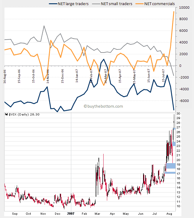
The chart below comes from BuyTheBottom.com and reflects positions from the Commitment of Traders report published last week. If you are not familiar with these reports there is no good short explanation I can offer, other than to pass along that conventional wisdom sees the commercials as the smart money in this equation. Their record is not great, but their positions generally have better predictive value regarding the future of the VIX than that of the large traders or the small traders.

I do not put a great deal of stock in the COT data, so I am posting the chart largely for informational purposes. Even if you don't agree with a dissenting opinion, it is important to pay attention to it, particularly if others do. Finally, if the commercials are correct, it looks like we have a category 5 volatility storm headed our way.

VIX and 100 Day SMA

I usually speak of mean reversion in terms of the distance the VIX is away from its 10 or 20 day simple moving average. These are high percentage plays with a good bit of statistical data to support a mean reversion trade.

With all the volatility of the past three weeks or so, the SMA that is getting my attention right now is the 100 day SMA, where the VIX sat 85.2% above the 100 day SMA of 15.28 as of Friday’s close.

This is not quite unprecedented, but since 1990 there have been only 13 trading days – several of which have been clustered together – in which the VIX has closed 80% or more above its 100 day SMA. Without an exception, these have all been excellent times to predict a VIX reversal, as the minimum VIX contraction 50 trading days later has been 18%. Specifically, the mean VIX contraction is 16% in 3 days, 20-21% in the 5/10/20 day period, and a whopping 33% some 50 trading days out.

Given that VIX options still have 8 trading days left for the current cycle, I suspect that the August 25 puts would be a good play, thought the 22.50s probably deserve some attention as well.

Can this gravity defying dance really continue for another week and a half? I’m betting against it.

Sunday, August 12, 2007

Portfolio A1 Losing Altitude Quickly

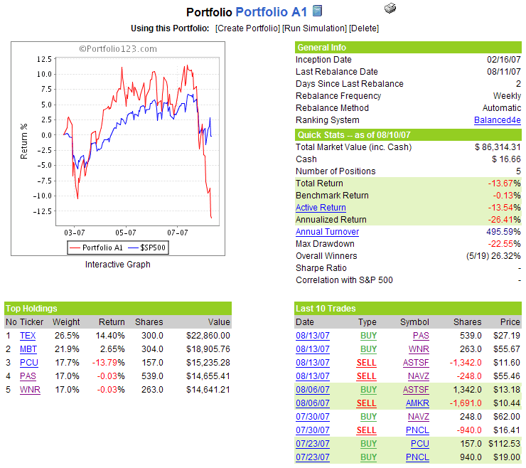
First, an apology. Last week I was on vacation and made a best efforts attempt to keep the information for Portfolio A1 current. As you can see from the transaction log below, I posted an ‘update’ of the portfolio too soon and missed the signal to sell Amkor Technology (AMKR) and replace it with AST Test Limited (ASTSF), the Taiwanese semiconductor testing company.

As it turns out, ASTSF lasted only one week in the portfolio and is being dropped along with Navistar International (NAVZ) in an effort to find a way to stop the bleeding.

The task of propping up the portfolio falls to Western Refining (WNR) and PepsiAmerican (PAS) – two relatively conservative plays that appear to be ideally suited to minimizing further downside risk rather than maximizing any gains from a bounce.

In the meantime, the equity curve tells the story of the damage. The total return is now -13.7% and the peak to trough drawdown currently sits at -22.6%. This will be a very difficult hole to dig out of, but I still like the long-term performance characteristics of this portfolio and have no intention of cutting the portfolio off without at least a year’s worth of performance statistics from which to learn some lessons.

A snapshot of the portfolio is as follows:

The Gravity Defying Dance Continues: VWSI Remains at -9

Last week I talked about how the VWSI was in uncharted waters. Given the events of the past week, I might as well rip up the charts. The current waters can’t be any more uncharted than the financial environment can be ‘more unique,’ but let’s just say that the gap between the historical record and the current situation has widened considerably in the past week.

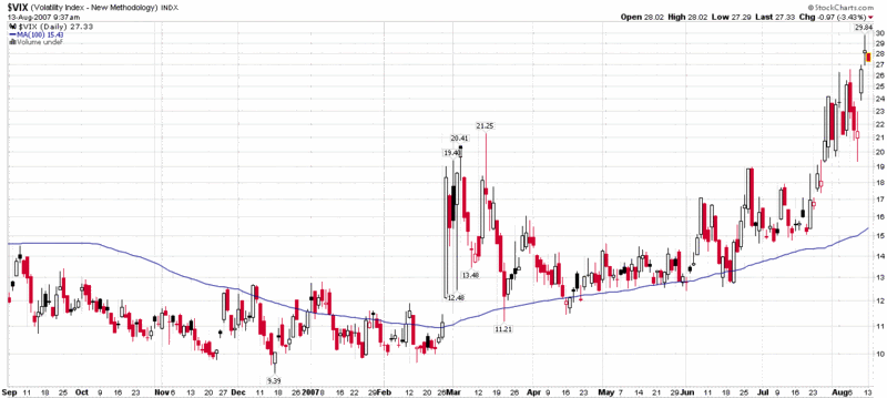
From a numbers perspective, the VIX jumped 17.2% for the week, moving up from 24.15 to 28.30 and now stands 92% above the close from just five weeks ago. With the futures pointing to a rally tomorrow morning, Friday’s high of 29.84 may turn out to be the high water mark in the VIX for the current upward cycle, but this is by no means guaranteed.

The VWSI finished the week at -9 and now has an almost unthinkable three week stretch of -10,-9, and -9. By comparison purposes, the only other three week stretch of significant negative VIX readings was at the height of the Russian financial crisis in August-September 1998, where the VWSI logged consecutive end of week readings of -6,-8, and -4.

I will have more to say about the uncharted waters of the VIX tomorrow, but suffice it to say that I will be all over VIX puts when the market opens.

(Note that in the above temperature gauge, the "bullish" and "bearish" labels apply to the VIX, not to the broader markets, which are usually negatively correlated with the VIX.)

Wine pairing: Unusual times mean unusual wines. I continue to recommend carmenere as an appropriate pairing for a VWSI of -9. Last week I recommend a Concha y Toro 2003 Terrunyo Carmenere as well as some of the favorite carmeneres listed at Cellar Tracker. For those curious about what American wineries are doing with this rare varietal, I encourage you to read about Dover Canyon’s efforts. I will do my best to see if I can find a bottle of their carmenere so that I can report on it the next time the VIX tries a moon shot.

Friday, August 10, 2007

Fear vs. Volatility

Astute observers may have noticed several instances over the past few days where VIX tops and market bottoms have parted company. Part of the reason for this is that the fear component of the VIX has recently grown large enough that it has sometimes overshadowed the volatility component. We have a lot of volatility at the moment, but we have more fear than we have seen in a very long time.

It is difficult to decompose fear and volatility by looking at charts, but one worth examining is the ratio of the VIX to the SDS, which is the 2x inverse ETF of the SPX. The graphic below is a 10 day chart with 30 minute bars, with the SPX behind it in gray. It shows the type of mirror image you would expect between volatility and market movements up until the latter stages of Wednesday’s session. From that point on, the formerly predictable negative correlation becomes significantly muddier, to the point where today’s session shows the ratio way out of proportion to the market downdrafts.

Some of this decoupling is clearly traders buying puts to protect themselves against Monday’s headline risk, but I do not believe this is the entire story. As the markets have rallied during the course of the day, the VIX to SDS ratio has remained stubbornly higher, suggesting that the fear component of the VIX may now be the tail wagging the volatility dog. I will see if I can do a better job of coming up with graphical data to support my contention, but you can now see and feel the fear in the markets, even if it is not that easy to isolate it in the charts.

Thursday, August 9, 2007

A Different Way to Look at the VIX: 1999-2007

Sometimes just turning something upside down can help us to understand it. Anyone who has ever tried the techniques in Drawing on the Right Side of the Brain knows exactly what I am talking about.
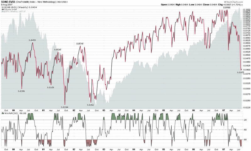
The same applies to charts. If a stock looks like a buy on the charts, would you sell it if the chart were inverted? What if I were talking about an index?

Enter the VIX.

If you want to use the VIX to help determine when it is a good time to be long or short the markets, one of the best things to do is to invert it, as I have done in the graphic below. Here you can see that from 2003-2007 the buy on the dip strategy has worked well with both the SPX and the inverted VIX, with the bigger dips providing the bigger opportunities. This should come as no surprise, as in long bull markets any strategy that relies on buying the dips is almost guaranteed to be successful. The larger question is how to distinguish the dips from the extended bear markets.

To help think about this question, I have included the 1999-2003 data, which generally show the dips to be good buying opportunities in the 1-3 month time frame, but subject to the gravity of the bear pull over the longer term.

One other aspect of this chart bears mentioning: if you want to think of the VIX as a fear gauge, it is indicating that current fear levels are on par with that of 2001-2002.

Until further notice, I am still in the contrarian bull camp.

Wednesday, August 8, 2007

Two Interesting Perspectives on the VIX

In my scramble to get caught up with what others have been saying about the markets, two VIX-related posts in particular have captured my attention.

It should come as no surprised that one of them comes from Bernie Schaeffer, a regular in this space, whose "Examining Sentiment in the Context of a Market Pullback" concludes:

"Pullbacks to support levels in a bull market when accompanied by climactic fear levels are almost always buying opportunities, and this diagnosis applies today. This does not necessarily mean today was the bottom, but it does strongly imply that it would be foolish to exit this market in response to the gloom and doom headlines."
I was also interested to see what Mark Longo, a long time contributor to Trader's Magazine, thinks of the VIX in the context of the current market. Writing for The Options Insider, Longo provides some interesting historical context for the VIX and wonders aloud if we are entering a new era of continued high volatility. Looking at some of the VIX options action, he points out that "the so-called 'smart money' is betting that the current volatility trend will continue, at least in the near-term." Siding with the smart money crowd, Longo concludes:
"...with oil and credit concerns looming on the horizon, it certainly appears as though the VIX may have finally awakened from its long slumber."
These are two perspectives are recommended reading, along with those of a dozen VIX-fluent bloggers:
...as well as others I'm sure I have accidentally overlooked.

Converging Milestones

After a little mini-vacation of sorts, I landed back in San Francisco just in time to miss Barry Bonds hit #756.
Now that I am back in my regular cockpit, I see that a couple of my own milestones are on deck.

The first of these is that according to Technorati, 98 blogs have linked to VIX and More in the seven months it has been up and running. Technorati's Authority number only looks back at a rolling six month period, so it may take a little longer for their official number to register triple digits, but I'll be counting down in the background with my own pro forma numbers.

The second milestone is the number of 'unique' visitors to the blog. There are many ways to count this and Sitemeter, whose widget I have on the blog, tends to be one of the more conservative visitor counters. Depending upon who is doing the counting, VIX and More has either recently surpassed 50,000 unique visitors or is just about to do so.

Finally, it is always nice to receive some subjective affirmation for some of the work I have put in and yesterday I received notice that VIX and More was ranked as one of the 'Top 100 Day Trading Blogs' at CurrencyTrading.net. While I do not consider myself to be a day trader, any list on which I appear sandwiched between Adam Warner and Pete Stolcers is going to put a smile on my face.

Thanks to all who have supported this blog and contributed to it in one way or another.

Tuesday, August 7, 2007

ISEE 10 Day SMA Dips Below 100

I have been traveling most of the day today (note to self: be sure to better distinguish between one and two day FOMC meetings before planning when to return from vacation) and managed to miss most of the market's action.

The first thing that caught my attention tonight, apart from the post-announcement bullish reversal, is the relatively rare occasion of the ISEE's 10 day SMA down below 100. With the exception of the first month of available ISEE data (October 2002), this has happened on only two previous occasions before:

  • August-September 2006 -- the beginning of a sharp bull move
  • March 2007 -- proved to mark an impressive bullish continuation

Count me firmly in the bullish camp for the moment and looking for a retest of some lows to confirm this sentiment.

Monday, August 6, 2007

Early Bottom Call

I'm calling a bottom here, with the NASDAQ having just hit 2492 and the SPX at 1427. I am notorious for calling bottoms early, but, then again, it's no fun calling them late.

Also, I have limited connectivity right now, so I won't get into the details of my thinking, but start with a VIX and ISEE that are about as extended as they get, then fill in the blanks in the bullish contrarian picture from there.

Of course, the big question should be whether this is just a delayed mini-bounce that I expect or a pullback bottom from the most recent tops. I'm going with a bottom -- though I wouldn't be surprised to see it retested.

Sunday, August 5, 2007

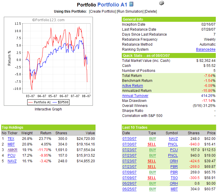
Portfolio A1 Slips as AMKR Guides Lower

Amkor Technology (AMKR), which fueled much of the gains in Portfolio A1 from February through June, guided third quarter revenues and earnings below analyst expectations on Tuesday, triggering a 21% loss in the stock for the week. Now down over 37% from the June high, AMKR’s slide has turned this former big gainer into a 12% loser for the portfolio and has contributed heavily to the portfolio’s decline in the past five weeks.

While this kind of news would automatically mean AMKR would be dropped from any of my discretionary trading systems, the stock Portfolio A1 ranker has not yet seen fit to drop AMKR [Edit: My error here. AMKR was indeed sold; please see 8/12/07 portfolio update for details.] Since the portfolio does not make any decisions regarding changes in holdings during the week, this means the stock has a reprieve for at least another five trading days.

Not surprisingly, the portfolio’s aggregate performance has turned ugly in the past week as well and now trails the benchmark S&P 500 index by 6.1%, the largest performance gap to date.

This is a highly concentrated portfolio of just five stocks, with an average beta that hovers in the 2.0 range, so large drawdowns always loom as a possibility. If the broader markets fail to rebound in the next week or two, it will be interesting to see how the stock ranking system culls some of the losers and where it chooses to reallocate capital. In the meantime, as indicated by the system’s rules, this portfolio will continue to remain on autopilot during the trading week.

A snapshot of the portfolio is as follows:

VWSI Still Holding at -9

In the 17 ½ years of VIX data, the VWSI has never managed register extreme negative reading two weeks in a row…until now. With the VIX spiking to 24.15 on Friday, down 0.02 for the week, the VWSI managed to end the week at -9, just one tick higher than the maximum -10 reading of a week ago. The old record for two consecutive weeks was a rather paltry sounding -6 and -8, which spanned the weeks ending August 28 and September 4, 1998, at the height of the Russian financial crisis.

So while a week ago I spelled out the historical context that argued forcefully for a mean reverting VIX drop this past week, clearly this week’s sideways movement represented another unprecedented turn of events for the VIX. In spite of this, I still anticipate that the VIX will shed some 15-20% in the coming week. If the VIX goes up again this week, then it is time to tweak the VWSI model and/or accept the fact that we are in uncharted volatility waters.

To put things in perspective from a VWSI standpoint, if the VIX holds steady this week, we will probably end the week with a VWSI of about -2. On the other hand, if the VWSI is to remain in the -9 to -10 range for a third consecutive week, it will take a VIX of at least the high 20s to pull that rabbit out of the hat.

(Note that in the above temperature gauge, the "bullish" and "bearish" labels apply to the VIX, not to the broader markets, which are usually negatively correlated with the VIX.)

Wine pairing: After two weeks of heightened volatility, I would be hard pressed to find fault with someone who is still drinking some of the ports from last week. A VWSI of -9, however, calls for a change of pace. What better change of pace then to turn to a varietal that was almost completely wiped out, only to stage a recent comeback over a century later on another continent. I am talking about carmenere, a grape whose rediscovery and revival in Chile is one of the great stories of the wine world. I was lucky enough to have an exceptional Concha y Toro 2003 Terrunyo Carmenere last year and it was one of the tasting highlights of the year. If you are looking for additional suggestions, see which other carmeneres have been getting rave reviews on Cellar Tracker.

Friday, August 3, 2007

Two Blogs to Read Every Weekend

Since I write to a largely anonymous audience, I have no idea what sources of information my collective readership relies on to make informed decisions about the markets. In less than a year of doing this, I find I now rarely bother with the print versions of the Wall Street Journal, New York Times, Investor’s Business Daily, etc. Increasingly, I find myself relying on almost 200 blogs, with Bloglines as my feed management tool to filter, sort, rank and present everything I think I might want to think about.

I do most of my macro thinking about investments and markets on the weekends, where there is enough white space in my life to worry more about strategy than tactics, planning than execution, and portfolios than individual holdings.

Yes I still read the New York Times business section on the weekend and I pick up a copy of Barron’s from time to time, but there are two blogs that consistently provide exactly what I am looking for each weekend – and a very different fashion. I assume most readers know about these blogs already, but in the event you do not, you owe it to yourself to check them out, weekends or otherwise.

The first blog is Bill Cara’s eponymous blog and it is as comprehensive a look at the investment world as I can manage in one sitting. Every week Bill boils the ocean and provides an excellent commentary and broad set of charts that cover just about every investment nook and cranny. Try his July 28, 2007 Week in Review on for starters, but don’t stop there.

An entirely different approach comes from Declan Fallon, whose work shows up in several locations, including his Fallond Picks blog. Declan surveys the landscape of the top chartists at StockCharts.com and cherry picks what he thinks are the most meaningful charts and associated commentary, covering a wide variety of topics. Check out the July 22 and July 14 installments of his weekly review of what others at StockCharts have been saying about the market.

If you make these two blogs part of your regular weekend reading, you could argue that the better first stop would be the broad brush strokes from Declan, followed by the more intensive drill down with Bill. Heck, go ahead and read Barron’s, IBD and the New York Times too. Just be ready with a plan and a couple of different scenarios to look for when the bell rings on Monday.

Thursday, August 2, 2007

ISEE in the 70s for the Last 2+ Hours of Trading

On the heels of an already low ISEE of 85 yesterday, this is fairly strong bullish contrarian evidence that most do not believe the current bounce has legs. Naturally, this skepticism raises the likelihood that yesterday's low will hold up going forward.

For the record, the post-2/27 crowd was much more gun shy when it came to buying calls following that VIX spike than the current market participants are following a stretch of nine volatile and bearish trading days.

The Aleph Blog on the VIX

I was fortunate enough to have been one of the first readers to stumble across The Aleph Blog, authored by David Merkel, and have a been a big fan ever since. Earlier this week, for instance, I linked to his ideas for reducing portfolio risk and for thinking about the Fed Model.

Today I am pleased to be able to recommend his thoughts on the VIX, which he began presenting in the last 24 hours. In what should be required reading for all VIX aficionados, David has (so far) laid out some of his thinking about this VIX as follows:

I have no idea how much more The Aleph Blog will have to say about the VIX, nor how often he will weave this subject into future writing, but I can encourage you to check out past and present posts, even if you are not one of those people who think the VIX may turn out to be the salvation of western civilization.

Wednesday, August 1, 2007

VIX (26.04) at 164% of 50 day SMA

This is not uncharted waters, but it is close.

If today is not a top in the VIX, I'd be shocked if the top is not in by the end of the week.

The Big Question for the VIX Is Not How High…

Even with the VIX climbing over 25.00 for the first time since early 2003, I don’t believe that the big question should be how high it is going right now. To my thinking, the more important question is how low it will sink once the current volatility storm has passed.
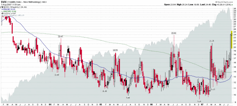
In looking at the weekly VIX chart below, keep in mind that the readings at the end of last year are at the very bottom of the range for the 17 years of VIX data. Also consider that many techniques used to evaluate stock charts have at best dubious cross application to the realm of volatility. I am, however, a believer in the usefulness of support and resistance for the VIX and believe a strong case can be made for the new post-spike VIX floor to likely settle in the 13-15 range. That number will undoubtedly seem high to those who are still mentally anchored in the recent experience of a sub-10 VIX. It will also probably seem low to those who see VIX futures trading around 21 all that way out to the June 2008 expiration.

This is exactly why I think the next floor is so important: it will either demonstrate that investors think it is safe to back into the water or tell us to expect the knee-jerk buying on the dips to be replaced by selling into rallies. If the new VIX floor settles somewhere above 16 or so, I suspect we will slowly see a substantial thinning of the bull herd.

Euronext Adding Three New Volatility Indices

Euronext, the European arm of NYSE Euronext, recently announced the creation of three new volatility indices: the AEX Volatility Index; the BEL 20 Volatility Index; and the CAC 40 Volatility Index. These indices will be calculated in the same manner as the current VIX methodology and will be launched on September 3, 2007.

Euronext has also historical data available for download for all three indices and has some summary information available for each index:

The three new volatility indices will compete with the VDAX, which is the incumbent volatility index of choice for the European markets and also a product of the Deutsche Börse.

It should come as no surprise that volatility products are proliferating in the US and across the globe, with volatility in the headlines as of late, demand for these products growing rapidly, and the battle for supremacy among the major exchanges heating up at the same time. I wonder, though, given that we already have a volatility index for the Frankfurt Stock Exchange, do we gain anything significant by adding new ones for Amsterdam, Brussels and Paris as well?

DISCLAIMER: "VIX®" is a trademark of Chicago Board Options Exchange, Incorporated. Chicago Board Options Exchange, Incorporated is not affiliated with this website or this website's owner's or operators. CBOE assumes no responsibility for the accuracy or completeness or any other aspect of any content posted on this website by its operator or any third party. All content on this site is provided for informational and entertainment purposes only and is not intended as advice to buy or sell any securities. Stocks are difficult to trade; options are even harder. When it comes to VIX derivatives, don't fall into the trap of thinking that just because you can ride a horse, you can ride an alligator. Please do your own homework and accept full responsibility for any investment decisions you make. No content on this site can be used for commercial purposes without the prior written permission of the author. Copyright © 2007-2023 Bill Luby. All rights reserved.
 
Web Analytics