Showing posts with label France. Show all posts

Tuesday, March 10, 2020

Looking at Coronavirus Cases per Million, by Country


Further to yesterday’s Coronavirus (COVID-19), post, Tracking the Trajectory and Peak of Coronavirus Cases, I want to make sure we are thinking not just in terms of the absolute number of confirmed cases, but also cases per million. 

The graphic below highlights the countries which have been hit hardest on a per capita basis.  Using this criterion, Iceland is the country where the coronavirus is most prevalent, followed by Italy, South Korea, Iran, China and Switzerland.  These six countries stand out as having passed an inflection point.  Given the data out of Western Europe in the past 48 hours, it appears as if Spain, Sweden, France and Denmark are not far behind.  The U.S. currently ranks 41st in terms of cases per million, with just 1/100th of the penetration in Iceland.

[source(s):  Wikipedia, VIX and More]

Assuming the distribution of new cases continues to trace a parabolic path, being able to reasonably estimate the terminal penetration rate – which will no doubt vary by country – could help to set expectations about the progress and timeline of new cases.

Finally, to follow up on yesterday’s post, I am now dating the first day of 100 new cases in the U.S. at March 7th.  Using the 8-14 day window for 100 new cases to peak new cases means the U.S. could see peak new cases in the March 15th – March 22nd time frame, with an outside shot of the peak extending out to March 29th.  Of course, this projection are merely an extrapolation from the experience in other countries and will be largely dependent upon the rate at which testing is ramped up in the U.S.

Further Reading:

For those who may be interested, you can always follow me on Twitter at @VIXandMore

Disclosure(s):
none

Monday, March 9, 2020

Tracking the Trajectory and Peak of Coronavirus Cases


I have seen a lot written about the Coronavirus, a.k.a. COVID-19, but I have yet to see any informed discussion about the trajectory of cases in various regions, the cycle time to peak new cases or meaningful predictions about the future course of the spread of the virus.

So here are some thoughts on the subject, using historical data from Wikipedia that is more standardized in time and collection methodology than any other data I have been able to find on the Web.  First, I examined the entire history of case data by country and found inflection points that roughly correspond to 10 new cases and 100 new cases per day.  As identification of initial cases is somewhat problematic given the variable protocols for testing, availability of testing kits, timing of nearby positive cases, etc. I elected to use the 100 new cases per day threshold.

It turns out that there have been seven countries so far that have logged 100 new COVID-19 cases in a single day.  In order of reaching that 100 new cases threshold, they are:  China (January 21st), South Korea (February 21st), Italy (February 26th), Iran (February 27th), France (March 5th), Germany (March 6th) and Spain (March 6th).  The U.S. has come close to the 100 new case threshold and may indeed hit that mark today or tomorrow.

The graphic below shows the daily number of new cases in each of the seven 100+ new case countries.  Note that it is reasonable to expect some sort of parabolic pattern for new cases with a steep jump in new cases that eventually flattens out, peaks and declines in a similar fashion.  This pattern probably would have been the case in China, except that on February 10th, China changed the methodology for counting new “confirmed” cases from relying strictly on the basis of a positive result from a lab testing kit to cases that included patients where CT scans for pneumonia allowed for a “confirmed” case clinical diagnosis for likely COVID-19 cases without having to wait for a lab test and results.

[source(s):  Wikipedia, VIX and More]

To summarize the data in the graph, three of the four countries that are at least ten days from the initial 100-case day have seen what appears to be a peak in new cases.  In China, it was 22 days from 100 cases to peak new cases, though it is possible that peak new cases might have been 14 days if China had not expanded the methodology for defining new cases to include a clinical diagnosis.

In South Korea, a concerted effort to ramp up testing as quickly as possible is probably responsible for the fact that South Korea saw a peak in new cases just 9 days after the first 100-case day.

While the peak in new case data in Iran should be considered provisional, the current peak in new cases was only 8 days after the first 100-case day, perhaps aided by the steep trajectory in new cases during the first five days.

Italy is the outlier in that there are no signs of a peak some ten days after the first 100-case day, though it is reasonable to expect that the newly implemented national lockdown and public gathering measures will help to slow the rate of new cases going forward.

The remaining three Western European countries – France, Germany and Spain are only 3-4 days into their post-100 timeline, so it is too early to talk about a peak.

The first quick takeaway is that the time from 100 new cases to peak new cases seems to cluster around 8-14 days or perhaps 8-22 days if you overlook the changes in the methodology for counting new cases in China.

Second, with the U.S. new case count hovering just below 100, it is reasonable to expect that the 8-14 day window for new cases will also apply to the U.S. putting a likely peak count in the March 17th – March 24th time frame, with an outside shot of the peak extending out to April 1st.  This assumes, of course, that the U.S. follows a similar trajectory to the other countries.  Along those lines, it will be interesting to see if Italy’s new cases peak during the next week.

Obviously, there are a number of factors that can affect how successful a country can be in containing the COVID-19 outbreak, conduct an appropriate number of tests and other factors. Japan, for instance, had its first case almost two months ago and has yet to approach 100 new cases in a day.

More to come on the COVID-19 global outbreak, the VIX, volatility and more.

Further Reading:

For those who may be interested, you can always follow me on Twitter at @VIXandMore

Disclosure(s): none

Tuesday, May 2, 2017

Euro Zone VSTOXX ETNs Land on U.S. Beaches!

Think the market is too complacent about this weekend’s election in France?  Worried that the euro area is going to crumble under the weight of Italy’s struggles?  Convinced that Greece, Portugal or Spain are just one more kicked can away from a disaster?

As of tomorrow, investors in the U.S. will have another way to translate these ideas into actionable trades with tomorrow’s launch of two new exchange-traded notes (ETNs) – EVIX (long euro zone volatility) and EXIV (inverse euro zone volatility) – from VelocityShares and UBS that put a European face on existing U.S. VIX-based products such as VIIX and perennial favorite XIV.

Based on the VSTOXX, the VIX-like volatility index for the EURO STOXX 50 Index of 50 blue-chip stocks from 11 euro zone countries, EVIX and EXIV should be familiar to those who are knowledgeable about VXX and VIIX on the long volatility side as well as XIV and SVXY on the short volatility side.  EVIX and EXIV are based on VSTOXX futures and have a target maturity of 30 days – a maturity that is maintained by rolling a portion of the portfolio each day and therefore subjecting both products to the vagaries of contango and backwardation.  In the event these are terms you are not familiar with, I strongly recommend that you click on the links above and educate yourself.  Believe it or not, this is the ninth year I have been talking about the VIX futures term structure, negative roll yield, contango and backwardation.  (Those who have been paying attention since the early days of VXX and VXZ have no doubt profited mightily from this knowledge.)

The beauty of EVIX and EXIV is that these products create so much flexibility for investors who maintain a global, cross-asset class view of volatility.  In the run-up to the first round of the French election, for example, VSTOXX spiked dramatically and pushed the VSTOXX:VIX ratio below 1.00, creating some interesting arbitrage opportunities and/or pairs trades in the process.  Now investors can trade euro zone volatility against U.S. volatility, use targeted hedges for risk that is specific to the euro zone or speculate more easily about the direction of volatility in the euro zone.

I encourage everyone to study the EVIX and EXIV prospectus closely.

This is a huge development in the volatility space and if options on EVIX and EXIV follow later this week, as expected, the volatility trading landscape will be much richer and more diverse. 

Now if we can only get liquid volatility products for gold volatility (GVZ) and crude oil volatility (OVX), I won’t even have to set out a stocking next to the chimney this Christmas.

While I’m at it, why are there no options on XIV?  This is such a popular high-beta product that it deserves options so traders can express a broader range of opinions on volatility.  Readers, it never hurts to nudge the CBOE on these issues.  An outpouring of popular sentiment can make a difference.

As the risk of charging off into full rant mode, I feel compelled to say that I hope volatility investors know a good thing when they see it.  It is a shame that VXST futures did not attract enough attention to hang around and that VMAX and VMIN are not trading with higher volumes.  One of the best volatility products ever created, ZIV, nearly died of neglect before investors finally paid it some attention.

As I see it, EVIX and EXIV as well as VMAX and VMIN are test cases for the future of the breadth of volatility products.  If you would like a diverse tapestry of volatility products in the future, it would not hurt to “buy local” volatility ETPs rather than sticking to the handful of already successful products.  If you don’t vote with your feet, you had better be happy playing in a small and rather limited sandbox.  I am fond of saying, “In volatility, there is opportunity!” – but that opportunity is a function of the richness of the various volatility product platforms.

Last but not least, I know Eurozone and eurozone are the preferred spellings, but I am sticking to the two-word “euro zone” with as much stubbornness as I can muster.  What can I say, I am short convention…

Further Reading:

For those who may be interested, you can always follow me on Twitter at @VIXandMore

Disclosure(s): net short VXX and VMAX; net long XIV and ZIV at time of writing.  The CBOE is an advertiser on VIX and More.

Saturday, July 7, 2012

Chart of the Week: As Goes Spain…

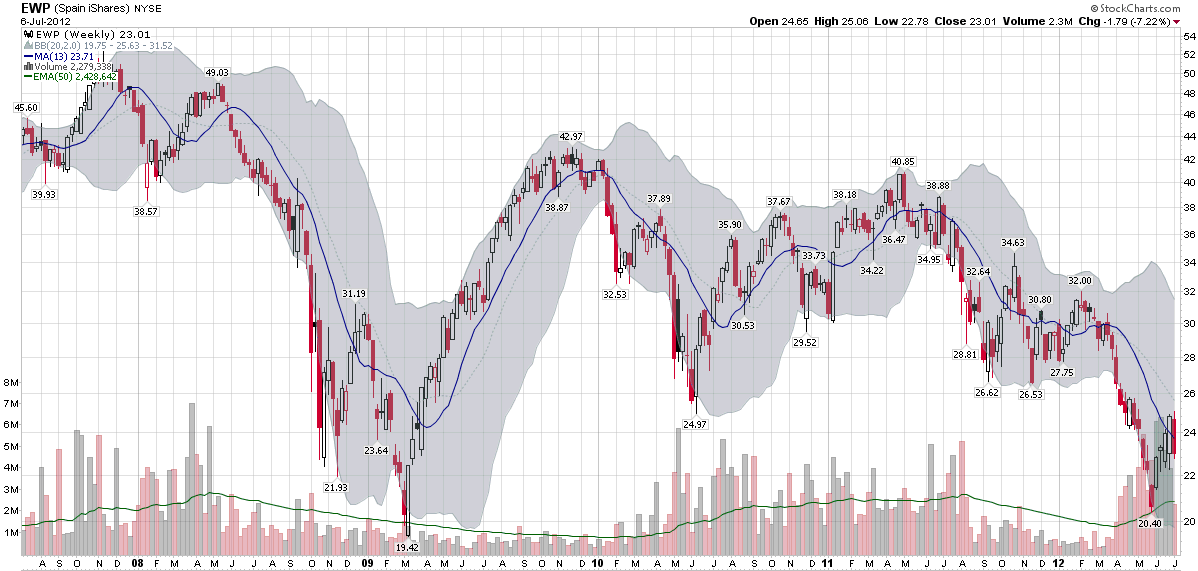
Two years ago today, in Spain rallies, I posted a chart of the Spanish ETF, EWP, that showed EWP had rallied off of a bottom and looked like it was poised for a bullish breakout.

In July 2010, I saw Spain as the keystone in the euro zone puzzle:

“Spain is the tipping point in the European sovereign debt crisis as I see it. In a nutshell, as goes Spain, so goes Europe.”

Two years later, I still believe that Spain is the most important line in the sand that euro zone leaders have to grapple with and the country whose fate is probably most intertwined with the future of the euro.

The chart of the week below shows weekly bars of EWP going back five years. The dominant feature in this chart is the financial crisis of 2008-2009. Various iterations of the euro zone crisis can be identified in the bottoms in June 2010, September 2011, November 2011, etc. EWP was in a gradual downtrend from April 2011 to March 2012, but fell sharply until the beginning of June. The most recent bounce in the Spanish ETF still looks somewhat tentative on the charts and is likely to be tested in the weeks and months ahead.

As concerning as the equity situation looks in Spain, the country’s credit default swaps (just 8% off of their all-time highs at 578) and yields on sovereign debt (yields on the 10-year bond are 5% below their all-time highs at 6.95%) indicate an even greater degree of financial stress.

At one time or another, I would expect Italy, France to find their way back into the crosshairs of traders who are looking to capitalize on euro zone angst, but as far as I am concerned, Spain will continue to the most critical line in the sand.

Related posts:

[source(s): StockCharts.com]

Disclosure(s): none

Thursday, June 28, 2012

The Evolution of European Equity Risk

There are many ways in which investors can evaluate risk related to the euro zone. Credit default swaps for sovereign debt are one way to evaluate the risk of country default. Sovereign bond yields are a good proxy for a country’s access to funding via the credit markets. The euro crosses and related directional moves are a barometer of the strength of the currency and the euro zone countries as a whole, while various Intrade contracts can lend a sense of the probabilities that investors assign to various events, such as to the risk of one or more countries dropping the euro.

On the volatility side, the VSTOXX (EURO STOXX 50 Volatility Index) the EVZ (CBOE EuroCurrency Volatility Index) provide a market assessment of risk and uncertainty in euro zone stocks as well as the currency.

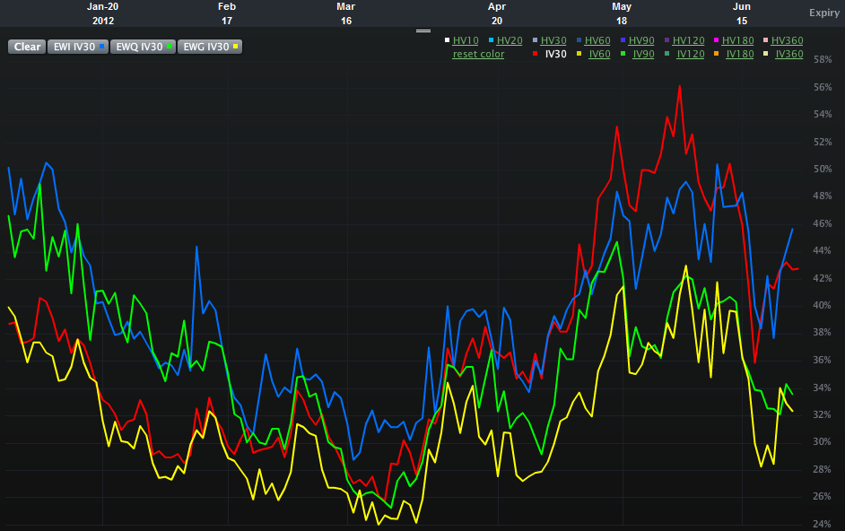
One piece of analysis I have not seen, however, is an assessment of the relative risk and uncertainty for equity markets in some of the more important euro zone nations. Specifically, Spain, Italy, France and Germany. The chart below attempts to offer up that very information, using 30-day implied volatility for the various country ETFs over the course of the past six months:

  • EWP – Spain (red line)
  • EWI – Italy (blue line)
  • EWQ – France (green line)
  • EWG – Germany (yellow line)

Looking at the chart, what initially catches my eye is the recent evolution of the two-tiered risk system. In the first half of the year, the higher risk is clearly associated with Italy and France, whereas Spain and Germany appear to be considerably less risky in terms of implied volatility. By the March the risk appears to have lessened across the board and the distinctions between individual countries is more difficult to discern. Over the course of the last 1 ½ months or so, a new two-tiered system has appeared. This time around it is Italy and Spain where the risk to equities is considered to be the greatest, with France now joining Germany in the lower risk tier.

In essence, Italy has persisted in the high risk tier and Germany has been a constant in the lower risk category. Over the course of the past few months, the interesting development has been the switch between France and Spain, with the former improving from being a peer of Italy to a peer of Germany, while Spain has moved in the opposite direction.

One could certainly argue that all four countries are in the same boat (taking on water, with shoddy life preservers, in shark-infested waters and being one small mutiny away from having no captain…), but clearly investors think there are important distinctions to be made in terms of equity risk and uncertainty. Perhaps of more interest, these fortunes appear to be shifting, with little perceptible difference not just between Spain and Italy, but also between Germany and France.

Related posts:

[source(s): LivevolPro.com]

Disclosure(s): Livevol is an advertiser on VIX and More

Sunday, May 6, 2012

The Hollande Discount

With a little more than an hour to go before the equity markets open in Europe, investors are still attempting to digest the significance of an electoral victory for Francois Hollande in France as well as a much more fragmented political scene in Greece, where the radical leftist Syriza party showed surprising strength.

While the outcome of the election in Greece was very difficult to handicap, the probability of a Hollande victory increased dramatically over the course of the last month or so.

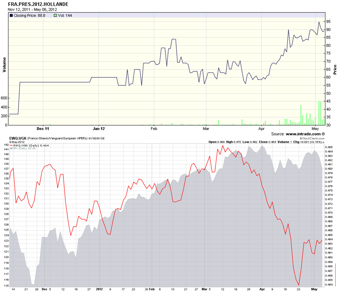
The chart of the week below shows the likelihood of a Hollande victory as indicated by the Intrade election contract (solid black line in upper half of top chart) since the second week of November. At the same time support for Holland was growing, one can see that the expectations for a Hollande victory put pressure on France ETF, (EWQ). The bottom half of the top chart shows a ratio of the EWQ to the broader Europe ETF, VGK as a solid red line. This ratio has declined sharply in conjunction with Hollande’s increasing strength in the polls and has moved in the opposite direction of U.S. stocks (gray area chart) since the middle of March.

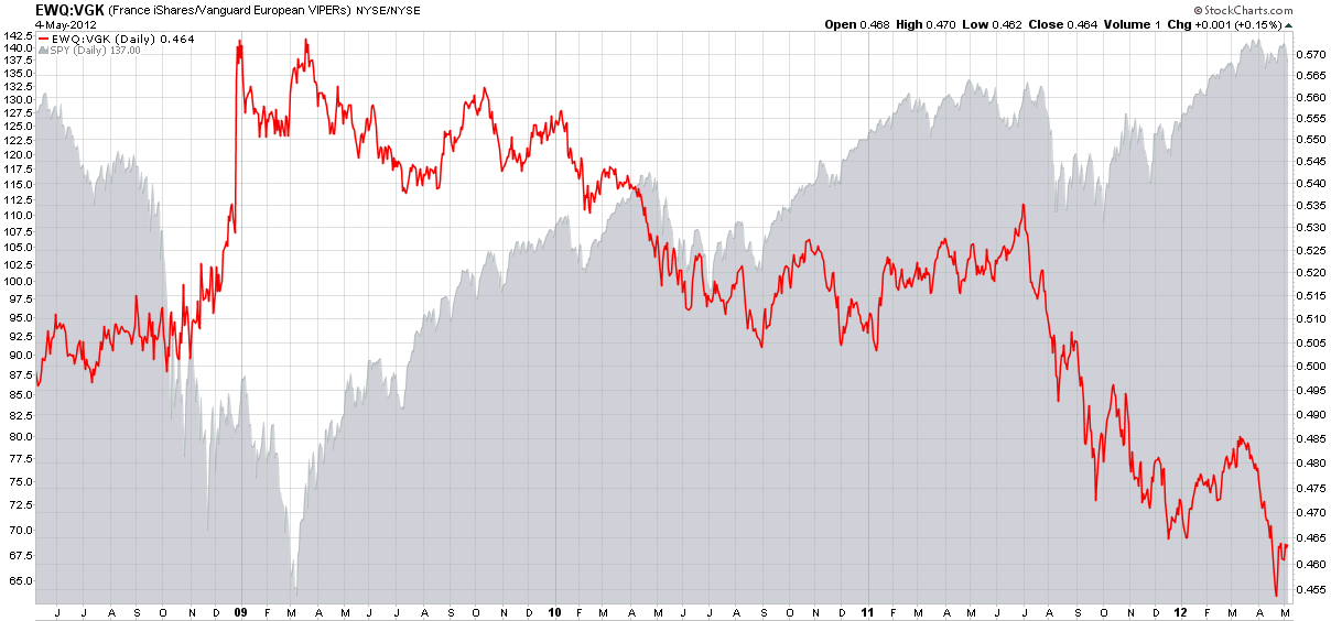
For some additional context, I have also included a bottom chart that captures the EWQ:VGK ratio and the SPY going back four years. Note that France was generally a source of relative strength in the euro zone through June 2011 and has struggled relative to its peer group for most of the past year.

Looking at the full set of charts, it is apparent that the markets have been pricing in the likely impact of a Hollande victory for the better part of a month. With U.S. equity futures down approximately 1% as I type this, my sense is that the Hollande discount has almost completely priced in, but the increased uncertainty in Greece is likely to roil the markets and put a jolt into volatility expectations for at least the next few weeks going forward.

Related posts:

[source(s): StockCharts.com, Intrade.com]

Disclosure(s): none

Tuesday, May 11, 2010

Recent Performance Divergence in European ETFs

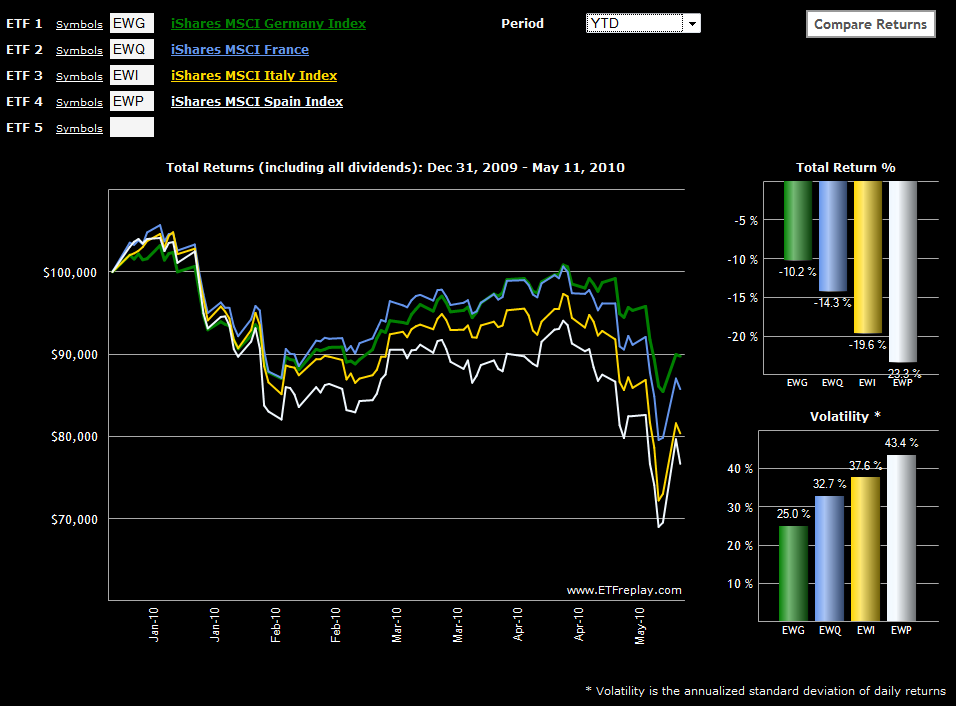
With all the turmoil in Europe, I thought it would be interesting to check on some of the single country ETFs for those nations which have been closest to the sovereign debt crisis. The chart below, courtesy of ETFreplay.com, captures the year-to-date price movements and (historical) volatility for the likes of Germany, France, Italy and Spain.

Not surprisingly, Germany has held up the best and Spain has been the worst performer in 2010. France, which had been tracking fairly close to Germany, has fallen into second as the country’s bank exposure to Greece has saddled France with additional risk. Italy, which has been on the periphery of the contagion concerns, has fared only slightly better than Spain and has actually been the worst performer of the four during the last month and a half as the crisis has deepened.

Also, note that as is often the case, volatility is negatively correlated with performance in these countries, as the largest moves have been negative ones.

For more on related subjects, readers are encouraged to check out:


[source: ETFreplay.com]

Disclosure(s): long EWG at time of writing

DISCLAIMER: "VIX®" is a trademark of Chicago Board Options Exchange, Incorporated. Chicago Board Options Exchange, Incorporated is not affiliated with this website or this website's owner's or operators. CBOE assumes no responsibility for the accuracy or completeness or any other aspect of any content posted on this website by its operator or any third party. All content on this site is provided for informational and entertainment purposes only and is not intended as advice to buy or sell any securities. Stocks are difficult to trade; options are even harder. When it comes to VIX derivatives, don't fall into the trap of thinking that just because you can ride a horse, you can ride an alligator. Please do your own homework and accept full responsibility for any investment decisions you make. No content on this site can be used for commercial purposes without the prior written permission of the author. Copyright © 2007-2023 Bill Luby. All rights reserved.
 
Web Analytics