The SPX and the 200 Day Moving Average
Lately there has been a great deal of talk related to the SPX closing above its 200 day moving average for the first time since the end of 2007.
The first question traders should ask themselves is whether this technical artifact has any relevance to trading. The simple answer is that it depends upon how many people pay attention to the 200 day moving average and incorporate rules related to it in their trading methodologies. For example, there are many traders who prefer – or insist upon – long positions only when the instrument in question is above its 200 day moving average and short positions only when it is below the 200 day moving average. In sum, if enough people pay attention to the 200 day moving average, it becomes a self-fulfilling prophecy of sorts.
But is there an edge in incorporating the 200 day moving average into trading decisions? Condor Options took up this subject earlier today in Exponentially Curb Your Enthusiasm and concluded that since 1965, long only strategies that incorporated the 200 day simple moving average (SMA) and exponential moving average (EMA) for the SPX both beat a simple buy and hold approach. (Interestingly, the EMA approach had a better track record than the SMA approach.)
A quick glance back at a long-term SPX chart show why the 200 day SMA has helped generate excellent timing signals. Note that from 1996-2000 and 2003-2007, the 200 day SMA kept investors in the bull market almost all the time. Investors would have been in cash (or perhaps even short) during the 2000-2003 bear market and from the beginning of 2008 to the present.
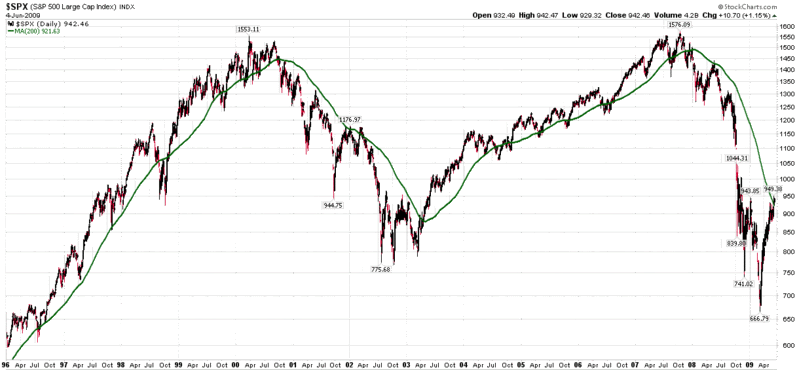
Looking at the SPX since the beginning of 2008, one can see the steady decline in the 200 day SMA, which actually peaked in January 2008.
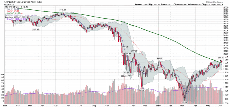
Before getting too excited about the 200 day SMA, it is important to look under the hood at the data that goes into the calculations. Right now, the 200 day window includes data going back to August 19, 2008, when the SPX closed at 1266.69. Tomorrow that number will be dropped from the calculations and replaced with one that is likely to be close to today’s close of 942.46. That is 324 points lost from the index calculations, which means that if the markets drift sideways, the 200 day SMA will be declining at rate of about 1.6 points per day as the higher closes from August scroll off. In fact, since the beginning of 2009, the 200 day SMA has dropped 48, 46, 69, 46 and 37 points in each of the last five months.
Another factor to consider is that the lows of March 6th and 9th are now almost three calendar months behind us. That translates into 61 and 62 trading days. It also means that the March lows will be in the midpoint of the data series in 38-39 trading days, which means that the 200 day SMA is most likely to continue to decline until the last week in July before turning back up.
So, go ahead and consider the 200 day SMA to be a potential support level or long/short inflection point, but going forward, this line on the charts should continue to decline and be less and less relevant, unless, of course, the markets follow the green line down.
[graphics: StockCharts]


17 comments:
Hi Bill! I've been reading your articles on the "complacency indicator" SPX:VIX and the various "fear gauges" that you introduced afterwards. Several people attacked this idea of studying the SPX:VIX ratio in the sense that it's like comparing apples and potatoes because SPX is absolute value but VIX is a 68% probable 1-year yield (it i got correctly the definition of VIX). So according to this reasoning, it would make more sense to plot SPX:UST ratio.
At this point, i arrived to the idea (i don't know whether it's well known or not) of looking at the following family of ratios: from UST2Y:VIX to TYX:VIX going through the various yields, FVX, TNX, etc ...
The plots are interesting because they reveal a structure not so different compared to the supposedly incoherent SPX:VIX: namely, a top at february 2007 (and not at july), a very "elliott-like" decay until november 2008, and a quite flat area after this date until march 2009.
Are you familiar with this kind of ratios ?
--
Laurent
PS: sorry, this comment doesn't deal that much with the 200-MA of SPX!
Hi Laurent,
Good comments. I think you may have mentioned this before and as behind as I am in responding to comments and emails, I may not have responded properly.
In any event, I started blogging about the SPX:VIX ratio right after I began the blog. Back in Feb 2007, in The SPX:VIX Relationship, I addressed the issue of a ratio with a trending numerator and oscillating denominator -- and I had some ideas on how to deal with that quirk.
Also, in March 2008, I blogged about the VIX:TNX and VIX:IRX ratios, using the 10-year and 3-month yields. After the VIX:IRX charts and commentary got so much attention, I kind of decided to standardize on that ratio.
I haven't blogged about this ratio since I made it a chart of the week in late November: Chart of the Week: Ratio of VIX to Yield on 3 Month T-Bills.
So...thanks for the reminder. I will take a peek at more VIX:yield ratios and hope to keep them in my rotation of ideas that I periodically post about on the blog.
Cheers,
-Bill
I see ... One issue with these ratios like TNX:VIX is that, despite the fact they are more consistent from the maths point of view (safe yield divided by absolute value of probabilistic yield equals dimensionless positive number), their "sensible" interpretation is much more difficult to figure out.
Dividing a safe treasury yield by the volatility yield (for instance UST1Y:VIX) can be justified somehow by saying that "flight to quality" makes UST1Y decrease and generally VIX increase and vice-versa. But is it sufficient to make it a reliable indicator with a clear interpretation ?
And how to interpret the "flat area" that we see now on these plots involving short-term debt compared to the rise for those involving longer-term debt ?
Still working on these matters!
--
Laurent
Hi Laurent,
I had the same theoretical basis as yours -- and I like the way these ratios acted in October and November, but the interpretation seems to have gotten more complicated with the events of 2009.
Feel free to weigh with any insights you may have going forward.
Cheers,
-Bill
I´d imagine you´d have more accuracy with the 8-month SMA.
I believe we have broken the 200-EMA today, which is now fairly flattened.
Brian @ Alphatrends.net is IMO the best technical trader and he says it's the direction that should get the most attention. He repeatedly points out that there is a high probability of a false break out through a declining MA that the big players use to trap people on the wrong side of a trade.
Going back and looking at the data myself I feel like he has a good point. Look at Jan-April 2002 for a similar pattern of what we're seeing now...if you go back you can find this in all the bad bear markets (e.g. the Nov 73).
Also more anecdotally it seems like they precede the final "flush out" wave 6-9 months later.
Also this
great insights Mikkel.
Didn't understand your comment about "..324 points lost..". I see a close of 1274.54 on the 20th...thanks. Allen
i think the important thing about the 200 day is how the market acts. if it takes it out and keeps going the likely hood of a bull market increases. If it moves sideways then the likelyhood of a false break out is there. 1982-1998-2003 all show this.
Bill, you showed the 200-day moving average only since the Tech Bubble Crash. There's more convincing evidence if you had gone back to 1963, as I have done.
I use a combination of 4 different MAs and there combination in very specific arrays does lead to an convincing advantage (in a bimodal, in/out strategy) than a simple buy-and-hold.
sell
sell. No brainer.
Hi Bill, I usually do not frequent blogs because I do not want to get influenced by others opinion. But being a avid observer of VIX, I frequent your blog. Many thanks for taking the time out to write. You can check me out at http://www.thinkingtrades.com
Please do visit my site. You won't find the usual charts that one finds at other trading sites but I try to provide my perspective about the markets in a simple manner. Hope you would like the site. I have been lucky so far in charting the markets but this market can humble anyone anytime.
This is good stuff.
Post a Comment