Showing posts with label GE. Show all posts

Sunday, October 3, 2010

Chart of the Week: Visualizing the Flash Crash

This week the allied forces of the SEC and CFTC released their joint report on the ‘flash crash’ with the title of Findings Regarding the Market Events of May 6, 2010.

While many were underwhelmed by the report, it provides traders with a sense of some of what happened during a day in which the Dow Jones Industrial Average fluctuated some 1138 points.

The chart of the week below shows what happened to IWM, the highly liquid ETF for the Russell 2000 index. IWM trades more than 60 million shares per day and is regularly one of the most active issues traded. Up until 2:43 p.m. ET, IWM was acting normally. Then as the price (dashed line, right scale) began to accelerate downward, liquidity (green and blue bands, left scale) suddenly began to dry up. By 2:46 p.m., market depth (the height of the green and blue bands) in IWM had almost completely disappeared. Over the course of the 74 minutes left in the normal trading session, liquidity began to return slowly to the markets. At the time the markets closed, approximately 60% of the normal market depth from earlier in the day had returned to IWM.

The report linked above has some interesting graphics surrounding trading in ACN, PG, MMM, IBM, AAPL, GE and IWM beginning on page 91 of the PDF. If anything, the action in IWM is the least extreme of the group.

If you have some time, the report is worth at least a scan.

Related posts:


[source: SEC and CFTC]

Disclosure(s): none

Monday, October 12, 2009

Implied Volatility Flat Ahead of Bank Earnings

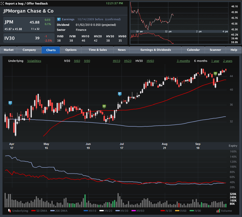
With some very important earnings in the financial sector coming up this week (JPM on Wednesday; C and GS on Thursday; BAC and GE on Friday), I have been watching implied volatility (IV) in the sector very closely. Much to my surprise, implied volatility has not increased ahead of earnings, as is typically the case.

The chart below, courtesy of Livevol, shows six months of price and volatility activity in JPMorgan Chase (JPM), with the upper portion chart highlighting the last two earnings releases with the blue “E” icon. The bottom half of the chart plots 30-day implied volatility (red line) against 30-day historical volatility (light blue line) during the same period.

Note that just prior to the last two earnings reports, implied volatility rose due to the uncertainty and potential for higher volatility associated with an earnings surprise. This time around, however, the lack of movement in implied volatility – as well as the proximity of the IV level to historical volatility – suggests that investors are not expecting any surprises at all. In fact, this situation is not specific to JPMorgan, but is also mirrored at Citigroup, Bank of America, Goldman Sachs and even quasi-financial General Electric. Not surprisingly, the bank ETFs, such as KBE, and the financial sector ETF, XLF, show a similar pattern.

No matter how the current earnings season unfolds, it is difficult to imagine that there will not be any surprises. Investors who think implied volatility is underestimating the surprise potential for the banks may look to initiate long straddles or long strangles to take advantage of a potential increase in implied volatility – and hence options prices.

For some related posts on implied volatility in financials, readers are encouraged to check out:

[source: Livevol Pro]

Saturday, February 28, 2009

Chart of the Week: GDP Worse Than Expected

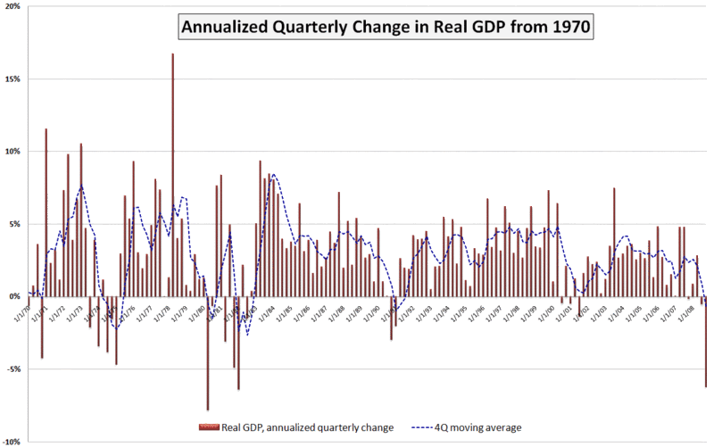
A lot happened in the markets this week: the government took a larger ownership stake in Citigroup (C); blue chip stalwarts JPMorgan Chase (JPM) and General Electric (GE) both slashed their dividends; durable goods and housing data failed to meet already lowered expectations; Q4 GDP was revised down to a 6.2% annualized drop; and the S&P 500 index fell to levels not seen since 1996.

In spite of all these body blows, the markets held up reasonably well, with the exception of the GDP data, which delivered a knockout blow Friday morning. The GDP numbers are notoriously backward-looking and the revisions to advance GDP data lend very little to the existing body of economic knowledge. That being said, Friday’s GDP numbers touched a statistical and psychological nerve for a market that was just not prepared to digest another assessment of how sharp the economic fall has been.

This week’s chart of the week attempts to put the most recent GDP number in historical perspective. While not shown on the chart, the raw GDP for the fourth quarter of 2008 is at approximately the level of economic activity that prevailed in June 2007. Also, while the 6.2% (annualized) drop in Q4 GDP is quite concerning, it is less than what we saw in the first quarter of 1982 (-6.4%) and the second quarter of 1980 (-7.8%). Going back even further (and not shown on the chart), GDP dropped a whopping 10.4% in the first quarter of 1958.

I have added a dashed blue line to show a four quarter moving average of GDP. By this measure, the current situation still has a way to go before it compares to 1991, not to mention the even larger four quarter dips in the 1970s and 1980s referenced above.

A survey of 43 economic forecasters published two weeks ago by the Federal Reserve Bank of Philadelphia showed expectations for a 5.2% drop in Q1 2009 GDP, followed by a 1.8% drop in Q2. Given the most recent revisions to the Q4 data, a 5.2% drop in the current quarter may be on the optimistic side, but the burning question right now is whether Q3 can show any growth at all – or at least a decrease in the rate of economic deterioration.

[source: Bureau of Economic Analysis, VIXandMore]

DISCLAIMER: "VIX®" is a trademark of Chicago Board Options Exchange, Incorporated. Chicago Board Options Exchange, Incorporated is not affiliated with this website or this website's owner's or operators. CBOE assumes no responsibility for the accuracy or completeness or any other aspect of any content posted on this website by its operator or any third party. All content on this site is provided for informational and entertainment purposes only and is not intended as advice to buy or sell any securities. Stocks are difficult to trade; options are even harder. When it comes to VIX derivatives, don't fall into the trap of thinking that just because you can ride a horse, you can ride an alligator. Please do your own homework and accept full responsibility for any investment decisions you make. No content on this site can be used for commercial purposes without the prior written permission of the author. Copyright © 2007-2023 Bill Luby. All rights reserved.
 
Web Analytics