Showing posts with label ISM. Show all posts

Friday, May 17, 2013

The Fed, QE, the Economy and Goldilocks 2.0

It was never easy being a central banker and the job has become much more difficult over the course of the last five years or so, but right now the task of guiding monetary policy and juggling the myriad of threats to economic stability is particularly daunting.

Take the Fed, for instance. The current policy statement calls for $85 billion of bond purchases each month, until the unemployment rate is below 6.5%, as long as inflation expectations do not rise above 2.5%.

At some point, however, the Fed will have to taper its bond purchases and ultimately begin selling some of its bond holdings. The big questions surround when to begin reversing course and how dramatic the increments will be in those policy changes.

With the unemployment rate and rate of inflation highlighted as the key data points for determining the timing and magnitude of the policy changes, the task of slowing and ultimately reversing the quantitative easing policy seems reasonably straightforward, at least in theory.

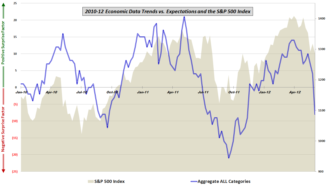
One big problem is that the unemployment rate may not be a very good gauge of the health of the economy. The chart below shows economic data reports relative to expectations over the course of the last 3 ½ years. Note that up until about a year ago, there was a very strong correlation between the performance of the S&P 500 index and whether economic data beat or missed consensus estimates. The correlation resumed when economic data turned up in the end of September, but a new divergence arose when economic data began stalling about two months ago, while stocks have been making new highs.
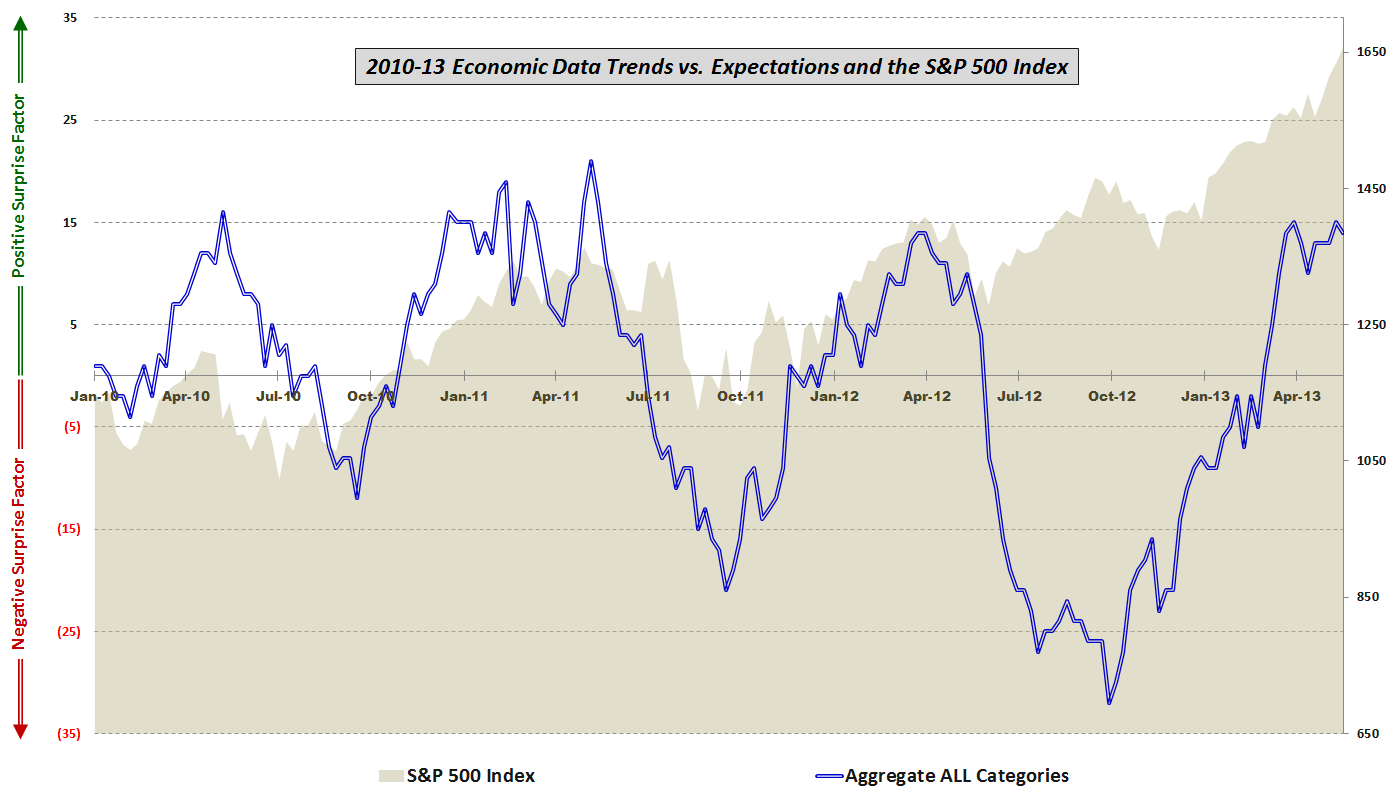
[source(s): various]

Looking at the five components of the economic data, one can see that for the past eight months or so there has been a favorable trend in housing/construction, employment, the consumer, and prices/inflation. As the graphic below illustrates, the one category that has been consistently missing expectations, particularly over the course of the last five weeks, has been manufacturing and general economic data, a category that includes reports such as GDP, ISM, Industrial Production, Capacity Utilization, Durable Goods, Factory Orders, Regional Fed Indices, Productivity, etc.

[source(s): various]

The problem for the Fed is that even though even though the consumer, housing / construction and aggregate unemployment rates all suggest an improving economy, the manufacturing sector and employment measures such as the labor force participation rate (official BLS graphic) paint a picture of continuing economic weakness.

As an investor, one has to guess how the Fed will handle this evolving conundrum. My general sense is that bulls will be rewarded if the economic data continue to fall slightly short of expectations and help to persuade the Fed that maintaining or perhaps even increasing bond purchases is the best policy approach – all of which should be a positive for stocks. Should economic data, particularly the employment component, begin to top estimates on a regular basis then we are left with the likely conclusion that the Fed will begin to remove the QE safety net relatively quickly. At the other end of the spectrum, if data fall well short of expectations going forward, the more perplexing conclusion is that even with its expanding toolbox, efforts by the Fed to prop up the economy are having at best a temporary effect and are also demonstrating diminishing returns. For investors, the data sweet spot going forward – or Goldilocks zone, if you will – is likely to be a series of near misses that extends the current policy indefinitely.

[Readers who are interested in more information on the component data included in this graphic and the methodology used are encouraged to check out the links below. For those seeking more details on the specific economic data releases which are part of my aggregate data calculations, check out Chart of the Week: The Year in Economic Data (2010).]

Related posts:

Disclosure(s): none

Friday, June 1, 2012

Worst Post-2009 Week in Economic Data Relative to Expectations

This week ties the record for the worst week ever in terms of economic data relative to expectations – at least in the 2 ½ years I have been collecting this data and putting it through my proprietary analytics.

I last reported on my analysis of economic data vs. expectations in the middle of April in Stocks and Economic Data on Upswing Despite Disappointing Manufacturing and Housing Numbers. At that time, I expressed concern about, the relative weakness of the manufacturing and housing data I noted:

“In both 2010 and 2011, it was the end of positive surprises in manufacturing and general economic data that coincided with bearish downturns in stocks. So far in 2012, the disappointments in manufacturing and general economic data have not been able to put a dent in the stock market rally. My sense is that this data and the stock market will be moving in the same direction within the next month. Whether that means an uptick in the data or a downtick in stocks remains to be seen.”

With the benefit of the data through today’s employment report, ISM manufacturing index and construction numbers, it is clear that the weakness is no longer confined to manufacturing and housing, but has also dragged down employment and well as consumer spending and confidence.

The chart below shows the aggregated data picture across all categories, since the beginning of 2010 across all categories.  For the record, the only other time there was a week in which data was this poor relative to expectations was in the middle of February 2011, at which point the data was pulling back from an all-time high, about 2 ½ months before data and equities topped and began their swoon.

This time around the story is obviously much different, but keep in mind that for the last six months or so stocks have been more correlated with employment data than with any other measure of economic activity.

[Readers who are interested in more information on the component data included in this graphic and the methodology used are encouraged to check out the links below. For those seeking more details on the specific economic data releases which are part of my aggregate data calculations, check out Chart of the Week: The Year in Economic Data (2010).]

Related posts:

[source(s): various]

Disclosure(s): none

Sunday, February 5, 2012

Economic Data: Divergence or Confirmation for Stocks?

The last time I checked in on the performance of U.S. economic data relative to expectations, some two months or so ago, I observed:

“One could certainly make the case that data underperformed stocks from April to September, but has been outperforming stocks for the last 2 ½ months.

While conventional wisdom says that stocks lead economic fundamentals for 6-9 months, this graphic does not support that idea. Instead, it will be interesting to see which of the two assumes a leading role now that at least some of the European angst appears to be in the rear view mirror.”

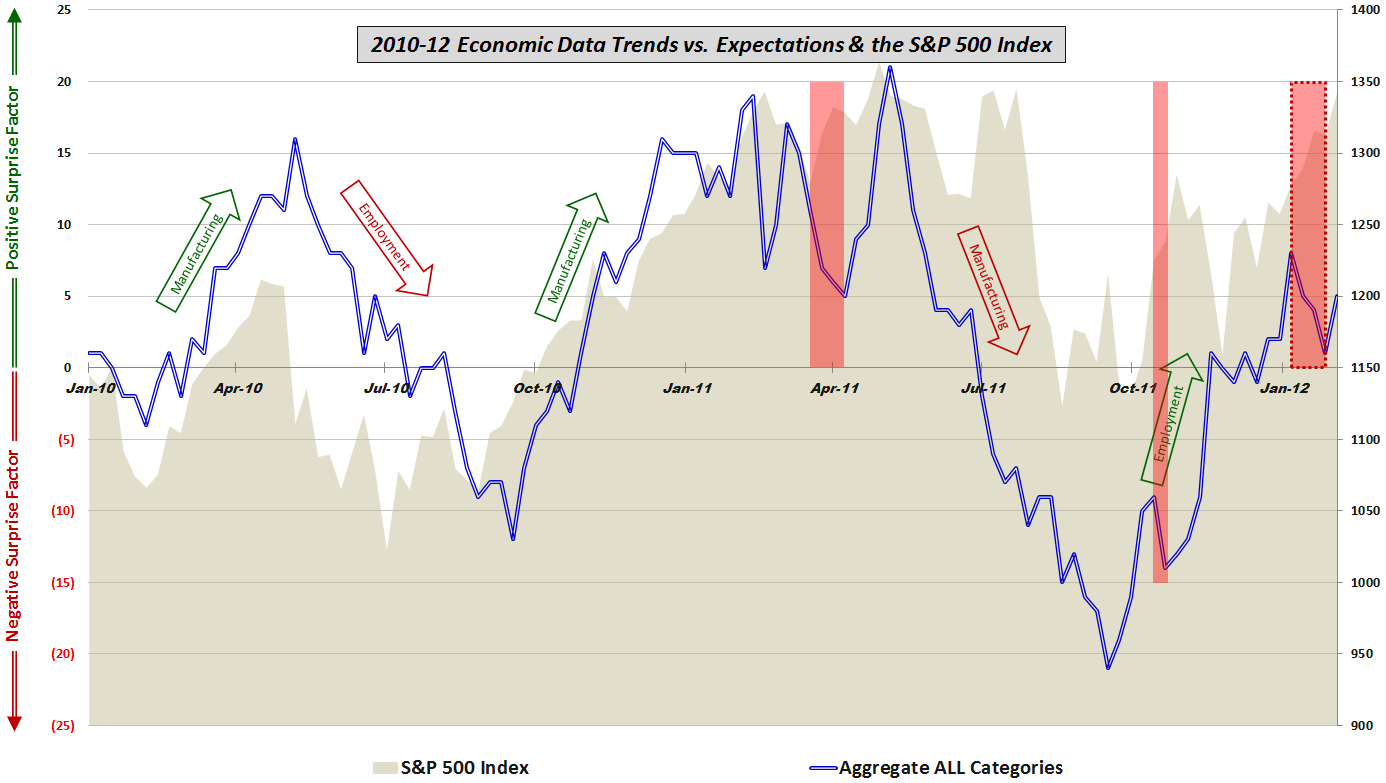
With the benefit of hindsight, clearly the stocks have been in the driver’s seat and to some extent, the increase in stock prices has had a positive effect on the economic data. For the better part of January, there was a substantial divergence (see dotted red box in graphic below) between stocks and economic data, with stocks in a marked uptrend, while economic data were falling short of consensus expectations on a regular basis.

It is possible that last week’s nonfarm payroll data and ISM services index marked a turning point in the performance of economic data relative to expectations, yet it is also clear that the data trend still lags the stock price trend by a significant margin.

For this update, I have annotated the graphic with arrows to show where manufacturing and employment have been the economic underpinnings of a rise in stocks. This time around the employment data seem to be moving in the right direction, but manufacturing has had trouble living up to expectations – at least for the past two months.

[Readers who are interested in more information on the component data included in this graphic and the methodology used are encouraged to check out the links below. For those seeking more details on the specific economic data releases which are part of my aggregate data calculations, check out Chart of the Week: The Year in Economic Data (2010).]

Related posts:

[sources: various]

Disclosure(s): none

Saturday, January 3, 2009

Chart of the Week: ISM Plummets

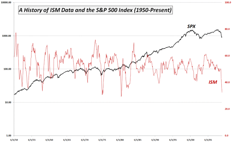
The stock market may have shaken off the December ISM’s 32.4 number, but investors should keep in mind that in the 61 year history of the ISM index, only three previous recessions (1949, 1974-75 and 1980) have seen lower ISM numbers. Even more concerning than the headline manufacturing index number was the report that new orders are now lower than they have been at any time in the 60 year history of the data.

The chart of the week below captures in ISM and the SPX from 1950. In addition to the obvious cliff dive that began in September, I find it interesting that the manufacturing index has been slowly trending down since hitting a high in May 2004.

As an aside, in 2009 I intend to devote more space on the blog to macroeconomic issues (particularly housing, manufacturing and consumer spending), as well global events that shape the geopolitical and economic landscape.

[source: Institute for Supply Management, VIX and More]

Monday, December 1, 2008

A Graphical History of the ISM and the S&P 500 Index

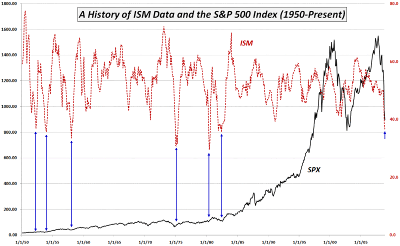
I am sure many out there are wondering just how bad an Institute for Supply Management (ISM) index of 36.2 is in the historical context and just what it may mean for the stock market.

Rather than a bunch of statistics, I thought the chart below might help. It identifies the six previous instances since 1950 in which the ISM index dipped as low as the current level.

Not surprisingly, historical precedent recalls a number of difficult economic periods. What I find particularly interesting is that, consistent with the belief that stocks are a leading indicator, when the ISM bottomed, this was often after stocks had made a substantial move off of their eventual bottom.


[source: Institute for Supply Management, VIX and More]

DISCLAIMER: "VIX®" is a trademark of Chicago Board Options Exchange, Incorporated. Chicago Board Options Exchange, Incorporated is not affiliated with this website or this website's owner's or operators. CBOE assumes no responsibility for the accuracy or completeness or any other aspect of any content posted on this website by its operator or any third party. All content on this site is provided for informational and entertainment purposes only and is not intended as advice to buy or sell any securities. Stocks are difficult to trade; options are even harder. When it comes to VIX derivatives, don't fall into the trap of thinking that just because you can ride a horse, you can ride an alligator. Please do your own homework and accept full responsibility for any investment decisions you make. No content on this site can be used for commercial purposes without the prior written permission of the author. Copyright © 2007-2023 Bill Luby. All rights reserved.
 
Web Analytics