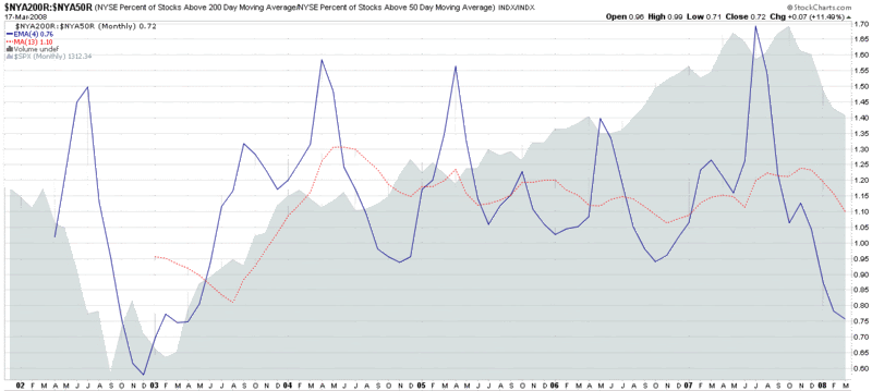
Ratio of Stocks Above 50 and 200 Day Moving Averages
As part of my ongoing effort to posts charts that you (probably) won’t find anywhere else, I offer up this monthly ratio chart of NYSE stocks above their 50 day and 200 day moving averages.
As the 2002 data show, this chart is capable of flagging extreme readings. Given that I use the 200 day SMA as the numerator and the 50 day SMA as the denominator, the chart tends to show short-term pullbacks as upward spikes in the 4 period EMA of the ratio and longer term extreme bear moves as downward spikes. Not surprisingly, the current 4 period EMA 0.76 is the lowest since late 2002.
Unfortunately, the data only goes back about six years, so I am unable to construct a chart that includes the end of the 1990’s bull market and the first two years of the bear market that followed.
While this chart may give you some things to chew on, the larger point is to consider changes in the percentage of stocks above certain moving averages as good measures of market momentum and ratios covering two different periods as good measures of relative market momentum or acceleration/deceleration.


4 comments:
Bill,
How do you put one chart behind another in the fashion you so often do? You use stockcharts.com, correct?
Thanks
Great post, Bill. I believe the good folks at IBD use a similar methodology as one of their measures to assess the 'quality' or strength of the current/prevailing trend.
But I was kinda hoping you'd say something about the VIX' action over the past few days. The last three market sessions have been pretty wild, and the VIX dropped nearly 6.5 points on the last trading session before MAR settlement tomorrow morning... on the heels of a solid spike and three-year closing high Monday.
The cash VIX came back from being stretched way above its 10d EMA yesterday to close today below its 50d SMA. A ten point swing from yesterday's highs to today's lows... for an underlying that is in the low thirties/high twenties. Yikes!
Of course, the VIX futures (and options underlying) did not swing as much as the cash did, but they had their own wild behaviors over the past three days. If anyone was on the wrong side of the move, I feel for them... and for those who were on the right side, you lucky (and smart) dogs! :)
Any thoughts (not predictions, lol) about where the VIX goes from here? :)
tnt
Hi Anon,
Most of the charts I post here are from StockCharts.com, including the ratio chart above. To add one (or more) chart to an existing chart in StockCharts, go to the "Indicators" pull down menu and select "Price." "$SPX" is the default security, so enter any other ticker you wish to use, then in the "Position" pull down menu change "Below" to "Behind Price." If you wish to make further changes to the new overlay, click on "Advanced Options" to the right of the "Position" column.
Felix,
I hear you about a good VIX chart. I had something else in mind for tomorrow, but if things are quiet enough, I can't see any reason not to double post. I'll check my bag of tricks and see what looks interesting.
Cheers,
-Bill
Thank you Bill, I understand...
Since today (Weds) is the last day trading index products that settle this Thursday a.m., instead of the usual Friday a.m., due to the Good Friday holiday, I expect traders with SPX, OEX, and/or RUT positions may be a little busy today. :)
tnt
Post a Comment