Are We Done Yet?
 The answer, of course, is that nobody knows. For the most part, panic and fear are not fleeting emotions.
For the curious, the photo on the left is of Colca Canyon, located in southern
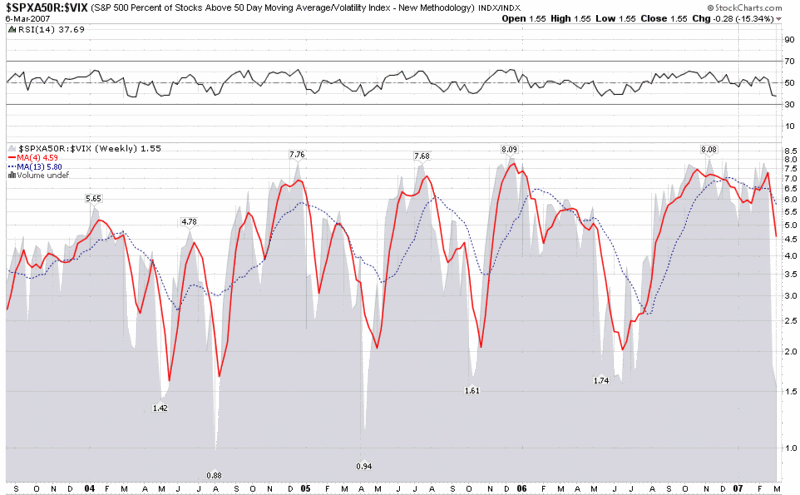
In thinking about the current investment topography, one of the more obscure charts that I refer to from time to time is a ratio chart of the percentage of S&P500 stocks above their 50 day SMA divided by the VIX. It is a rough approximation of greed ÷ fear and prints some interesting extreme numbers from time to time, particularly for market bottoms. Because the values of this ratio chart are one ratio divided by another, it is possible to compare values over time and get meaningful results.
In looking at the weekly ratio chart below, one of the first things that jumps out is the toppy readings (6.0 – 8.0) that persisted over the past six months or so, as compared to the previous high readings, which tended to last only a month or two.
The downside spikes are even more pronounced and tend to be much more short-lived. We know that the moves in the VIX over the past week have been unprecedented, but what the chart indicates is that given the steepness of the decline and the current low reading of 1.55, the ratio is not likely to deteriorate much further, if at all. Don’t expect the ratio to stay in the
I am certainly not going to declare that this ‘correction’ is over, but I will go out on a limb to say that the worst of it is likely behind us and that further declines, if any, should be a lot more orderly.