Canary or Canard?
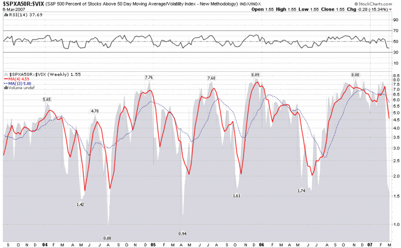
 Earlier in the week, I introduced a ratio chart of the percentage of S&P500 stocks above their 50 day SMA divided by the VIX. I described this as an attempt to find a rough approximation of greed ÷ fear. Since this chart received some favorable reviews, let me unveil another VIX ratio chart that attempts identify the same market sentiment extremes and provide a warning about the increased probability of near-term market highs and lows.
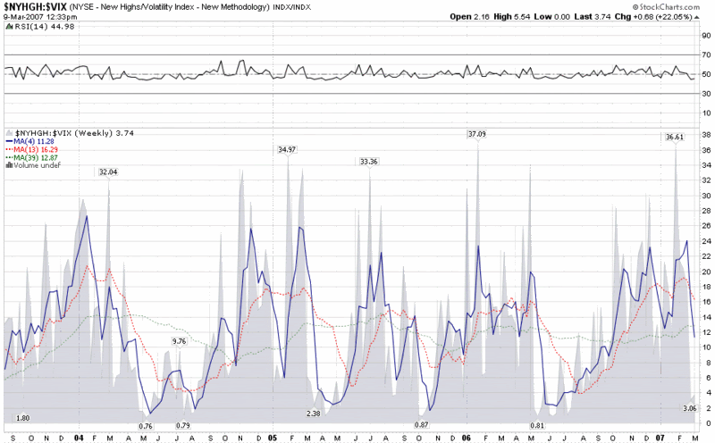
The chart below is a weekly chart of the ratio of the new 52 week highs in the NYSE divided by the VIX. I focus primarily on the raw number and the 4 week SMA. You can see from the chart that raw reading above 30 and a 4 week SMA readings above 20 tend to signal that a top is near.
In fact, this chart provided excellent advance notice of the 2/27/07 top, the 5/11/06 top, and previous tops in March 2004 and March 2005. With bottoms, the record is not quite as good, with an excellent advance call of the October 2005 low, but calls that were too early for May-July 2006, March-August 2004, and July 2002-March 2003.
You can decide if this ratio chart deserves a spot in your toolbox or bird cage or whatever it is that you use to try to divine the future. For me, it’s a keeper.