Comparative Volatility Indices
I am a strong believer in simplifying life – and one’s approach to investing – as much as possible. Less is more.
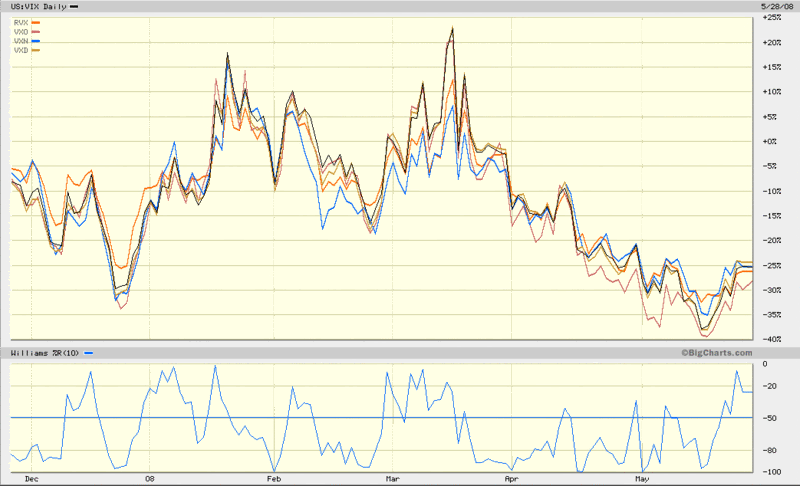
With that thought in mind, I pulled up a six month chart of the five major US volatility indices: VIX, VXO, VXN, RVX, and VXD. The chart, which comes courtesy of BigCharts, shows that over the past six months, the difference between the volatility indices are no more than subtle nuances. Keep in mind that during this period, the financial sector was extremely hard hit. Moreover, financials are overrepresented in the VIX and VXO, underrepresented in the RVX, and absent from the VXN. The sector distinction is all but lost in the charts (except perhaps from mid-February to mid-March) and if there were ever a time for the indices to diverge in a meaningful way, this was it.
The bottom line is that for most market observers, it makes sense to follow only the VIX. Volatility aficionados may also choose to follow the VXN, but after adding a second volatility index to one’s radar, the incremental return on effort and complexity diminishes rapidly.
When there are important divergences between these indices, I will be quick to point these out, but for the most part, expect my comments about the VIX to apply to the entire volatility index family tree as a whole.


2 comments:
Bill,
I beg your pardon, but with respect to your statement the difference between the volatility indices are no more than subtle nuances I totally disagree.
If you don't look at (and compare) the performance of each volatility index in percentage terms but look at the absolute delta between the volatility indexes in absolute terms instead, the respective deltas went from one extreme to the other within the last 6 to 9 month.
http://futuresource.quote.com/
charts/micro.jsp?s=%3D+%24VIX&s
=%3D+%24VXD&s=%3D+%24VXN&s=
%3D+%24RVX&s=%3D+%24VIX+-+%24VXD&s
=%3D+%24VIX+-+%24VXN&s=%3D+%24VIX
+-+%24RVX&s=%3D+%24VXD+-+%24RVX&s
=&s=&p=D&v=15&b=LINE&d=HIGH
(please copy and paste the complete link as one line into your browser)
For example the (absolute) delta between VIX and VXD went from a high of 3.10 on 02/11/2008 to only 1.18 yesterday (almost a 100 trading day low). The (absolute) delta between VXD and RVX narrowed from a "high" of -10.82 on 09/13/2007 to the current almost one year "low" of -4.93 yesterday (RVX is trading above VXD, the delta is therefore negative).
These movements concerning the absolute delta between the different volatility indexes are in no way subtle nuances but very large movements instead (especially for traders participating in spread trading between the respective volatility futures), and may be caused by the fact that VXN (Nasdaq 100) and RVX (Russel 200) were much less volatile because no or only very few financial stocks are included in the respective indexes.
Best regards
Frank
Hi Frank,
I hear you and appreciate your comments. My point is that a large portion of the change in absolute difference you see is without any significant change in the overall ratios. These indices peaked in the 30-37 range and subsequently dropped down to the 15-22 range, which is exactly what the VIX-RVX, VIX-VXD and VXD-RVX differential charts show. Look at a VIX:VXD ratio chart to confirm that the ratio has remained constant.
The pattern is less obvious in the VIX-VXN chart, which is where you would expect to see the financial vs. non-financial distinction. A ratio chart here still shows a fairly consistent ratio: VIX:VXN -- but to my eye, the divergences are still on the subtle side. I can understand, however, how you might see it differently.
The bottom line is that the VXN (which uses the NDX) completely excludes financials. The point I was trying to make is that volatility indices which include financials have surprisingly similar (if almost identical) charts to the one index, VXN, that excludes them.
Once again, thanks for weighing in with an alternative viewpoint.
Cheers,
-Bill
Post a Comment