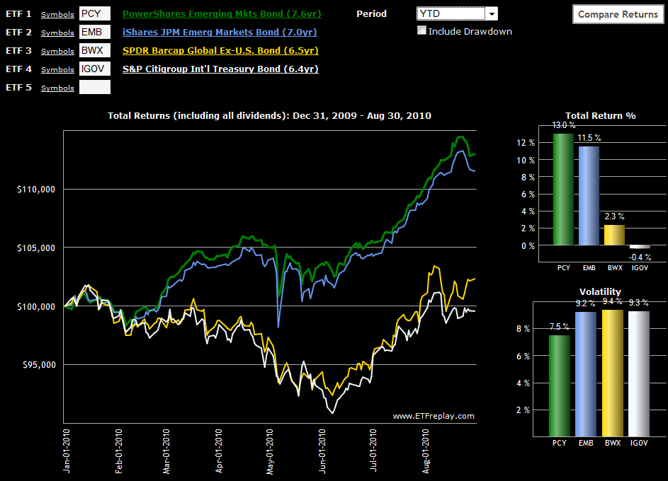
Emerging Markets Bond ETFs Soar
While there have been pockets of strength in emerging markets for equities (see links below), emerging markets bonds have been even stronger performers in 2010, both on an absolute and risk-adjusted basis. In fact, if one compares the chart of emerging markets bonds below, the gap between emerging markets and developed markets looks strikingly similar to what was seen on the equity side in Chart of the Week: Rethinking Geography.
I first wrote about PCY (the PowerShares Emerging Markets Sovereign Debt Portfolio ETF) back in October 2008 in the context of an indicator of the strength of the global economic in general and emerging markets in particular. Since that time, PCY has been an extremely strong performer, gaining 35.6% in 2009 and adding another 13.0% so far in 2010. Along the way, PCY has attracted completion in the form of EMB, the iShares USD Emerging Market Bond ETF, which was up 15.4% in 2009 and is up 11.5% year-to-date in 2010. Of course both PCY and EMB have been able to post these excellent returns with only a fraction of the risk of their equity market counterparts.
For comparison sake, I have also included two international bond ETFs that have a much higher weighting in developed markets than emerging markets. Of these two the more liquid is SPDR Barclays Capital International Treasury Bond ETF (BWX); the S&P/Citigroup International Treasury Bond ETF (IGOV) is a relative newcomer. A shorter duration option in this space is the S&P/Citigroup 1-3 Year International Treasury Bond ETF (ISHG).
It may be a global marketplace, but geography continues to have a strong influence over local and regional risk and reward. Without the sovereign debt problems, zombie banks and housing bubbles, emerging market debt is an attractive place to diversify a portfolio and capture a relatively high yield, such as the 5% or so currently available from PCY.
Related posts:
- Watch Emerging Market Bonds
- Chart of the Week: Rethinking Geography
- More Top Emerging Market ETFs
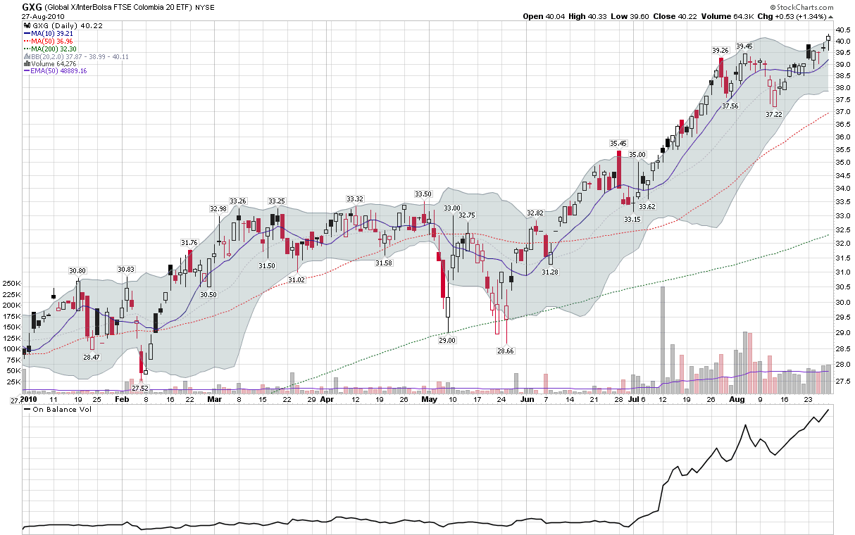
- Chart of the Week: Irrepressible Colombia (GXG)
- Frontier ETFs
Disclosure(s): long PCY at time of writing