EuroCurrency Volatility Index (EVZ) at Lowest Level Since March 2008, Diverges from VIX
Since its launch in August 2008, the CBOE EuroCurrency Volatility Index (ticker EVZ, sometimes known simply as the “euro VIX”), which is based on the FXE ETF, has toiled in relative obscurity compared to some of the more famous volatility indices.
Given all the fears about the European sovereign debt crisis over the past few years, I find the lack of interest in EVZ to be surprising. After all, in thinking about the euro zone one of the most basic questions has been whether or not the euro will survive. Further, outside of the U.S. at least, the future of the euro zone is still considered to be the biggest risk to the stock market.
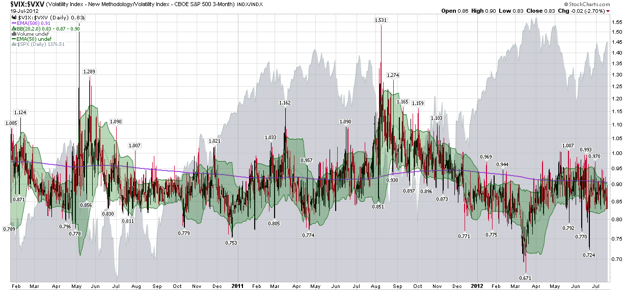
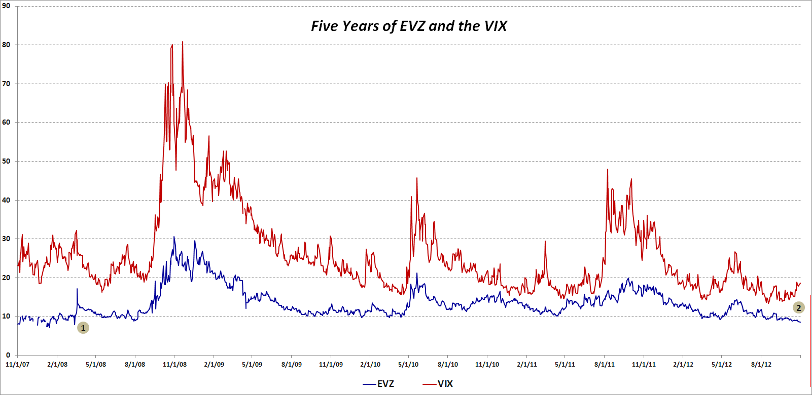
With all this in mind, I was looking at EVZ data this evening and discovered that today marks five years since the beginning of the historical EVZ data provided by the CBOE (reconstructed data fills the gap from November 2007 to the August 2008 launch.)
The chart below shows the history of closes in EVZ (blue line), as well as comparative closing prices for the VIX (red line.) I have annotated the chart to highlight two pieces of information:
- The last time that EVZ closed lower that it did today (8.55) was in March 2008, just before Bear Stearns collapsed and was sold to JP Morgan (JPM)
- The recent divergence between a falling EVZ and a rising VIX, which dates from the middle of September, is unusual, particularly given the length of the divergence
So…is EVZ understating the risk to the euro or is the VIX overstating the risk to stocks? Is it possible that these two measures of risk can be moving in opposite directions and both be right?
Related posts:
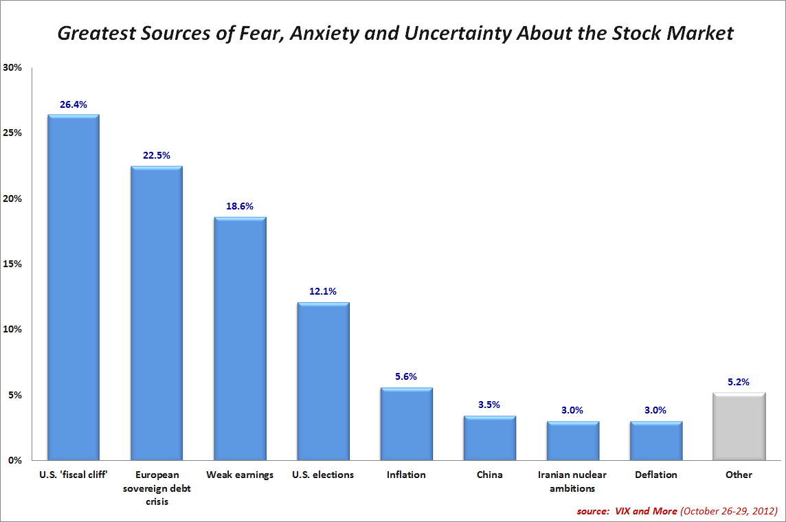
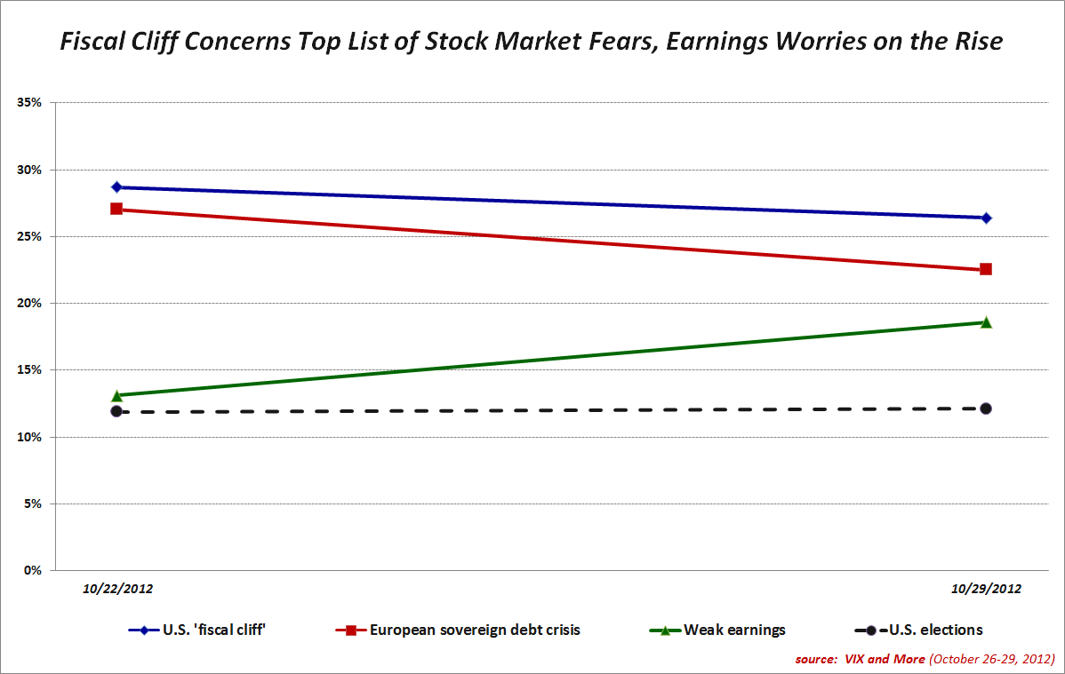
- U.S Fiscal Cliff Fears Top VIX Fear Poll Again
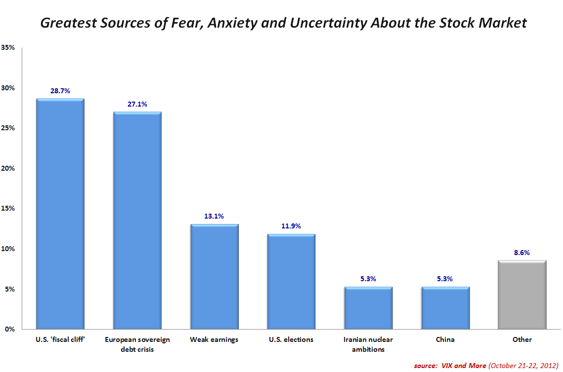
- U.S. Fiscal Cliff Concerns Top Results in Inaugural VIX and More Fear Poll
- The Evolution of European Equity Risk
- Euro Volatility and Risk
- Greek Elections and the Future of the Euro
- Handicapping the Chances of Greece Dropping the Euro
- The Evolution of the Volatility Index Family Tree
- A Conceptual Framework for Volatility Events
- Forces Acting on the VIX
- Thinking About Volatility (First in a Series)
[source(s): CBOE]
Disclosure(s): none