A Look at the Pullbacks of the 2009-2012 Bull Market
At various times over the past three years, I have been posting a table that I call the VIX and More 2009-12 SPX Peak to Trough Pullback Summary, the most recent version of which can be found in a March post, Putting the Current 2.6% SPX Pullback in Recent Historical Context .
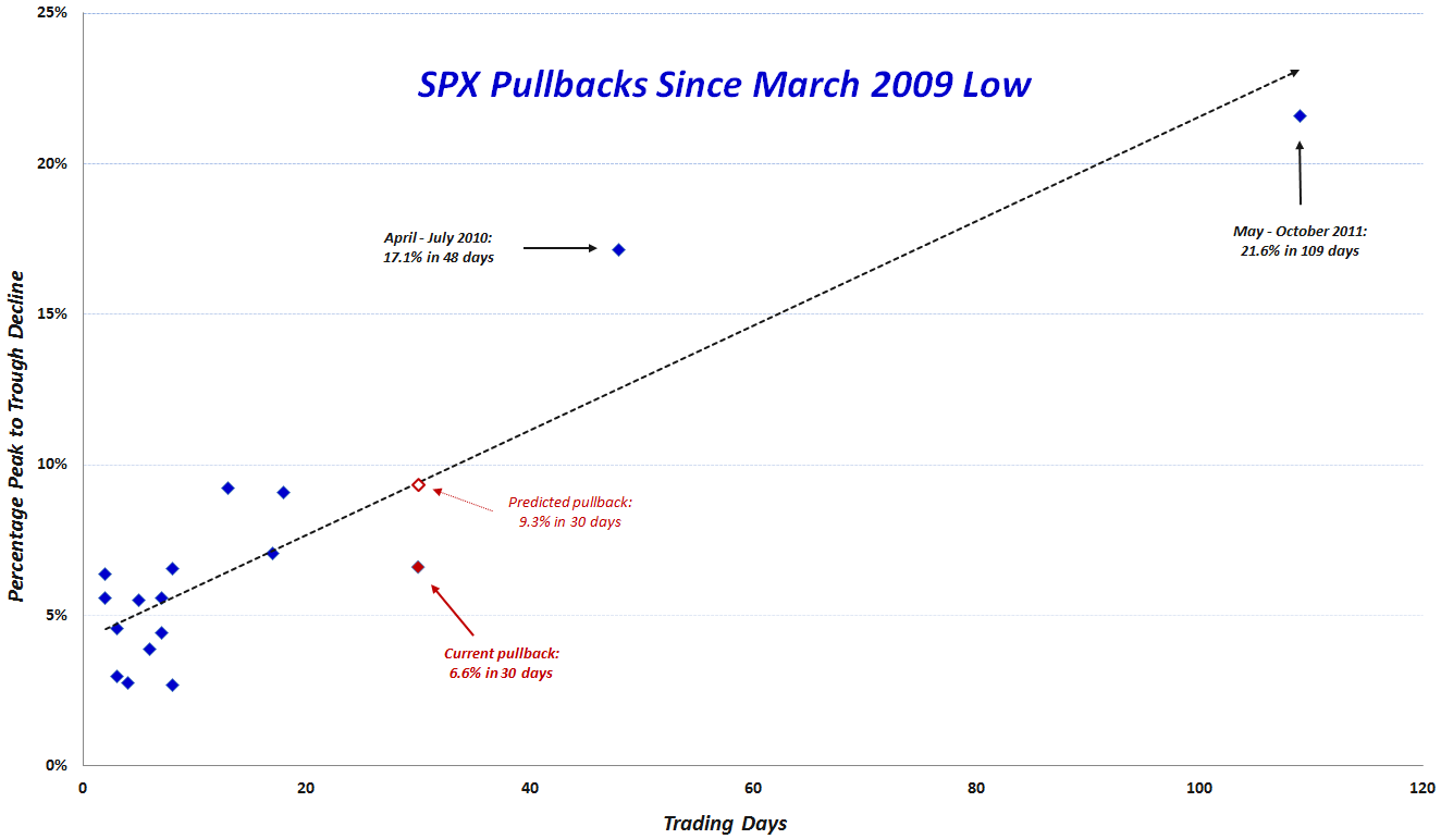
This time around I thought it might be of more value to present the same data, which now includes 17 pullbacks over a the course of a 38-month period, in the form of a scatter plot, with the magnitude of the peak-to-trough drawdown on the y-axis (inverted) and the number of trading days from the peak to the trough on the x-axis.
In the graphic below, I have highlighted the current 6.6% pullback from the April 2nd high of SPX 1422 with a solid red diamond. This pullback now ranks as the 6th deepest in terms of peak-to-trough magnitude and 3rd longest in terms of peak-to-trough trading days. Interestingly, the 6.6% pullback over the course of 30 days is well below the (dotted black) linear trend line for the full data set; the trend line prediction for 30 days is in fact a 9.3% pullback, which I have plotted with a hollow red diamond.
For reference, I have also annotated the top two pullbacks during the past 38 months:
- 21.6% over 109 days from May to October 2011
- 17.1% over 48 days from April to July 2010
While both of the above pullbacks had multiple causes, the theme of Greek contagion fears was prominently featured in both pullbacks.
Whether the current pullback stops at SPX 1328 remains to be seen, but clearly it is a long way before anyone will be comfortable saying that the European sovereign debt crisis is contained.
Related posts:
- Putting the Current 2.6% SPX Pullback in Recent Historical Context
- Why Not Point Hedges?
- Comparing SPLV and VQT
- Three New Risk Control ETFs from Direxion
- The Case for VQT
- The Year in Safe Havens
- The VIX as a Hedging Tool
- Handicapping the Chances of Greece Dropping the Euro

[source(s): Yahoo]
Disclosure(s): none

