Wednesday, March 31, 2010

Short Squeeze Portfolio One Year Later

In retrospect, I must have been a fool in February 2009 and a genius in March 2009. From a distance, that is typically what it looks like when I try to call a bottom.

Of course anyone with a dart and a list of stocks could have constructed a portfolio what would return at least 60% a year or so ago, but the tricky part is that so many were reluctant to pull the trigger.

Fortunately, when there was the first whiff of a possible bottom, I was lucky enough to be fishing from a sea of heavily shorted positions and assembled a portfolio of stocks in which at least 30% of the float was short and the average volume in the stock was at least 500,000 million shares. I first unveiled these ideas in Short Covering Driving Today’s Gains on March 10, 2009 and later followed up with a discussion of the performance of that portfolio in Short Covering Rally Data Points on May 1, 2009, at which point the average holding had already more than doubled.

Now, a little more than one year later, four of the holdings (GCI, CBL, MAC, MGM) have gained more than 400%. The two laggards are PALM, down almost 40%, and TLT, the long bond ETF, which is down about 10% after dividends and is omitted from the chart of equities and equity ETFs below.

I believe some of these former short squeeze candidates still have some room to run, but in my next post, I will look at some current heavy short interest plays and see whether the shorts have the odds in their favor this time around.

For more on related subjects, readers are encouraged to check out:


[source: FINVIZ.com]

Disclosure(s): long MAC, DB and XRT at time of writing
Tuesday, March 30, 2010

Some Favorite ETF Sites

Since last week’s mention of ETFreplay.com as one of my favorite up-and-coming ETF sites, a couple of readers have inquired about my other favorite ETF sites.

When I think about web sites which are dedicated to ETFs, two sites immediately come to mind. Keeping in mind that these lists are highly subjective, my favorite source for information and analysis of ETFs is probably ETFdb.com, where Michael Johnston and others cover the breaking stories, but more importantly offer up some finely crafted analysis of various ETFs and some of the issues surrounding these securities. The second site is ETF Rewind, which I discussed in Some Approaches to Trading ETFs. I rarely bother with subscription services, but I find the Excel-based data and analytics packed into Jeff Pietsch’s ETF Rewind Pro to be indispensible.

Once you get past the first cut of news and analysis sources and a data analysis tool, the incremental value added for each ETF web site starts to diminish. Gary Gordon at ETFExpert.com provides some valuable commentary and does a good job of linking to other ETF-related content around the web. If you like ETFreplay.com, you should also check out ETFScreen.com. In addition to the screening tools, there is also an excellent set of performance data, some trend information derived from relative strength analysis and an ability to build a correlation matrix for any group of ETFs.

For a different way of analyzing ETFs, try Arthur Hill’s ETFInvestmentOutlook.com, which focuses on the breadth and volume of each ETFs component. This site incorporates McClellan oscillator and summation index data, McClellan volume oscillator analysis, advance-decline volume, high-low analysis and related breadth tools to come up with a bottoms-up approach to evaluating ETFs strength and weakness.

In terms of mainstream media resources, Morningstar has an ETF section that has a solid screener and set of performance data. Not surprisingly, their profiles of the ETFs are among the most comprehensive on the web. The Wall Street Journal’s ETF Research center is also a good source for similar information.

Two other sites on the periphery of the ETF universe are CEFA.com, home of the Closed-End Fund Association and an excellent source for closed-end fund information; and Roger Nusbaum’s Random Roger blog, where the not-so-random one frequently, but not exclusively, opines about ETFs and related subjects.

Readers, please chime in and flag some of your favorites in the comments section.

For more on related subjects, readers are encouraged to check out:


Disclosure(s):
Morningstar is an advertiser on VIX and More; ETF Rewind and the VIX and More Subscriber Newsletter are available as part of a bundle (with Quantifiable Edges) in Blogger Triple Play

Sunday, March 28, 2010

Chart of the Week: Impact of Falling Euro on Stocks and Commodities

Given all the general economic problems facing Europe and the sovereign debt issues related to Greece and the PIIGS (Portugal, Italy, Ireland, Greece and Spain), it is not surprising that the euro has come under so much selling pressure as of late.

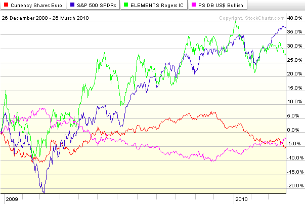
Considering that the dollar index is comprised of a weighted basket of foreign currencies of which the euro comprises 57.6%, it is not too much of a stretch to think of the dollar as an inverse euro – as their almost mirror image in the chart below suggests. So given that recent weakness in the euro is accounting for most of the dollar’s resurgence and the dollar has a strong influence on the prices of commodities and stocks, it is meaningful to consider how the fluctuations in the euro have translated into changes in stocks and commodities.

This week’s chart of the week looks at ETFs for the euro (FXE), dollar (UUP), stocks (SPY) and commodities (RJI) for the last 15 months. Following the bottom of the stock market in March 2009, the euro (red line) rallied in concert with the S&P 500 index (blue line) and commodities (green line) through December 2009. As the euro began to weaken, however, both stocks and commodities initially continued their bullish climb, before selling off in January and the beginning of February. Since the early February lows, stocks (SPY) have managed to rally in spite of a weakening euro and firming dollar (purple line). Commodities, which tend to react more strongly to currency fluctuations, have struggled much more with euro weakness and dollar strength. Should the euro continue to fall, it is reasonable to expect stocks to continue to outperform commodities and of course euro weakness to directly lift the dollar to new heights.

For more on related subjects, readers are encouraged to check out:


[source: StockCharts.com]

Disclosure(s): none

Friday, March 26, 2010

Volatility Skew Charts from Livevol

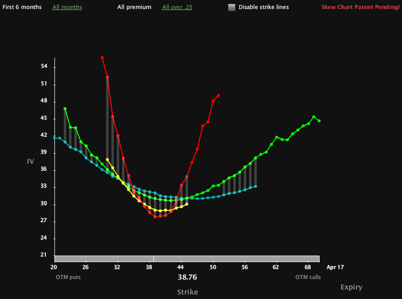
Yesterday’s post on ETFreplay.com triggered so many favorable comments about this site and their graphics that it occurred to me I had neglected to mention that Livevol has added some new volatility skew graphics to Livevol Pro.

In the chart below, I have captured a snapshot of the implied volatility skew in USO, the crude oil ETF. With USO at just under 39 as I type this, the Livevol graphic captures the IV skew in the April (red line), May (yellow line), July (green line) and October (blue line) options. The April front month options have a steep smile, while the July options reflect the more classic flatter smile. Note that the May options look more like a smirk. I have not discussed volatility skew much to date, but I think it is time the blog dove into the Greeks, volatility skew and some more advanced options analytics, so this is definitely on my list of things to do going forward.

If anyone wishes to learn more about these skew graphics and get a better sense of how to interpret them, a good place to start is at the Livevol blog.

Finally, I can’t help but wonder whether I am the only one who thinks about the Aurora Borealis while looking at these skew charts…

For more on related subjects, readers are encouraged to check out:


[source: Livevol Pro]

Disclosure(s): Livevol is an advertiser on VIX and More

Thursday, March 25, 2010

ETFreplay.com Brings ETFs, Volatility and Charts Together Under One Roof

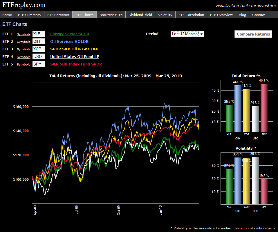
As a full-time investor and part-time blogger, I have a weakness for web sites that focus on ETFs, volatility and charts – three of the subjects I feature prominently in this space. For this reason, I was excited when ETFreplay.com appeared on the scene earlier this year specializing in ETFs, offering some unique and compelling graphics, and demonstrating an interest in volatility.

The site is still evolving, but is already a fun an informative destination, particularly for investors who are interested in ETFs. Some of the functionality currently offered includes screening, back testing, correlations, charting, etc. There is also a blog which provides graphics and commentary on a number of issues related to ETFs. The content is excellent, but the graphics are what inspired the tagline, “Visualization tools for investors.” I have included one example graphic below in which I decided to compare the performance and volatility of four popular energy ETFs (XLE, OIH, XOP and USO) relative to the S&P 500 ETF (SPY) over the course of the past year. I'll let the chart speak for itself.

In my opinion, there only a handful of top tier ETF web sites out there. While it may still be a little too early to add ETFreplay.com to that list, based on the speed at which the site is improving, I suspect it will not be long before that gap is closed.

For more on related subjects, readers are encouraged to check out:


[source: ETFreplay.com]

Disclosure(s): long XOP at time of writing

Wednesday, March 24, 2010

CME to Use VIX Methodology for New Crude Oil, Corn, Soybean and Gold Volatility Indices

Earlier this month, the Chicago Mercantile Exchange (CME) announced they are collaborating with the Chicago Board Options Exchange (CBOE) to bring to market four new volatility indices which are scheduled to be launched in the third quarter of 2010.

The CBOE will use the VIX methodology to calculate volatility indices for four commodities: crude oil; corn; soybeans; and gold.

Commenting on this new collaborative effort between the CBOE and the CME, CBOE Executive Vice President Richard G. DuFour noted, “VIX has become the accepted standard for measuring market volatility, and the new products that will result from this agreement illustrate the broad utility of this methodology.”

Personally, I find it difficult to disagree with DuFour’s assessment and am excited by the prospect of volatility indices being extended to the CME and commodities. Of course the CBOE has already rolled out two commodity-related volatility indices with the CBOE Crude Oil Volatility Index, also known as the “Oil VIX” (OVX) and the CBOE Gold Volatility Index, also known as the “Gold VIX” (GVX). Should the joint CME/CBOE volatility indices gain broad acceptance, I would not be surprised to see additional commodity-related volatility indices to follow.

For more on related subjects, readers are encouraged to check out:

Disclosure(s): none

Monday, March 22, 2010

Expiring Monthly: The Option Traders Journal Launches Today


For those who may have missed it, today is the official launch of Expiring Monthly: The Option Traders Journal. This electronic magazine will be published once per month on the Monday immediately following options expiration and is a collaborative effort involving five of the top options bloggers:

In the inaugural issue, one of my contributions is a section called Charting the Market, which includes a half dozen options-related charts and commentary. In a feature article, “The VIX ETNs: VXX and VXZ,” I examine VXX in detail. For those who wonder about the nature of the content, the introductory paragraph provides a concise summary:

“In the course of my conversations with a broad cross-section of investors, I cannot help but conclude that the popular VIX ETN, VXX, is probably the most misunderstood of all actively traded securities. In this article, I will attempt to look under the hood of VXX, explain how various factors impact the movement of VXX and offer some suggestions about how to approach trading VXX.”

For a more detailed post on Expiring Monthly, readers are encouraged to check out:

Those who are interested can subscribe to Expiring Monthly at a rate of $99 per year or visit http://www.expiringmonthly.com/ for additional information.

Disclosures: I am one of the founders and owners of Expiring Monthly

Sunday, March 21, 2010

Chart of the Week: VIX After 2002 Bottom

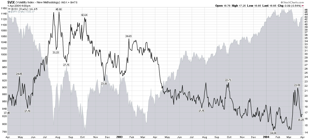
With all the comments I have heard about the persistent falling volatility, one would think that the drop in the VIX to below the 17.00 level is an unwarranted aberration. Several factors suggest otherwise.

Perhaps the most impressive statistical evidence in support of a low VIX is the level of 20 day historical volatility in the SPX, which ended the week at 9.10, following a close of 8.68 on Thursday. While it is true that for the course of its history the VIX has generally been higher than historical volatility in the SPX, the average premium is about 35%, not the unusually high 86% from Friday.

In addition to the statistical evidence, it is also helpful to place the current rally off of a bottom in historical context. In the chart of the week below, which examines the 2002 low, one can see the VIX spiking over 42.00 just as the SPX was bottoming in early October 2002. Some 12 ½ months later, the middle of October 2003, the VIX was hovering in the mid-16s, on the way to a low of about 16.00 by the end of the month and an eventual cycle low in the 14s some 3 ½ months later.

As stocks are now also 12 ½ months away from their March 2009 lows, a VIX in the 16s should not be a surprise, particularly given historical volatility levels, which are generally lower now than they were in October 2003.

As much as I think a lower VIX is possible, my personal forecast is for the VIX to have difficulty gaining traction below the 16.00 level, at least during the April options expiration cycle.

For more on related subjects, readers are encouraged to check out:


[source: StockCharts]

Disclosure(s): none

Friday, March 19, 2010

Bears Emboldened By Low CBOE Equity Put to Call Ratio

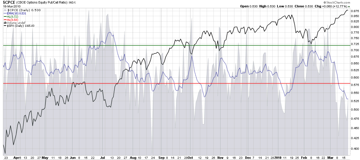
Truthfully, I have not surveyed our ursine friends this morning, so I really have no idea if they are emboldened by the low CBOE equity put to call ratio (CPCE), but they should be.

My preferred way of looking at the equity put to call ratio involves using an exponential 10 day moving average (EMA) as a smoothing factor. The 10 day EMA generates the dotted blue line in the chart below, which is now at a one month low, meaning that bullish investors are now likely to be speculating more aggressively with calls and are less concerned about managing risk with put protection. The chart shows that prior lows in August, September, October and January all preceded meaningful pullbacks. The history of put to call extremes suggests that another pullback is now in the offing.

Whether the bears are truly emboldened or even bother watching put to call ratios, this looks like an excellent time for longs to take some profits and go enjoy the vernal equinox.

For more on related subjects, readers are encouraged to check out:


[source: StockCharts]

Disclosure(s): none

Sunday, March 14, 2010

Chart of the Week: RUT vs. DJIA

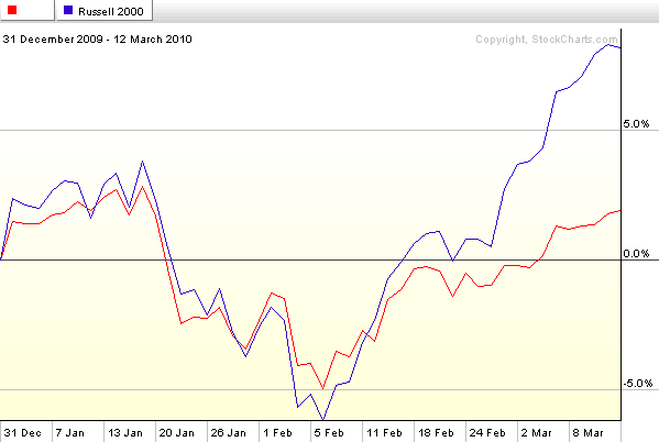
Among the many ways to evaluate the speculative activity in stocks is to evaluate the relative interest in small cap stocks versus blue chips. I like to do this by simply comparing the Russell 2000 index of small cap stocks (RUT) to the Dow Jones Industrial Average.

As the chart of the week below shows, for all of January and most of February, these two indices were tracking fairly closely. During the last two plus weeks, however, the Russell 2000 has begun to significantly outperform the other major market indices while the DJIA has been an underperformer in relative terms. As a result, RUT has begun to separate from the DJIA, indicating that investors are developing an appetite for riskier small cap stocks and are shying away from the safer blue-chip alternatives. A strong RUT relative to the DJIA typically means that the “risk trade” is in full gear and investors are comfortable placing more money in more speculative assets. As long as this trend continues, it is generally bullish for stocks as a whole.

For more on related subjects, readers are encouraged to check out:


[source: StockCharts]

Disclosure(s): none

Sunday, March 7, 2010

Chart of the Week: Updated Nonfarm Payrolls and Unemployment Rate

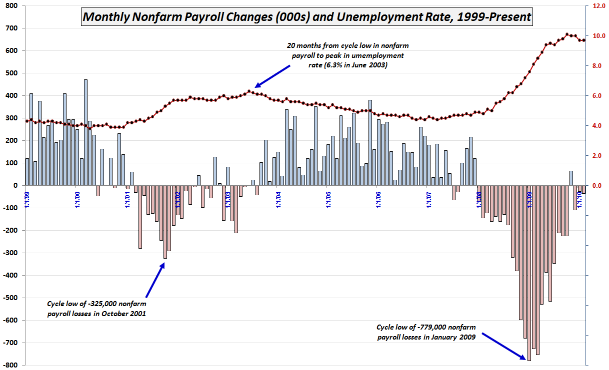
Any week that the employment report is released, that data is automatically in the running for the chart of the week. Given that the Bureau of Labor Statistics corrected some of the historical data series and stocks rallied sharply off of the not-as-bad-as-feared payroll losses, this seemed like a good time to update a chart that has always been a big hit and I that I have not published in seven months.

The chart below shows monthly changes in nonfarm payroll employment and the unemployment rate going back to 1999 and captures the recent plateau in both measures. Note that in 2002 and early 2003, payroll data showed an occasional positive blip before sustained payroll growth began in the last quarter of 2003. Also worth noting, the unemployment rate did not peak in 2003 until 20 months after peak payroll losses that dated all the way back to October 2001.

Of course every recovery is different, but from a labor perspective, one can still make the case that there is not enough evidence that the employment situation has bottomed.

For more on related subjects, readers are encouraged to check out:


[source: Bureau of Labor Statistics]

Disclosure(s): none

Friday, March 5, 2010

VIX Price Channel Chart

Today I am concluding my presentation of some of the charts I received as entries in last week’s chart of the week contest.

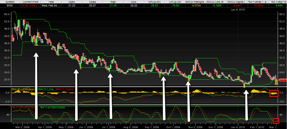
The chart below comes from Dan Glynn, who offered the following commentary:

“This is just a simple one year chart of the VIX in a price channel with MACD and stochastic indicators. Every time the VIX has broken the price channel lower line (highlighted) there has been a reversal, even in this lengthy downtrend. In addition, I have white arrows pointing from where the stochastic lines were crossing. This either coincided with the channel break or was slightly before or after. I also red boxed the most recent MACD bars, which are getting shorter. [Finally,] the distance between the last price line break and the most recent shows the most X-axis (vertical) distance [of] any other consecutive price line breaks throughout the year.”

The original version of the chart, which is larger and easier to read, can be found here.

Thanks again to all who sent in charts. This was a lot of fun for me and I will definitely do it again.

For more on related subjects, readers are encouraged to check out:


[source: Dan Glynn]

Disclosure(s): none

Thursday, March 4, 2010

Annotated VIX Downtrend Symmetry Channel

Not surprisingly, I received quite a few VIX charts in last week’s chart of the week contest. After several reader requests, I am taking the liberty of posting some of my favorites that fell just short of the (highly subjective) gold medal, but probably should have been somewhere on the podium.

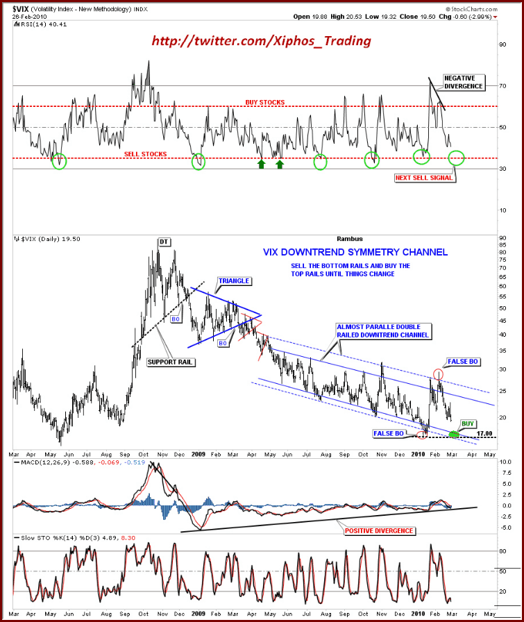
Included in the runner up list is the chart below from Rick at Xiphos Trading. In my opinion, Rick’s chart is a superb example of using the power of clean lines and annotations to turn a great deal of data into a relatively simple interpretive model with buy and sell signals that are easy to discern. Not only is the look and feel attractive, but the interpretation and conclusions are interesting as well. This chart has quite a few moving parts, but they are integrated well, with an overlay of geometry and commentary that makes the main chart and three supplementary studies easy to digest and act upon.

For more on related subjects, readers are encouraged to check out:


[source: Rick, Xiphos Trading]

Disclosure(s): none

Wednesday, March 3, 2010

Correlation of VIX and “VIX Index” Searches on Google

In retrospect, recognizing only one winner for the chart of the week contest was probably a little short sighted on my part, particularly given the very high quality of the entries.

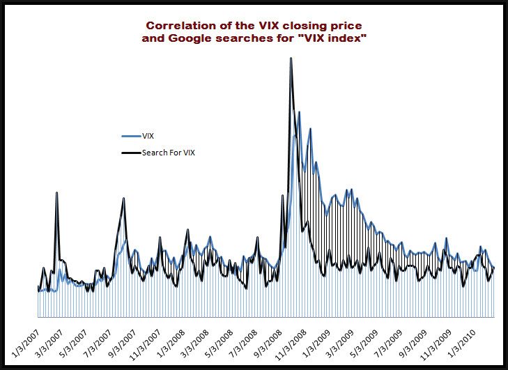
Several readers have asked to see some of the other entries and I am happy to oblige. One of the contenders for the mythical silver or bronze medal certainly would have been a submission from Darren Miller of Attitrade. In the chart below, Darren has compared the level of the VIX with the relative frequency of Google searches for “VIX index” from the beginning of 2007 to the present.

Note that prior to the October 2008 VIX spike, there were more significant spikes in searches for information about the VIX than in the VIX itself. Following the VIX peaks in October and November 2008, the demand for information about the VIX subsided much more rapidly than the VIX index. In fact, according to the graphic, the “VIX index” search activity was back to pre-crisis levels by December 2008, whereas it took the actual index another year to make a comparable drop.

What does this mean? I’m sure Darren and others have their own interpretation, but the chart does bump up against some of the ideas I outlines in my availability bias and disaster imprinting series from last year:

In a nutshell:

“Disaster imprinting refers to a phenomenon in which the threats of financial and psychological disaster were so severe that they continue to leave a permanent or semi-permanent scar in one’s psyche. Another way to describe disaster imprinting might be to liken it to a low level financial post-traumatic stress disorder.”

In reviewing the chart of the VIX against corresponding Google searches, it is possible to conclude that availability bias and disaster imprinting are present in that searches for information about the VIX rapidly reverted to historical norms, while the level of the VIX itself was only gradually reduced over a period of months and months, creating a significant gap between the index and the search activity for almost all of 2009.

For more on related subjects, readers are encouraged to check out:

[source: Darren Miller, Attitrade]

Disclosure(s): none

Monday, March 1, 2010

Chart of the Week: Total Put to Call Ratio

Thanks to all who submitted charts for the chart of the week contest. After getting off to a slow start, I was somewhat skeptical that my idea of opening up the chart of the week to readers would turn out as I had hoped, but when over two dozen submissions landed in my inbox, I was humbled by the breadth and depth of the body of work they represented.

Alas there can only be one gold medal and this time around (I’m sure I will do this again), the winner is Amir from Las Vegas.

Amir’s chart shows how using the CBOE’s total put to call ratio (CPC) could have been helpful in identifying tops and bottoms in the S&P 500 index during the course of the last year. The areas highlighted in yellow show that the total put to call ratio (which summarizes put and call activity for individual equities plus indices) spiking to extreme levels during the June-July 2009 low and just last month dropping to the lowest level in several years. Clearly last month's signal was an excellent time to trade on the short side, at least for the short-term. Whether the extreme reading turns out to be a harbinger of a much steeper downturn remains to be seen.

My personal bias is to use the ISEE and CPCE (equity only) put to call data, but any one of these indicators is capable of generating excellent short-term to long-term market timing signals.

For his efforts, Amir also wins a one year free subscription to Expiring Monthly: The Option Traders Journal.

Thanks again to all those who submitted a very strong group of charts. As much fun as this was, I will be sure to periodically open up the Chart of the Week competition to readers going forward.

For more on related subjects, readers are encouraged to check out:


[source: StockCharts]

Disclosure(s): I am one of the founders and owners of Expiring Monthly


DISCLAIMER: "VIX®" is a trademark of Chicago Board Options Exchange, Incorporated. Chicago Board Options Exchange, Incorporated is not affiliated with this website or this website's owner's or operators. CBOE assumes no responsibility for the accuracy or completeness or any other aspect of any content posted on this website by its operator or any third party. All content on this site is provided for informational and entertainment purposes only and is not intended as advice to buy or sell any securities. Stocks are difficult to trade; options are even harder. When it comes to VIX derivatives, don't fall into the trap of thinking that just because you can ride a horse, you can ride an alligator. Please do your own homework and accept full responsibility for any investment decisions you make. No content on this site can be used for commercial purposes without the prior written permission of the author. Copyright © 2007-2023 Bill Luby. All rights reserved.
 
Web Analytics