Sunday, December 27, 2015

Enhancing Performance with Low Volatility ETPs

One theme that I will spend more time on in 2016 and beyond is the low volatility anomaly, which has been discussed in considerable detail in the academic world, leading to papers such as the following:


In a nutshell, the research supports the claim that low volatility and low beta stocks in the United States and across the globe outperform high volatility and high beta stocks, with low volatility stocks generating substantially higher risk-adjusted returns.

Not coincidentally, the groundswell of research pointing to outperformance by low volatility stocks has created a land rush for low volatility ETPs in the first generation of “smart beta” or factor-based investment products in ETP wrappers.  Since I believe smart beta or factor-based ETPs is one of the key revolutionary ideas to appear in the investment world in recent memory, I will have a great deal to say about this subject and the many tangential ideas that arise from it going forward.  After nine years focusing primarily on the VIX, volatility and related subjects, it is time to charge off in some new directions, starting with some that have a whiff of volatility and ETP innovation.

For now I am going to be content with updating a February 2013 post, with the title The Options and Volatility ETPs Landscape.  At that time, I wanted to capture those ETPs which employed a buy-write / covered call approach, employed a put-write strategy, focused on the convertible bond space or targeted low volatility stocks.  Well, a lot has changed in the past three years, notably in the low volatility space.  This time around, I have some enhancements to the options and volatility ETPs graphic.  As is the case with The Current VIX ETP Landscape, I have added yellow stars for those ETPs with an average daily volume of 1,000,000 or higher and pink stars for ETPs with an average daily volume between 100,000 and 1,000,000.  Additionally, I have highlighted the new currency-hedged crop of low volatility ETPs by using a red font and have captured the demise of HFIN, a financials buy-write ETF that closed in March 2015 with a X-HFIN designation. 


[source(s): VIX and More]

There are a number of other sub-categorizations I will delve into at a future data, but note that whereas FTHI is a buy-write only, FTLB adds an out-of-the-money put.  Three other relatively new arrivals, CFO, CDC and CSF, are structured so that they will hold up to 75% of portfolio assets in cash in adverse market conditions.  Another intriguing new entrant, SLOW, attempts to avoid sector bias by forcing greater sector diversification than most other low volatility ETPs.

So if you found 2015 volatility to be daunting and are looking to dampen volatility in your portfolio in 2016 or tap into the performance benefits of the low volatility anomaly, keep the list above in mind.  While comprehensive and including many ETPs with marginal liquidity, this list may not touch upon some of the many new and illiquid products that might be flying under the radar.

Related posts:


Disclosure(s): none

Sunday, December 6, 2015

The Current VIX ETP Landscape

I have been writing about VIX ETPs since the launch of the initial duo of VXX and VXZ back in January 2009 and from 2010 onward I have been plotting all of them on a leverage/maturity grid like the one below. It is amazing how often various VIX ETP investors mentioned one of these charts when I talk to them. Even through the VIX ETP space has been relatively stable as of late, I have not updated this graphic since early 2014, so a refresh is long overdue.

For those who have not been following along over the years, I have plotted every VIX-based ETP using leverage on the Y-axis and maturity on the X-axis. With the advent of what I am calling VIX strategy ETPs, I have isolated in their own box in the lower right hand corner a half dozen of these products whose characteristics do not necessarily imply a fixed point on Cartesian coordinate system.

The key at the bottom highlights various salient features of each of these products. From previous incarnations, I have retained the presence of non-VIX legs (typically positions in SPX/SPY), the combination of both long and short legs, dynamic allocation of the legs and optionability. I have also shaded areas where there is high leverage/compounding risk as well as high roll yield risk. Not surprisingly, these risks converge at TVIX and UVXY, two of the more infamous VIX ETPs.  Another carryover is font color, where black indicates ETFs and blue is for ETNs.  This time around I have also added yellow stars for those ETPs with an average daily volume of 1,000,000 or higher and pink stars for ETPs with an average daily volume between 100,000 and 1,000,000. Note that while CVOL technically makes the cut, at today’s closing price of 0.40, any sort of meaningful reverse split to raise the price about 5 or 10 would highlight just how illiquid this issue is. In fact, only six VIX ETPs pass the one million share screen: TVIX, UVXY, VIXY, VXX, SVXY and XIV.

VIX ETPs 120615

[source(s): VIX and More]

There are three new additions to this graphic. The most notable of these are VXUP and VXDN, which were launched by AccuShares back in May. These products deserve a post (or series of posts) dedicated to some of the issues surrounding them, but the short version is that high complexity, frequent distributions and consistent tracking errors resulted in a product that investors decided was not worth their trouble. The other “new” products is, VQTS, the first ETP that tracks the SPX VEQTOR Switch Index, making it a relative of VQT and PHDG, but one which uses a dynamic allocation to VIX futures to achieve a 10% target realized (historical) volatility. VQTS was launched in December 2014 and like most VIX ETPs, has struggled to reach critical mass.

While the VIX ETP market is showing some signs of maturing, there are many new and exciting developments in terms of low volatility ETPs and more broadly in the ETP space in general. As I am currently at the IMN 20th Annual Global Indexing & ETF Conference – and scheduled to speak on a panel, “Trading the VIX: Riding Today's Waves of Volatility” with Larry McDonald, Mark Shore and Matt Moran tomorrow – this seems like a good time to devote more time to writing and in particular to resurrecting the “and More” portion of this blog.

Related posts (a selection from literally hundreds of posts on VIX ETPs):

Disclosure(s): net short VIX, VXX, UVXY and TVIX; net long SVXY, XIV and ZIV at time of writing

Monday, November 23, 2015

VIX Weekly Futures and Options Expire Tomorrow (Tuesday); Last Trading Day Is Today

Just a quick public service announcement to remind traders of VIX futures and options that the VIX weekly futures and options, which the CBOE launched earlier this year, will expire tomorrow instead of the usual Wednesday expiration.

The reason for the unusual Tuesday expiration is the Christmas holiday calendar. Keep in mind that VIX options expire 30 days before the underlying S&P 500 Index options on which they are based. As Christmas Day falls on a Friday this year, the SPX weekly options for the fourth week in December have their expiration moved up to Thursday, December 23, with the VIX weeklys for the fourth week in November moved up to tomorrow. Perhaps even more important, this means that this week’s VIX weeklys can last be traded today, so if you harbor any intentions about opening or closing a short-dated VIX weekly options (or futures) position tomorrow, be sure to make that happen today instead.

As an aside, as I see it, the VIX weeklys are the most important product launch in the volatility space in several years. The VIX weekly futures were launched in July, followed by a launch of the VIX weekly options in October. How popular are these products? Well, the VIX weekly options that expire tomorrow have an open interest of just under 100,000 contracts as I type this, as the graphic below demonstrates.

VIX weekly options 122315

[source(s): Livevol Pro / CBOE]

The VIX weeklys have already become a staple of my client portfolios and are something every volatility investor should investigate. If you are one of those who has shied away from weeklys or is not comfortable trading options close to expiration, one book that I’m sure will give you something to think about along those lines is Jeff Augen’s, Trading Options at Expiration.

It should go without saying every options trader should have their own options calendar handy in order to help identify these calendar anomalies in advance. My personal favorites are as follows:

Note that the links above are for 2016. For 2015 or for any other year, just edit the URL accordingly.

Finally, I have missed blogging on a regular basis and am committed to getting back into the game this week, ramping up my activity into the December FOMC meeting.

Related posts:

Disclosure(s): short VIX at time of writing; the CBOE and Livevol are advertisers on VIX and More

Wednesday, September 2, 2015

China Growth and Market Structural Integrity Top List of Fear Poll Concerns

After a hiatus of almost a year (the October 2014 pullback, to be exact), I have reprised the VIX and More Fear Poll in an attempt to get some insight into which issues have been responsible for bring fear back into the investing equation and in so triggering the highest VIX spike (53.29) outside of the 2008-09 financial crisis and the #5 and #6 one-day VIX spikes ever on consecutive days.

In the chart below, I have summarized the top ten responses from almost 400 voters, covering 40 countries over the past two days.  The question:  “Which of the following makes you most fearful anxious or uncertain about the stock market?”

VIX and More Fear Poll results 090215

[source(s): VIX and More]

I should note that Tuesday’s responses had “Market structural integrity (high-frequency trading, flash crashes, exchange stability, etc.)” as the #1 concern, but a late flurry of votes today for “China – weak economic growth” put China concerns over the top. Combining Chinese growth concerns with concerns about a bubble in Chinese stocks and/or housing makes it a landslide in favor of all things China. Without too much of a stretch, one could also lump in the likes of currency problems, deflation, low crude oil prices and falling commodities prices in general into a broader China-related bucket and suddenly the China + ripple effect accounts for about 50% of the votes.

As always, I love to see how the American view of the world contrasts with those non-U.S. respondents. This time around, the area most overemphasized by Americans relative to the rest of the world is, in classic Americentric myopia fashion…”U.S. – weak economic growth,” which 8.7% more Americans label as their #1 concern than their non-U.S. counterparts. Conversely, the biggest blind spot for Americans – at least relative to the concerns of the rest of the world – is commodities prices, which Americans underweight by 5.1%. A close second in the American myopia sweepstakes is Chinese bubbles in stocks and/or housing. I do not find the commodities oversight to be surprising, but certainly the relatively low concern about Chinese bubbles is unexpected.

For those who have not seen some of the earlier incarnations of this poll, these dataeback to 2012 and chronicle a U.S. public that was so obsessed with the fiscal cliff that they did not fully appreciate the gravity of the European sovereign debt crisis.

Related posts:

Disclosure(s): none

Monday, August 24, 2015

Third Biggest and Second Longest SPX Peak to Trough Pullback Since March 2009

Nary a pullback goes by without at least a handful of requests to update my pullback table to help put the current pullback in perspective. Whether the current market action is best described as a pullback, correction or even bear market, I am happy to oblige.

For those who may new to this graphic, note that the table below includes only S&P 500 Index pullbacks from all-time highs and only those that go back to the March 2009 bottom. (Due to the all-time high requirement, I count back to the May 20th intraday high of 2134.72, even though almost all of the damage has been done in the past three days.) In terms of defining the minimum pullback for the table, here 2.75% seems to be a natural cutoff, but I am more apt to include smaller numbers if it took a relatively large number of days to arrive at the bottom. Of course the current move does more than just squeak in: it is now the third largest in terms of magnitude at 12.5% and second longest from peak to trough, at 66 days.

Worth noting is that the #1 pullback (21.6% in 2011) saw a peak VIX of 48.00 during the decline, while the #2 pullback (17.1% in 2010) coincided with a maximum VIX of 48.20. The current pullback falls into the #3 slot, while the #4 pullback (10.9% in 2012) saw a maximum VIX of only 26.71. For the record, today’s VIX intraday high of 53.29 is the highest VIX on record outside of the 2008-2009 financial crisis, with data going back to 1990.

SPX pullback table as of 082415

[source(s): CBOE, Yahoo, VIX and More]

While there is no obvious proximate cause of the current pullback and VIX spike, it is clear that concerns about slowing growth in China is the main source of investor anxiety.  Investors are clearly uneasy about various sub-plots related to the real level of China’s GDP, the impact of slowing Chinese growth on commodities and related markets, speculative excess and bubbles in China’s domestic stock market (ASHR) and real estate market (TAO) or broader concerns about the ability of the Chinese government to manage the economic transition from infrastructure-driven growth to growth based on domestic consumption.

Sharp selling and higher volatility has been present for many months in commodities and currencies. Only recently has the selling and higher volatility spilled over into Chinese equities and emerging markets as a whole. In fact, emerging markets have suffered greatly as of late, with the popular EEM ETF plummeting during the last two weeks and now down 32% from its April high. At the same time, the VXEEM emerging markets volatility index soared to record of 111.39 on an intraday basis today, crushing the previous all-time high of 86.44.

As with all big pullbacks, at this point we only know that we are closer to a bottom and have no assurance that the current bottom will hold. Most likely it will be tested again in the next day or two and traders will take their cues based on how well SPX 1867 holds up as support.
Related posts:

Disclosure(s): long EEM at time of writing

Last Two Days Are #5 and #6 One-Day VIX Spikes in History

Many readers have commented that one of their favorite of my regular graphics is the table of VIX spikes of 30% or more that I update periodically in this space, along with the subsequent performance in the S&P 500 Index following these spikes.

This time around I have elected to add an additional column that identifies the catalysts involved (necessarily a subjective process) in each instance. When thinking about these catalysts, it might be helpful to compare the nature of the threat and the size of the VIX spike to changes in volatility during various high-profile historical events, an analysis I captured in Volatility During Crises. Another useful exercise is to think about the fundamental factors influencing each VIX spike in the context of A Conceptual Framework for Volatility Events, which I find particularly useful in helping to gauge just how large of a VIX spike a certain type of event might trigger.

Of course the table below has its own set of data nuggets, both fundamental and technical. One interesting statistic I find worth highlighting is the relatively high frequency of large VIX spikes that have occurred during the past five years. VIX data goes back 26 years and yet more than half of the VIX spikes in this table data are from the past five years. I think it is no coincidence that the VIX ETPs (initially VXX and VXZ) were launched in 2009 and the inverse VIX ETPs (XIV and ZIV) and leveraged VIX ETPs (starting with TVIX) were launched in the following year, when big VIX spikes suddenly became more common – much more so than during the 2008 financial crisis, the dotcom crash, etc. For additional information on the subject of more VIX spikes in spite of a generally lower volatility environment, check out 2014 Had Third Highest Number of 20% VIX Spikes.

History of 30 pct VIX Spikes w Catalysts 082415

[source(s): CBOE, VIX and More]

As noted previously, based on the data for all VIX spikes in excess of 30%, the SPX has a tendency to outperform its long-term average over the course of the 1, 3 and 5-day periods following the VIX spike. Also worth noting that that 10 and 20 days following the VIX spike, the SPX has a tendency not only to underperform, but to decline. Further, while the huge decline following 9/29/08 VIX spike tends to dwarf the other data points, even when you remove the 9/29/08 VIX spike it turns out that the SPX still loses money in the 10 and 20-day period following a VIX spike. When the analysis is extended out 50 trading days, the SPX is back to being profitable, but performing below its long-term average. On the other hand, when the analysis includes 100 days following the VIX spike, the SPX is back to outperforming its long-term average.

In summary, this data suggests that following a 30% one-day VIX spike, there appears to generally be a tradable oversold condition in stocks that lasts approximately one week, followed by a period of another month or so in which the markets typically has difficulty coming to terms with the threat to stocks. This tendency makes today’s market action even more remarkable in that today was by far the worst performance of the SPX in a day following a 30% VIX spike.

Taking a longer-term perspective, looking out at least one quarter, all fears are usually in the rear view mirror and stocks are likely to have tacked on significant gains.

As noted many times here in the past, the data in this table supports the idea of both short-term and longer-term mean reversion, but calls into question the role of mean reversion in the 10-20 days following a VIX spike, where fundamental factors have a tendency to overwhelm a technically oversold condition in stocks.

Related posts:

Disclosure(s): short VIX at time of writing; the CBOE is an advertiser on VIX and More

Saturday, July 11, 2015

Seizing Opportunity From Stock Market Volatility (Guest Columnist at Barron’s)

Steve Sears and I have a running joke that whenever I am tapped as a guest columnist for The Striking Price at Barron’s, we should both start buying VIX calls as inevitably something is going to come along and cause a volatility spike just in time to give me something topical to discuss.

This time around I thought China might be the culprit or Greece or Puerto Rico or the Fed or maybe even the NYSE. In fact, it was a cocktail of everything that has turned a relatively quiet Q2 into a much more menacing volatility environment in Q3. In Seizing Opportunity From Stock Market Volatility, which appears today in Barron’s, I turn my attention to small caps (RUT, IWM) and use IWM vs. SPY as a way to think about relative volatility in the context of exposure to China, the euro zone and a strong dollar. Focusing on the Russell 2000 Volatility Index (RVX) and VIX, investors have been attributing roughly the same level of uncertainty and relative risk for small caps as large caps, which I see as questionable when one considers the very different exposure each asset class has to global issues and the dollar.

Given that RVX futures (VU) are thinly traded, it probably does not make sense to be short VU and long VX, the VIX futures. Another way to translate the thinking above into a strict volatility trade would be to short an at-the-money straddle for RUT or IWM, while going long an at-the-money straddle for SPX or SPY. That type of trade is probably a stretch for most Barron’s readers, but I suspect is probably right in the wheelhouse of many readers in this space. For the Barron’s article, I came up with something simpler to execute, an IWM Aug 121/123 bull put spread, which has both volatility and directional components to it and is disengaged from volatility in SPX/SPY.

In the Barron’s article, I talk a little bit about selling volatility in a post-crisis market environment or following a significant volatility event, observing:

“Selling options on the downslope of a volatility spike is often only marginally less profitable than selling options at the top of a volatility spike.”

If any of this sounds a little bit like a corollary to some of my work on “disaster imprinting” then some readers clearly have very good memories.

Related posts:

A full list of my (16) Barron’s contributions:

Disclosure(s): none

Monday, June 29, 2015

Today’s 34% VIX Spike and What to Expect Going Forward

One of the top posts of 2013 was All-Time VIX Spike #11 (and a treasure trove of VIX spike data), in which I sliced and diced the twenty largest one-day VIX spikes in the history of the VIX. Nineteen of those spikes were in excess of 30% and with all-time #5 arriving later in 2013 and all-time #15 and #16 following in 2014, I was compelled to comment that despite the seemingly low VIX and concerns about complacency, 2014 Had Third Highest Number of 20% VIX Spikes.

Fast forward to the present and for all the talk of a low VIX, some forget that the second day of 2015 had a 28.1% VIX spike and then today, we saw a 34.5% VIX spike, the eleventh largest in the history of the VIX and enough to trigger an update to the table of largest one-day VIX spikes below.

History of 30pct VIX Spikes 062915

[source(s): CBOE, VIX and More]

Note that based on the data for the 23 VIX spikes in excess of 30%, the SPX has a tendency to outperform its long-term average over the course of the 1, 3 and 5-day periods following the VIX spike. Also worth noting that that 10 and 20 days following the VIX spike, the SPX has a tendency not only to underperform, but decline. Further, while the huge decline following 9/29/2008 VIX spike tends to dwarf the other data points, even when you remove the 9/29/2008 VIX spike it turns out that the SPX still loses money in the 10 and 20-day period following a VIX spike. When the analysis is extended out 50 trading days, the SPX is back to being profitable, but performing below its long-term average. On the other hand, when the analysis includes 100 days following the VIX spike, the SPX is back to outperforming its long-term average.

With the caveat that this is a limited data set, it is still worth flagging the pattern in which following a 30% one-day VIX spike, there appears to generally be a tradable oversold condition in stocks that lasts approximately one week, followed by a period of another month or so in which the markets typically has difficulty coming to terms with the threat to stocks. One quarter later, however, all fears are generally in the rear view mirror and stocks are likely to have tacked on significant gains.

This type of pattern supports the idea of both short-term and longer-term mean reversion, but calls into question the role of mean reversion in the 10-20 days following a VIX spike, perhaps has fundamental factors begin to win out over a technically oversold condition in stocks.

Now that we have a template, let’s see how well it works for the current market environment.

Since the events of the day have given all of us a fair amount to think about, I have included a larger than usual number of related and tangential links below for those who wish to do a little extra reading.

Related posts:

Disclosure(s): short VIX at time of writing; the CBOE is an advertiser on VIX and More

Longest SPX Peak to Trough Pullback Since 2012

I have been quiet in this space as of late, but there is nothing like a 34% one-day spike in the VIX to inspire me to dust of the cobwebs and get this place humming again. I will start by updating an old favorite table that invariably is the subject of many requests whenever stocks begin to show signs of a meaningful pullback, as is the case today.

Note that the table below includes only pullbacks from all-time highs and only those that go back to the March 2009 bottom. Here 2.75% seems to be a natural cutoff, but I am more apt to include smaller numbers if it took a relatively large number of days to arrive at the bottom. Seen in this light, today’s 2.09% decline in the S&P 500 Index brings the aggregate peak-to-trough decline to 3.7%, but perhaps the most interesting number is that it took a full 27 trading days to realize that 3.7% drop. In fact, no peak-to-trough decline has taken longer to materialize since a pair of 43-day moves from late 2012 that resulted in 8.9% and 10.9% declines. Of course, there is no reason to believe that today is a bottom, but then again, there have been only four longer-lasting pullbacks since the current bull market started over five years ago.

SPX pullback chart as of 062915

[source(s): CBOE, Yahoo, VIX and More]

Depending upon whether one attributes the current pullback to China, Greece, Puerto Rico or more nebulous factors as valuation, time without a correction, etc. one might draw different conclusions about the path forward. Personally, I see China as the biggest culprit, followed (at least today) by Puerto Rico and then Greece. What concerns me most is that the issues in China and Puerto Rico are no less thorny or difficult to resolve than they are in Greece.

For what it is worth, while I think it is important to understand the age of a bull market as a partial proxy for vulnerability, I do not subscribe to the theory that a healthy market needs a 10% correction every x months or y years. Further, did the 9.8% peak-to-trough decline in the SPX really need another 0.2% to reset some sort of magical market-timing sundial? (Don’t forget that both the NASDAQ-100 [NDX] and Russell 2000 [RUT] did hit that threshold during the same period.)

In technical analysis, the time for a move to unfold is sometimes almost as important as the magnitude of the move. In another week or so, we should know whether the current price action is just a slow-motion, short and shallow dip or perhaps the first signs of a deeper and more painful countertrend – and the best part is that we don’t even need a referendum to decide the matter.

Related posts:

Disclosure(s): none

Tuesday, January 27, 2015

Average Annual Normalized VIX Futures Term Structure, 2004-2014

One graphic I post periodically that never fails to generate a great deal of interest among traders, strategists and other volatility aficionados is my normalized VIX futures term structure graph. From 2008 – 2013, the annual normalized term structure was notable in that almost every year was an outlier in one way or another. For instance, 2012 and 2013 were the two years with the steepest contango in history, while 2008, 2009 and 2011 represent three of the four years (2007 being the fourth) with the flattest term structure.

And 2014? It could not have been more average. If one combines all the years from 2004 to 2014 and creates an “average year” (i.e., the wide gray line on the chart) then 2014 (double blue line) comes closest to that average.

Normalized VIX Futures Term Structure, 2004-2014

[source(s): CBOE, VIX and More]

Note that the terms structure lines are dotted and somewhat wavy for 2004 – 2006, due to the fact that the CBOE did not implement a full complement of consecutive monthly futures until October 2006.

As for 2015, which is not plotted on the graph above, so far it looks quite flat, almost like a cross between 2007 and 2009. It will be interesting to see if this pattern holds for the balance of the year.

Related posts:

Disclosure(s): the CBOE is an advertiser on VIX and More

Sunday, January 25, 2015

The Year in VIX and Volatility (2014)

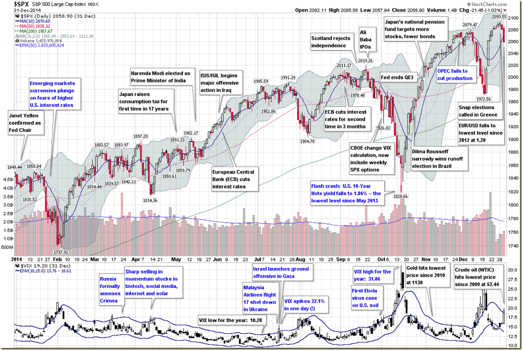
This is the seventh year in a row I have offered a retrospective look at the year in VIX and Volatility, which is my attempt to cram some of the highlights of the year in volatility onto one eye chart graphic with a (somewhat) manageable number of annotations.

In aggregate, 2014 was a very quiet year for the VIX, with a mean close of just 14.19 for the year, which is the lowest the VIX has been since 2006 and third lowest since 1995. On the other hand, as I recently documented, VIX spikes were common last year, with 2014 registering the third highest number of 20% VIX spikes since the beginning of VIX data, in 1990. In short, the VIX was susceptible to large spikes, but these were typically followed by strong mean-reverting declines. For example, the peak VIX of 31.06 on October 15 was the highest VIX reading since 2011, yet just six weeks later the VIX was back in the 11s.

When asked in October what they perceived as the biggest threat to stocks, respondents to the VIX and More fear poll pointed to the end of quantitative easing and the removal of the Fed safety net as their top concern, with Ebola narrowly edging out the much more nebulous “market technical factors” for the second slot. As best as I am able to determine, it was the panic associated with fears of an Ebola epidemic that took an already elevated VIX and pushed it up into the 30s.

At various times during the year, Ukraine/Russia, crude oil, ISIS/ISIL, Israel/Gaza, the Fed and the European Central Bank all managed to increase anxiety and perceptions of risk among investors. Also, the narrow miss in the vote for Scottish independence created turmoil in the United Kingdom and across the euro zone, but managed to avoid morphing into another nationalist crisis. Early in the year, there was a currency crisis in emerging markets that was triggered by (unfounded, in retrospect) concerns about higher interest rates in the U.S. Throughout the year there were concerns about valuations and excesses momentum trading in the likes of biotechnology, social media, internet and solar stocks. To some extent, these concerns peaked in April (see The Correction as Seen in the ETP Landscape for additional details), only to return periodically throughout the balance of the year.
The Year in VIX and Volatility 2014

[source(s): StockCharts.com, VIX and More]

Last year at this time, the prevailing worries were focused on whether or not Fed Chair Janet Yellen was leaning toward a more hawkish stance, the inevitable march to higher interest rates in the U.S., the weakening of emerging markets currencies and the potential fallout from the Fed’s tapering of bond purchases. In retrospect, investors were largely worrying about the wrong things.

The first few weeks of 2015 have seen Greece, Saudi Arabia and Ukraine back in the spotlight, with the Swiss National Bank and European Central Bank dominating news on the central banking front. If the past is any guide, the big issue for 2015 has yet to rear its ugly head, whether it turns out to be a gray, charcoal or black swan.

Related posts:

Disclosure(s): none

Top Posts of 2014

Since I launched VIX and More some eight plus years ago, I have devoted one post to highlighting the top 25 most-read posts of each year. I do this in part for archival purposes: to see what is important to readers and how their interest in various issues changes over time. I also hope that these aggregations of most-read posts will serve as relatively easily accessible repositories of high-quality material for the benefit of new readers and long-term readers alike.

During 2014, the blog saw an extended hiatus for the first time in its history, largely due to events arising from the passing of my father. For this reason, I am limiting the number of top posts for the year to thirteen, largely because Song for My Father* ended the year in the #13 slot.

Looking ahead, volatility is back and so am I. I miss writing and I miss the interaction with readers. In the coming year I will significantly ramp up my activity on the blog and also in the comments section. I will also continue to write a weekly newsletter specializing in volatility (which just so happens to have a 14-day free trial), pen periodic guest columns for Barron’s and perhaps contribute to some other publications as well.  All this will be in addition to my primary role, which is that of an investment manager.

In 2014, some of the top stories were Ebola, Ukraine vs. Russia, crude oil, ISIS/ISIL, the Fed and the European Central Bank.  The posts below represent those that have been read by the highest number of unique readers during 2014. Farther down there are links to similar lists going back to 2008, along with several other “best of” type posts that I have flagged for archival purposes.

For the record, each year I also attach the hall of fame label to a handful of posts that I believe have particularly compelling and/or original content, regardless of readership. I was a tough grader last year, as I only added one new post to the HoF in 2014, but I already have an addition for 2015 and my goal is to continue to crank out Hall-of-Fame-worthy posts on a regular basis in 2015 – and even manage to do it without assistance provided by performance-enhancing drugs…

With an increase in posting on the blog, I also foresee a substantial uptick in my activity on Twitter, where @VIXandMore gives me a platform to contribute more in terms of time-sensitive news, short-term insights and other related subjects.

The thirteen most-read posts on VIX and More in 2014 were:

Related posts:

Disclosure(s): none

Tuesday, January 6, 2015

2014 Had Third Highest Number of 20% VIX Spikes

By most measures, one would think that 2014 was a relatively quiet year for the VIX and equity volatility in general. In fact, the average VIX of 14.19 was the lowest for the full year since 2006 and the third lowest going back to 1995. Of course, averages can be misleading and just as you can drown in a river with an average depth of one inch, anyone who was short the VIX when it spiked all the way up to 31.06 in October knows that minimum and maximum readings are important.

With this in mind, the chart below shows the number of 20% one-day VIX spikes per year, going back to 1990. Note that when looked through the lens of those 20% spikes, 2014 was the third most volatile year for the VIX since 1990, with the same number of 20% VIX spikes as 2008! Additionally, if one were to round up a near miss from December 8th, last year would move into a tie for the #2 slot, just behind the euro zone carnage from 2011.

VIXspikesbyyearthru010515_zpse2baffc9[1]

[source(s): CBOE, VIX and More]

Perhaps the most interesting thing about the 20% VIX spikes is that two of them came during the last month of the year and with a little rounding, the December 8th spike could have been number three. Toss in yesterday’s 28.1% VIX spike and that is four VIX spikes of at least 19.5% in one month. Uncharted territory? Not quite, with August 2011 having already marched down that path, but something not achieved in any other year, including 2008 or at any time during the bursting of the dotcom bubble.

The have been a number of important changes in the volatility space during the past year or so and going forward I will address quite a few of them, with additional analysis and commentary.

Related posts:

Disclosure(s): short VIX at time of writing