Saturday, February 27, 2010

Charting 101

Given the dismal response to the chart of the week contest, I thought a couple of suggestions and hints might be in order to help get the graphics flowing.

For starters, creating charts is easy. Making charts that tell a compelling story only requires a little bit of insight and effort. Sometimes the best way to make a interesting chart is just to look at a bunch of them until one of them jumps off the page and forces you to take notice.

A good place to start with charting is your favorite broker. For those who like to use a third party specialty chart tool, one of the best free charting sites is at FreeStockCharts.com, where you can create an attractive chart that is as simple or complex as you wish in one or two minutes.

For those wishing to subscribe to a charting service, my personal favorite is StockCharts.com, where you can maintain a stable of charts that are customized to your liking. Non-subscribers can create a fairly comprehensive view of almost any security, ratio, etc. using gallery charts. There are a number of attractive features that are also available for free. These include an extensive group of public chart lists that are the product of some of exceptionally talented technical analysis practitioners, a ticker cloud of the most popular current charts and a sharp charts voyeur that keeps tabs on charts being created by others.

Keep in mind that with the explosion of ETFs, it is possible to slice and dice the investment universe with almost infinite precision and variation. Also, a screen capture tool such as Screen Hunter can make it easy to capture any chart for posterity.

For those who are partial to fundamental data, there is the Federal Reserve Economic Database (FRED), where you are never more than two clicks away from creating your own customized chart of economic data. The Bureau of Economic Analysis, National Bureau of Economic Reserach and U.S. Census Bureau are three of many other excellent sources for government data.

If your interests run more toward concepts and ideas, Google Trends can churn out some fascinating charts in a matter of seconds.

Finally, many providers of specialized data publish their own charts. Two that I like to refer to on a regular basis are the CBOE VIX term structure and the ISEE call to put ratio. [If you intend use a chart created by a non-governmental third party, I always recommend asking for permission in advance.]

So…the one year free subscription to Expiring Monthly: The Option Traders Journal is still up for grabs. Where is the winning chart?

For more on related subjects, readers are encouraged to check out:

Disclosure(s): I am one of the founders and owners of Expiring Monthly
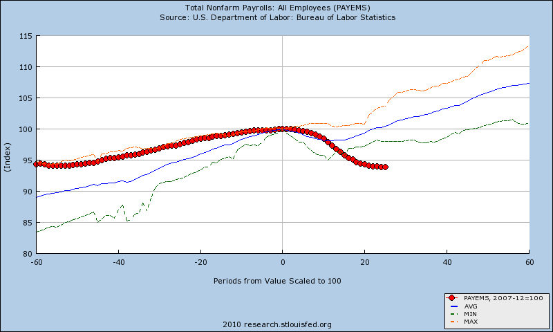
Chart of the Week Contest Wide Open

Much to my surprise and disappointment, the response to the chart of the week contest has been…well…less than tepid so far. At this stage I would consider the contest wide open, meaning that the bar is quite low right now for anyone interested in claiming the honor of being the first ever guest contributor to the VIX and More chart of the week and also pocketing a free one year subscription to Expiring Monthly: The Option Traders Journal in the process.

Readers can submit a chart of the week entry in the comments section of this post or by emailing me directly at bill.luby[at]gmail.com no later than 12:00 noon PST on Sunday, February 28th.

The inaugural edition of Expiring Monthly: The Option Traders Journal will be published on Monday, March 22nd, with subsequent editions to follow on each Monday after options expiration. There is still a pre-launch promotion of 20% off the annual subscription price which will be available for only one more day. Subscribe by February 28th, 2010 and receive one full year of Expiring Monthly at the discounted rate of $79.

Subscribe here, or to learn more, visit http://www.expiringmonthly.com/.

For more on related subjects, readers are encouraged to check out:

Disclosure(s): I am one of the founders and owners of Expiring Monthly
Thursday, February 25, 2010

Top Submission for Chart of the Week Wins One Free Year of Expiring Monthly

Since I launched the chart of the week feature in November 2008 (I guess it was a quiet month and I had nothing else to do…) I have elected to create most of the graphics myself and pluck a few from out of the public domain.

This week I’d like to try a different approach and get input from readers. To make it more interesting, in addition to publishing a reader submission as the official VIX and More chart of the week on Sunday, I will award a free one year subscription to Expiring Monthly: The Option Traders Journal to the winner.

Readers can submit a chart of the week entry in the comments section of this post or by emailing me directly at bill.luby[at]gmail.com.

I will select one winner in my own idiosyncratic and arbitrary manner, but will give strong preference to graphics that are topical, creative and fresh. Humor (I recall that Roubini and the VIX was a big hit) is also encouraged. In terms of subject matter, I am open to anything that is at least loosely associated with investing and economics. There are no other rules, per se, except that I would ask all submissions to confirm who the author of the material is and be submitted no later than 12:00 noon PST on Sunday, February 28th.

As far as the magazine is concerned, the inaugural edition of Expiring Monthly: The Option Traders Journal will be published on Monday, March 22nd, with subsequent editions to follow on each Monday after options expiration. Additionally, the current pre-launch promotion of 20% off the annual subscription price will be available for only three more days. Subscribe at any time through February 28th, 2010 and receive one full year of Expiring Monthly at the discounted rate of $79.

Subscribe here, or to learn more, visit http://www.expiringmonthly.com/.

For more on related subjects, readers are encouraged to check out:

Disclosures: I am one of the founders and owners of Expiring Monthly
Wednesday, February 24, 2010

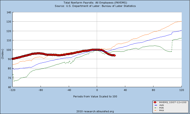
Nonfarm Payrolls Before and After Recessions

I was pleased to see that Sunday’s Chart of the Week: A Broader Look at the U.S. Recovery generated a good deal of interest and discussion. While I have always been a card carrying Quadropheniac, truth be told the only slice of the economy anyone is obsessing about these days is jobs. So with the weekly jobless claims numbers due out tomorrow and the February nonfarm payrolls slated for a week from Friday, this seems like an opportune time to revisit the employment situation.

Since last Sunday’s chart measured nonfarm payrolls from 12 months prior to 27 months following the preceding business cycle peak, I have elected to take a much longer view of employment and recessions. The two charts below show employment trend data for five (top) and ten (bottom) years before and after each business cycle since 1948.

Note that in the years leading up to the December 2007 business cycle peak, job growth was relatively flat compared to the historical mean (blue line). More importantly, the performance during the current ‘recovery’ is not only anemic compared to prior post-recession job creation efforts, there is still no concrete evidence of a bottom in employment. The current economic environment is in stark contrast to prior recessions, where there economy has typically replaced all the jobs lost in the downturn at this stage and was already in a net positive job situation relative to the prior business cycle peak.

While I still anticipate that job growth will begin in the next few months, the longer this jobless recovery persists, the harder it will be to get the economy firing on all cylinders.

For more on related subjects, readers are encouraged to check out:


[source: Federal Reserve Bank of St. Louis]

Disclosures:
none

Tuesday, February 23, 2010

Two Must Read Blogs for Volatility Aficionados

Lately I have been a little light on posting due to various commitments that have kept me fully occupied. While I intend to start ramping up my posting frequency to previous levels, this seems like a good opportunity to highlight two relatively new bloggers who are serving up some excellent insights into volatility.

On the scene since last July is SurlyTrader, whose bio indicates a specialty in trading derivatives. This blog should probably be listed in my Favorite Options Blogs blogroll, but because of the breadth of the subject matter covered, I have elected to included the not-so-surly-one in my list of Other Blogs I Frequent. If today’s What Influences Volatiilty? does not make you an immediate fan, I’d be shocked.

A more recent entrant to the options blog scene is Volatility Square. Launched earlier this month, the new blog on the block immediately won me over with topics that are close to my heart, such as the recent VIX Fair Value Model.

For some reason, options blog seems to have a very short half-life. I’m hoping these two stick around for a long time.

For more on related subjects, readers are encouraged to check out:

Disclosures: none

Monday, February 22, 2010

One Month Until the Launch of Expiring Monthly: The Option Traders Journal

Just a quick reminder that the inaugural edition of Expiring Monthly: The Option Traders Journal, will be published one month from today, on Monday, March 22nd. Thereafter, the magazine will be published on the Monday following options expiration.

Additionally, the pre-launch promotion of 20% off the annual subscription price will be available for only six more days. Subscribe at any time through February 28th, 2010 and receive one full year of Expiring Monthly at the discounted rate of $79.

Subscribe here, or to learn more, visit http://www.expiringmonthly.com/.

For more on related subjects, readers are encouraged to check out:

Disclosures: I am one of the founders and owners of Expiring Monthly
Sunday, February 21, 2010

Chart of the Week: A Broader Look at the U.S. Economic Recovery

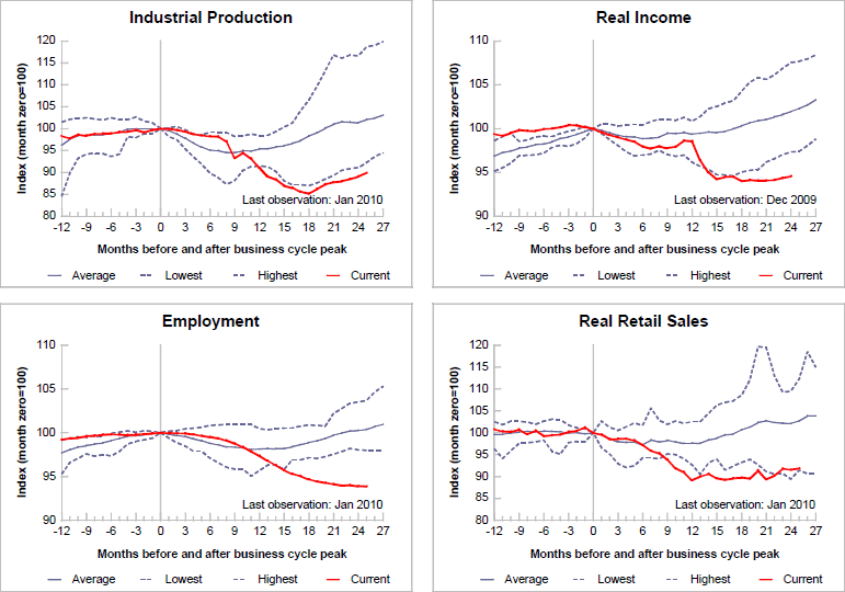
Last week, in Chart of the Week: Retail Sales Recovering, I attempted to demonstrate that the much beleaguered U.S. consumer has actually been a relative source of strength during the economic recovery.

In this week’s chart of the week, my goal is to expand that relatively narrow view of economic activity to encompass four key recession indicators that cut across a broad scope of economic activity: industrial production; income; employment; and retail sales.

Note that relative to previous recoveries, which typically follow a bottom that comes some 8-12 months after the top, the current recovery is by far the weakest in the 62 years of data for employment and real income. Industrial production has shown the sharpest rebound, but is still the weakest bounce in 62 years. The only one of the four indicators that is above the historical low is retail sales – yet even here the margin is a narrow one.

The rather simplified question suggested by this data puzzle is whether retail sales and industrial production will pull incomes and employment up or whether weak employment and income trends will drag down retail sales and industrial production.

For comparison purposes, it may be interesting to look at a chart of the same data as of eight months ago.

For more on related subjects, readers are encouraged to check out:


[source: Federal Reserve Bank of St. Louis]

Disclosures: none

Monday, February 15, 2010

Chart of the Week: Retail Sales Recovering

With all eyes seemingly focused on Europe last week, it seems as if investors largely ignored the new economic data coming out of the United States.

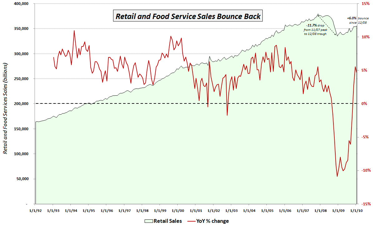
I consider the most important of the new pieces of economic data to be the January retail sales report, which showed retail sales increasing 0.5% on a month-over-month basis (consensus estimate +0.3%) and 4.7% on a year-over-year basis.

The chart of the week below attempts to put the recent retail sales numbers into a meaningful historical context. Since the media generally only reports the month-over-month change from the Census Bureau press release, I thought I would add a couple of my own twists. First, the green area data series below captures the aggregate retail and food service sales in green going back to 1992. Note that until the beginning of 2009, there was never a sustained dip in retail sales. The red line overlays the year-over-year percentage change in retail sales. Given the relatively shallow historical dips, this number was never only negative twice prior to 2008: once in 2001; and a second time in 2002.

Starting in September 2008, the year-over-year change in retail sales was negative for 14 consecutive months. That streak was finally broken in November 2009, but when retail sales slipped during December, there were rumblings about the sustainability of the bounce in retail sales. January’s positive surprise has at least temporarily shelved some of those concerns and brought new buyers into the retail sector, where the two 800 lb. gorilla ETFs (XRT and XLY) have seen renewed interest.

The chart also annotates the 11.7% drop in retail sales from the October 2007 peak to the December 2008 cycle low. Since the low, retail sales have bounced 6.0% or 2.7% in real terms. It will likely be another year or two before retail sales return to their October 2007 highs, but to this point, the consumer has been much more resilient than many pundits had expected.

For more on related subjects, readers are encouraged to check out:


[source: Federal Reserve Bank of St. Louis]

Disclosures:
none

Friday, February 12, 2010

Greece or Chinese Real Estate?

A couple of days ago I posed the question, Are You Watching Greece? While I am certain that most investors are doing their best to keep on top of the latest news swirling around Greece and the European Union, the smaller question I addressed was which security or indicator would give a good glimpse into the status of the Greek problem.

While considerable attention is rightly being paid to Greece at the moment, one could easily argue that the increase in reserve requirement for Chinese banks is an equally large threat to global economic growth.

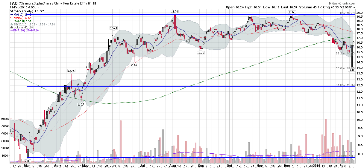
Unfortunately, good economic data is hard to come by in China, but with all the talk of a potential real estate bubble, investors should be focusing a good deal of their attention on Chinese real estate. The good news is that there is a Chinese real estate ETF that has a relatively long track record, good liquidity, and can serve as an excellent barometer for the real estate sector in China. Trading under the ticker TAO, the Claymore/AlphaShares China Real Estate ETF (holdings) includes REITs and publicly traded firms in the real estate sector in mainland China, Hong Kong and Macau.

The chart below captures of year of price action in TAO. Note that in the chart below, the long white candle from Wednesday is almost certainly the result of erroneous data. Excluding that bad print at the open, Friday’s low of 15.31 has all the appearances of at least a short-term cycle low.

At a minimum, investors should keep an eye on TAO. Beyond that, TAO is an excellent way for foreigners to speculate on Chinese real estate trends and/or hedge their portfolios accordingly.

For more on related subjects, readers are encouraged to check out:


[source: StockCharts]

Disclosures: long TAO at time of writing

Thursday, February 11, 2010

ProShares Adds Four New Triple ETF Pairs

When Direxion launched the first batch of triple ETFs back in November 2008, I may have been the first person to openly champion them, even going way out on a limb with Prediction: Direxion Triple ETFs Will Revolutionize Day Trading.

Fifteen months later, triple ETFs have exploded in popularity, sometimes confounded investors and eventually prompted regulators to step in, with FINRA increasing margin requirements for triple ETFs on December 1, 2009.

Now it appears that triple ETFs have weathered the regulatory storm and occasional investor discontent, with trading volumes recently having picked up again after signs of a plateau.

Triple ETFs – particularly those which are rebalanced on a daily basis – received another vote of confidence today, as ProShares launched eight new triple ETFs. ProShares, which launched their first two triple ETFs (UPRO and SPXU) in June of last year, is now back with a broader line of index offerings. New today are two pairs which cover new ground and two that closely overlap with existing Direxion triple ETFs. The pair that interests me the most are those which track the NASDAQ-100 index (NDX): TQQQ is the new +3x ETF for the NDX; SQQQ is the new -3x ETF. Also breaking new ground are a pair linked to the Dow Jones Industrial Average: UDOW is the +3x ETF; and SDOW is the -3x variant.

The two more problematic new ETF pairs are in the mid-cap and small-cap space. For the S&P MidCap 400 index, ProShares is offering UMDD (+3x) and SMDD (-3x). The risk here is that these two offerings may be too similar to the Direxion MWJ and MWN, which are based on the Russell Midcap index. An even larger overlap problem is likely with the new ProShares Russell 2000 index ETFs, which include URTY (+3x) and SRTY (-3x). Here there is very little to distinguish these ETFs from the popular Direxion TNA and TZA ETFs.

In a market where a first mover advantage is often decisive, ProShares faces an uphill battle, but already UPRO and SPXU have been widely accepted and there is no reason to believe TQQQ/SQQQ and UDOW/SDOQ will not enjoy similar success. The prognosis for the new mid-cap and small cap ETFs, however, is not as favorable.

For the full list of triple ETF offerings, try:

For related posts on these subjects, readers are encouraged to check out:

Disclosures: short TZA at time of writing

Wednesday, February 10, 2010

SPX 1070 Looms Large…Again

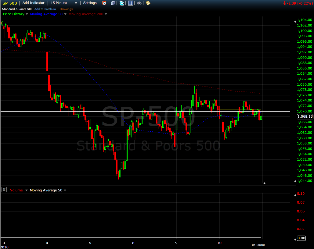
Like any stock index, from time to time the S&P 500 index seems to hand pick a number and make it an important support and resistance level. Sometimes these lines in the sand are ephemeral and sometimes they persist for extended periods.

Take SPX 1070, for instance. Back in October 2009, SPX 1070 was the exact midpoint in the SPX trading range I talked about in Strangle Pong and two subsequent posts (see links below.)

Since last Thursday, it seems as if SPX 1070 is starting to reassert itself once again. In the chart below, 1070 acts as critical support for awhile on February 4th, then as resistance on the 8th. Yesterday and today, 1070 was a pivot point of sorts, acting as both support and resistance. With 1070 just above today’s close and the futures currently pointing to a bullish start to tomorrow’s session, I will be watching closely to see how the SPX acts while crossing above or below the 1070 level.

For posts on the Strangle Pong and related subjects, readers are encouraged to check out:


Disclosures: neutral position in SPX via options at time or writing

[source: FreeStockCharts.com]

Tuesday, February 9, 2010

Are You Watching Greece?

Retail investors in the United States sometimes have difficulty staying on top of events and markets in Europe.

In the last week, I have suggested several ways to monitor the status of various pockets of interest in Europe, including Spain (via the iShares MSCI Spain Index ETF, EWP) and the euro. I certainly also could have included the VSTOXX, the volatility index tied to the Dow Jones STOXX 50 index of European companies.

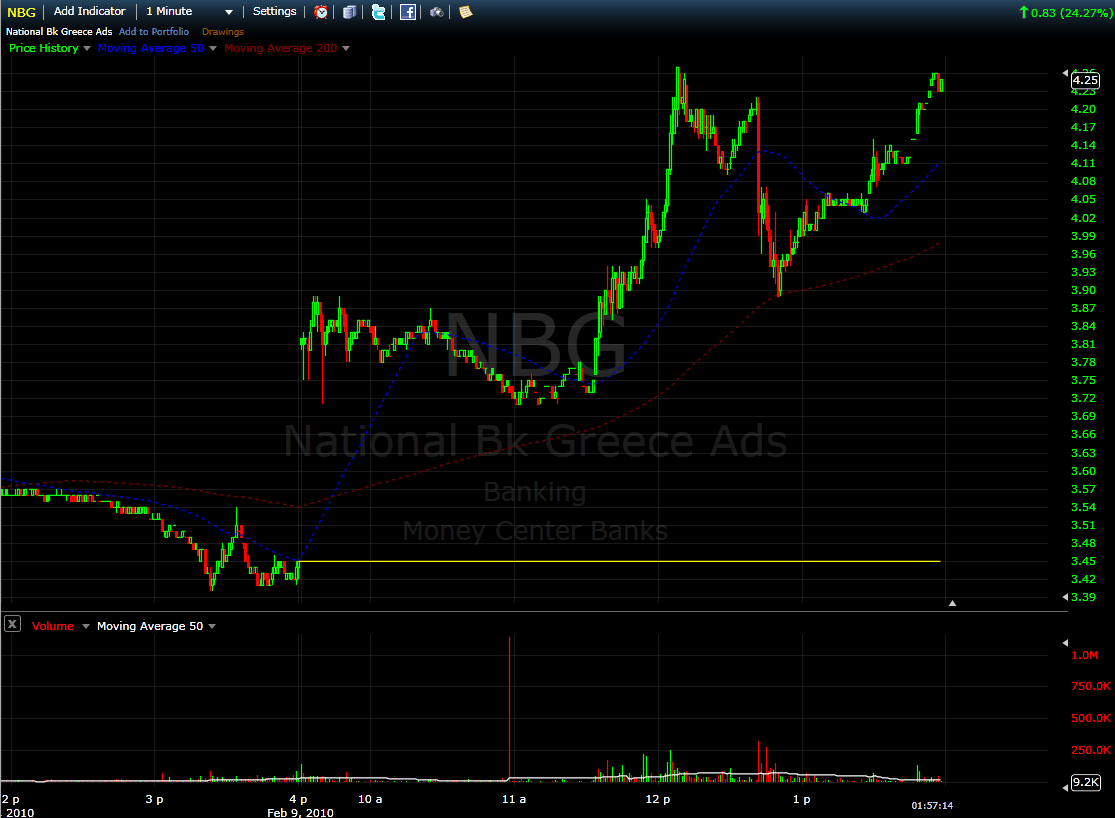
While I love proxies, ground zero for the European financial crisis is Greece, where ongoing discussions with European Union leaders, particularly those from Germany, are wrestling with the best way to balance national and regional interests.

There is not currently a Greek ETF, but as proxies for Greece go, the National Bank of Greece (NBG) is an excellent one. This bank trades millions of shares per day and has a market cap of $12.5 billion. So whether you just wish to take the temperature of the Greek financial situation or want to speculate on a particular outcome, NBG is a worthy addition to any watch list.

For related posts on these subjects, readers are encouraged to check out:


Disclosures: long NBG and EWP at time or writing

[source: FreeStockCharts.com]

Monday, February 8, 2010

But Am I Fast Enough to Play Cornerback?

Woody Allen once said, “Eighty percent of success is showing up.”

Now that VIX and More has been showing up for four years, this formerly whimsical electronic playpen that is dedicated to tilting at statistical windmills now has all the earmarks of a veteran mainstream investment blog. I like to think I continue to straddle the fence between both worlds, but it is nice to occasionally be lumped in with some luminaries who tread down a more traditional path.

Today, for instance, Zack Miller of New Rules of Investing is out with his Super Bowl Team: Online Finance’s Best. The list includes some excellent bloggers, categorized according to their appropriate football position (including coaches, special teams players, a statistician, a referee and even a cheerleader), along with a brief descriptions of some of the blogging/football characteristics they bring to the game. VIX and More is delighted to be picked as part of the Super Bowl group, teamed up with Meb Faber (of World Beta) and James Altucher (of Stockpickr and seemingly many other places) as defensive backs.

Miller describes the trio as follows:

“These guys are quick, some of the best athletes on the field. Most importantly, they need to be able to cover the offense deep over the air while being strong/aggressive enough to step up and make a play on the ground.”
There are some excellent blogs on this group and I am honored to be mentioned in their company.
For the record, VIX and More has been mentioned on several all-star blogging teams in the past. Five awards that spring quickly to mind are:
For related posts on these subjects, readers are encouraged to check out:

Disclosures: I am probably a better free safety than cover corner

Sunday, February 7, 2010

Chart of the Week: Where and When Will the Euro Bottom?

Last week was the type of trading week that raised a lot more questions than it answered – at least for me.

The epicenter of many of those questions seems to be southern Europe, where Greece, Portugal, Spain and to a lesser extent the remainder of the so-called PIIGS (Portugal, Italy, Ireland, Greece and Spain) have flamed investor concerns that burgeoning public debt may significantly weaken investor demand for sovereign debt and exacerbate an already trouble budgetary crisis.

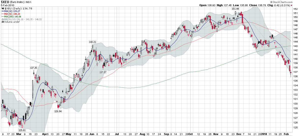
Many investors have taken to selling the euro is as a means by which to reduce exposure to these problem areas and/or speculate on one or more of these crises spiraling out of control. This week’s chart of the week looks at one year of the euro, including a strong rally through most of 2009 and more recently and two-stage selloff, starting in the first half of December and picking up steam over the course of the past 3 ½ weeks as traders looked to capitalize on weakness stemming from the problems in Greece, Portugal and Spain.

Going forward, that ability of the euro to hold support at 136 will be one of the market tells that I watch closely.

For related posts on these subjects, readers are encouraged to check out:


[source: StockCharts]

Disclosures: none

Thursday, February 4, 2010

Largest Pullback Since March 2009 Rally Began

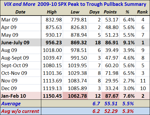
Given all the requests I have to update the table below, I guess it is time to come to terms that the SPX Peak to Trough Summary Chart is going to be a regular feature on the blog for the time being.

This time around I have made a couple of minor changes. First, the 9.1% pullback of June-July 2009 is now highlighted in gray and the current pullback is highlighted in light red. Second, I have highlighted in a darker red those cells which indicate the current selloff has reached an important threshold. In the case of today’s low of 1062.78, the highlighting reflects the fact that the low is now below the much shallower lows from November and December. Of course, a pattern of lower lows will likely encourage additional selling and set the stage for a possible test of the next important support level in the area of SPX 1030-1035.

The other cell I highlighted reflects the 87.67 points that have been lost from peak to trough over the course of the last 12 trading days. In absolute terms, this makes the current pullback the largest since the beginning of the March 2009 rally. My preferred measure is not points but percentages, which ranks the current 7.6% pullback as #2 behind the June-July 2009 selloff.

Knowing where the current pullback sits in historical terms does not necessarily help forecast where and when it will end. It does reinforce the point, however, that if the SPX closes below 1030 that we should begin talking about a bear market instead of a pullback. For the record, the 200 day moving average should be up to 1030 in about two weeks, at which point the SPX will also be fighting a rising moving average tide in order to remain technically bullish.

For related posts on these subjects, readers are encouraged to check out:


Disclosures: none

Greece, Spain and the Pulse of European Anxiety

Investors who are attempting to get a sense of the magnitude of anxiety about the economic problems in Greece have a multitude of ways in which to measure how markets are evaluating the situation. Perhaps the most direct approach is with Greece credit default swaps, but the sovereign credit information available to retail investors through firms such as Markit is neither timely or comprehensive.

The euro is another excellent proxy for sentiment about Greece and the rest of the so-called PIIGS (Portugal, Italy, Ireland, Greece and Spain), though once again many U.S. retail investors do not have much in the way of background and experience when it comes to foreign currency.

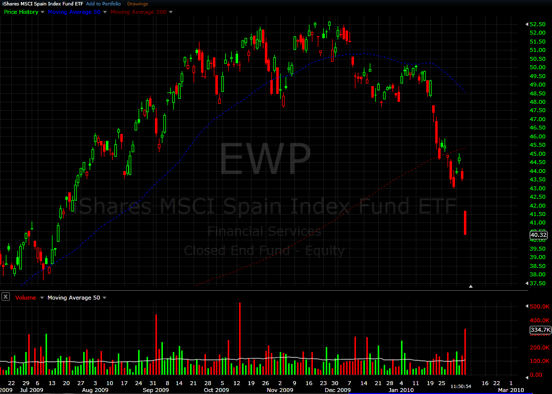
My recommendation is to watch the iShares MSCI Spain Index ETF, EWP. This is a reasonably liquid ETF that is appropriate as a market barometer and/or trading vehicle. The chart below shows the performance of EWP going back to June 2009. After breaking recent technical support at 47.50, this ETF has been subject to intense selling pressure and after a large gap down this morning is currently trading down about 7% on the day.

Watch the euro, watch Spain, watch the large European banks, and if you can get your hands on some good credit default swap data, use a healthy dose of that to take the temperature of the European markets. The situation in Greece is very different than that in Dubai. Whether that is a good or a bad thing remains to be seen.

For related posts on these subjects, readers are encouraged to check out:


[source: FreeStockCharts.com]


Disclosures:
short EWP at time of writing

Wednesday, February 3, 2010

Fidelity Offering 25 iShares ETFs Commission Free

Mutual fund giant Fidelity has largely sidestepped the ETF revolution, but the company fired in important competitive salvo when they announced that starting today 25 iShares ETFs will be available for trading through Fidelity on a commission-free basis.

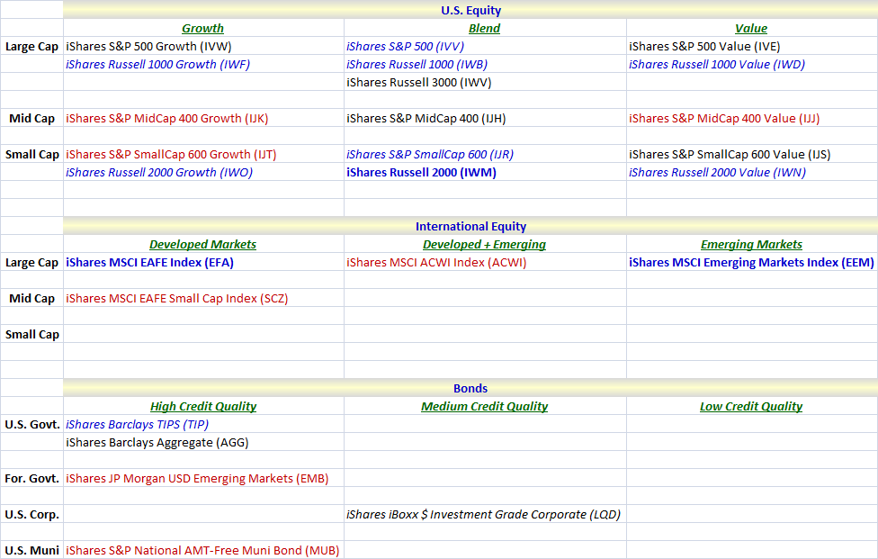
The 25 ETFs include 16 U.S. equity index ETFs, 4 ETFs based on international equity indices and 5 bond ETFs that cover a broad range of issuers, geographies and credit quality. The table below attempts to slice and dice these commission-free ETFs in a an way that should help investors who are unaware of some or all of these ETFs better understand their characteristics.

Included in the Fidelity/iShares 25 are three heavyweights that I have highlighted on bold blue font. Each of these ETFs trades 20 million shares or more per day on average and has a highly liquid options market. In fact, EEM and IWM are among the top five most actively traded ETFs. In addition to these three heavyweights, I have also highlighted in italicized blue font the eight other ETFs in this group which trade an average of at least 1 million shares per day. The next most liquid ETFs are in black font. Finally, I have reserved the red font for the seven ETFs that do not have options associated with them. Not surprisingly, the underlying ETFs are also among the least liquid of the group.

In terms of groupings, I have divided the ETFs into three high level categories: U.S. equity; international equity; and bonds categories. For the U.S. equity ETFs, I have further subdivided these ETFs into Morningstar style box categories. For international equity ETFs, I decompose these according to market cap and developed/emerging market exposure. Finally, for bond ETFs, these are broken down by issuer and credit quality.

Investors who have shied away from transaction-intensive strategies because of commission costs may now want to rethink some of those ideas in the context of the Fidelity/iShares commission-free ETFs. As for options traders, some stock-option strategies such as buy-writes now may deserve another look as well.

For related posts on these subjects, readers are encouraged to check out:


Disclosures: none

Tuesday, February 2, 2010

Mamis Overbought-Oversold Indicator

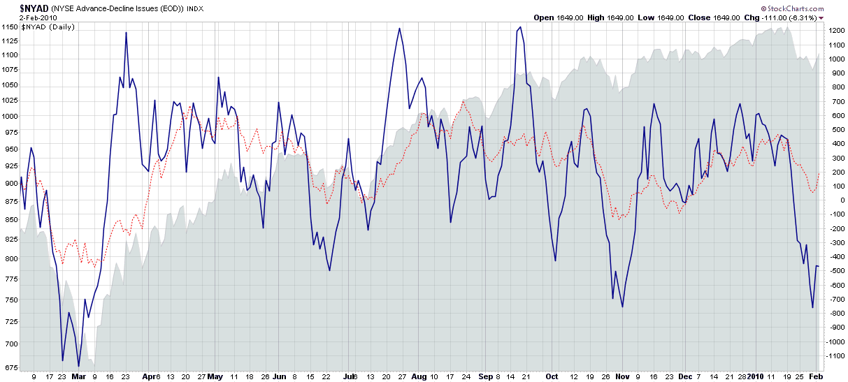
One of the books I have recommended frequently to beginning investors is When to Sell, which was written by Justin Mamis in 1977. Among the books many gems Mamis unveils is the Overbought-Oversold Indicator, which is a simple 10 day moving average of the NYSE advances minus declines. Helene Meisler, a Mamis protégé, later popularized the Overbought-Oversold Indicator and blogger Ron Sen at Technically Speaking has championed the same indicator over the past few years, usually adding in a 30 day moving average for comparison purposes and calling it the Mamis-Meisler Breadth Oscillator.

In non-trending markets, a good market breadth oscillator can be a trader’s best friend and with the SPX for now at least apparently stuck in a trading range between 1070 and 1150, breadth becomes an important piece of the overall technical puzzle.

The chart below captures what I will call the Mamis Overbought-Oversold Indicator (MOOI?) and shows negative extremes in the 10 day moving average (solid blue line) of at least -400 to be solid predictors of oversold conditions. The positive extremes (dotted red line) of +700 or so are less valuable in terms of calling market tops, but often presage a selloff. Right now, the indicator suggests a bullish oversold market.

Of course there are no perfect technical indicators, but in choppy markets a reliable market breadth oscillator can be a powerful timing tool.

For more on related subjects, readers are encouraged to check out:


[source: StockCharts]

Disclosures: none

Monday, February 1, 2010

Introducing…Expiring Monthly: The Option Traders Journal


I am delighted to announce that I am joining forces with four of the top options bloggers to launch Expiring Monthly: The Option Traders Journal. This electronic magazine will be published once per month on the Monday immediately following options expiration, with the inaugural issue scheduled for publication on Monday, March 22nd.

Expiring Monthly will bring together the efforts five of the top options bloggers as contributing editors:

The magazine should appeal to beginning and advanced traders alike and will emphasize trading insights, opinion, and a variety of options-related statistics. The first issue includes Mark Sebastian’s interview with Sheldon Natenberg, author of one of the true classic books on options: Option Volatility & Pricing: Advanced Trading Strategies and Techniques. Also in the first issue, Adam Warner tells the story of the rise and fall of the American Stock Exchange.

In addition to regular features such as book reviews, breaking down a trade, reader questions and answers, etc., each of the contributing editors will also author a monthly column, as follows:

  • Monthly Options Report – Adam Warner
  • Charting the Markets – Bill Luby
  • Income Spread Trading – Jared Woodard
  • Market Maker Trading Tips – Mark Sebastian
  • For the New Options Trader – Mark D. Wolfinger

We are offering a pre-launch promotion of 20% off the regular price:

Take advantage of our pre-launch promotion, now through Feb 28, 2010 only: receive one full year of Expiring Monthly at the discounted rate of $79.

Subscribe here, or to learn more, visit http://www.expiringmonthly.com/.

Disclosures: I am one of the founders and owners of Expiring Monthly
DISCLAIMER: "VIX®" is a trademark of Chicago Board Options Exchange, Incorporated. Chicago Board Options Exchange, Incorporated is not affiliated with this website or this website's owner's or operators. CBOE assumes no responsibility for the accuracy or completeness or any other aspect of any content posted on this website by its operator or any third party. All content on this site is provided for informational and entertainment purposes only and is not intended as advice to buy or sell any securities. Stocks are difficult to trade; options are even harder. When it comes to VIX derivatives, don't fall into the trap of thinking that just because you can ride a horse, you can ride an alligator. Please do your own homework and accept full responsibility for any investment decisions you make. No content on this site can be used for commercial purposes without the prior written permission of the author. Copyright © 2007-2023 Bill Luby. All rights reserved.
 
Web Analytics