Showing posts with label commodities. Show all posts

Saturday, December 31, 2016

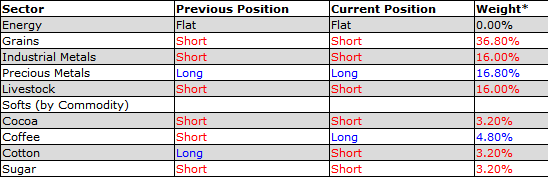
The Year in VIX and Volatility (2016)

The consensus called for a big uptick in volatility in 2016 and while there was a lot of drama, the VIX spikes were relatively manageable and short-lived.  The VIX opened the year at 22.48 and ended the year at just 14.04.  For the full year, the median VIX was 14.31, while SPX historical volatility for the full year ended up at a mere 13.12.

That being said, there were five distinct VIX spikes in the graphic below, listed according to chronology:
  • Fears related to slowing growth in China (January)
  • A plunge in crude oil prices to $26.05/bbl. for WTIC, as investors grappled with the possibility that Cushing storage facilities would be exhausted (February)
  • The surprise Brexit vote result in favor of the U.K. leaving the E.U. (June)
  • A cocktail of nearly simultaneous shocks from Fed President Rosengren (suddenly sounding hawkish), Jeff Gundlach (interest rates have bottomed) and the European Central Bank (no additional stimulus) puts pressure on stocks (September)
  • Increasing uncertainty leading up to the U.S. election (November) 

In all five instances, the VIX moved up sharply, but in defiance of historical precedent, the volatility index moved down almost as sharply as it moved up.  In fact, some of the biggest extremes for the year came in the form of volatility crushes, where the VIX had an unprecedented series of sharp downward one-day move.  Checking the record books, the only previous year that the VIX posted three top 20 one-day declines was 2007 – and clearly investors were in denial that year.  This year the Trump election caused the sixth largest one-day drop in the history of the VIX, whereas the Thursday before and Tuesday after the Brexit vote triggered the eighteenth and tenth largest one-day VIX declines.

On the other side of the ledger, some of the upward moves in the VIX made the record books as well.  The day following the Brexit vote saw a 49.3% VIX spike – the fifth highest one-day spike on record.  What was even more surprising was the Rosengren/Gundlach/ECB cocktail noted above triggered a 39.9% spike (eleventh highest in history) in what seemed to be a relatively calm market environment in September.  It turns out the VIX was just getting warmed up for greater things, including a record nine consecutive up days leading up to the November election.

Even with these extremes, the highs and lows in the VIX were rather middling, with the VIX peaking at 32.09 on January 20th and hitting an annual low of 10.93 on December 21st.

The graphic below captures these and other highlights from 2016:


[source(s): StockCharts.com, VIX and More]

Included in the non-VIX highlights are a 5000+ year low in interest rates in Europe and Japan (where negative interest rates prevailed) as well as a thirteen-year low in the price of crude oil.  On the geopolitical front, political craziness of one kind or another abounded in Brazil, South Korea, Turkey, Italy, Colombia and South Africa, among other locations.  Terrorism also left its footprint again in 2016 and Zika also created considerable political and social turmoil.  In the financial realm, European banks had a very difficult year and begin 2017 on shaky footing.

While the year ended on a relatively quiet not, I suspect 2017 will have much more in the way of new surprises, including swans of many dark hues.  Next week I will resume the VIX and More fear poll and find out what the consensus is for volatility and its causes in the coming year.

Finally, since 2011, I have been maintaining a proprietary Macro Risk Index that measures volatility and risk across a broad range of asset classes, including U.S. equities, foreign equities, commodities, currencies and bonds.  In 2016, the Macro Risk Index was trending down most of the year, punctuated by significant spikes in February (crude oil) and again in June (European currencies). 

How did 2016 measure up to expectations?  I sum up the year in My Low Volatility Prediction for 2016: Both Idiocy and Genius.  Also worth investigating are a pair of Barron’s articles from one year ago laying out two opposing perspectives on volatility in 2016.  For the case for rising volatility and what to do about it, try Jared Woodard’s Prepare for Rising Volatility in 2016.  I provide the contrarian point of view in The Case Against High Stock-Market Volatility in 2016.

Have a happy, healthy and profitable 2017!

Related posts:


For those who may be interested, you can always follow me on Twitter at @VIXandMore

Disclosure(s): the CBOE is an advertiser on VIX and More

Sunday, November 20, 2016

Post-Election Risk Trending Up in Treasuries and the Euro, Down in U.S. Stocks

You can always tell when the crowd gets long the VIX and ends up on the wrong side of the trade.  “The VIX is broken!” becomes an oft-repeated refrain, as does “The markets are rigged!” and the usual list of exhortations from those who are in denial.  The current line of thinking is that the world must be much more dangerous, risky and uncertain as a result of a Trump victory, yet the VIX is actually down 31.4% since the election – ipso facto the VIX is broken.

While I have more than a small soft spot in my heart for the VIX, I will be the first to point that taking an Americentric, equity-centric view of the investment landscape is dangerous and naïve.  More often than not, the issues that end up having a strong influence on the VIX are born on foreign soil and/or in other asset classes.  Just look at the recent history in China, Greece, Italy, currencies and commodities to name a few.

When it comes to looking at implied volatility indices as a risk proxy, I prefer to survey the landscape across asset classes, geographies and sectors, which is why I have developed tools such as a proprietary Macro Risk Index (more on this shortly) that look at risk across asset classes, geographies and sectors.

In the graphic below, I have isolated a handful of volatility indices that cut across asset classes and geographies to show how these have moved in the eight days following the election.  Note that Treasuries (TYVIX) and the euro (EVZ) have been trending steadily higher since the election as uncertainty related to the future of inflation and interest rates in the U.S. has risen, while the relationship that the Trump Administration will have with our NATO allies and the European Union is also somewhat murkier. 

Gold implied volatility (GVZ) initially moved sharply higher following the election, but has since receded, as gold prices fell swiftly after the election, but have since stabilized.  Meanwhile, emerging markets saw dramatic selling immediately following the election, but have bounced during the course of the past week as fears and implied volatility (VXEEM) have subsided.  Last but not least, the moves in crude oil and crude oil implied volatility (OVX) have been the least remarkable of the group


[source(s):  CBOE, VIX and More]

In aggregate, the picture is a mixed one in terms of implied volatility, risk and uncertainty.  As is often the case, risk has become elevated in certain asset classes, such as Treasuries and the euro.  In other areas, such as U.S. equities – and their VIXian barometer – there are winners and losers, with the result that a net bullish outlook has moved equity implied volatility lower.  This is not to say that a Trump Administration – whose cabinet members and policy priorities are largely unknown at this juncture – will not increase risk in some areas.  More risk is certainly on the horizon and if history is any guide, an Americentric, equity-centric view of the investment world is likely to be slow in identifying those risks.

Related posts:


For those who may be interested, you can always follow me on Twitter at @VIXandMore


Disclosure(s): the CBOE is an advertiser on VIX and More

Tuesday, January 5, 2016

The Year in VIX and Volatility (2015)

Every year one of my most-read posts is my annotated overview of the year in VIX and volatility.  Now that I have been doing this for the past eight years, the aggregated view of volatility from 2008 to the present makes for a fascinating concise history not just of volatility, but more broadly of the financial markets and of economic activity in general.

The graphic below captures most of the highlights from 2015 and from a volatility perspective, it was a year for the record books.  During August we saw the largest one-week VIX spike (+113%) that resulted from unprecedented back-to-back days of VIX spikes of more than 45%!  The cumulative jump in the VIX pushed the VIX to a high of 53.29 – the only time outside of the 2008-09 financial crisis since the launch of the VIX in 1993 that the VIX has topped 50.


[source(s): VIX and More]

While most investors pointed to China as the proximate cause of the record VIX spike(s), a VIX and More fear poll one week after the big VIX spike also highlighted “market structural integrity (HFT, flash crash, exchange issues, etc.)” as almost on par with China concerns, with “market technical factors (breach of support, end of trend, etc.)” not that far behind.

The balance of the year saw a wide variety of events that moved the markets, including the Fed’s first rate hike in nine years; crude oil plummeting to $34/bbl.; shock waves in the high-yield bond market due to low oil prices; chilling terrorist attacks in Paris and in California; Puerto Rico announcing it will default on some of its debt; turmoil in the currency markets when the Swiss National Bank ended the peg of the Swiss franc to the euro; a dramatic boom-bust cycle in Chinese A-shares – and a flurry of ineffective interventions on the part of the Chinese government to restore stability; a proxy war between Saudi Arabia and Iran in Yemen; and the European Central Bank committing to $1.2 trillion of quantitative easing.

As noted previously, even with all of the volatility, Every Single VIX ETP (Long and Short) Lost Money in 2015.

Finally, since 2011, I have been maintaining a proprietary Macro Risk Index that measures volatility and risk across a broad range of asset classes, including U.S. equities, foreign equities, commodities, currencies and bonds.  In 2015, the Macro Risk Index was consistently higher than it has been during any year since the 2011 inception.

What does high volatility in 2015 mean for 2016?  During the past two weeks, Barron’s published two opposing (but not necessarily inconsistent) perspectives on volatility in 2016.  For the case for rising volatility and what to do about it, try Jared Woodard’s Prepare for Rising Volatility in 2016.  I provide the contrarian point of view in The Case Against High Stock-Market Volatility in 2016.


Related posts:


Disclosure(s): net short VIX at time of writing

Wednesday, September 2, 2015

China Growth and Market Structural Integrity Top List of Fear Poll Concerns

After a hiatus of almost a year (the October 2014 pullback, to be exact), I have reprised the VIX and More Fear Poll in an attempt to get some insight into which issues have been responsible for bring fear back into the investing equation and in so triggering the highest VIX spike (53.29) outside of the 2008-09 financial crisis and the #5 and #6 one-day VIX spikes ever on consecutive days.

In the chart below, I have summarized the top ten responses from almost 400 voters, covering 40 countries over the past two days.  The question:  “Which of the following makes you most fearful anxious or uncertain about the stock market?”

VIX and More Fear Poll results 090215

[source(s): VIX and More]

I should note that Tuesday’s responses had “Market structural integrity (high-frequency trading, flash crashes, exchange stability, etc.)” as the #1 concern, but a late flurry of votes today for “China – weak economic growth” put China concerns over the top. Combining Chinese growth concerns with concerns about a bubble in Chinese stocks and/or housing makes it a landslide in favor of all things China. Without too much of a stretch, one could also lump in the likes of currency problems, deflation, low crude oil prices and falling commodities prices in general into a broader China-related bucket and suddenly the China + ripple effect accounts for about 50% of the votes.

As always, I love to see how the American view of the world contrasts with those non-U.S. respondents. This time around, the area most overemphasized by Americans relative to the rest of the world is, in classic Americentric myopia fashion…”U.S. – weak economic growth,” which 8.7% more Americans label as their #1 concern than their non-U.S. counterparts. Conversely, the biggest blind spot for Americans – at least relative to the concerns of the rest of the world – is commodities prices, which Americans underweight by 5.1%. A close second in the American myopia sweepstakes is Chinese bubbles in stocks and/or housing. I do not find the commodities oversight to be surprising, but certainly the relatively low concern about Chinese bubbles is unexpected.

For those who have not seen some of the earlier incarnations of this poll, these dataeback to 2012 and chronicle a U.S. public that was so obsessed with the fiscal cliff that they did not fully appreciate the gravity of the European sovereign debt crisis.

Related posts:

Disclosure(s): none

Monday, August 24, 2015

Third Biggest and Second Longest SPX Peak to Trough Pullback Since March 2009

Nary a pullback goes by without at least a handful of requests to update my pullback table to help put the current pullback in perspective. Whether the current market action is best described as a pullback, correction or even bear market, I am happy to oblige.

For those who may new to this graphic, note that the table below includes only S&P 500 Index pullbacks from all-time highs and only those that go back to the March 2009 bottom. (Due to the all-time high requirement, I count back to the May 20th intraday high of 2134.72, even though almost all of the damage has been done in the past three days.) In terms of defining the minimum pullback for the table, here 2.75% seems to be a natural cutoff, but I am more apt to include smaller numbers if it took a relatively large number of days to arrive at the bottom. Of course the current move does more than just squeak in: it is now the third largest in terms of magnitude at 12.5% and second longest from peak to trough, at 66 days.

Worth noting is that the #1 pullback (21.6% in 2011) saw a peak VIX of 48.00 during the decline, while the #2 pullback (17.1% in 2010) coincided with a maximum VIX of 48.20. The current pullback falls into the #3 slot, while the #4 pullback (10.9% in 2012) saw a maximum VIX of only 26.71. For the record, today’s VIX intraday high of 53.29 is the highest VIX on record outside of the 2008-2009 financial crisis, with data going back to 1990.

SPX pullback table as of 082415

[source(s): CBOE, Yahoo, VIX and More]

While there is no obvious proximate cause of the current pullback and VIX spike, it is clear that concerns about slowing growth in China is the main source of investor anxiety.  Investors are clearly uneasy about various sub-plots related to the real level of China’s GDP, the impact of slowing Chinese growth on commodities and related markets, speculative excess and bubbles in China’s domestic stock market (ASHR) and real estate market (TAO) or broader concerns about the ability of the Chinese government to manage the economic transition from infrastructure-driven growth to growth based on domestic consumption.

Sharp selling and higher volatility has been present for many months in commodities and currencies. Only recently has the selling and higher volatility spilled over into Chinese equities and emerging markets as a whole. In fact, emerging markets have suffered greatly as of late, with the popular EEM ETF plummeting during the last two weeks and now down 32% from its April high. At the same time, the VXEEM emerging markets volatility index soared to record of 111.39 on an intraday basis today, crushing the previous all-time high of 86.44.

As with all big pullbacks, at this point we only know that we are closer to a bottom and have no assurance that the current bottom will hold. Most likely it will be tested again in the next day or two and traders will take their cues based on how well SPX 1867 holds up as support.
Related posts:

Disclosure(s): long EEM at time of writing

Thursday, May 16, 2013

ETPs Turn to Selling Options to Generate Income

Not long after I penned The Options and Volatility ETPs Landscape, Credit Suisse (CS) added another buy-write / covered call ETP to the mix: the Credit Suisse Silver Shares Covered Call ETN (SLVO).

With SLVO, Credit Suisse is essentially extending the methodology they pioneered with the Credit Suisse Gold Shares Covered Call ETN (GLDI). In the case of both GLDI and SLVO, the ETPs are selling covered calls against the underlying commodity ETF for gold (GLD) and silver (SLV) in an effort to generate some income, and in so doing, choosing to forego some upside potential. In both instances, the ETP starts selling covered calls with 39 days until expiration and completes the sales with 35 days to expiration. One month later, the ETP buys these covered calls back over a period ranging from five to nine days prior to expiration. The net proceeds of these covered call transactions are then paid out as a monthly dividend. This dividend payment is not guaranteed and can fluctuate substantially from month to month. In the first four months following its launch, the monthly dividend for GLDI has been 0.1146, 0.0724, 0.1319 and 0.0572.

As silver is generally much more volatile than gold, SLVO elects to sell calls that are 6% out-of-the-money, while GLDI sells calls that are only 3% OTM. Other than this difference in strike selection or moneyness, the strategies employed by GLDI and SLVO are essentially the same.

Of course, covered call strategies work best when the price of the underlying is flat or when the underlying is appreciating slowly. During the recent sharp drop in GLD and SLV, the covered calls did provide a small amount of downside protection, but with GLD falling 13% over the course of just two trading days last month, the downside protection offered by a covered call was barely more than a rounding error. Covered calls and buy-write strategies generally outperform a long position in the underlying in all instances except when the underlying experiences a strong bull move.  (See graphic below for details.)

Thinking more broadly, the introduction of GLDI and SLVO should reinforce the idea that with ETPs now spanning a wide variety of asset classes and alternative investments, covered call strategies can be implemented in many non-traditional ways. The most popular of the traditional methods is PowerShares S&P 500 BuyWrite (PBP), which sells covered calls against the popular equity index. There is no reason, however, why there cannot be a similar product that sells covered calls against more volatile groups or sectors, such as emerging markets (EEM), small caps (IWM) or semiconductors (SMH), just to name a few. One can even bring alternative assets under the covered call tent. I’m not talking just about the likes of crude oil, copper or corn, but why not have covered calls on real estate, currencies or even volatility ETPs?

Better yet, why stop at covered calls? A strategy that I have discussed here on a number of occasions is selling cash-secured puts. The recent launch of U.S. Equity High Volatility Put Write Index ETF (HVPW) brought the put-write strategy into the ETP marketplace.  It is unfortunate that put-write strategies have not found a wider audience at this point or they too would be ripe for extending beyond the comfortable confines of the S&P 500 index.

Assuming this market eventually stops going up almost every day, investors are going to have to look for other ways to grow their portfolio and the scramble for yield will no doubt intensify. With ETPs now selling options to generate income, investors may want to look at some of the shrink-wrapped products mentioned above or consider how they might wish to implement similar strategies on their own.

[source(s): StockCharts.com]

Related posts:

Disclosure(s): long GLDI and HVPW at time of writing

Thursday, July 5, 2012

Recent Corn Rally in Context of Twenty Years of Corn Futures Prices

Since the launch of the Teucrium Commodity Trust Corn Fund ETF (CORN) in June 2010, investors who were unwilling to open up a futures account have been able to take long and short positions on corn via the CORN ETF, which holds a basket of corn futures.

Investors who are new to corn or to commodities in general may have been surprised by the big move in CORN, which is up 20% in the past two weeks and 28% over the course of the past month. No doubt they probably believe that the move in CORN (and corn futures) is likely to soon be exhausted.

While CORN/corn may indeed be about to peak, I would urge new arrivals on the commodity scene to study the history of agricultural commodities prices over the years and note that extreme price moves are not uncommon, particularly when unusual weather patterns are involved. The chart below uses monthly bars of corn futures over the course of the last 20 years. Note that while the June-July 2012 move in corn looks impressive, it pales in comparison to the spikes in corn prices that occurred in 1994-1996, 2005-2008 and 2010-2011. In other words, this could be just the beginning of a huge move in corn prices, particularly given that the price move of the last month or so comes on top of a much higher base.

Corn may be putting in a top soon, but a fat-tailed spike is not guaranteed to top out at the prior highs of $8.00 per bushel.

As an aside, if you are going to trade CORN or corn futures, it would certainly help to become a weather guru, but be forewarned that understanding the weather nuances that affect corn prices is no easy task.

Related posts:

[source(s): StockCharts.com]

Disclosure(s): long CORN at time of writing

Monday, January 10, 2011

World Food Sub-Index Prices

Sometimes I just don’t know when to leave well enough alone, particularly when it involves that Holy Grailesque quest to cram every potentially relevant piece of data into one overcrowded chart.

Yesterday’s Chart of the Week: World Food Prices is an example of a relatively uncluttered chart that attempts to make one or two simple points in a relatively clear and concise manner. After some back and forth with several readers, I have elected to butcher that simplicity and unveil a chart which adds the five sub-indices: meat; dairy; cereal; oils and sugar. The result, which I have appended below, shows that the real wild card in world food prices has been sugar, which is represented on the chart by the green line. To a lesser extent, cereal, dairy and oil have had their moments of extreme price fluctuations. By far the least volatile of the five sub-groups has been meat.

For those who are looking beyond futures to ETPs which can replicate some of these commodity sub-indices, there are a number of broad-based agricultural ETFs which cover most or all of the sub-indices. The popular PowerShares DB Agriculture Fund (DBA) is by far the most liquid of the group. Alternatives to DBA include RJA, JJA, FUD and UAG. For investors looking to target grains, JJG and GRU are worth investigating, as is the corn-specific ETP, CORN. For the sugar sub-index, SGG is an excellent match. JJS is an ETP for the ‘softs’ space and is almost equally weighted between coffee, cotton and sugar. Finally, both COW and UBC are potential proxies for the meat sub-index.

Related posts:


[source: United Nations]

Disclosure(s): long CORN and SGG at time of writing

Sunday, January 9, 2011

Chart of the Week: World Food Prices

Talk of rising commodities prices seems to focus primarily on energy and metals, with agricultural commodities often overlooked, at least in the United States.

This week’s chart of the week is intended to underscore the inflationary trend in agricultural commodities and ‘softs’ (which generally refer to sugar, coffee and cocoa) as reflected in the United Nations World Food Price Index. As the chart below shows, world food prices hit a new high in December, after jumping more than 54% from a February 2009 low. The new high in the index eclipses the old high from June 2008.

Among the various sub-indices, the most dramatic increase has been seen in sugar, which is up 51% in just four months and is up a staggering 239% over the course of the past two years to a new all-time high. Meat prices are also at new highs, but while the sugar price index currently stands at 398.4, meat has only risen to 142.2. Note that all index values reflect a baseline of 100 that is derived from the 2002-2004 average prices.

Commodities prices have both economic and political implications. The economic implications are particularly severe for emerging markets in which food costs represent a disproportionately high percentage of the typical household budget. Here the incremental increase in food prices can have a disastrous impact on the family cost structure. There are also some countries where the possibility of food riots and related civil unrest has the potential to destabilize those who are in power and in some cases perhaps even thrust the political system into chaos.

So far rising food prices have triggered only a mild backlash here and there, but should prices continue to rise at the current rate of more than 20% per year, it is not possible to rule out catastrophic consequences across the globe.

Related posts:


[source: United Nations]

Disclosure(s):
none

Tuesday, November 23, 2010

Expiring Monthly November 2010 Issue Recap

A reminder that the November issue of Expiring Monthly: The Option Traders Journal was published yesterday and is available for subscribers to download.

This month’s issue has what may be my favorite feature article to date, The Volatility Risk Premium in Commodity Options, authored by Jared Woodard. If you have an interest in options on commodities, this issue has seven articles devoted to various aspects of that subject.

I have two contributions to the November issue. The first is Options Volume and Commodities ETFs, in which I discuss some of my thoughts on volume as it applies to combining market timing and options. The second piece comes from the back page column of the magazine (the same place where The Education of a Trader first appeared) and is necessarily more tangential to the options world than the other articles in the magazine. I have given this effort the title of Life Is A Call Option and will leave it at that in order to retain at least a little mystique.

I have reproduced a copy of the Table of Contents for the November issue below for those who may be interested in learning more about the magazine. Thanks to all who have already subscribed. For those who are interested in subscription information and additional details about the magazine, you can find all that and more at http://www.expiringmonthly.com/.

Related posts:


[source: Expiring Monthly]

Disclosure(s): I am one of the founders and owners of Expiring Monthly

Friday, July 30, 2010

LSC Long-Short Commodities ETF Struggling Mightily

Launched in June 2008, the ELEMENTS S&P Commodity Trends Indicator ETN (LSC) was an immediate hit with retail investors, attracting a considerable volume, offering diversification from an equity-heavy portfolio and even using a long-short approach to take advantage of both bullish and bearish trends in commodities. By the end of the 2008, the ETF was already up more than 6%.

Unfortunately, since the end of 2008 the ETF has been steadily losing ground and is now down 44% from its 2008 high water mark. The graphic below, from ETFreplay.com, shows LSC’s performance relative to broadly diversified commodity ETFs, RJI and DJP over the course of the last year. While the graphic alone may make LSC appear to be an attractive short, I think it is important to note that the prospectus has historical data going back to 2001 which shows excellent long-term performance characteristics.


A look under the hood shows that LSC’s trend following approach uses a 7-month exponential moving average (EMA) to evaluate trends in the following 16 commodity futures contracts:

  • Wheat (CBOT: W)
  • Corn (CBOT: C)
  • Soybeans (CBOT: S)
  • Cotton (NYCE: CT)
  • Cocoa (CSCE: CC)
  • Sugar (CSCE: SB)
  • Coffee (CSCE: KC)
  • Live Cattle (CME: LC)
  • Lean Hogs (CME: LH)
  • Copper (COMEX: HG)
  • Gold (COMEX: GC)
  • Silver (COMEX: SI)
  • Heating Oil (NYMEX: HO)
  • Light Crude Oil (NYMEX: CL)
  • RBOB Gasoline (NYMEX: XB)
  • Natural Gas (NYMEX: NG)

Based on where the commodities are relative to the EMA, the ETF will go long or short, or have a neutral position. The one exception is crude oil, where the ETF is only allowed to be long or flat. The prospectus lays out the rationale for the short restriction on crude oil as follows:

Energy, due to the significant level of its continuous consumption, limited reserves, and oil cartel control is subject to rapid price increases in the event of perceived or actual shortages. For example, although a problem of this magnitude has not occurred historically, if the Index were capable of shorting the energy sector and a catastrophe occurred which caused Light Crude prices to surge dramatically while the energy Sector allocation was set to short, the Index would lose a significant portion of its value on the Light Crude position alone. Because no other sector is subject to the same continuous demand with supply and concentration risk, the energy sector is never positioned short in the Index.

LSC evaluates all futures contracts at the end of each month and makes any new long-short decisions at that time. The current (July) positions of LSC are as follows:


Those interested in additional information on LSC should try:

Going forward, I think the “…and More” portion of this blog will begin to place increased emphasis on the commodity space, including ETFs, futures and options on commodities.

As an aside, there are two new ETF sites that have recently launched which offer a great deal of promise to ETF investors:

For more on related subjects, readers are encouraged to check out:

[sources: ETFreplay.com, ELEMENTS/Merrill Lynch]

Disclosure(s): short LSC at time of writing


Sunday, March 28, 2010

Chart of the Week: Impact of Falling Euro on Stocks and Commodities

Given all the general economic problems facing Europe and the sovereign debt issues related to Greece and the PIIGS (Portugal, Italy, Ireland, Greece and Spain), it is not surprising that the euro has come under so much selling pressure as of late.

Considering that the dollar index is comprised of a weighted basket of foreign currencies of which the euro comprises 57.6%, it is not too much of a stretch to think of the dollar as an inverse euro – as their almost mirror image in the chart below suggests. So given that recent weakness in the euro is accounting for most of the dollar’s resurgence and the dollar has a strong influence on the prices of commodities and stocks, it is meaningful to consider how the fluctuations in the euro have translated into changes in stocks and commodities.

This week’s chart of the week looks at ETFs for the euro (FXE), dollar (UUP), stocks (SPY) and commodities (RJI) for the last 15 months. Following the bottom of the stock market in March 2009, the euro (red line) rallied in concert with the S&P 500 index (blue line) and commodities (green line) through December 2009. As the euro began to weaken, however, both stocks and commodities initially continued their bullish climb, before selling off in January and the beginning of February. Since the early February lows, stocks (SPY) have managed to rally in spite of a weakening euro and firming dollar (purple line). Commodities, which tend to react more strongly to currency fluctuations, have struggled much more with euro weakness and dollar strength. Should the euro continue to fall, it is reasonable to expect stocks to continue to outperform commodities and of course euro weakness to directly lift the dollar to new heights.

For more on related subjects, readers are encouraged to check out:


[source: StockCharts.com]

Disclosure(s): none

Wednesday, March 24, 2010

CME to Use VIX Methodology for New Crude Oil, Corn, Soybean and Gold Volatility Indices

Earlier this month, the Chicago Mercantile Exchange (CME) announced they are collaborating with the Chicago Board Options Exchange (CBOE) to bring to market four new volatility indices which are scheduled to be launched in the third quarter of 2010.

The CBOE will use the VIX methodology to calculate volatility indices for four commodities: crude oil; corn; soybeans; and gold.

Commenting on this new collaborative effort between the CBOE and the CME, CBOE Executive Vice President Richard G. DuFour noted, “VIX has become the accepted standard for measuring market volatility, and the new products that will result from this agreement illustrate the broad utility of this methodology.”

Personally, I find it difficult to disagree with DuFour’s assessment and am excited by the prospect of volatility indices being extended to the CME and commodities. Of course the CBOE has already rolled out two commodity-related volatility indices with the CBOE Crude Oil Volatility Index, also known as the “Oil VIX” (OVX) and the CBOE Gold Volatility Index, also known as the “Gold VIX” (GVX). Should the joint CME/CBOE volatility indices gain broad acceptance, I would not be surprised to see additional commodity-related volatility indices to follow.

For more on related subjects, readers are encouraged to check out:

Disclosure(s): none

Sunday, May 31, 2009

Chart of the Week: Emerging Markets

One of my best trades for 2009 has been a long position in EEM, the emerging markets ETF. The chart of the week below shows that emerging markets have been consistently outperforming the S&P 500 index since the beginning or January (see ratio study at top of chart) and was one of the first major equity groups to top its 200 day simple moving average (dotted green line) in late April. While the SPX has been going sideways during May, emerging markets have continued to tack on gains, bolstered by rising prices for commodities.

I would not be surprised to see EEM finding increasing resistance at several stages in the 34-40 range, but for now at least, I see no reason to exit EEM at least until its performance relative to the SPX begins to falter.


Disclosure: Long EEM at time of writing.

Sunday, May 24, 2009

Chart of the Week: Commodities and the Dollar

One of the market-moving stories of the week was a decision by Standard & Poor’s to lower their outlook for AAA-rated sovereign debt of the United Kingdom from stable to negative. This action caused ripples in the currency markets, with the dollar coming under pressure after investors such as Bill Gross of PIMCO expressed concerns about the mounting U.S. deficit and potential future risk to the AAA credit rating for U.S. debt.

By the end of the week the dollar was at a four month low against the euro and commodities were up sharply, partly because commodities are seen as an effective hedge against inflation.

In the chart of the week below, I have captured a chart of the Rogers International Commodity Total Return Index ETF (RJI) versus the U.S. dollar. The chart shows that commodities formed a bottom in mid-February and have recently attracted buying in higher volumes.

Shortly after commodities bottomed, the dollar peaked and has experienced several sharp moves down. The drop in the dollar has helped to lift prices of dollar-denominated commodities and pushed money toward commodities as a potential inflationary hedge. During the course of the past three months, commodities have had two up trending periods, each of which was followed by a consolidation period. With the dollar breaking down and in danger of testing the December support level, commodities could be preparing for another upward leg soon.

[source: StockCharts]

Sunday, May 10, 2009

Chart of the Week: Breaking Out Recent Commodities Moves

This week’s chart of the week looks at commodities, where base metals (blue line) and energy (red line) began to bottom just after the middle of February, about 2 ½ weeks before stocks put in a bottom. Interestingly, agriculture (green line) bottomed on March 2nd, just before stocks found their bottom. Precious metals, which marches to the beat of a very different drummer during periods of economic stress, bottomed back on November 12th and made its most recent high on February 23rd, just as base metals and energy began to rally.

The chart below captures the action in four commodity sub-sector ETFs since February 17th. The chart shows the base metals ETF (DBB) to be the strongest performer during this period. While DBB has faltered in the past few days, energy (DBE) has surged. Agriculture (DBA) has recently joined the bull party and with concerns about rising interest rates heating up, even precious metals (DBP) have started to rally as well.

It would not surprise me if 3-4 of these commodity sub-sector ETFs outperform the S&P 500 index for the rest of 2009. At the very least, they could provide some important portfolio diversification and a potential hedge against inflation.

[source: StockCharts]

Disclosure: Long DBB at time of writing.

Tuesday, March 10, 2009

Rising Baltic Dry Index a Sign of a Commodities Bottom?

On the last day of 2008, I urged readers to Watch the Baltic Dry Index in 2009 for clues about the strength of global trade.

To quickly recap, the Baltic Dry Index (BDI) measures shipping rates for dry bulk carriers that carry commodities such as coal, iron and other ores, cocoa, grains, phosphates, fertilizers, animal feeds, etc.

While I have previously chronicled the dramatic drop in production in several of the world’s most important export economies, according to the Baltic Dry Index, shipping rates started moving up in December and have turned up sharply in the past six weeks. Since the beginning of the year, crude oil and copper prices have begun to firm and commodities in general have been outperforming on a relative basis. To be fair, some of the bullish action in commodities has been due to expectations about an increase in the proposed Chinese stimulus package. Given that recent announcements from Beijing have disappointed those looking for new stimulus measures, however, one now has to consider that the BDI and commodity prices have been able to extend their recent gains without the help of increased government spending plans. This development raises the possibility that commodities may indeed be in the process of bottoming.

[source: StockCharts]

Wednesday, December 31, 2008

Watch the Baltic Dry Index in 2009

In 2009 investors will be scanning the globe for signs of economic recovery or deterioration. Among the many tools they should be watching in order to gauge the strength of global trade is the Baltic Dry Index (BDI.) The Baltic Dry Index measures shipping rates for dry bulk carriers that carry commodities such as coal, iron and other ores, cocoa, grains, phosphates, fertilizers, animal feeds, etc. In short, the BDI is an excellent proxy for global trade.

In the chart below, note how the BDI peaked after the S&P 500 index did in 2007 and bottomed after the SPX last month. The BDI may not be a leading indicator, but it is an important way to confirm whether moves in global equities are being reflected in an increase in global shipping. If the BDI fails to rally in 2009, be skeptical of any rally in stocks.

For those who are interested in following stocks of some of the leading dry bulk carriers, a good place to start is with Diana Shipping (DSX), DryShips (DRYS), and Excel Maritime Carriers (EXM).

[source: StockCharts]

Wednesday, December 10, 2008

Strange Rally, With Gold and Energy Up, Financials Down

For what it's worth, I'm short right now, as among other factors I am suspicious of a DJIA that is up 187 points largely behind strength in gold and the energy sectors.

Meanwhile, financials are in the red.

Will financials pull the broader market back down? Will commodities lift the market higher?

The more I think about it, the more I think we are moving closer to a deadlock and the more I like that SPX straddle trade...

Wednesday, November 26, 2008

ProShares Rolls Out Commodity and Currency 2x and -2x ETFs

Just 12 days ago I came out with what I thought was a bold statement in Prediction: Direxion Triple ETFs Will Revolutionize Day Trading. I was going to do a follow-up to show how volume has skyrocketed in these ETFs, but Bespoke beat me to it in today’s 3x ETFs on Fire. Bespoke includes some excellent graphics that capture the extreme volatility in these ETFs as well as the snowballing volume trend.

Not to be outdone by Direxion, ProShares is now rushing to market a new group of 2x and -2x ETFs focused on commodities and currencies.

Personally, I continue to transition more and more of my trading from stocks to ETFs. I think the ETF trend is here to stay.

[source: ProShares]

DISCLAIMER: "VIX®" is a trademark of Chicago Board Options Exchange, Incorporated. Chicago Board Options Exchange, Incorporated is not affiliated with this website or this website's owner's or operators. CBOE assumes no responsibility for the accuracy or completeness or any other aspect of any content posted on this website by its operator or any third party. All content on this site is provided for informational and entertainment purposes only and is not intended as advice to buy or sell any securities. Stocks are difficult to trade; options are even harder. When it comes to VIX derivatives, don't fall into the trap of thinking that just because you can ride a horse, you can ride an alligator. Please do your own homework and accept full responsibility for any investment decisions you make. No content on this site can be used for commercial purposes without the prior written permission of the author. Copyright © 2007-2023 Bill Luby. All rights reserved.
 
Web Analytics