Monday, June 30, 2008

Portfolio A1 Performance Update: 6/30/08

Per reader request, what follows is a snapshot of Portfolio A1 for the month ended June 2008.

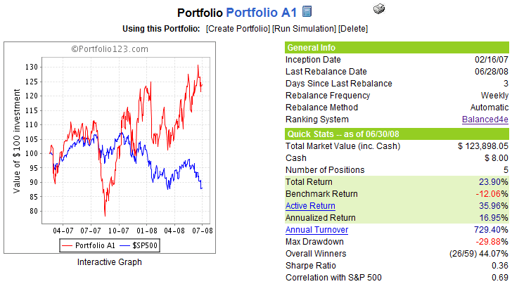
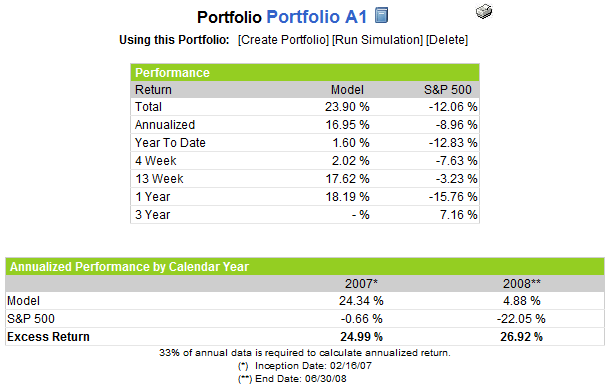
The chart below shows the equity curve and some summary performance statistics for Portfolio A1 since the equities only (no ETFs or options), long only portfolio was created on February 16, 2007. During the 16 ½ months since inception, Portfolio A1 has posted a cumulative return (exclusive of dividends) of 23.9%, while the benchmark S&P 500 index has declined 12.1%. This adds up to a net performance of +36.0% for the portfolio vs. the benchmark.


The graphic to the right provides some additional performance details for Portfolio A1 vs. the S&P 500 index over a variety of time frames. For the second quarter of 2008, for instance, Portfolio A1 returned 17.6%, while the S&P 500 was down 3.2%

For the record, Portfolio A1’s current holdings include: Mosaic (MOS); TBS International (TBSI); PetroQuest (PQ); DreamWorks Animation (DWA); and Homex Development Corp (HXM). Portfolio A1 also shares some common ancestry and has a stock ranking system that is similar to the VIX and More Focus Aggressive Trader model portfolio – one of the four model portfolios that I update transaction by transaction for the VIX and More subscriber newsletter.

Finally, I would be remiss in not reiterating that Portfolio A1 was created with tools developed by Portfolio123.com and is managed via Portfolio123.com’s tool set. For more information on Portfolio123.com, please refer to an earlier post on the subject, Portfolio123.com: The Engine Behind Portfolio A1.

Don Fishback on Complacency in the VIX/VXO During Selloffs

When someone follows the VXO more closely than the VIX, it is usually because they have been doing it for a decade or more and found no reason to switch when the CBOE changed how the VIX was calculated back in 2003. For all practical purposes, the differences between the VIX and the VXO are not meaningful enough for most investors to warrant monitoring both volatility indices.

With that preamble out of the way, I am pleased to report on some interesting research on the VXO by Don Fishback, who is indeed an experienced hand when it comes to options and volatility. Looking at instances going back to 1986 in which the OEX (the S&P 100 index, which is the underlying for the VXO) declined 10% and the VXO remained under 30, Fishback concludes:

“Bottom line is that when the market falls 10% off of a recent high, and VXO stays below 30%, what was bad gets worse. In every prior instance where VXO failed to climb to above 30%, the market continued lower. The MINIMUM additional downside is another 10%.”

Granted, these conclusions cover only six data points that fit the statistical profile noted above, but the correlation between the level of the VXO when the 10% OEX decline is met and the extent of the subsequent decline over all 14 data points in the study is also worth pondering. Read the full article at 10% Declines and VXO Less than 30% and consider checking out another take on Don’s work by my blogging alter ego at Daily Options Report.

When it comes to VIX spikes a signs of a market bottom, my thinking is remains that while we don’t need a Brunhilde Day to signal capitulation, the higher the VIX spike, the higher the odds that a bottom will hold. See January’s Can the Markets Bottom Without a VIX Spike? for a more detailed discussion of VIX spikes and market bottoms.

Friday, June 27, 2008

NDX Drops 4% and IBD Bag Indicator Is Yellow…

Earlier this month I talked a little bit about the mean reverting bounce associated with a 3% one day drop in the SPX in VIX Spikes and SPX Drops Are Not Necessarily Two Sides of the Same Coin.

Yesterday, we had a 4% drop in the NASDAQ-100 (NDX) and, not surprisingly, the 33 year historical record of 4% drops in the NDX suggests that a bounce is again likely to follow yesterday’s pain. What I found particularly interesting is that the bounce following a 4% NDX drop has a lifespan of only a month or so before any incremental gains revert back to the historical norm. In fact, the maximum post-bounce advantage peaks at about ten trading days, then slowly starts to erode. Looking at data from all 108 of those 4% drops, average performance begins to drop after the tenth day and is decidedly bearish during the period of 2-6 months after that 4% drop.

Part of the reason for this statistical bull trap is the relatively high number of 4% drops in the NDX that occurred during the 2000-2003 period (accounting for 75% of all 4% drops during the 33 year period under study), which lends a bearish cast to the data.

So what about the IBD bag? Well…someone decided to start me on a trial subscription to Investor’s Business Daily about a week or two ago. I scanned the paper for the first few days and noted with a smile that it came wrapped in a green plastic bag. Yesterday the paper arrived in a yellow bag and I wondered if this was some sort of signal from Bill O’Neil or God or perhaps both. Of course, the markets proceeded to plummet on that yellow bag day. So today I look outside in eager anticipation to see what color the bag is and it’s yellow again. This time the markets are only down about 0.7%, but the day is young. I wonder what it means when the paper arrives in a red bag?

Thursday, June 26, 2008

New 2008 Low in the DJIA, Yet VIX Shows Complacency

I have received a number of questions and comments in which readers have expressed surprise about the relative complacency in the VIX (currently at 23.51 as I type this) while the DJIA is in the process of making a new low for the year.

One important and often overlooked element of a VIX spike is surprise. Similar to Nassim Taleb’s idea that a black swan cannot be anticipated, if all of the Bob Janjuah’s of the world predict an impending market crash, the media runs with the story, and investors rush out to snap up portfolio protection…then it becomes much less likely that people will panic and the market will crash if stocks start to turn down. Put another way, where there is a safety net, there is a lot less fear.

Another point worth noting is that the DJIA is not representative of the broader markets, as reiterated by Adam at Daily Options Report today in Lookout Below? The Russell 2000 and NASDAQ-100 indices, for instance, are showing considerably more resiliency in the recent downtrend.

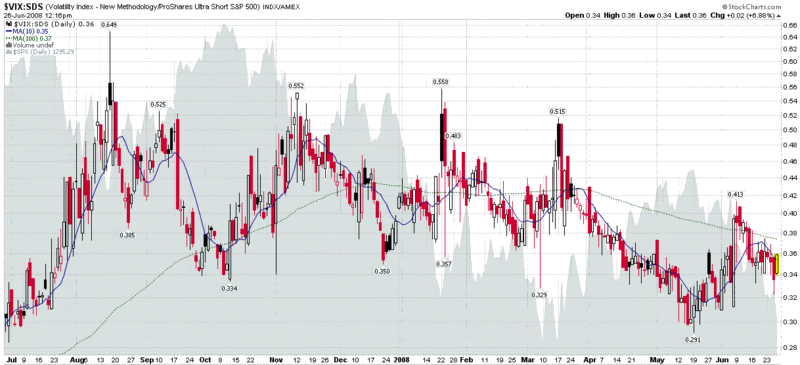
Turning to the VIX:SDS ratio, which I unveiled last August in Fear vs. Volatility (follow the links for some background and explanatory notes), I use this indicator to evaluate the amount of fear and complacency in the market relative to market movements. The size and direction of the gap between the current ratio and the 100 day SMA or the 10 day SMA and the 100 day SMA provide some useful information about the incremental sentiment involved in market moves.

At the moment, it looks as if the VIX:SDS ratio is showing a small amount of complacency, which I find a little unusual for the current market environment, but not particularly noteworthy. Of course, if investors see the monster approaching and prepare themselves accordingly, it is a good bet that the monster will never quite make it close enough to terrify the markets.

Wednesday, June 25, 2008

The Three-Legged Stool

The issue of whether to rely primarily on fundamental or technical analysis is one that each investor has to struggle with, usually a number of times over the course of his or her investing lifetime.

While the relative merits of the two approaches will appeal to different types of investors, I find it hard to believe that the high court of investment strategy will ever rule in favor of one approach at the expense of the other.

None of this stopped Felix Salmon of Portfolio.com from launching an attack on technical analysis in Monday’s Adventures in Technical Analysis, Jim Cramer Edition. After giving Cramer a well-deserved lambasting, Salmon makes the jump from the particular to the general case:

“…Stock traders don't know anything.

It's not just Cramer, is the point. They all do it: even much smarter and much more analytical traders like Barry Ritholtz do it too. Do what? Resort to ‘technical analysis’, which is the art of drawing lines on charts and extrapolating from them what the market is going to do next.

Whenever you hear words like ‘overbought’ or ‘oversold’ or ‘momentum’ or ‘support’ or ‘resistance’, it means that whatever you're hearing is garbage. But it also means that the person you're listening to has no idea what's about to happen, and is therefore resorting to the financial equivalent of astrology.”

For starters, I would consider Cramer to be more of a fundamental guy than a technical analyst, but that is not the important point. Interestingly, to my thinking, Barry Ritholtz spends as much time as anyone writing about macroeconomic and fundamental issues, but this apparently escaped Salmon’s notice as well.

Ritholtz’s succinct response, which can be found in its entirety in Let’s Get Technical, includes a reframing of the question and a quick summary of some of the merits of technical analysis:

A better question to ask is "What information do charts and related data provide, and how can this be used by investors and traders?"

I posit that, when used appropriately, charts and data can provide tremendous insight:

- Provides a statistical approach to investing, one that describes the probabilities of various outcomes (versus making predictions)
- Charts show you if we are in a bull or bear market, allowing you to manage risk appropriately;
- Trends can keep you away from the wrong sectors (Housing, Autos, and Finance are obvious examples) or keep you in the right sectors (eg., Energy and Ag)

- Developing good risk/reward analyses;
- Tracking what the institutions are doing;
- Identifying specific stocks that might be appealing;

The bottom line is that TA is merely a tool, albeit one used more skillfully by some than others.

Finally, consider this question: If you could look at one and only one source before buying your next stock or fund, which would you choose: a fundamental analyst's report (with no charts in it), or any chart of your choosing? While I like having access to both, I cannot ever imagine buying something without first looking at the chart …”

There are many examples of investors who have been very successful investing exclusively with a fundamental approach – and I’m sure there are at least as many investors who have prospered mightily using only technical analysis. Part of the reason investors gravitate to one approach or the other is that it fits their personality and provides a certain level of comfort.

To my thinking, the most important determinant of whether to focus on fundamentals or technical analysis is one’s investment time horizon. In a nutshell, the shorter the time horizon, the more important technical analysis becomes. Find me a day trader, for instance, that invests primarily based on fundamental factors. One the flip side, find me a chartist who is looking at monthly charts covering more than a decade who does not think it is important to be educated on some of the relevant fundamentals that are driving the long-term price action.

Personally, I like to think of my trading style as marrying roughly equal parts of technical analysis and analysis of market sentiment (which I consider to be tangential to TA), informed by a broad view of stock and industry fundamentals, in the context of a larger macroeconomic environment and interrelated global markets. Ultimately, it’s a three-legged stool, with TA, market sentiment, and fundamental analysis providing a balanced perspective.

Finally, I have received a number of comments in which readers have expressed surprise that my subscriber newsletter covers a much broader range of topics than is generally touched upon in the blog. The reasons for this are simple. All the talking heads talk about macroeconomics and fundamentals all day long. There are also a number of blogs and other web sites that spend a lot of time analyzing charts and other TA data. I choose to focus on market sentiment on the blog because I don’t believe this subject gets nearly the attention it deserves. Those who understand volatility, put to call ratios, market breadth data, and other related subjects and who can combine that information with a fundamental + technical approach have a much greater chance of success than those who ignore market sentiment.

In the subscriber newsletter, I utilize a holistic approach to the markets and incorporate a broad range of themes, because I believe it is important to see the whole playing field and not to have any investing blind spots. The approach seems to be working, as I have a 98% renewal rate and am in the process of writing a book on the subject, slated to be published by Wiley Trading in the first half of 2009.
Tuesday, June 24, 2008

SPY Put Volume Study

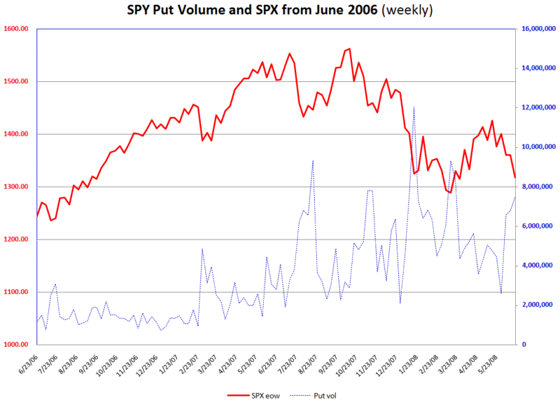
For those who were underwhelmed by yesterday’s monthly charts of the call volume and put to call ratios for the VIX, I am going to try to whelm you a little more by switching over to weekly charts of SPY (the ETF for the S&P 500 index) puts.

The logic here is that those who may not want to be short the market (or hedge long positions) with the additional leverage of VIX calls may prefer the increased liquidity, dollar strike price increments, and penny pricing benefits of SPY puts.

Looking at the chart below, the SPY put volume correlates nicely with intermediate bottoms in the SPX/SPY. Note the current spike in put volume. It is something to think about, anyway, as you contemplate what the Fed could possibly say that might put a stop to the slide in the equities market.

Monday, June 23, 2008

VIX Put to Call Ratios and Call Option Volume

I have not yet posted much about VIX call options volume on the blog, but the subject of VIX option volume and put to call ratios is an interesting one that I will return to periodically.

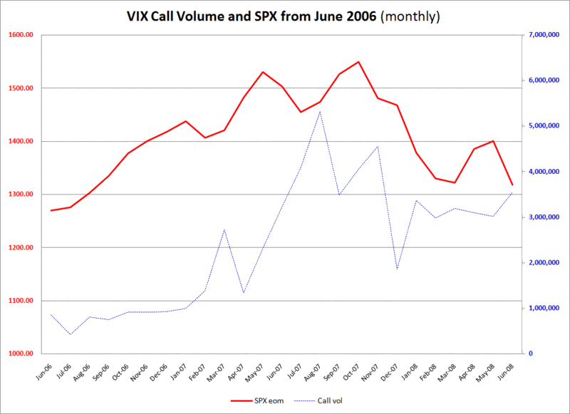
First, I should set some context by pointing out that two years ago, it was rare for VIX options volume to hit one million contracts in a single month. Following the record 64% one day spike in the VIX on February 27, 2007, VIX options suddenly surged in popularity, with their monthly volume rising steadily and peaking in August 2007 at 7.15 million. Interestingly, since last August, VIX options volume has been fairly steady month to month and has been averaging about 4 million contracts per month.

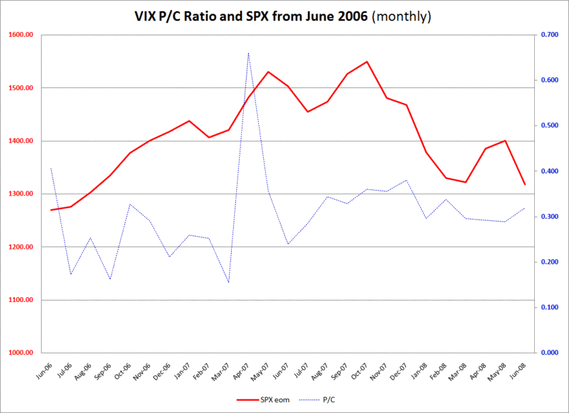
Given the general increase in activity in VIX options volume, it should come as no surprise that the call volume has surged with the overall options activity. For this reason I have included two VIX options charts, each with the monthly close in the SPX for reference. The top chart shows two years of the VIX monthly put to call ratio. From a quick visual study, it is difficult to conclude that this data provides much in the way of meaningful clues about future trends in the SPX. The bottom chart is a two year history the VIX monthly call volume (with projected end of month volume for June based on data through 6/20/08) and shows a moderate negative correlation between the VIX put to call ratio and movements in the SPX, particularly during 2007. I mention this because VIX call volume for the month of June is on track to be at its highest level in at least 7 months, with the spike in VIX calls increasing the likelihood of a market bottom in the near term.

Consider this an appetite whetter; I will delve more into VIX options and various interpretations of VIX options data in this space going forward.


Friday, June 20, 2008

Volatility at RKH Regional Banking ETF

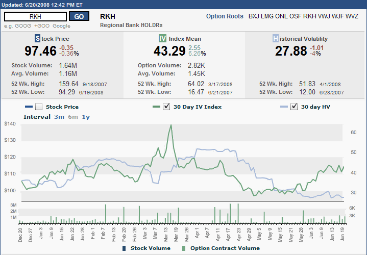
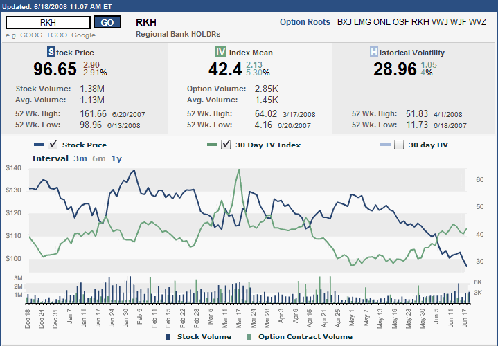
I just mentioned RKH, the HOLDRS regional banking ETF, on Wednesday in Regional Banking Woes Worsen, where I also posted a graph of RKH’s six month stock price and 30 day implied volatility.

I am revisiting RKH today with a slightly different chart, also courtesy of the ISE, that compares RKH’s implied volatility and historical volatility over the past six months. In the chart below, notice that the implied volatility in this ETF has been more of an uptrend than the spike from mid-March. Notice also that implied volatility appears to have hit a plateau and is still far below the mid-March peak.

Also of interest, the gap between implied and historical volatility is at a six month high right now, as historical volatility has been trending down over the past three weeks at the same time implied volatility has been trending up.

Finally, note that in those instances where historical volatility has been elevated, it usually preceded a drop in implied volatility; conversely, where historical volatility has been depressed, this has a tendency to precede an uptick in volatility. Volatility extremes often signal turning points. Whether the current high implied volatility and low historical volatility means that the regional banks are finally bottoming remains to be seen, but I have to believe that the probability of a bottom is increasing with each volatile session.

Thursday, June 19, 2008

Keep an Eye on the QID Volume

The week’s trading volume has been on the thin side, particularly for an options expiration week. Of course, not all volume is created equal.

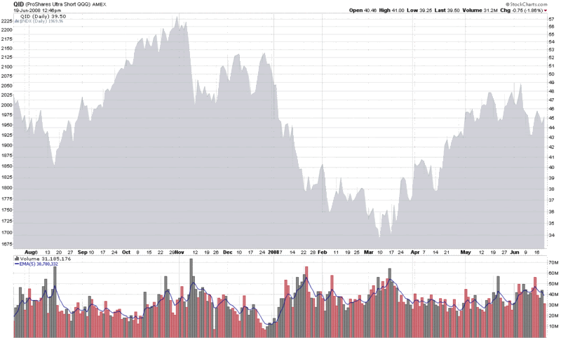
One the areas of the investment world where I pay close attention to volume is double inverse ETFs, which include the UltraShort ETFs pioneered by ProShares. The double inverse ETFs are an attractive set of investment vehicles for speculative bears to place their bets, because the oversized payoff if they are correct.

Of the double inverse ETFs, I am particularly fond of the QID, the double inverse ETF for the NASDAQ-100 index (NDX). The QID has captured the imagination of many retail investors who are not particularly comfortable going short, but have no qualms about making a bearish investment by going long an inverse ETF. Volume patterns in this ETF demonstrate that the QID can be an effective contrarian indicator. Take the chart below, for example, where a 5 day EMA of the volume has been a good indicator of tops in the NDX (the gray area chart on the top) when it rises above the 45-50 million share level.

In a broader sense, ETFs are opening up a new frontier for those who are interested in market sentiment. I will be sharing some of my thinking in this area in the weeks and months ahead.


Wednesday, June 18, 2008

Regional Banking Woes Worsen

If you subscribe to the cockroach theory of investing (where there is one cockroach, there is an army; where there is one piece of bad news, there is likely to be more in the pipeline), then the recent regional banking turmoil should come as no surprise. Fundamentally, it was just a matter of time before the subprime>housing>credit crisis started to manifest itself on the balance sheets of those regional banks in the areas that have been hardest hit by the recent economic problems.

Two quickly recap, Cleveland-based National City Corp (NCC) made the biggest headlines in late April when it received a $7 billion capital infusion from an investment group led by Corsair Capital. Just a week ago, NCC acknowledged that is operating essentially in a probationary mode governed by the contents of two memoranda of understanding with the Office of the Comptroller of the Currency and the Federal Reserve Bank of Cleveland. The details of these MOUs have not been made public.

Among the many other regional banks that have stumbled, KeyCorp (KEY), which is also headquartered in Cleveland, has been one of the more spectacular examples. Toward the end of May, KeyCorp doubled it estimates for write-offs for mortgages, HELOCs and educational loans just one month after raising write-off estimates when it reported earnings. More recently, KeyCorp announced plans to raise $1.5 billion in new capital and slash its dividend 50%.

A third Ohio bank, Cincinnati-based Fifth Third Bancorp (FITB), is dominating the headlines today, with news that the company will raise $2 billion in capital and slash its dividend 66%.

In terms of stock performance, NCC is down 75% from its December levels, while both KEY and FITB are down more than 50% since the beginning of May.

With all the turmoil in the regional banking market, I am tempted to swap out Lehman Brothers (LEH) as my official financial sector fear indicator and replace it with one of the regional banking indices. Better yet, why not make that a regional banking ETF, such as RKH (Regional Bank HOLDRS Trust), whose options status make it easy not only to keep track of price trends, but implied volatility trends (see chart below) as well.

Finally, I would be remiss in not pointing out that Ohio is the classic swing state in Presidential elections and voters go to the polls in less than five months…

Tuesday, June 17, 2008

Bollinger Bands and the Percent B Setting

It occurred to me, as I reviewed my last two posts on Bollinger Bands, that it would take quite a few posts to do anything more than scratch the surface of the Bollinger Bands indicator. For that reason, I am going to set aside my thinking on Bollinger Bands after today’s third post in the series, with a promise to pick up the subject again at a later date.

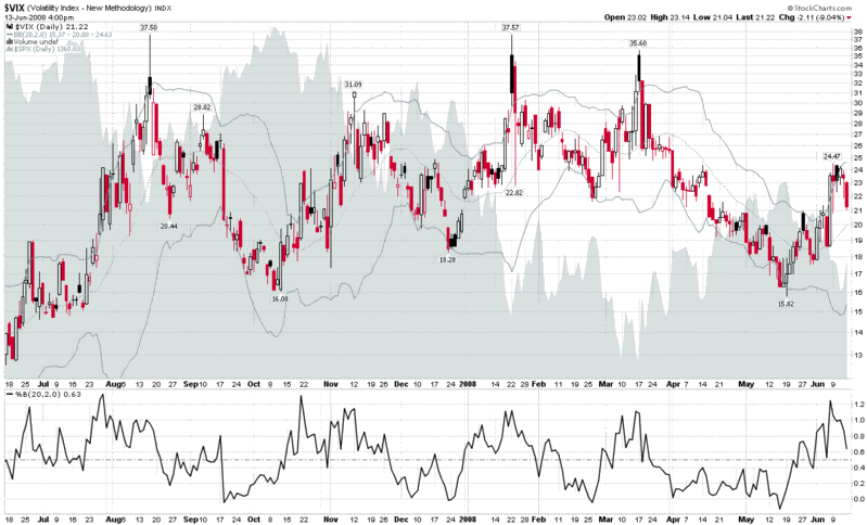
Before I wrap up this introductory look at Bollinger Bands, I want to be sure to mention the %b indicator. Quite simply, %b calculates the current price relative to the top and bottom Bollinger Bands. A %b reading of 0.5 means that the current price is exactly at the middle band (the dotted line in the gray line in the graph below that is a 20 day simple moving average in the default setting). A 1.0 reading puts the current price exactly at the level of the top band and a 0.0 reading establishes that the current price is at the level of the lower band. Unlike some oscillating indicators, %b is unbounded, so in the chart below it will exceed 1.0 when the VIX spikes above the upper band (note the most recent instances of this in January, March and the first week of June.) Each 0.1 increment above 1.0 translates to 10% of the band width above the upper band, so that a %b of 1.25 would mean 25% of the band width above the upper band. In addition to spikes above the upper band, when the VIX drops rapidly, it will periodically slide into negative territory, as it did most recently in February and May.

The %b indicator can also help to identify a change in the volatility climate. If one studies the %b peaks in late July and mid-October of last year, these %b readings of over 1.2 were nowhere the VIX tops. In each instance, however, the extreme %b readings did signal a dramatic change in volatility that ultimately ended with a volatility climax about three weeks after the 1.2+ readings in the %b indicator.

Finally, from a systems development perspective, consider that while converting Bollinger Band chart data into mechanical signals may seem like a daunting task, the %b numbers are often ideally suited for this purpose.

Monday, June 16, 2008

Bollinger Bands and the Standard Deviation Setting

On Friday, I used Bollinger Bands: Why 20 Days? as an excuse to begin my “evangelical crusade against rampant defaultism.” I did this mostly so I could make up a word (or so I thought, apparently others beat me to it), but also to warn against the tendency to favor the default settings in charting software in lieu of rigorously exploring the alternatives.

Using Bollinger Bands as my guinea pig indicator, on Friday I explored what happens when you tweak the default setting of 20 days. The other important setting in Bollinger Bands, of course, is the standard deviation setting. In Bollinger on Bollinger Bands, John Bollinger cites tests he conducted on various stocks, indices, currency pairs, and commodities, the results of which led him to conclude that a 2.0 standard deviation setting was quite robust across a variety of asset classes and time frames. Bollinger went on to recommend that the standard deviation setting should be decreased to 1.9 for a time window of 10 days and increased to 2.1 standard deviations when the time frame is extended to 50 days. In other words, modifying the number of days is more likely to provide additional insight than adjusting the standard deviation setting.

Undeterred, I have had a lot of fun experimenting with the standard deviation setting for VIX charts and a number of other charts. My takeaway: even if you do not discover any particularly revealing new information, it is important to experiment with the default settings to get a better understanding of how the indicator works in default mode and why the bands act the way they do.

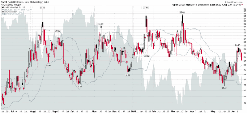
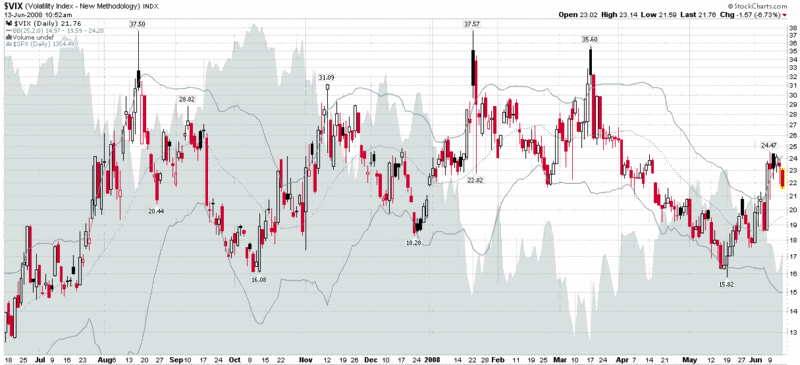
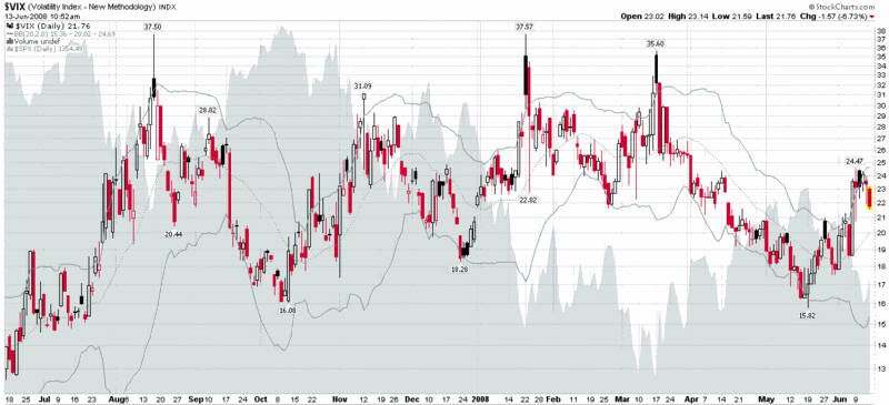
In the VIX charts below, I have included the 2.5 standard deviation setting on the top, with the default 2.0 standard deviation setting in the middle, and the 1.5 standard deviation setting on the bottom. As the graphics show, the standard deviation settings can be fine tuned to adjust the frequency of signals generated by the indicator in a given time period. The exact settings should be largely a function of one’s preferred trading time horizon.

Friday, June 13, 2008

Bollinger Bands: Why 20 Days?

I am surprised by how many traders, bloggers, and hybrids (a category I seem to have morphed into) are content to stick with the default settings offered by their favorite charting package. On a related note, one reader had asked me why I stick to the 10/50/200 simple moving averages on most of my charts; another reader regularly decries the laziness of the default charting crowd, adding that they deserve the mediocre performance that their lack of curiosity and imagination undoubtedly lead to.

So consider this the first post in my evangelical crusade against rampant defaultism.

Let’s start with simple moving averages. Personally, I prefer my standard chart of daily bars to have SMA settings of 16, 38 and 155 days. That is not much different from the 20/50/200 setting that is favored by many charting packages, but it works for me and it gives me a slightly different perspective on the world, which often makes it easier to take a position against the crowd. Of course, I have different settings for looking at narrower or broader time frames.

Moving on to an example, Bollinger Bands is one of the indicators for which I rarely see anything other than the default settings of 20 days and 2 standard deviations. Why is this? Is it laziness? Is the indicator so perfectly constructed as to defy tweaking? Is it possible that 20 days and 2 standard deviations work that well over all time horizons? Hardly. Read Bollinger on Bollinger Bands to see what John Bollinger has to say on the subject or do some experimenting on your own without the safety net of Bollinger’s commentary (for more information on Bollinger Bands, check out John Bollinger’s Bollinger Bands web site.)

In the three charts below, I have modified the Bollinger Bands setting to reflect a 25, 20, and 15 day setting – while keeping (at least for today) the 2 standard deviation parameter intact. Without providing too much commentary, note that in the top chart, the 25 day setting casts what I call a longer ‘time shadow’ to the right of any major moves. This time shadow is muted somewhat in the second chart (20 days) and is even less noticeable in the bottom chart (15 days). Note also how the 25 day setting almost resembles Donchian Channels (aka price channels), while the 15 day setting hugs the price action closely enough so that even a gentle trend can exceed the standard deviation bands. Consider, for a minute, the possible implications of customizing Bollinger Bands for securities that have a greater tendency to trend (i.e. commodities) vs. those that have more pronounced mean-reverting characteristics, like the VIX.

Thursday, June 12, 2008

A Weekly Perspective on the FXI

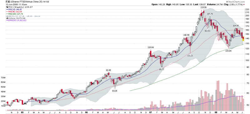
Yesterday afternoon, one of my favorite trading systems, a self-styled ETF reversal swing trader, gave a signal to go long FXI, the iShares FTSE/Xinhua China 25 Index (for those who are interested, the 29 components and weightings of the FXI are available from the iShares FXI holdings page.)

If one looks at the daily chart of the FXI, there is not much in the chart to inspire bullish optimism, as FXI has fallen by 35% since late October and has logged distribution days in three of the last four trading sessions.

When the action is particularly volatile on a daily basis, I like to spend more time with the weekly charts. In the case of FXI, zooming out to weekly bars offers a different perspective, with more in the way of bullish opportunities. In the weekly chart below, it is easy to discern that the 40 week simple moving average contained all of the pullbacks from 2005 to the beginning of 2008. Also of interest, the March low just touched the 100 week SMA before bouncing off of that level and moving up. As the current 100 week SMA is approaching the 130 level, yesterday’s 135.30 low looks like it may be a relatively low risk entry, with a potential short to intermediate-term upside target of 155 or more.

The Chinese markets are about as volatile as any at the moment and bullish reversal trades are notoriously risky, but this does not exclude the possibility of entries with a favorable risk-reward profile.

Wednesday, June 11, 2008

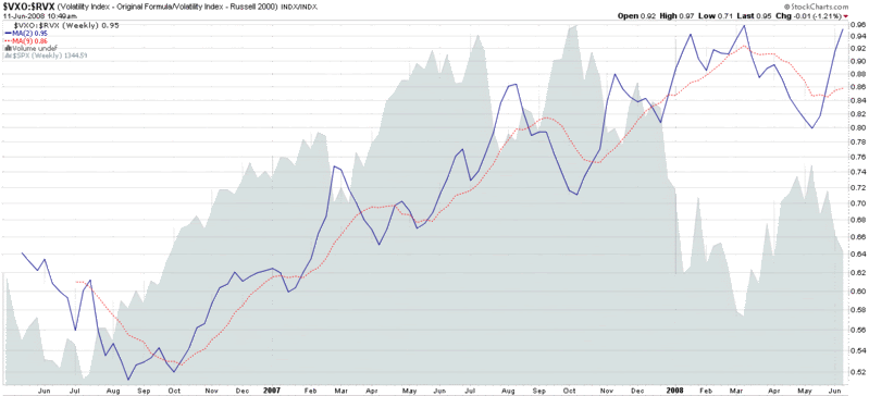
Unusual Chart of the Month: VXO and RVX

In the past, I have been accused of dreaming up strange and unusual charts just for the fun of it. I will gladly enter a guilty plea on that one. In fact, I enjoy cajoling the Department of Strange and Unusual Charts to come up with something that readers have never encountered before.

If the chart below looks a little out of the ordinary, chalk it up to that personality disorder I have already confessed to. Before trying to interpret whether the chart has any possible validity, it is important to take a step back. Consider that each chart contains at least one hypothesis about a relationship between various data points and/or data sets. At first glance that hypothesis might seem outrageous or merely coincidental. The point of the strange and unusual charts is that it is more important to drag those hypotheses out into the open and give readers an opportunity to pause and reflect on them than it is to present each hypothesis as unassailable .

In the long run, it is those strange and unusual relationships that no one else sees, but which persist over time, that provide a meaningful trading edge. So keep an open mind and keep looking.

Turning to the ratio of the VXO to the RVX, recall that the VXO is the ‘original VIX’ and reflects the volatility associated with the large cap S&P 100 index (OEX). The RVX, on the other hand, is the volatility index for the Russell 2000 small cap index (RUT). Small caps have been outperforming large caps lately, so it is not surprising to see recent volatility trending higher with the large caps. What did surprise me, however, was to see that a spike in the VXO relative to the RVX has been an excellent indicator of market bottoms over the past two years. If we extrapolate from the past, the current levels of the VXO versus the RVX also suggest a likely intermediate market bottom, at least in the SPX, which is represented by a gray area chart in the graph. Unassailable? No. Worth watching going forward? Absolutely.

Tuesday, June 10, 2008

The LEHVIX

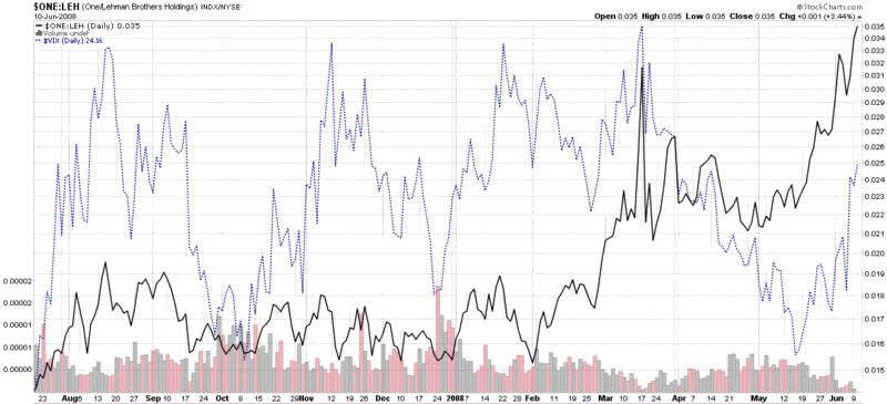
Yesterday I heard myself joke that lately I had not been watching the VIX as closely as I used to, because I had jettisoned the VIX in favor of Lehman Brothers (LEH) as my favored indicator of fear and anxiety. OK, so maybe I was more serious than joking.

In a recent poll of a group of savvy investors, I found it interesting that the two issues these investors are most concerned about vis-Ă -vis their investments are the stability of financial institutions and increasing inflation. Of course, Lehman Brothers is still the poster child for investor anxiety about the stability of financial institutions, just as it was when I first applied this label back in March.

So what does a LEHVIX look like? Well…thanks to StockCharts.com, you can invert the LEH price chart and have the precipitous price drops look like spikes instead, as I have done in the chart below. Now compare the VIX (dotted blue) line with LEH (solid black line) and ask yourself which best represents the level of fear and anxiety you have experienced with respect to the markets. The VIX shows roughly equal levels of concern in August, November, January, and March. The LEHVIX (inverted LEH price history) shows a blip in August and January, but sheer panic in March and again in June. In this case, I think LEH has a better fix on fear and anxiety than the VIX. Of course, your mileage may vary…

Monday, June 9, 2008

VIX Spikes and SPX Drops Are Not Necessarily Two Sides of the Same Coin

Friday was a day in which the VIX spiked 26.5% and the SPX dropped 3.1%. On the surface, that does not sound unusual: the market plunges and the VIX simultaneously spikes in the opposite direction as sellers get a little panicky.

Over the weekend, I was reviewing the performance of the SPX after a 3% drop and saw the classic mean reversion pattern of a market that usually does very well after a big one day selloff. I looked at the VIX and noticed an even more predictable pattern of mean reversion following a VIX spike. Again, this is what is what you might expect -- particularly if you spend a lot of time with this data, as I do.

Then I saw something that I was sure had to be some sort of mistake: when the VIX spikes 20% or more in one day (see Adam at Daily Options Report for his thoughts on this phenomenon), the VIX reverts, but the SPX does not tend to perform particularly well going forward. But how can this be? I had just looked at data I had crunched to show that following a SPX drop of 3%, the index had a history of exceeding ‘normal’ performance by three to ten times over the course of the next few weeks and months.

As it turns out, prior to Friday, there are 27 instances since January 1990 in which the VIX has spiked 20% or more in a single day. As luck would have it, there are also exactly 27 instances in which the SPX has dropped 3% in a single day during that period. It turns out, however, that only 8 of those 27 instances are the same session. In analyzing the data, I have come to the conclusion that as a rule, the 3% drops in the SPX are better indicators of a future bounce in the SPX than the 20% drops in the VIX. I will be sure to elaborate more on this observation going forward, but thought I should offer up this conclusion this morning for those who are still wondering about whether Friday’s session has bullish or bearish implications.

Friday, June 6, 2008

A Long-Term View of the Put to Call Ratio

Of all the trading/investing blogs that have arrived on the scene in 2008, I think my favorite is Rob Hanna’s Quantifiable Edges. The title pretty much sums up the blog’s approach. This is a place where Rob analyzes the markets, observes various relationships that lie hidden under the surface for most investors, extracts some insight, and back tests these ideas to determine their historical profit potential.

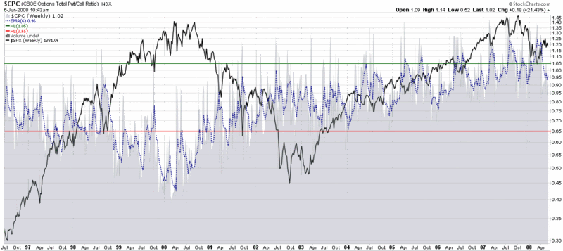
Today Rob takes a slightly different approach, as the Celtics-Lakers game appears to have depleted his overnight R&D staff. Instead, in Why You Need to Normalize the Put to Call Ratio, Rob posts a graphic that looks a lot like the night sky (the bottom section of the first graphic, below), but actually comprises 12 years of the CBOE Total Put to Call ratio.

Rob conclusions mirror much of my own thinking and are worth capturing in detail:

“Often times I hear traders refer to absolute levels in put/call ratios as if they are significant. What you can see by looking at the chart above is that ‘significant’ has change over time. From ’97 to ’02 a ‘spike’ in the ratio over 1.00 could have been viewed as significant. A trader seeing such a reading may conclude that fear among option traders was running high. Now a reading of 1.00 is below average. A reading of 0.5 would sure be significant, though. In 2000 it was about average. Strategies that may have been developed 7 or 8 years ago that looked for a move to a certain number are now likely obsolete. That doesn’t mean the put/call ratio has stopped working as an indicator, though.

The issue lies in the fact that the popularity and use of options for traders and institutions has changed over time. It will continue to change. To adjust for this you should normalize the readings over a certain time period and then compare the current readings to ‘normal’.”

Just for fun, I have appended a StockCharts.com graph of the SPX to the top of Rob’s TradeStation chart of the put to call ratio. It may resemble a visual Minotaur of sorts, but the result shows an almost perfect negative correlation between the put to call ratio and the SPX from the mid-1990s through the end of 2003. Then, without warning, the correlation shifts from a negative one to a positive one from 2004 to 2008, before reverting to the traditional negative correlation pattern for the last six months or so.


In the graphic at the bottom, I have done my best to fit a weekly chart of the total put to call ratio into an absolute scale that provides meaningful buy and sell signals. There are a number of ways to look at this chart. The first thing to do is to acknowledge that there is no place in the chart where meaningful buy and sell signals were generated in the same general time frame. A second possible takeaway is that on those occasions when the P/C levels were below the red sell line or above the green buy line for an extended period of time, this could have been a signal (and an helpful one, in retrospect) to be short from 1999-2001 and long from 2005-2008. Finally, while not spelled out on the chart, one can see how tracking the deviation between the 6 week EMA shown with a dotted blue line and a long-term (i.e., 40-50 week) moving average (not shown) could provide an actionable synthesis of the need to measure absolute and relative levels of the put to call ratio.

Something to think about, at least, while watching the Celtics and Lakers…

Thursday, June 5, 2008

Schaeffer on the Volatility of the VIX

Bernie Schaeffer is out with another interesting take on the VIX today. In Schaeffer’s Short Takes: The Volatility of the VIX (may require free registration), he offers some compelling data and charts on the historical volatility of the VIX.

The charts make for good reading, but it is Schaeffer’s conclusion that I wish to focus on:

“From a sentiment perspective, one might conclude that a high ‘second derivative VIX’ is an indication of excessive bearishness. At the very least one can reasonably conclude that if the protection trade is in fact crowded, then the chances of a major downside accident are significantly reduced as big money is already down on the black swan event.”

The important point is that the more downside protection that investors load up on (using VIX calls or by buying puts on other indices), the less impact any downturn will have. In other words, there will be little in the way of a vicious cycle of selling if options are mitigating losses from a bear move. By the same token, a black swan event, by definition, has to be a surprise. If investors are prepared for the beast, then it will have to arrive in another form, if it arrives at all.

As an aside, I don’t believe the term ‘second derivative VIX’ is the best phrase to use when speaking about the historical volatility of the VIX. The VIX is the implied volatility of the SPX, so a second derivative would logically refer to the implied volatility of the VIX, something I have labeled meta volatility in this space in the past. While technically one can derive both historical and implied volatility from the VIX, mixing historical volatility and implied volatility together in this context muddies the already murky waters of what a VIX derivative is.

It sounds like it is about time for another VIX 101 post to clarify some of this…

Wednesday, June 4, 2008

The VIX and Sectors: A One Day Snapshot

I collect a lot of strange and unusual data in the course of trying to be “Your One Stop VIX-Centric View of the Universe…” and it makes sense to share some of those chunks of data from time to time, even when I don’t think it will change the way anyone looks at the market.

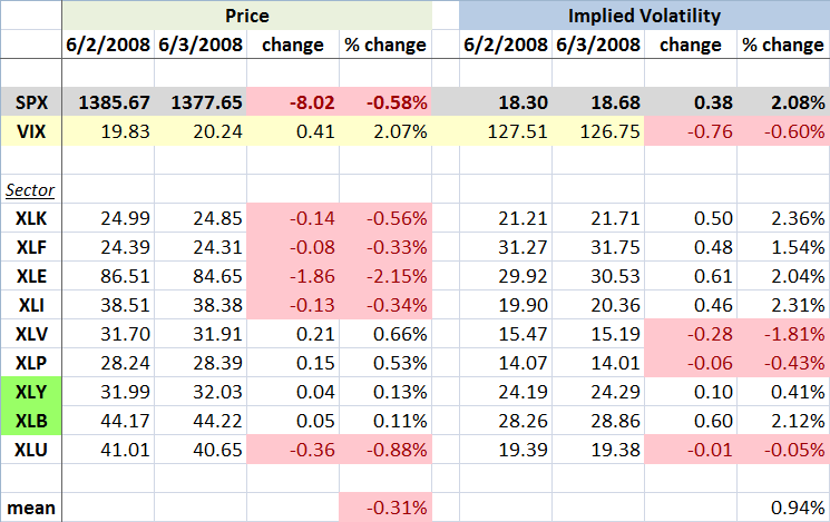
Now that I’ve lowered your expectations, I call your attention to the graphic below, which captures the movements in the various sector SPDRs over the course of Monday to Tuesday, a day in which rumors of persistent difficulties at Lehman Brothers (LEH) helped to drag down the financial sector ETF (XLF) to its lowest level since March. The sectors are ordered with the highest weighted ETF at the top (XLK - technology) and the lowest weighted (XLU - utilities) at the bottom. With any luck, the balance of the graphic is self-explanatory.

From a sector and volatility perspective, I found a few interesting tidbits from the graphic. First of all, the change in the VIX and the change in the SPX implied volatility were almost identical, which is what you would expect. I did find it interesting that the VIX jumped more than twice the percentage change in the mean IV across the nine sector ETFs. Drilling down a little more, only three of the sectors had an increase in IV that was higher than the jump in the VIX -- and in each instance this was just barely the case.

I have highlighted in green the two sectors in which the price of the ETF increased at the same time that implied volatility increased. For the consumer discretionary sector (XLY), the change is not particularly dramatic, but for the materials sector (XLB), there is a substantial jump in IV on the heels of increasing price. Needless to say, this is unusual.

Part of the explanation for the large increase in the VIX (and SPX IV) relative to the individual sectors may come from the fact that the four most heavily weighted sector ETFs all had a substantial rise in IV, but even when taking this into consideration, the change in the VIX exceeds the change in the sum of the weighted parts.

Finally, for anyone who followed my fearogram and SPX-VIX correlation analysis last year, you may recall that the median daily percentage move in the VIX is -4.2x of the daily move in the SPX. For the record, yesterday the VIX moved 3.6x in the opposite direction of the SPX. In percentage terms, this is a fairly typical negative daily correlation number. [Disclosure: Long LEH at time of writing.]

Tuesday, June 3, 2008

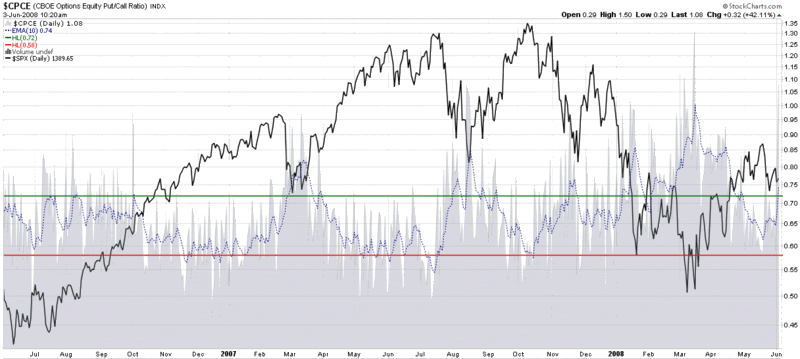
CBOE Equity Put to Call Ratio Looking Bullish

Based on one of the ways I like to apply the CBOE Equity Put to Call Ratio, this ratio has just turned bullish for the first time since late April. Like any indicator, put to call ratios are far from infallible, but looking at historical context, there is a good possibility that the recent surge in put activity will be enough bricks in the wall of worry to provide a base for another bullish move from current levels.

Given that most of the other indicators I follow have a more neutral outlook, it will be interesting to see how this plays out.

Monday, June 2, 2008

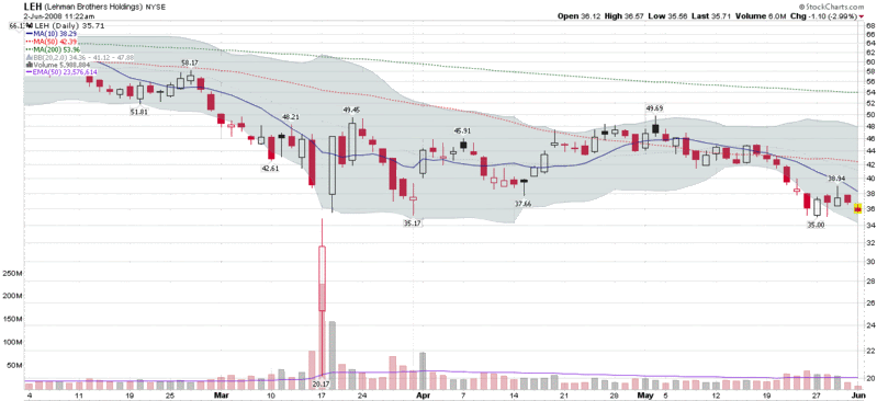
Lehman Teetering Again

I would love to be able to dismiss out of hand the various rumors that have been circulating about Lehman Brothers (LEH) over the course of the past few weeks. The fact is that Lehman seems to be unable to escape the Pig-Penesque cloud that has hung over the stock since the demise of Bear Stearns.

Lehman Brothers is down another 3% to 35.59 as I write this, with the prospect of another test of last week’s 35.00 support level coming soon. If 35.00 fails to contain the current round of selling, this could get ugly quickly and raise more questions about counterparty risk. I don’t like the looks of the LEH chart; clearly they are a long way from being out of the woods.

Sunday, June 1, 2008

Subscriber Newsletter Portfolio Performance through May

As I hinted at yesterday in Portfolio A1 Performance Update: 5/31/08, PortfolioA1, which I updated here on a weekly basis from February 2007 through April 2008, has been tweaked and enhanced to create the VIX and More Focus Aggressive Trader Model Portfolio.

In fact, the subscriber newsletter has four model portfolios that I make available to newsletter subscribers. Since their March 30, 2008 launch, the four (equities only, long only) portfolios have performed as follows:

  • Focus Aggressive Trader: +16.93%

  • Focus Growth: +3.25%

  • Focus Foreign Growth: +9.75%

  • Stock of the Week Sequential Portfolio: +64.58%

In addition to the model portfolios, the subscriber newsletter includes a number of regular weekly sections, including a market commentary, asset class outlook, market sentiment update, current investment thesis, and week in review. Features generally focus on subjects such as sector rotation, volatility, put to call ratios, market breadth, volume, and other sentiment-related issues. Some of the May features have included:

  • Technology Leadership Is Bullish
  • New Picks from the Volatility-Based Sector Rotation Model
  • Interpreting the Recent Low VIX
  • An Expanded Look at the VIX:VXV Ratio
  • Measuring Complacency
  • ETF Reversal Swing Trader
  • Trading Oil with ETFs
  • Different Ways to Cross the 200 Day SMA
  • The Role of Speculation in Oil Prices
  • Oil, Energy, and Correlations

I continue to be pleased by the positive feedback from subscribers, 25% of whom are located outside of the United States, which has included the following comments:

I really appreciate all your help and the thoughtful views you have of the market…It appears you have a knack for picking the stock of the week! -- PP, USA

You've blogged only rarely on the broader thrust of the newsletter. It comes off as applied VIX, or perhaps punches up the "..and More" part of "VIX and More". -- DK, USA

The newsletter is exactly what I am looking for. -- MD, Germany

I loved your Sunday edition. Congrats on the success of your picks. -- VH, USA

For more information on the subscriber newsletter contents, check out a blog that I have dedicated to the subscriber newsletter: VIX and More Subscriber Newsletter Blog.

If anyone has any additional questions or comments about the subscriber newsletter, please feel free to email me at bill.luby@gmail.com

DISCLAIMER: "VIX®" is a trademark of Chicago Board Options Exchange, Incorporated. Chicago Board Options Exchange, Incorporated is not affiliated with this website or this website's owner's or operators. CBOE assumes no responsibility for the accuracy or completeness or any other aspect of any content posted on this website by its operator or any third party. All content on this site is provided for informational and entertainment purposes only and is not intended as advice to buy or sell any securities. Stocks are difficult to trade; options are even harder. When it comes to VIX derivatives, don't fall into the trap of thinking that just because you can ride a horse, you can ride an alligator. Please do your own homework and accept full responsibility for any investment decisions you make. No content on this site can be used for commercial purposes without the prior written permission of the author. Copyright © 2007-2023 Bill Luby. All rights reserved.
 
Web Analytics