A Long-Term View of the Put to Call Ratio
Of all the trading/investing blogs that have arrived on the scene in 2008, I think my favorite is Rob Hanna’s Quantifiable Edges. The title pretty much sums up the blog’s approach. This is a place where Rob analyzes the markets, observes various relationships that lie hidden under the surface for most investors, extracts some insight, and back tests these ideas to determine their historical profit potential.
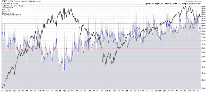
Today Rob takes a slightly different approach, as the Celtics-Lakers game appears to have depleted his overnight R&D staff. Instead, in Why You Need to Normalize the Put to Call Ratio, Rob posts a graphic that looks a lot like the night sky (the bottom section of the first graphic, below), but actually comprises 12 years of the CBOE Total Put to Call ratio.
Rob conclusions mirror much of my own thinking and are worth capturing in detail:
“Often times I hear traders refer to absolute levels in put/call ratios as if they are significant. What you can see by looking at the chart above is that ‘significant’ has change over time. From ’97 to ’02 a ‘spike’ in the ratio over 1.00 could have been viewed as significant. A trader seeing such a reading may conclude that fear among option traders was running high. Now a reading of 1.00 is below average. A reading of 0.5 would sure be significant, though. In 2000 it was about average. Strategies that may have been developed 7 or 8 years ago that looked for a move to a certain number are now likely obsolete. That doesn’t mean the put/call ratio has stopped working as an indicator, though.
The issue lies in the fact that the popularity and use of options for traders and institutions has changed over time. It will continue to change. To adjust for this you should normalize the readings over a certain time period and then compare the current readings to ‘normal’.”
Just for fun, I have appended a StockCharts.com graph of the SPX to the top of Rob’s TradeStation chart of the put to call ratio. It may resemble a visual Minotaur of sorts, but the result shows an almost perfect negative correlation between the put to call ratio and the SPX from the mid-1990s through the end of 2003. Then, without warning, the correlation shifts from a negative one to a positive one from 2004 to 2008, before reverting to the traditional negative correlation pattern for the last six months or so.

In the graphic at the bottom, I have done my best to fit a weekly chart of the total put to call ratio into an absolute scale that provides meaningful buy and sell signals. There are a number of ways to look at this chart. The first thing to do is to acknowledge that there is no place in the chart where meaningful buy and sell signals were generated in the same general time frame. A second possible takeaway is that on those occasions when the P/C levels were below the red sell line or above the green buy line for an extended period of time, this could have been a signal (and an helpful one, in retrospect) to be short from 1999-2001 and long from 2005-2008. Finally, while not spelled out on the chart, one can see how tracking the deviation between the 6 week EMA shown with a dotted blue line and a long-term (i.e., 40-50 week) moving average (not shown) could provide an actionable synthesis of the need to measure absolute and relative levels of the put to call ratio.
Something to think about, at least, while watching the Celtics and Lakers…


3 comments:
Excuse me Bill but i do not fully understand. Then again, perhaps it best i do not understand. If you will be generous to add additional
insight into this study i [and probably] many others would appreciate it.
klauden-
The first thing I think of when reading your post is System death and you must design your trading system to be robust enough to work in changing market conditions (well the term conditions could be debated). Your last line was right on... something to think about...
Klauden,
The key takeaway is that you can use horizontal bars (absolute levels) for short-term trade signals, but these do not make sense over the long term, as the put/call ratio changes with the markets. For this reason, moving averages, moving average envelopes, Bollinger Bands, etc. are better approaches to use when evaluating put/call data over longer time frames.
For more of my thinking about this subject, do a search on the blog for "put to call" or "CPCE" and go from there.
I hope this helps.
-Bill
Post a Comment