Saturday, February 28, 2009

Chart of the Week: GDP Worse Than Expected

A lot happened in the markets this week: the government took a larger ownership stake in Citigroup (C); blue chip stalwarts JPMorgan Chase (JPM) and General Electric (GE) both slashed their dividends; durable goods and housing data failed to meet already lowered expectations; Q4 GDP was revised down to a 6.2% annualized drop; and the S&P 500 index fell to levels not seen since 1996.

In spite of all these body blows, the markets held up reasonably well, with the exception of the GDP data, which delivered a knockout blow Friday morning. The GDP numbers are notoriously backward-looking and the revisions to advance GDP data lend very little to the existing body of economic knowledge. That being said, Friday’s GDP numbers touched a statistical and psychological nerve for a market that was just not prepared to digest another assessment of how sharp the economic fall has been.

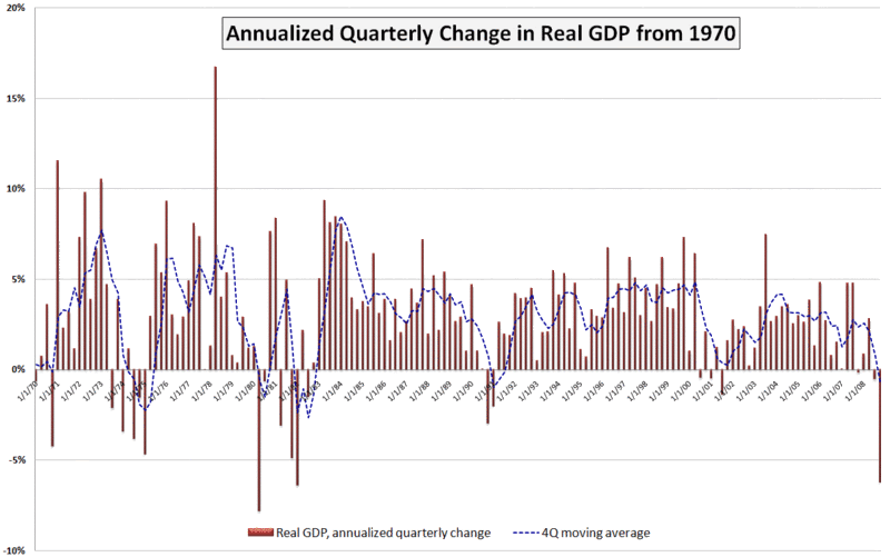
This week’s chart of the week attempts to put the most recent GDP number in historical perspective. While not shown on the chart, the raw GDP for the fourth quarter of 2008 is at approximately the level of economic activity that prevailed in June 2007. Also, while the 6.2% (annualized) drop in Q4 GDP is quite concerning, it is less than what we saw in the first quarter of 1982 (-6.4%) and the second quarter of 1980 (-7.8%). Going back even further (and not shown on the chart), GDP dropped a whopping 10.4% in the first quarter of 1958.

I have added a dashed blue line to show a four quarter moving average of GDP. By this measure, the current situation still has a way to go before it compares to 1991, not to mention the even larger four quarter dips in the 1970s and 1980s referenced above.

A survey of 43 economic forecasters published two weeks ago by the Federal Reserve Bank of Philadelphia showed expectations for a 5.2% drop in Q1 2009 GDP, followed by a 1.8% drop in Q2. Given the most recent revisions to the Q4 data, a 5.2% drop in the current quarter may be on the optimistic side, but the burning question right now is whether Q3 can show any growth at all – or at least a decrease in the rate of economic deterioration.
[source: Bureau of Economic Analysis, VIXandMore]

Friday, February 27, 2009

Volatility Storm at Two Years and Counting…

It was exactly two years ago today that the first winds of the volatility storm blew in from China. Back on February 27, 2007, concerns about the Chinese government raising interest rates to discourage speculation helped to trigger an 8.8% loss in the Shanghai Composite Index and a 9.9% loss in the FTSE/Xinhua China 25 index that is the basis for the popular Chinese ETF, FXI.

In one of the earlier challenges to the decoupling theory, stocks around the world fell in sympathy, with the Dow Jones Industrial Average losing 416 points later that day to close at 12,216. The simultaneous 64% spike in the VIX still stands as a one day record, though two years later it seems a little quaint to talk about a massive VIX spike when the VIX failed to get out of the teens.

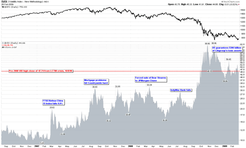
As the chart below shows, following the February VIX spike, the floor in the VIX jumped from 10.00 to 12.00 and that floor kept rising, first to 15, then 16, 18 and 22. In fact, the pattern of higher lows continued for over a year.

In the StockCharts chart, I have elected to show volatility as an area chart to emphasize the rising tide aspect of volatility. Even though the May 2008 bottom prints as a lower low and the IndyMac Bank failure in July shows up as a lower high, this turned out to be the last glimpse of somewhat normal volatility before September 2008 unleashed the full force of the volatility storm. For easy reference and archival purposes, I have highlighted a handful of fundamental events that coincided with some of the important tops in the VIX in the past two years.

It has now been two full years and counting since the big drop in China and the first global volatility ripples, yet only a few hearty souls are willing to go out on a limb and predict that the worst is behind us.

Frankly, it think it is unlikely – though certainly not out of the realm of possibility – that we will see the VIX close over 80 again during the next decade, but then again two years ago no one was predicting that it would be so easy to keep the VIX above the 40 level for five full months.

This storm will eventually blow itself out, but the coastline will never look the same again.

[source: StockCharts]

Thursday, February 26, 2009

Recent Acorda Therapeutics Rumors

Rumors are a part of Wall Street. They always have been and they always will be.

For the most part I tend to ignore the rumors and not bother to mention them on the blog, but occasionally one is too interesting to pass up or illustrates a point I would like to make. With Acorda Therapeutics (ACOR) it is a matter of both.

The fun began on Acorda’s conference call (transcript courtesy of Seeking Alpha) on Tuesday, when President and CEO Ron Cohen found himself fielding quite a few questions about potential European partnerships for Fampridine-SR and about the path forward in the U.S. market. Cohen summarized his thinking on the subject as follows:

“From our perspective, the bar is extremely high to allow anyone to co-promote in the US with us. Obviously everything has a price and we’re going to be guided by what we think optimizes the value of the asset, but from our perspective right now, the very much most likely way to optimize the value in the US is for us to do that, and to commercialize it ourselves; whereas ex-US, the opposite obtains.

We think that depending on the nature of the deal we could do, it’s likely that partnering would be a more effective way to go, but again, that’s an outlook. It really depends on what sort of offers people make and we have to assess those on a as they come basis.”

Things got interesting after the conference call when a rumor appeared that Biogen Idec (BIIB) was in talks with Acorda and that an acquisition was one of the possible outcomes. This rumor helped to send Acorda stock up 19% on Tuesday on heavy volume. Yesterday Biogen Idec apparently denied the discussions with Acorda and Acorda’s stock gave back 5.5%. Today there are rumors of a possible Biogen Idec takeover of Acorda, with a price tag as high as $40 per share being floated, which is about a 70% premium over where Acorda is trading today.

With all the rumors, Acorda is down another 2% today and skeptics of the deal abound.

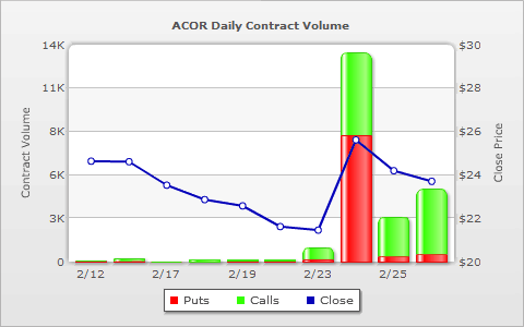
With all this speculation, one of my favorite sources for getting a handle on the options activity is WhatsTrading.com. Specifically, I like to look at the WhatsTrading 10 day chart of put and call activity, which I have reproduced below. In the chart, it is clear that Tuesday’s activity triggered more activity in puts than calls. Over the course of the past two days, however, volumes have been ramping up in the calls. The data is by no means conclusive, but at current levels, with the stock having given back a fair portion of Tuesday’s gains and implied volatility tracking only slightly above the average for the past four months, this has become an interesting long call play.

[source: WhatsTrading.com]

Disclosure: Long ACOR at time of writing.

(For those who may be interested, WhatsTrading.com recently began offering some premium options services)

Wednesday, February 25, 2009

Mini-VIX Futures Coming on March 2nd

The CBOE is out with a press release confirming that mini-VIX futures will begin trading next Monday.

The mini-VIX is 1/10 the size of the standard VIX futures contract, making the mini-VIX much more approachable for the typical retail investor.

VXX Juice Factor and Portfolio Insurance Implications

While I continue to receive quite a few questions about VXX, the new the VIX ETN, I note that volume seems to have settled into a pattern of approximately 100,000 shares per day. Perhaps the interest in this product is going to be more of an academic nature in the early stages, before trading and hedging strategies become better developed.

In any event, one of the key issues surrounding VXX has to do with what I call the VXX juice factor. In a nutshell, the question surrounds what sort of movement one can expect from a long VXX position relative to the VIX. Another way of looking at the same issue is to phrase the question in terms of how much VXX will move in one direction when the SPX moves in the opposite direction.

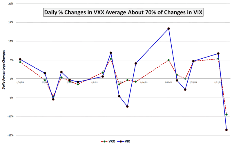
Last Friday, in VXX Tracking VIX at 80+% Today, I attempted to answer the first of these questions based on historical data. Today I will take a shot at both questions, using data from the first 17 days since the launch of VXX and with the aid of the graphic below.

In the first 17 days it has traded, I show VXX with a juice factor of just under 70%, meaning that, on average, for every 1% movement in the VIX, VXX has moved about 0.7%. Unfortunately, when the VIX makes a large move, this is the time when VXX typically has the smallest juice factor, as the divergences on February 12th and February 17th demonstrate.

At this stage, my working hypothesis is that VXX provides the most portfolio insurance when you don’t need it at all and is least effective when you need it the most.

I will address this issue in more detail going forward and bring some more data to bear on the subject.

[source: VIXandMore]

Tuesday, February 24, 2009

Germany and China Faring Relatively Well in Downturn

With the SPX perched precariously above its November low and pundits monitoring the vital signs around the clock, coverage of the stock markets in the U.S. has once again taken on a very Americentric tone. For the most part, focusing on the U.S. financial system and the U.S. economy makes sense. One of the many lessons to come out of the current financial crisis, however, is the end of the decoupling myth. In fact, we are all butterflies flapping our wings on a global stage now.

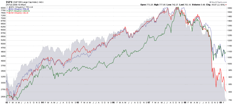
As always, some countries are faring better than others. The chart of the Nikkei 225 looks sufficiently like that of the SPX that I elected to omit it from the graphic below. Instead, I have chosen to compare the stock market indices of the world’s third and fourth largest economies, China (FXT, the index that forms the basis of the popular ETF, FXI) and Germany (DAX), in the context of the S&P 500 and the Dow Jones World Stock Index (DJW).

Note that relative to the October/November lows, China has shown a distinct pattern of making higher lows – in sharp contrast to U.S. and global indices. Germany has also shown considerable resiliency. Even though the DAX is now trading below its November low, Germany stocks have outperformed their global counterparts.

Scrolling back to 2003, I find it interesting that both China and Germany still are well above their 2003 lows, while the Dow Jones World Stock Index is now only about 5% above the lows from that bear market.

So while most investors are currently focusing their attention on the Dow Jones Industrial Average, the S&P 500, the NASDAQ indices and the Russell 2000, support levels and trends in key international indices may hold equally important clues about global buying and selling patterns – and the possibility of finding a bottom.

[source: StockCharts]

Monday, February 23, 2009

VIX Kitchen Sink Chart

The VIX is once again above 50 as I type this and technical analysis aficionados are wondering where the next resistance levels are for the VIX and whether these might increase the odds of predicting a market bottom.

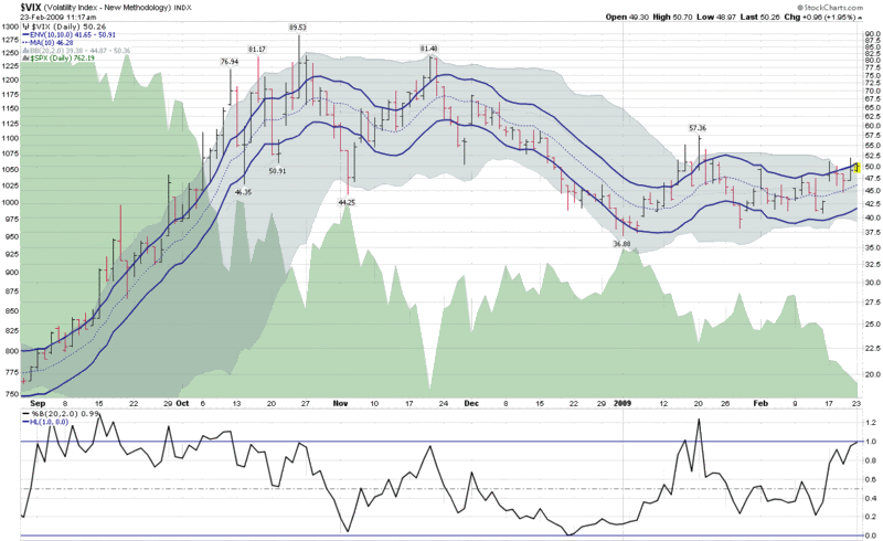
The chart below is a kitchen sink chart of sorts, as it includes the 10 day moving average of the VIX (dotted blue line), surrounded by 10% moving average envelopes (solid blue lines) to indicate when the VIX is 10% above or below that 10 day moving average.

The chart also includes Bollinger Bands (the gray cloud around the price history), which have been left at the default 20 day, 2.0 standard deviations settings. I have also added the %b setting for the Bollinger Bands in order to determine where the VIX is relative to the middle (0.5) of the Bollinger Band range.

During highly volatile periods, the Bollinger Bands are typically much wider than the moving average envelopes and large moves in the VIX usually pierce the moving average envelopes before they reach the limits of the Bollinger Bands. At present, however, the upper boundary of the Bollinger Bands is at 50.36, with the top of the moving average envelope at 50.91. With the VIX having posted an intraday high of 50.70 so far, the Bollinger Bands have been violated, yet the moving average envelope is intact. This unusual situation reflects the relatively low historical volatility we have been experiencing (the 20 day historical volatility in the SPX is below 35 and 50 day historical volatility in the SPX is the lowest it has been since September.)

If one considers that implied volatility is largely a function of historical volatility plus a premium based on fear and uncertainty, then obviously the fear and uncertainty component is currently responsible for implied volatility (in the form of the VIX) being almost 50% higher than historical volatility.


[source: StockCharts.com]

Saturday, February 21, 2009

Chart of the Week: How Much Citigroup for My Gold?

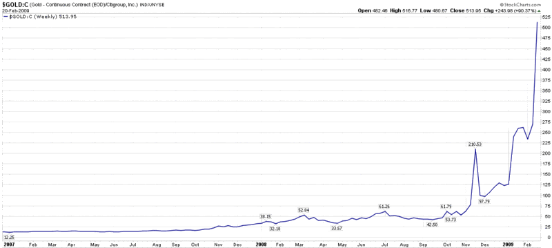
In 2001, an investor who wanted to exchange his gold bullion for Citigroup (C) shares was able to acquire about six shares of stock for each ounce of gold. With Citigroup closing just under 2.00 yesterday and gold above the 1000.00 mark, that same swap now entitles the holder of gold to about 514 Citigroup shares.

The change in fortunes says much less about gold, which is almost 300% above the 2001 lows, than it does about Citigroup, which has fallen about 96% from an early 2007 high.

This week’s chart of the week chronicles the ratio of gold continuous contract futures to the price of Citigroup stock, essentially tracking the exchange rate for Citigroup in gold since the beginning of 2007. In many respects, this chart is also an excellent proxy for the magnitude of the problems facing the U.S. banking system.

[As an aside, now three months old, the full history of the VIX and More Chart of the Week series can be found by following the chart of the week link.]

[source: StockCharts]

Friday, February 20, 2009

Institutional Buying in VIX March 60 Calls

Jamie Tyrrell reports from the CBOE trading floor on OptionMONSTER’s Volatility Sonar report, discussing some interesting large VIX options trades, including institutional purchases of:

  • 4000 March 60 calls @ 1.40

  • March 55-65 call spread @ 1.25

VXX Tracking VIX at 80+% Today

As I write this, the VIX is at 51.30, up 9% and VXX is at 116.40, up 7.5%.

I continue to get quite a few questions about VXX, the VIX ETN. The biggest issues, by far, seem to be around how well VXX tracks the VIX and how much juice to expect from VXX relative to the VIX.

As best I can determine, when there are small day to day changes in the SPX, VXX should reflect, on average, approximately 35-40% of the daily change in the VIX. In more volatile markets, such as SPX daily changes of 3% or more, VXX should move, on average, about 55-60% as much as the VIX does. (Of course, on average, if you walk down the middle of a two way street you won’t get hit by oncoming traffic, but deviate to one side or the other even briefly…)

For more information on the movements of VXX and the VIX, check out Directional Exposure to Volatility Via Listed Futures: S&P 500 VIX Short-Term Futures Index, authored by Gareth Parker, Gerlinda Liu and Keith Loggie of Standard & Poors.

Global Bank Stocks in a Post-Lehman World

I get tired of talking about the banks, but it is the story for the foreseeable future. While Citigroup’s (C) common stock flirts with the 2.00 line (can we call it Bank of Mendoza?) and insists it has not had conversations with the government about nationalization, Bank of America (BAC), whose stock is barely above the 3.00 level, is also out saying, “We see no reason to nationalize a bank that is profitable, well capitalized and actively lending.” Add to the financial stew a Wells Fargo (WFC) stock under 10.00 for the first time since 1996 and it is hard not to be obsessed by the banking sector.

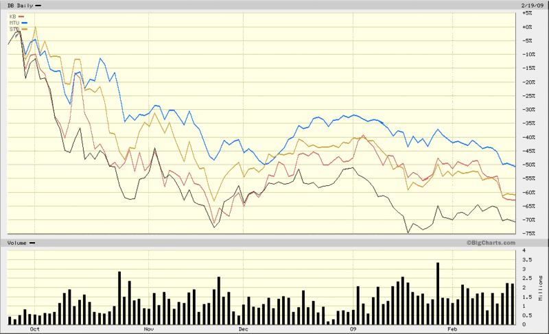
For all the discussion of U.S. banks, I wish to turn to the global scene. Lately U.K. banks and Irish banks have been the target of rumblings about possible nationalization, so I am going to skip over banks from these countries and instead focus on the largest banks in two critical European countries (Germany and Spain) and two critical Asian countries (Japan and South Korea). These four banks are Deutsche Bank (DB), Banco Santander (STD), Mitsibushi UFJ Financial (MTU) and Kookmin Bank (KB). All four banks happen to trade in the U.S. via American Depository Receipts (ADRs).

In the chart below, I have graphed the performance of all four giant banks since the last week in September, when the ripple effects of the Lehman bankruptcy and nationalization of AIG began to be felt across the globe. Not surprisingly, all four banks have seen their stock prices fall by more than 50%, with Deutsche Bank the worst performer among the group and Mitsibushi UFJ Financial feeling the least amount of pain. For comparison purposes, most of the Irish and British banks are down more than 90% during the same period.

The global banking crisis obviously has a long way to go before anyone can say with confidence that it is behind us. In the interim, even a medium-sized bank from a country most U.S. investors are not watching closely can lead to another tipping point that puts the global financial system closer to the brink. Investors seeking to keep a weather eye on global financial firms may also wish to monitor closely the iShares Global Financials ETF (IXG).

[source: BigCharts]

Thursday, February 19, 2009

Tell Congress to Block the Trader Tax

In case anyone missed this, I encourage you the read (and sign the petition to) Tell Congress to Block the Trader Tax

VIX Sluggish as Market Probes Lows

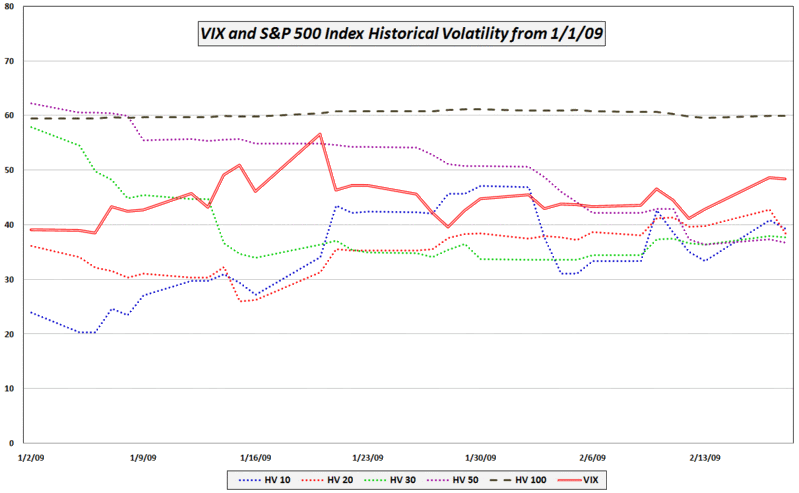
A reader asked why the VIX was down almost 5% with the SPX basically flat.

In addition the possibility of statistical white noise, there are several factors which may be affecting today’s VIX readings relative to the SPX. In no particular order, they include:

  • Much of the news cycle uncertainty is gone (earnings season is essentially over, Geithner made his speech about TARP 2.0, the FOMC minutes are out, almost all of the key economic data for February has been released, etc.)

  • Most of the recent volatility has been in the banks (KBE) and banks are an increasingly smaller portion of the S&P 500 index (two years ago financials (XLF) were 22% of the SPX, now they are only 10%)

  • VIX futures indicate expectations are for a VIX in the low 40s during the second half of the year

  • Low volatility leading into options expiration – while the SPX was down 4.6% on Tuesday, in four of the past five days the daily closing change has been no more than +/-1%

  • The VIX is significantly higher than the 10, 20, 30 and 50 day historical volatility in the SPX – all of which is currently under 40 (see below)

[source: VIXandMore]

Wednesday, February 18, 2009

Follow Up to “A VIX Butterfly Play”

Someone asked me to explain how the VIX options trade I outlined yesterday in A VIX Butterfly Play turned out. I will try to keep the explanation short.

The original trade, which I described yesterday morning when the VIX was trading at 50.04, was as follows:

  • long 10 VIX Feb 45 calls
  • short 20 VIX Feb 50 calls
  • long 10 VIX Feb 55 calls

To review, yesterday was the last trading day in VIX February options and today the VIX February contract exercise-settlement value was fixed at a special opening quotation (SOQ) of the VIX that was based off of the SPX March options series. Today’s SOQ (ticker VRO) was 48.40, which was 0.26 below yesterday's VIX close.

[Note that the reason the VIX has its own options expiration calendar is that VIX options settle 30 days prior to the options expiration date for SPX options in the subsequent month.]

To summarize, the profit zone for this trade was a VIX of 46.80 - 53.20, with the trade breaking even at the extremes of the range. The maximum profit was at a VIX of 50.00.

With a 10/20/10 position, the maximum potential profit for this trade was $3200; the maximum potential loss (with a VIX either at 45 or below or at 55 or above) was $1800. At 48.40, the VIX just happened to close exactly halfway between the maximum gain and the break even area. As a result, the trade gained half of the maximum potential profit, or $1600. Of course these profit and loss numbers are based on a position involving 40 calls (10/20/10). I consider that to be a 10 unit trade. With the accounting on an individual unit basis (long 1, short 2, long 1), the profit would have been $160 per unit.

In one sense, this type of trade is a pure gamble on volatility, but when volatility is unusually high, as it was last night, the profit zone can be large enough to make it a positive expectation trade, depending on one's forecast of overnight volatility.

US Bancorp Reeling

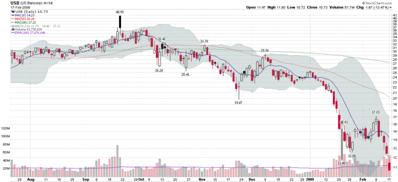
Not too long ago, Minneapolis-based US Bancorp (USB) was held up as an example as a ‘good bank’ with a strong loan portfolio. As recently as September, the stock was trading as high as 42 and the bank was widely hailed as one of the few national banks that was gaining ground on weaker competitors. On January 21, however, the bank announced a 65% drop in earnings as a result of a deteriorating loan portfolio and securities losses and the story began to unravel.

In reviewing the performance of bank stocks over the course of the past week, I was surprised to see that among large banks, US Bancorp has been the worst performer of all. The chart below shows the earnings-related 52-week low from January 21 was taken out decisively yesterday, following a week of heavy volume in which the stock lost a third of its value.

While investors are watching Citigroup (C) and Bank of America (BAC) closely for signs of weakness, perhaps US Bancorp and the regional banks are better indicators of what is going on in the banking landscape than their quasi-governmental big brothers.

[source: StockCharts]

DISCLAIMER: "VIX®" is a trademark of Chicago Board Options Exchange, Incorporated. Chicago Board Options Exchange, Incorporated is not affiliated with this website or this website's owner's or operators. CBOE assumes no responsibility for the accuracy or completeness or any other aspect of any content posted on this website by its operator or any third party. All content on this site is provided for informational and entertainment purposes only and is not intended as advice to buy or sell any securities. Stocks are difficult to trade; options are even harder. When it comes to VIX derivatives, don't fall into the trap of thinking that just because you can ride a horse, you can ride an alligator. Please do your own homework and accept full responsibility for any investment decisions you make. No content on this site can be used for commercial purposes without the prior written permission of the author. Copyright © 2007-2023 Bill Luby. All rights reserved.
 
Web Analytics