Monday, March 10, 2008

Other Perspectives on Last Week

A confluence of familial and meteorological factors left me in rural Texas with only intermittent internet access last week. This week I am running on full bandwidth, but as I was off the information grid for a good part of last week, I am going to rely on those who were plugged in to provide a recap.

First, from a strict numbers perspective, important support was breached in several of the major indices last week and the put to call numbers were at extreme levels all week. In contrast to the put to call data, the volatility indices were sluggish and unremarkable during the week, with the VIX finishing the week up 0.95 (3.6%) to 27.49 and the VWSI rising to +1.

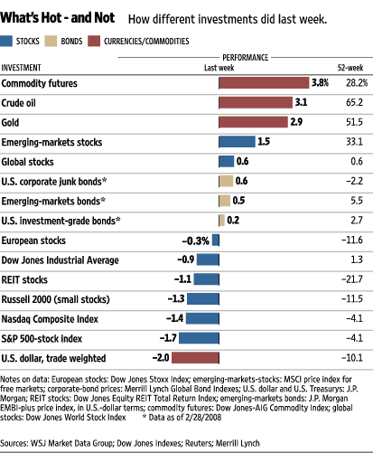
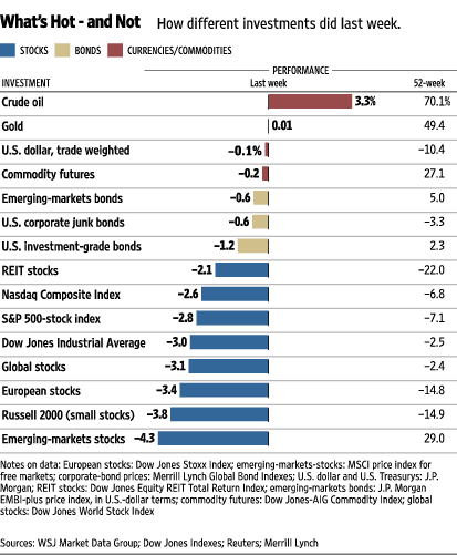
As the Wall Street Journal ‘Hot or Not’ chart shows, oil was just about the only winning play last week, while the smaller (market cap) and more far flung one’s equity positions were, the worse they performed.

Four top bloggers do an excellent job of summarizing the action on a number of fronts:

Barry Ritholtz at The Big Picture is back with his Linkfest, where he surveys a wide variety of facts and opinions, with an emphasis on macroeconomic and fundamental news. Babak at Trader’s Narrative provides his Sentiment Overview for the week. Declan Fallond (Fallond Stock Picks) offers up a review of last week through the eyes of some of the StockCharts.com chart reader cognoscenti – along with his own commentary. Last but not least by a long shot, Bill Cara has his usual exhaustive inventory of charts and commentary for the week – ideal for those who wish to slice and dice the markets by sector, region and asset class.

Finally, I cannot end here without recommending an inexpensive red blend that I tried last night: a $6.99 (at Trader Joe’s) Novella Synergy from EOS Winery in Paso Robles, California. This blend changes every year, but the 2005 version that I tried consists of 46% petite sirah, 33% cabernet sauvignon, 16% sangiovese, and 5% petit verdot. While the combination of petite sirah and cabernet sounds like it might make for a heavy, overpowering wine, this is an everyday red with much more finesse than I expected. Food friendly and quaffable on its own, this wine is also an excellent change of pace for those stuck in a ‘same varietal again’ rut.

Thursday, March 6, 2008

Next Up: VIX 101

It looks like I will be out of pocket for the day, so I thought I would take this opportunity to encourage some reader input.

One of the mini-projects that I want to get up an running soon is a series of posts that I will probably be calling VIX 101. Essentially, this should provide answers to some of the most common questions that readers have about the VIX and volatility, starting with the basic and obvious, such as:
What is the VIX?
How is the VIX calculated?
What triggered the creation of the VIX?
Can I trade the VIX?
How is the VIX used as a hedge?
How do investors use the VIX to time the market?

So...what other important questions about the VIX and volatility should I address?

Wednesday, March 5, 2008

SPX to VIX Ratio Turns Up

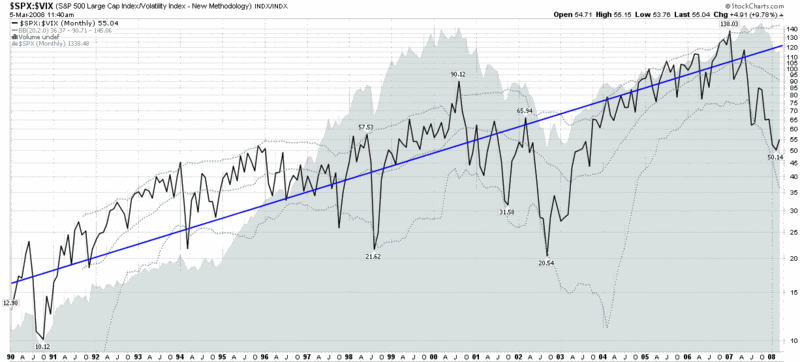
Given my ongoing infatuation with the VIX:VXV ratio and the VIX:SDS ratio, one could easily assume that I have pushed aside an old standby, the SPX:VIX ratio. In fact, I have not posted a chart of the SPX:VIX ratio since the end of July 2007, at which point the ratio had just bounced from 60 to 75.

Fast forward eight months and the weekly chart of the SPX:VIX ratio shows a new low of 50 and a current reading of just under 55. It turns out that the bounce from last July was a temporary one and the ratio has since turned down to levels not seen since September 2003.

One of the factors I watch in this ratio is the distance between the current level and the (blue) 10% trend line [for an explanation of the 10% trend line, try “The SPX:VIX Relationship], which is now greater than any time it has been in the history of the VIX, with the sole exception of the 2002-03 bear market bottom.

Given that the SPX:VIX ratio appears to be turning up again (and ABK was just halted as I type this, so there is the potential for significant momentum flowing back into financials and the SPX if this turns out to be good news), there is a good chance that the bottom in this ratio will hold and the relationship between the SPX and the VIX will move back toward historical norms. I realize that the markets need to work through a considerable amount of credit and other financial turmoil before the SPX:VIX ratio returns to anything resembling a ‘normal’ number, but my gut – and the chart below – suggests there is a good chance the tide is turning right now.

Tuesday, March 4, 2008

ISE Implied Volatility Charts

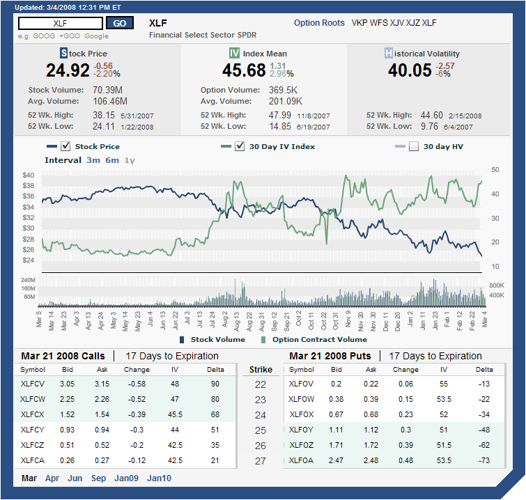
When it comes to implied volatility charts, I normally use the charts from two of my favorite options brokers: thinkorswim and optionsXpress. On the other hand, this blog is littered with IV charts from iVolatility.com, largely because these charts are freely available on the web and because the look and feel is relatively clean and uncluttered.

For a visual change of pace, I suspect I will soon start posting some of the excellent thinkorswim charts, but for those wishing to roll their own, I want to offer a strong recommendation for the implied volatility charts put out by the ISE. When it comes to the ISEE charts on the ISE site, I am often frustrated by the poor graphics, but the ISE charts for individual securities are excellent. An example of one of the ISE’s volatility charts is the one I have included for XLF below. These charts can be customized to a time frame of 3 months, 6 months or 12 months and allow users to specify, via check boxes, any of stock price, implied volatility, and 30 day historical volatility (I have historical volatility turned off here.) As you can see from the graphic below, there is a lot of information crammed into these charts, including daily stock and option volume (easier to read in the shorter time frames), as well as a fair amount of volatility data. All data is delayed by 20 minutes, but as far as I am concerned these are the best free volatility charts out there.

To generate your own volatility charts at ISE, try their Quotes/Volatility page.


[source: International Securities Exchange]

Obama vs. Clinton on Free Trade

I will continue to do my best to keep politics largely absent from this blog, but I cannot help but think that one of the most important questions voters should be asking themselves is where the various candidates stand on the free trade vs. protectionism spectrum.

Of course this is not an easy subject to pin down, as speeches in Ohio tend to bring out the type of posturing and rhetoric that politicians may not believe is in the long-term interest of the country as a whole.

The reason I am posting about this subject, apart from the fact that I think it is a critical one, is that I have yet to see an in-depth analysis of the free trade credentials of Barack Obama pitted against those of Hillary Clinton. Until yesterday, that is. Greg Mankiw, a blogger extrodinare who teaches economics at Harvard to pay for his blogging habit, called to my attention a Financial Times article by Jagdish Bhagwati whose title, Obama’s Free Trade Credentials Top Clinton’s, give you a sense of where Bhagwati comes down on that question. Bhagwati cites five reason why Obama is a better free trade candidate and points to economic advisor Austan Goolsbee as one of the keys to that conclusion. For more on Goolsbee, I recommend a January 31 interview with Doug Krizner and a more detailed evaluation of Obama’s advisors in an April 2007 article from the Wall Street Journal: Seeking Clues to Obamanomics.

Monday, March 3, 2008

Put to Call Data at Extreme Levels

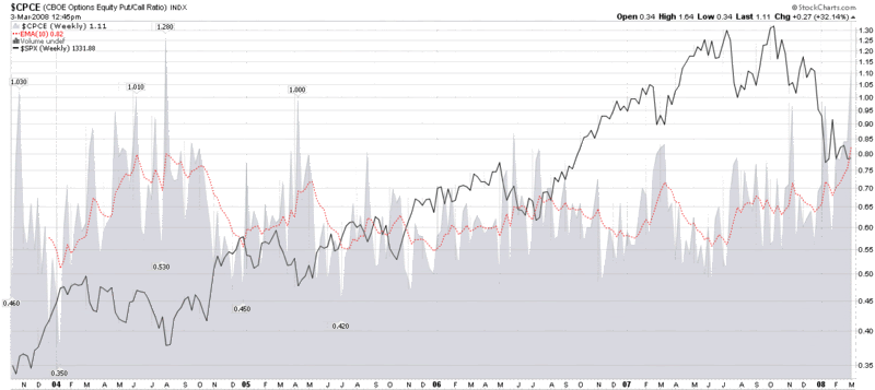
Earlier this morning, I mentioned that the ISEE is setting new records on a daily for the all-time lowest readings in the 20, 50 and 100 simple moving averages and pointed out that the CBOE Equity Put to Call numbers have spiked to record levels as well. I thought a graphic might do a better job of telling the story, so I have attached a weekly chart of the CBOE Equity Put to Call Ratio below.

The chart goes back to the point at which the CBOE started publishing equity only put to call data and uses a 10 week EMA as a smoothing function. As the chart shows, the current EMA of 82 is a new record, eclipsing the old record of August 2004. In retrospect, 2004 was a great buying opportunity for those who had the fortitude to go against the crowd. As for the present, while the jury is still out, the odds are that the current situation is also a good buying opportunity, as difficult as it may be for some to pull the trigger.


[source: StockCharts]

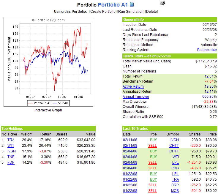
WTI Falters and Is Dropped From Portfolio A1

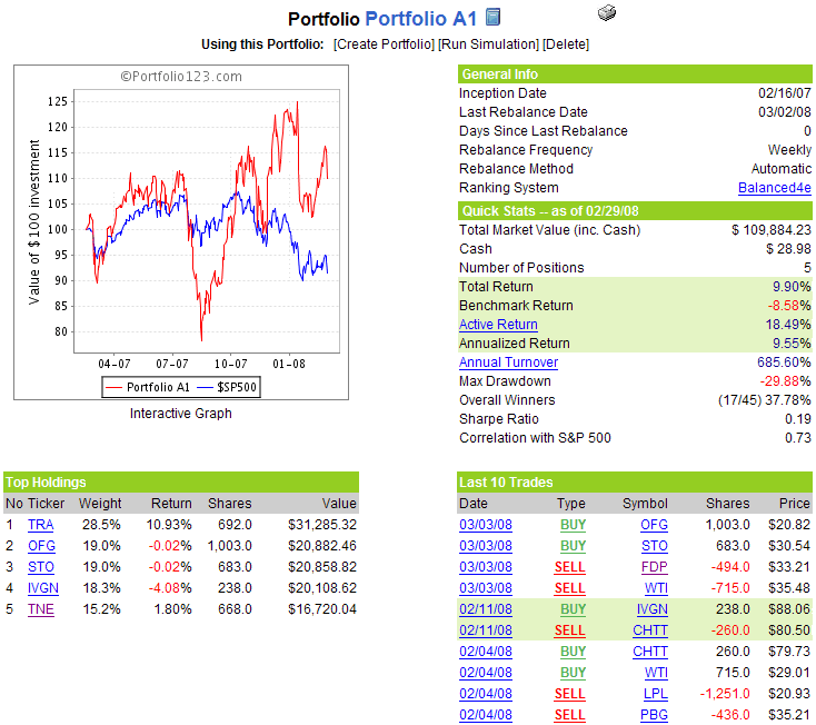
After racking up gains of 26.4% in just three weeks in the portfolio, it only took one week for W&T Offshore (WTI) to falter and be dropped from the portfolio. The culprit, as it often is, was earnings. More accurately, it was an analyst downgrade following WTI’s earnings report that helped to push the stock down 8.7% on Friday and trigger a sale. Interestingly, WTI’s stock traded up following Thursday morning’s earnings report and a generally successful conference call with analysts later that morning. It wasn't until Friday that the analyst's comments took their toll.

Friday’s slump in WTI and the rest of the portfolio undid what had been a very successful week to that point, with the result that Portfolio A1 end up losing 0.86% to the benchmark S&P 500 index for the week. Over the 1 year and 2 weeks since Portfolio A1’s inception, the cumulative return stands at 9.9% vs. -8.6% for the SPX.

In addition to WTI, Fresh Del Monte Produce (FDP) also bows out after several lackluster weeks. Replacing these two holdings are returnee StatoilHydro (STO), the state-owned Norwegian oil giant, and a new addition, San Juan, Puerto Rico-based Oriental Financial Group (OFG), a $500 million (market cap) bank whose stock is up almost 150% since August 2007.

There no additional changes to the portfolio this week.

A snapshot of Portfolio A1 is as follows:

Put to Calls and TRIN More Skittish than VIX, VWSI

A quick programming note: henceforth, I am going to be a little more freeform with my end of week commentary, making it less VIX and VWSI-centric. Lately the VIX has been at best a sub-plot in the market turmoil and the VWSI has not generated any extreme readings, so I will be expanding my weekly scope to include some of my other favorite indicators: put to call ratios, market breadth data, TRIN numbers, etc. going forward – or whatever else looks to be most newsworthy.

The Wall Street Journal “What’s Hot and Not” graphic shows where the action was last week – and this story is starting to look familiar. Oil, gold and other commodities were the biggest gainers last week, with a weak dollar and a weak US stock market accounting for the biggest losers.

The VIX ended the week up 2.48 (+10.3%) to 26.54, with the VWSI slipping back to zero. More interesting was the action in the put to call data, where the ISEE set all-time records lows for the 20, 50 and 100 day moving averages each day from Tuesday through Friday and the CPCE (CBOE Equity Put to Call Ratio) hit a new high of 1.50. In the wake of Friday’s precipitous drop, the TRIN and NASDAQ TRIN also ended the week with extreme readings of 2.46 and 2.76, respectively.

All this continues to mean one of two things: either the market is extremely oversold and anxious investors are going to create a massive wall of worry for a nice rebound…or we are in the midst of a financial meltdown not seen in the lifetime of most investors. I continue to reside in the former camp, but am watching SPX 1310 and NDX 1725 for signs of additional cracks in the dike.

Friday, February 29, 2008

McClellan Summation Index Turns Positive

It may seem like the height of folly to be talking about an upturn in the market on a day when the DJIA is down 230 points, but I’m not going to let that stop me.

Apart from the recent bump in the markets, I see several factors that lead me to believe that the markets are poised to continue to go up from current levels. The first of these, as highlighted by J.J. McGrath on his MackTheKnife blog, is that money formerly on the sidelines is starting to flow back into mutual funds. It may not be a flood yet, but it is a toe in the water. The second factor is the persistent extreme readings in put to call ratios that are evident in the ISEE and the CBOE equity only numbers. These numbers indicate that while some institutional money is coming back into the market, many retail investors are still sitting on the sidelines or have a short bias.

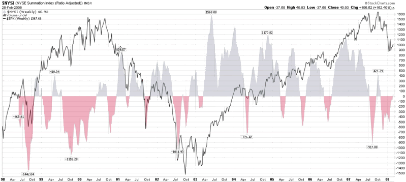
A third way to think about pent-up demand is to look at the McClellan Summation Index, a chart of which I have appended below. As can be seen in the chart, the index just turned positive for the first time since late October. While this is by no means a guarantee that the markets are moving up, this signal has historically been a bullish one. Perhaps more importantly, one way to think about the size of the red areas under the zero line is that these represent bearish periods in which pent-up demand continued to accumulate under the surface, roughly proportionate to the duration and magnitude of the red spike.

To summarize my thinking here, two bullish signals are mutual funds moving cash into the market and advance decline data turning positive, suggesting that the tide has turned. At this stage, only options sentiment data needs to normalize to indicate that the retail investor is once again comfortable going long and helping to push the market out of the recent trading range.


[source:  StockCharts.com]

Thursday, February 28, 2008

optionsXpress Trading Patterns and the VIX

One of the trading tools that satisfies my inner investment voyeur is the Trading Patterns feature at optionsXpress. If the “Trading Patterns” name doesn’t ring a bell, you might also know this feature as “People Trading ___ Also Traded…” in the spirit of Amazon’s recommendation technology and predecessor technology that dates back to internet pioneer Firefly Network Inc.

In the past, I have used the Trading Patterns data to see which companies were being most actively traded by those who are seeking high risk speculative momentum plays. I somewhat arbitrarily made BIDU the poster child for these momentum chasers and have twice looked at what those who were playing with BIDU were also trading.

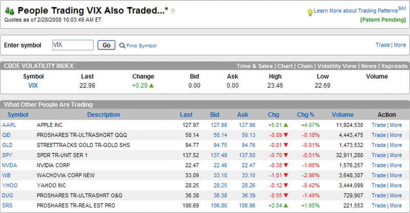
With all the discussion around potential substitutes for the VIX at least as a hedging tool, I thought it might be interesting to get a broader picture of those who trade VIX options. Thanks to Trading Patterns, I have captured just such a snapshot below. Not surprisingly, VIX traders are aggressive risk takers. In aggregate, they appear to be hoarding gold (GLD) and going short with the double inverse ETFs for real estate (SRS) and the NASDAQ-100 index (QID). It’s just a guess about the direction of some holdings, but the other positions appear to fall squarely in the short finance and technology camp: SPY, WB, AAPL, YHOO, and NVDA. The one finding that I see as somewhat surprising is the presence of the ProShares Ultrashort Oil & Gas ETF (DUG). Given the list of trading vehicles, I am concluding that the VIX players see oil and gas as overbought instead of a safe haven like gold. In any event, it is clear that the pessimism of VIX traders continues to be grounded in an expansion of the real estate and financial woes, the expectation that this will drag technology down with it, and the opinion that gold is the most sensible long position at the moment.

Wednesday, February 27, 2008

The VIX and Going Short

A reader asked about the feasibility of the declining VIX providing an entry signal for new short positions. Specifically, he noted that his weekly chart of the VIX, which utilizes a 43 week simple moving average, has contained all the action in the VIX over the past year or so, with that 43 week SMA acting as support. Ultimately, his question concerns whether I believe that the 43 week SMA is likely to hold.

Before I get to the details of that question, let me reiterate my general thinking about using traditional technical analysis on the VIX. In a nutshell, I believe that because the VIX is a derivative (more accurately a derivative of a derivative), traditional technical analysis has only limited validity. This is particularly noteworthy when it comes to support and resistance. If the VIX hits 20, for instance, nobody can rush in and buy the VIX to support it at that level, because one cannot buy and sell the cash VIX. Sure, some may use a VIX of 20 as a rationale for starting to buy VIX options or futures, but the impact of these transactions on the cash VIX is indirect and weak. The impact becomes a little stronger if traders use VIX signals to buy SPX options, but I still prefer to think of the VIX as more of a thermometer than an actual weather phenomenon. Even a major deity would have trouble adjusting the sunshine, clouds and other factors to make the temperature read exactly 60 °F on your back porch.

So my bias is generally against moving averages as providing meaningful support and resistance for the VIX, given that I believe an arithmetic mean of a derivative of a derivative is not a meaningful number. I do believe, however, that previous intermediate and long-term highs and lows in the VIX (e.g., January’s 37.57), round numbers (20, 25, 30, etc.), and deviations of significant magnitude from various moving average (% of 10 day SMA, etc.) can signal (or perhaps even trigger) important psychological milestones and provide high probability entries.

My conclusion, therefore, is that the 43 week SMA is more likely to hold if coincides with a previous low, round number or distance from certain critical SMAs. Given the current numbers, I would say that strong support in the VIX is mostly likely to be found in the 19-20 range.

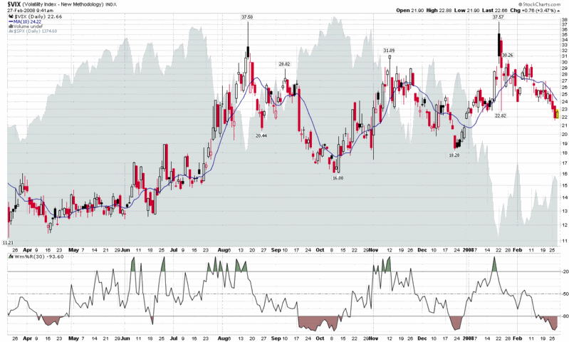
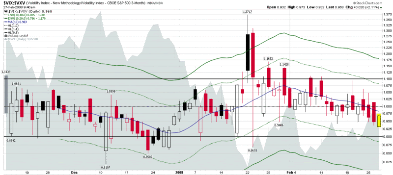
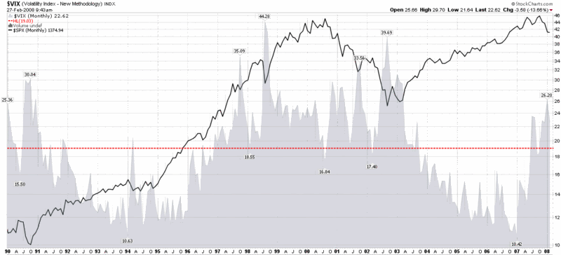
Just for fun, I have included three charts that provide three very different perspectives on the VIX. The top chart is a basic chart of the VIX going back about a year. As with the major indices, consolidation in the form of a triangle pattern is obvious, but with the VIX, the pattern reaches back to August. The VIX:VXV ratio chart shows the volatility expectations for the next 30 days (VIX) vs. the next 93 days (VXV) – and these are middling at best. The final chart shows a lifetime of the VIX graphed against the SPX, with a horizontal line showing the lifetime mean of the VIX (19.03) thrown in for good measure. There are a number of potential conclusions to draw from these charts, but when I add them all together I come out neutral on the VIX, at least for the short to medium term time frame.

As an aside, when it comes to initiating new short positions, I don't like getting short until at least the third trading day of a new month, particularly with so much worried money sitting on the sidelines. Finally, in terms of support and resistance, I prefer to use the broad equity indices instead of the VIX to time entries and would watch SPX 1410 and NDX 1900 more closely than the VIX, but keep a weather eye on a VIX of 19.


Tuesday, February 26, 2008

Brazil Rallies While China Struggles

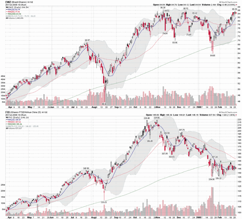
As the chart below shows, speculative money has been cautious about China since late October, but still bullish on Brazil, as indicated by the strong performance in EWZ, the iShares MSCI Brazil Index ETF. Not only is EWZ showing a gain for the year, but in an impressive display of strength, it has rallied more than 30% off of the January low. This performance puts EWZ not only well ahead of the most popular Chinese ETF, FXI, but also considerably ahead of the broad market emerging market ETF, EEM, known formally as the iShares MSCI Emerging Markets Index.

While EWZ is a great way to play the Brazilian market, there are several ADRs that are worth singling out as well. My Portfolio A1 holds Tele Norte Leste Participacoes SA (TNE) and has also been long Brasil Telecom Participacoes SA (BRP) in recent months, but there are even better plays. In fact, of the handful of long-term global holdings that I believe you could almost buy and forget about, two of my favorites are Brazilian giants. At the top of the list is Petroleo Brasileiro SA (PBR), a.k.a. Petrobras, the superbly managed national oil company that is pushing the envelope in the ultra-deep recovery space with their massive Tupi oilfield. Close behind is Vale (RIO), formerly know as Companhia Vale do Rio Doce, the metals and mining giant that recently extracted a 65% price increase in iron ore prices from Baosteel, the largest steel company in China.

In a healthy global economy, PBR and RIO are two of the best blue chip oil and iron plays out there. For those wishing a broader, more diversified play, EWZ is hard to beat, especially as Brazil continues to outpace China.

Monday, February 25, 2008

The XLF and the SPX

After I penned (keyboarded?) The Rising Popularity of XLF Options on Friday, I was please to see that a number of other bloggers picked up on the XLF theme and weighed in with some interesting commentary. One post I found particularly noteworthy was from Bob Barnes at bzbtrader. In his aptly titled, Deconstructing the XLF, Bob breaks down the top holdings of the XLF, dissects the open interest, and discusses trends in short interest as well. (If you click through, don’t stop with the XLF post, as Bob does an excellent job with a broad range of charting and TA issues and should be required reading for anyone who follows the QQQQs.)

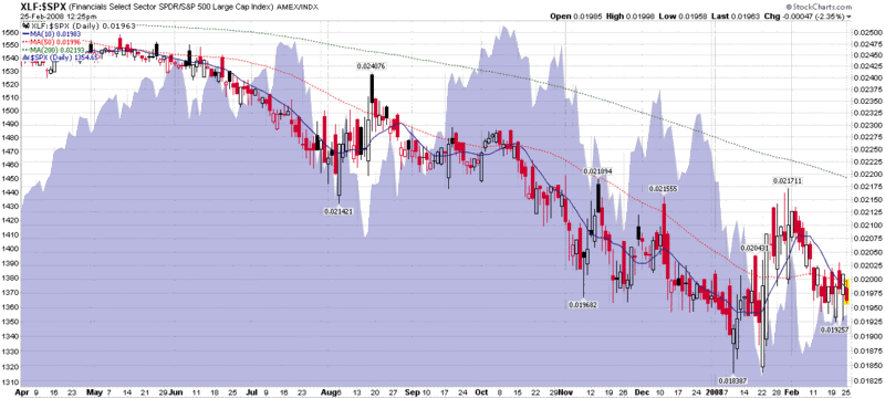
Another thing to think about vis-Ă -vis the XLF is the relative performance of this sector to the broader indices, like the SPX. In the chart below, I have graphed a ratio of the XLF to the SPX, with a blue area chart of the SPX added for context. As financials are still the largest sector component of the SPX, it is not surprising to see these two indices move in the same direction. When the XLF and the SPX diverge, however, investors should pay close attention. The divergence from May to October is notable, for instance, with the decline in the XLF perhaps providing a warning that the market was topping during this period. Another interesting period is in early February, when the SPX rose in spite of a falling XLF. Now it appears that both the SPX and XLF are moving sideways in unison. For what it’s worth, I don’t expect the SPX to be able to stage a significant rally without dragging the XLF along for the ride or perhaps even following the financials back up.

So watch the XLF in absolute terms, but also keep an eye on the performance of the XLF relative to the SPX.

WTI Continues to Lift Portfolio A1

In just three weeks in the portfolio, W&T Offshore (WTI) has demonstrated the beginnings of star power, logging weekly returns of 9.2%, 5.6% and, most recently, 9.6%. Also helping to increase Portfolio A1’s performance delta over the SPX was a strong performance this week from Tele Norte Leste Participacoes (TNE) (+8.6% for the week) and fertilizer high flier Terra Industries (TRA) (+3.0 for the week).

With the boost from WTI, Portfolio A1’s performance since the 2/16/07 inception now stands at of +12.3% vs. -7.0% in the benchmark S&P 500 index over the same period.

There no changes to the portfolio this week.

A snapshot of Portfolio A1 is as follows:

Amidst Symmetrical Triangles, VIX and VWSI Slide

With market indices in a symmetrical triangle consolidation pattern, trading ranges have been shrinking as of late. The VIX has reflected this lack of action by dropping to its lowest levels relative to its 20, 50 and 100 day simple moving averages since the beginning of the year. After touching 26.95 on Wednesday, the VIX fell back to end the four day week at 24.06, down 0.96 (3.8%) from the previous week.

A symmetrical triangle pattern is often resolved by a dramatic move one way or the other. In the current market environment, the direction of that move is anyone’s guess, but for now, I am positioned for a move to the upside.

The VWSI is a little more cautious and is showing a +1 reading at the moment, down from a +3 last week and, essentially neutral about market volatility in the near-term, suggesting that a sideways to slightly more volatile market is the most likely course of events for the coming week.

As is my weekly custom, for a survey of the best in current thinking about the markets, Barry Ritholtz at The Big Picture sums up the week that was and the week that is on tap in his Oscar Night Linkfest.

I am toying with introducing a multi-faceted sentiment indicator in this weekly VWSI space, but for now I am sticking with the VWSI:

(Note that in the above temperature gauge, the "bullish" and "bearish" labels apply to the VIX, not to the broader markets, which are usually negatively correlated with the VIX.)

Wine pairing: For a VWSI of +1, I recommend a guwurztraminer. My favorite American version of this wine is the dry gewurztraminer from Londer Vineyards of Anderson Valley. I have not yet sampled the 2006 vintage, but the 2005 was an unforgettable wine that I would love to see in a blind tasting against some of the top Alsatian competition.

In my previous roundup of California gewurztraminer, I suggested Navarro and Harvest Moon. For some of my top selections from Alsace, check out Trimbach; Hugel; and Domaine Weinbach. You can also check out the top-rated gewurztraminers in the 2007 San Francisco Chronicle Wine Competition.

DISCLAIMER: "VIX®" is a trademark of Chicago Board Options Exchange, Incorporated. Chicago Board Options Exchange, Incorporated is not affiliated with this website or this website's owner's or operators. CBOE assumes no responsibility for the accuracy or completeness or any other aspect of any content posted on this website by its operator or any third party. All content on this site is provided for informational and entertainment purposes only and is not intended as advice to buy or sell any securities. Stocks are difficult to trade; options are even harder. When it comes to VIX derivatives, don't fall into the trap of thinking that just because you can ride a horse, you can ride an alligator. Please do your own homework and accept full responsibility for any investment decisions you make. No content on this site can be used for commercial purposes without the prior written permission of the author. Copyright © 2007-2023 Bill Luby. All rights reserved.
 
Web Analytics