Tuesday, March 31, 2009

Introducing the Parabolic Stop and Reverse (SAR)

Yesterday, a reader asked about the usefulness of the parabolic stop and reverse indicator, sometimes called the PSAR or SAR. Since this is one of my favorite not-quite-mainstream indicators, I thought I would take a moment and mention some of the reasons why I am a fan of the SAR. One thing led to another and before I knew it, my simple response had grown to Tolstoyan proportions. For that reason, I am going to address the SAR over the course of several posts.

The SAR was unveiled by Welles Wilder as part of the groundbreaking 1978 classic, New Concepts in Technical Trading Systems. Even after more than three decades, the achievements in this book still boggle the mind. In one fell swoop, Wilder launched the RSI (relative strength index), ATR (average true range), ADX (average directional indicator) and SAR, along with several lesser known indicators (e.g., commodity selection index, swing index, etc.) that probably deserve much more attention.

When it comes to adding more indicators to one’s TA toolbox, I am always a little hesitant to do so, as I prefer to keep things simple rather than make them too complex. This bias for “less is more” when it comes to indicators is partly due to the fact that so many of the indicators share some computational ancestry that the value added is often a lot less than meets the eye.

With those caveats in mind, I consider the SAR to be an exception. Specifically, the SAR is a unique combination of price and time. It works particularly well in trending markets and perhaps best suited to being implemented as a trailing stop mechanism.

This time around, I will not delve into the details of the calculations of the SAR; instead, I will provide a quick overview of how the SAR works. In the chart below, I have captured data in XLF, the financial ETF, going back one year. The SAR values are represented by the purple dots that are overlays on the price chart. When the purple dots are below the candlesticks, this indicates rising prices; when the purple dots are above the candlesticks, this indicates falling prices. Each time a change in trend is signaled, the purple dots flip from the bottom to the top or the top to the bottom. To make these reversal signals easier to identify, I have added green and red arrows to indicate trend reversals.

The SAR assumes traders are always in the market. Very simply, when the trend reverses, the SAR signals a new position should be initiated. To get a sense of how the SAR values move, review the new short signal from the second week in December. Note that the SAR is a good distance above the initial short entry signal, but as time passes, the SAR continues in the direction of the original signal, regardless of whether the market follows the trend or not. This brings the SAR close to the price at the beginning of the year. Take note also that as XLF begins to move sharply down in the beginning of January, the SAR accelerates down with it and stays close to the price action. When XLF finally reverses in the last week in January, the trailing stop is so tight that one bullish gap up day triggers an exit. This is the essence of the SAR: it gives gradual trends some time to gather momentum, hugs sharp trends closely, and acts as a tight stop should the trend begin to change direction.

Now study the balance of the chart. Notice that when XLF was in a persistent trend (May, June, October, etc.), the SAR performed quite well. When XLF traded sideways, however, as it did in August, the SAR was responsible for quite a few whipsaws.

In the next article in this series, I will delve deeper into the calculations behind the SAR and discuss some of the preferred approaches for applying this indicator.

[source: StockCharts]

Monday, March 30, 2009

Newsletter Celebrates One Year Anniversary, Joins Forces with Market Rewind and Quantifiable Edges

Just about this time a year ago, many of us were finally starting to exhale in the wake of the Bear Stearns debacle. Surveying the investment landscape, I thought it might be an interesting time to try my hand at a subscriber newsletter. Little did I know just how interesting this first year would turn out to be.

Looking back, I am quite pleased with how the newsletter has evolved. It incorporates a much broader range of subjects, including global and macroeconomic themes, than generally appear on the blog. It has also provided me with a forum to talk about several proprietary volatility and market sentiment indicators, give my outlook for a variety of asset classes and even share my thinking about specific trades.

The newsletter now has nine sections that appear each week and has been molded into a format that is well-suited to recapping and analyzing the previous week as well as planning and strategizing for the week ahead. Those who are interested in learning more or who wish to take advantage of the 14 day free trial offer can get all the details at the VIX and More Subscriber Newsletter Blog.

Also, in conjunction with the one year anniversary, I am pleased to announce that I have joined forces with esteemed bloggers Jeff Pietsch of Market Rewind and Rob Hanna of Quantifiable Edges to offer a Blogger Triple Play. This bundled offer includes subscriptions from Jeff’s ETF Rewind Pro, Rob’s Quantifiable Edges Silver Membership, and the VIX and More subscriber newsletter at an annual subscription rate of $725, which is $240 (25%) off of the combined monthly subscription prices of the three services if they had been purchased individually. For more details, try Announcing Blogger Triple Play.

Looking ahead, I do not expect that the second year of the newsletter will see the VIX up over 80 again or have multiple days in which the SPX moves 10%, but whatever events do unfold, I will be there to put them in context and attempt to determine what some of the implications are from a trading perspective.

Thanks again to all who have encouraged and supported my efforts on the blog and in the subscriber newsletter.

Recent Financial Sector Component Performance

Back in early December, in Breaking Down the Financial Sector Post-Lehman, I contrasted the broad-based KBW Bank Index ETF (KBE) with several other KBW financial sector ETFs, notably KRE (KBW regional banking index), KCE (KBW capital markets index) and KIE (KBW insurance index.) At that time, the regional banking index was holding up better than its siblings, but had begun to show some weakness.

Fast forward almost four months and in the chart below I contrast the performance of the same quartet of ETFs since the November 21st bottom (SPX 741), when things probably looked darkest for the financial sector.

Notice that now the capital markets group (with top holdings of GS, MS, CME, SCHW and STT) is sporting gains of over 20% since this period, while insurance stocks are almost back to breaking even and both banking ETFs, the regional and money center variants, have been bring up the rear, moving almost in lockstep as of late and showing losses in excess of 25% for the period in question. All four groups have bounced impressively off of the March lows, but once again, it is the capital markets group that has showed the most strength, with State Street (STT) leading the way.

[source: BigCharts]

Sunday, March 29, 2009

Chart of the Week: TIPS Breaking Out

While there were many important stories that broke this week, the one which found me briefly holding my breath was the failed auction of £1.75 billion in U.K. government 40-year bonds on Wednesday followed by the weak demand for $34 billion of 5-year U.S. Treasury notes later in the day. While Thursday’s successful auction of $24 billion of 7-year U.S. Treasury notes has temporarily put the government debt auction issue on the back burner, the interest rate plot is clearly thickening – and the debate on deflation vs. inflation is starting to heat up.

One excellent way to protect against inflation is through the use of Treasury Inflation-Protected Securities, more commonly known as TIPS. As I noted last September in Treasury Inflation -Protected Securities and Inflationary Expectations, TIPS utilize the CPI as an inflationary benchmark and TIPS coupon payments and the underlying principal are automatically adjusted to account for inflation.

All of this brings us to the chart of the week below, which shows a ratio of the iShares Barclays TIPS Bond Fund ETF (TIP) to the 10-Year U.S. Treasury Note. This ratio has seen several jolts in the last six or so months, but since mid-December, investors have shown a strong preference for TIPS over the standard Treasuries. In fact, as concern about inflation has elevated during the course of the last week or so, TIP, with an average maturity of approximately nine years, has moved up impressively while Treasuries with comparable maturities have fallen. The ratio is now approaching its pre-Lehman levels, so that further moves could help to gauge whether inflationary or deflationary fears are dominating the thinking of investors.

[source: StockCharts]

Friday, March 27, 2009

Learning About Options: The Exchanges (2)

When I first started drafting yesterday’s Learning About Options (1), I initially intended a brief overview of sources for those interested in teaching themselves about the subject of options. The more I thought about it, the more I decided that I really needed a multi-post series to properly address the subject and based on the enthusiastic response to the first post in this series, I am glad to have chosen that path.

In keeping with yesterday’s theme of free content from independent sources, today I wish to focus on the options exchanges. In the world of options exchanges, there are two large players at the top of the food chain. The Chicago Board Options Exchange (CBOE) is the undisputed leader in index options and a close second to the International Securities Exchange (ISE) when it comes to single-equity options volume.

The younger, all-electronic ISE has recently made a push to become more involved in education. The majority of the content for the ISE’s educational offerings utilize content from the Options Industry Council that I referenced in yesterday’s Learning About Options (1). This includes basic and advanced articles about options, a description of various options strategies, as well as several trading tools and online classes in options for beginner, intermediate and advanced traders.

In terms of non-OIC content, the ISE offers webinars and podcasts, but so far these have focused almost exclusively on foreign exchange trading, which I find more than a little disappointing. At this time, the ISE has posted over 350 videos in a YouTube ISE Options Education repository. Once again, forex is the dominant theme.

While the ISE has some material of interest, the CBOE has taken options education to an entirely different level, with a large amount of original content, covering a broad array of subjects and presented in just about every format imaginable. The CBOE even has a dedicated options education arm, The Options Institute, which offers a comprehensive set of tutorials, more detailed online courses, webcasts, seminars, “master sessions” with guest speakers and even customized programs. You can find these and most of the CBOE’s educational materials at the CBOE’s web site under the Learning Center tab.

Adjacent to the Learning Center tab are some options Strategies materials that are also worth checking out. In addition to information about the usual equity options strategies, the strategy tab includes information on LEAPS and index options that are rarely even acknowledged elsewhere on the web. More detailed explanations of advanced options strategies can be found in the archives of the Weekly Strategy Discussions.

The CBOE has also done some excellent work with top tier partners in the options space. The exchange has partnered with iVolatility.com to offer free IV index and options calculator tools, as well several premium options tools that come with free trials. For those who may be interested in virtual trading, the CBOE has two different approaches, based on partnerships with two of the top options brokers. The CBOE has worked with optionsXpress to deliver Virtual Trade Tool and with thinkorswim to offer paperMoney, each of which are virtual trading modules that are excellent ways for beginning traders to become familiar with the options trading process without putting real money at risk.

In terms of news, commentary and analysis, CBOE-TV continues to ramp up and has 3-4 new videos each trading day from the likes of Jon Najarian, Dan Sheridan and Angela Miles. This includes a great deal timely information that addresses options movers, economic data releases that are moving the market, etc.

Some of the newer features just rolled out this week include the Strategy of the Week program with Peter Lusk on CBOE-TV and a market commentary, which includes weekly articles from the staff of InvestorsObserver.

As you can see from some of the information I chose to highlight above, the CBOE offers best in class options education products and services, for the beginner to the advanced practitioner. If you are interested in learning about options, the CBOE is an invaluable educational resource.

Thursday, March 26, 2009

Learning About Options (1)

I have recently received several requests from readers who are interested in learning about options from scratch and are looking for suggestions on how to proceed.

First, I should preface my answer by saying that even if you never intend to trade options, it will probably be worth your while to take some time to understand how they work. At the very least, it is helpful to appreciate what is in the black box that generates various options indicators, such as the VIX and the put to call ratios.

Second, I intend on making this the first installment in a series of posts that cover the subject of learning about options. Today I will talk about two excellent general resources on the web; in later posts I will examine educational resources offered by the exchanges and several options brokers, recommend some books, discuss additional web sites and conclude with an overview of some of my favorite options blogs.

The subject of options is broad and deep. Fortunately, there are some excellent free resources on the web that allow someone who is interested in options to learn at their own pace and in small chunks of ideas and information.

Two excellent all-purpose resources for options beginners are The Options Guide and The Options Industry Council (OIC). I mention these two sites first, because their sole intent is to inform and educate, unlike some commercial sites that provide some free information and then try to sell you something with a subtle or sometimes not-too-subtle approach.

The Options Guide has a variety of short articles in their Options Basics section, as well as a handy Options Strategies reference, where you can search for specific types of options strategies that meet your needs, or click on an excellent visual menu of profit and loss graphs to get detailed information about a wide variety of strategies. There are even separate sections for index options and VIX options.

The Options Industry Council takes a comprehensive approach to education. While The Options Guide is a great starter kit and reference tool, I consider the OIC’s web site to be the gold standard. It is a great place to browse and get lost. If you want articles, DVDs, books, brochures, etc. on just about any options topic you are interested in, there is a good chance you will find it in the OIC’s online vault. The OIC has embraced a multimedia approach and as a result, offers online classes, as well as seminars and webcasts. You can see what material is available as a video webcast and also download a wide variety of podcasts.

The OIC also has a broad range of tools that includes a several options calculators, an options strategy screener and a position simulator. If that is not enough, you can even do some virtual trading through the OIC.

Considering that everything offered by The Options Guide and just about everything (books are an exception) offered by the Options Industry Council is free, investors who are interested in learning about options should put these two web sites at the top of their list when embarking on a self-study approach to learning about options.

Wednesday, March 25, 2009

New Blog: Trading the Odds

Veteran readers of VIX and More will no doubt be familiar with the wealth of statistical knowledge and insight brought to bear by a commenter by the name of Frank.

I was therefore delighted to learn that as of yesterday, Frank has decided to share in more detail some of his analytical work and thinking in a new blog that is going by the name of Trading the Odds. Based on a set of initial posts, it looks as if Frank will be using his considerable statistical data bank to talk about weekly and monthly seasonality, RSI (2), mean reversion, correlation and other related issues. I have a hunch that anyone who appreciates the heavily quantitative and statistical approach to the markets taken by the likes of Quantifiable Edges and MarketSci will find Trading the Odds has a similar appeal.

Given Frank’s body of work solely as a commenter on VIX and More, I would encourage readers to become familiar with his new blog. If anyone needs an additional nudge, note that today Frank addresses one of my favorite VIX quirks, Weekday Seasonality of the VIX, which looks at the ‘calendar reversion’ effect for VIX levels on Fridays and Mondays.

Welcome to the blogosphere, Frank.

Tuesday, March 24, 2009

On Trading Rules and Guidelines

Last Friday’s post, Can Selling Options Make You a Better Trader? prompted quite a few emails and comments, including a request that I share some of my trading rules.

To be perfectly honest, I used to keep a list of trading rules handy to refer to at all times, but this is no longer the case. The rules are still valid, but after five years of full-time trading, I have retrained myself in the way I think about, react emotionally to and ultimately respond to the markets.

I do think, however, that the process of developing and codifying a set of trading rules and guidelines is one of the most important exercises that a new or inexperienced trader can undertake. Also, I firmly believe that veteran traders should constantly be evaluating their beliefs about the markets they trade and the guiding principles that provide the basis for various approaches to trading.

Before I decided to make trading a full-time business, I sat down and attempted to capture most of my beliefs about the markets. I originally started out with about 80 "axioms" (beliefs would probably be a more accurate term) and as I traded, I added to this list.

Originally I grouped my axioms/beliefs into the following categories:

  • Overriding Principles
  • Market Technical Analysis & Sentiment Indicators
  • Stock Selection - General (long-term, swing and day trading)
  • Stock Selection - Day Trading
  • Stock Selection - Shorts
  • Opening a Position
  • Taking Profits
  • Taking Losses
  • Pre-Market Activities
  • Intraday Activities
  • Post-Market Activities
  • Risk Control and Drawdown Rules

After a year or so of trading, I found that I had standardized on about 15 rules/guidelines that have changed only slightly since then.

As requested, here are ten overriding principles that have survived the past five years, through bull and bear markets:

  1. Always live to fight another day
  2. Entries must have a statistical edge
  3. Patience and discipline
  4. Be a jellyfish (swim with the current)
  5. Trade only liquid securities
  6. Focus on trying to capture the middle 80% of a move
  7. Know your exit points when you open a position (and stick to them!)
  8. When in doubt, reduce position size by 50%
  9. Limit losses to 2% of total equity for any single trade
  10. Start each day with a clean financial and emotional slate

The above list is relatively generic, but it helped provide me with a framework for organizing how I would approach trading as a business, what strategies I should adopt, how those strategies should be executed, and ultimately defining what success should look like.

Trading rules are vitally important – as is knowing when they should be broken. Even more important, I believe, is the process that one goes through in order to arrive at these rules and to make sure that as new market situations unfold and new blind spots are revealed, the rules and guidelines are enhanced to maximize the opportunity for the trader to continue to grow and develop.

Now Appearing at Minyanville

As several posters have noted, I recently started contributing to Minyanville in an options section that was launched about a month ago.

In Minyanville Options, I am delighted to be part of a group of options experts (professors, in Minyanspeak) that includes regulars Steve Smith, Jared Woodard (Condor Options), Mark Wolfinger (Options for Rookies) and emcee Adam Warner (Daily Options Report).

For those who may be interested, an archive of my Minyanville posts can be found here.

Monday, March 23, 2009

Cash on the Sidelines Headed Back to Stocks?

Two months ago, in Chart of the Week: Change of Trends in Cash Holdings? I posted a chart based on money market mutual fund cash levels as calculated by the Investment Company Institute’s (ICI) that generated a considerable amount of discussion when I concluded that the chart may be pointing to a topping trend for cash on the sidelines.

Fast forward to the present and as the updated version of the same chart shows, the mid-January drop in money market mutual fund cash levels turns out to indeed have been the beginning of a change in trend, at least according to the ICI data.

In fact, last week’s data, which cuts off on Wednesday, shows the largest drop in money market mutual fund cash levels in over six months.

With rates on money markets and bonds both headed lower, I would not be surprised to see more money flowing back into stocks for the simple reason that alternative investments have become less attractive.

[source: Investment Company Institute, VIX and More]

Sunday, March 22, 2009

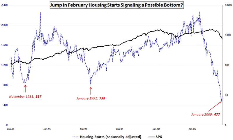
Chart of the Week: Bottom in Housing Starts?

Conventional wisdom dictates that it is way too early to even contemplate a bottom in housing, where prices presumably have another 10-20% to fall. In light of the February housing starts data released on Tuesday, I am wondering if we might be closer to a bottom in housing than many of the pundits believe.

This week’s chart of the week tracks housing starts going back to the beginning of 1980 and shows the January 2009 number as an all-time low. The February data, which is subject to future revisions, shows a 22.2% increase from the January low in combined single-family (+1.1%) and multi-family (+82.3%) housing starts.

The February data could certainly be just a statistical anomaly, but the next data point that suggests a possible stabilizing of housing prices, increase in demand or significant decrease in inventories could cause a rapid reevaluation of where the housing market stands and where it may be going in 2009.

I am not yet a housing bull, but I will be watching tomorrow’s February existing home sales and Wednesday’s February new home sales very closely to see what the numbers tell us.

[source: Census Bureau, VIX and More]

Friday, March 20, 2009

Can Selling Options Make You a Better Trader?

I used to have a list of trading rules guidelines taped to my monitor. The list went through several iterations, but near the top were always reminders that a good trader needs “patience and discipline” to be successful. The list is no longer there, but by now the important ideas have been branded into my psyche.

On a related note, over the course of the past few years I have increasingly gravitated toward trading options. More often than not I find myself selling options, either with or without a directional bias, and enjoying time decay (theta) work in my favor to increase my portfolio value. Recently, it occurred to me that selling options has made me a better trader because it has cut down on the number of trades I make and enhanced my patience and discipline. How does this happen? Each morning I look at my portfolio and see what my portfolio’s aggregate theta is. This tells me how much money I will make from time decay alone if the market does nothing and I do not make any trades. As a rule, I try to structure my portfolio so that the aggregate theta is at least as large as my daily profit target. For this reason, I never rarely feel obligated to “make something happen” and force trades that should not be taken.

While there are many approaches to trading, I believe that every trader should be comfortable trading long positions and short positions, buying options and selling options. Better yet, traders should not have a built in bias toward long-only trading or only buying calls. Ideally, a trader should be directionally agnostic and equally comfortable with the full menu of possible trades.

Ultimately, a considerable amount of trading success comes down to the “know thyself” dictum. A trader that understands his or her personality type, comfort zones and preferences can do a better job of applying the appropriate psychological approach to trading. These skills are some of the most difficult for many traders to master. It is quite possible that selling options may provide a shortcut to developing some of those skills.

For more on applying psychology to improve your trading, the best resource on the web is undoubtedly Brett Steenbarger’s TraderFeed.

For more on theta and time decay, check out Theta, an excellent overview of the subject at Know Your Options, a promising new options blog authored by Tyler Craig.

Thursday, March 19, 2009

Equity Put to Call Ratio Hits Ten Month Low

At the moment it is not at all difficult to find an indicator that believes stocks are overbought, at least on a short-term basis.

Of the many out there, I choose to highlight the CBOE’s equity ratio (CPCE), which, along with the ISEE, is one of my two favorite put to call ratios.

In the chart below, there is ample evidence of low levels of put activity compared to call activity at the CBOE. The daily data are represented by the dotted blue lines; I also use a 10 day exponential moving average to smooth the data over a two week period. I find that the 10 day EMA gives excellent contrarian signals. The most recent low in the 10 day EMA was at the beginning of the year and was a slightly early sell signal. The last time the 10 day EMA was this low was in May 2008, when it was an even more timely sell signal.

Longs, this looks like a good time to take some profits. Shorts, expiration week can sometimes delay trend reversals by a few days, but by Monday, the trend is likely to be back down.

[Edit: A commenter asked for an explanation of how to read this chart. For those who are interested, my response is in the comments section below.]

[source: StockCharts]

Wednesday, March 18, 2009

XLF Bias Depends on Time Frame

Lately it seems as if the financial sector is the market. For this reason, I now watch the financial sector SPDR (XLF) and the KBW Bank Index (BKX) tick by tick, in addition to a handful of financial stocks that seem to be in the most peril on a particular day.

In my opinion, however, XLF is the best way to capture the full extent of goings on in the financial sector, from banks and brokerage houses to insurers and consumer finance companies, XLF pretty much covers the waterfront.

The chart below captures the last six months of action in XLF and highlights the problem facing XLF and the broader markets at the moment. Stocks are overbought in the short-term and oversold in the long-term.

Rather than use oscillators to show how overbought and oversold stocks are, I generally prefer to rely on a combination of moving averages and trend strength indicators, with volatility as an important secondary indicator. Looking at the moving averages, XLF is now well above the 10 day MA and running up against resistance in the form of the 50 day MA. In terms of trend, utilizing the Aroon indicator to measure trend and breakout strength, XLF is bullish in the 10 day calculations, but bearish from a 30 day perspective. In this chart there is not much to see in terms of volatility, but by tracking in the upper half of the Bollinger Bands, XLF generally has positive short-term momentum, while proximity to the upper band suggests a reversal is likely soon.

So there you have it: bullish momentum triggering buying on the part of the trend following crowd, while overbought indicators have the swing trading crowd ready to get short. Such is the current state of the market. The direction in which you lean is more likely to be a function of the time horizon of your analysis than any other technical factor.

[source: StockCharts]

Disclosure: Short XLF at time of writing.

Tuesday, March 17, 2009

VXX Sets New Volume Record for Fourth Consecutive Day

When it was first launched, VXX, the short-term (one month) VIX ETN, was an immediate success, at least as judged by the volume of trading, which exceeded 100,000 in each of the first eight sessions. Interest in VXX seemed to wane for awhile, then suddenly surged last Wednesday, as I reported in VXX Sets New Volume Record.

Volume in VXX has only increased since last Wednesday. After today’s 531,234 share day, VXX now can claim four consecutive days of new volume records, surpassing the old record (dotted green line) that was established on the second day of trading.

Following last Wednesday’s record volume, I opined:

“I suspect that VXX trading volume will prove to be a meaningful sentiment indicator with the passage of time. Volume climaxes should provide some insight into the mindset of the retail trader and provide some contrarian signals at sentiment extremes.”

I have no way of knowing whether the recent surge in volume is the result of bearish directional plays (i.e., bearish on stocks, bullish on volatility) on increased hedging activity. My hunch continues to be that the bulk of VXX trading is largely directional speculation and may provide to be a contrarian signal. They again, VXX traders may ultimately prove to be part of the smart money crowd.

I will keep an eye on this story and provide additional updates as appropriate.

[source: StockCharts]

DISCLAIMER: "VIX®" is a trademark of Chicago Board Options Exchange, Incorporated. Chicago Board Options Exchange, Incorporated is not affiliated with this website or this website's owner's or operators. CBOE assumes no responsibility for the accuracy or completeness or any other aspect of any content posted on this website by its operator or any third party. All content on this site is provided for informational and entertainment purposes only and is not intended as advice to buy or sell any securities. Stocks are difficult to trade; options are even harder. When it comes to VIX derivatives, don't fall into the trap of thinking that just because you can ride a horse, you can ride an alligator. Please do your own homework and accept full responsibility for any investment decisions you make. No content on this site can be used for commercial purposes without the prior written permission of the author. Copyright © 2007-2023 Bill Luby. All rights reserved.
 
Web Analytics