Drilling Down on Sector Performance
Yesterday I talked about sectors in the context of the nine AMEX Select Sector SPDRs. While these are excellent high level buckets for analyzing macro sector performance, when you lift the hood on these SPDRs (click on any one for details), you jump down to the individual stock level, without the benefit of sub-sectors to analyze.
Fortunately, there are many other excellent free resources where one can drill down on sector performance. Four great places to start are:
- ETFScreen.com sector performance and RS – all sectors, sortable from 1 day to 1 year
- ClearStation’s sectors and industries – includes relative performance data as well as new high/low numbers (click on the number to see the companies making new highs/lows in that sector)
- Marketwatch 10 best/worst performing industries – sorted by % change from 1 week to 5 years (BigCharts has the same data)
- ADR.com’s top sectors – for an important global sector perspective
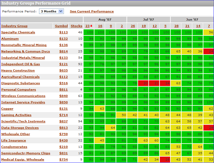
I should probably devote an entire post to Prophet.net, which does many interesting things with sectors. The tools I find of particular value are sortable performance for 214 sectors from 2 days to 5 years; and historical sector ranks from 3 months to 5 years in a helpful graphical format (see below), complete with a drill down capability that pops up the charts for all the individual stocks in a particular sector. Also, from the I-just-couldn’t-help-myself category, while the pull down menu only allows for a minimum historical performance of 3 months, if you manually edit the URL, you can produce some interesting charts for shorter time frames. For example, where the URL for the 3 month graphic ends in “…period=3m” it can be edited to “...period=1m” to generate a particularly interesting one month historical chart. Try it!

MarketGauge.com has an industry group summary that is an excellent graphical tool covering multiple time frames, but also offers four fundamental analysis options for analyzing the top and bottom sectors. I particularly like a feature they have that highlights the stocks driving the strongest/weakest groups higher and a perhaps even more valuable leading stocks in today’s top groups page that includes fundamental data and charts on one handy page.
For a different take on sector performance and momentum, you might want to try ETFInvestmentOutlook.com. Two of their features that I get the most use out of are the McClellan breadth ETF rankings and the high-low breadth ETF rankings.
In addition to the above, there are a number of interesting sector-related heat maps available, including two sites of particular note:
- SmartMoney heatmaps – sector map, map of the market, mutual fund map, etc.
- NASDAQ – NASDAQ-100 Heatmap, NASDAQ-100 Pre-Market Heatmap, ETF Heatmap, and a custom heatmap you can build yourself
Finally, in the event that you have not been there in awhile, Yahoo has beefed up their Industry Center a little. A good place to start surfing there is in the leaders and laggards section.


3 comments:
you probably mean RS and not RSI.
Thanks, i.l. I made the edit.
Hello Bill,
thanks for usefull links...
Vlada
Post a Comment