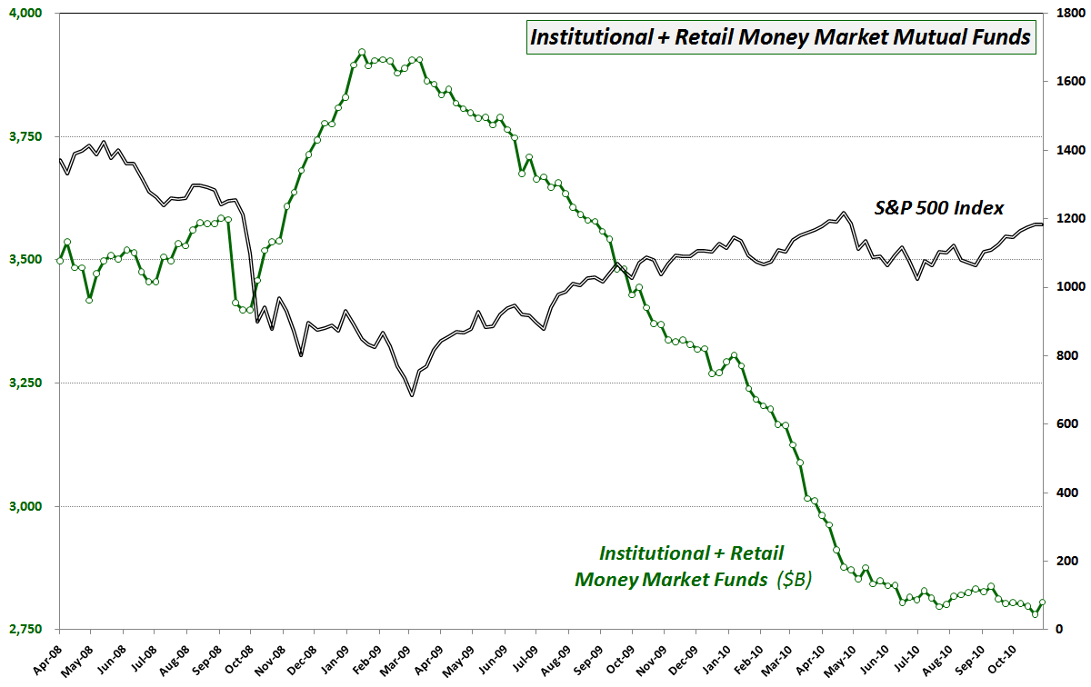
Chart of the Week: Money Market Mutual Funds
When the first version of this week’s chart of the week first appeared on the blog in Chart of the Week: Change of Trend in Cash Holdings? in January 2009, it generated a surprising amount of controversy. A follow-up post in March 2009, Cash on the Sidelines Headed Back to Stocks? also seemed to polarize some of the readership here.
In retrospect, this data from the Investment Company Institute (ICI) as well as similar data from AMG Data Services did an excellent job of keeping track of the flow of funds in and out of cash and therefore have been excellent proxies for a large part of the net change in demand for equities.
In the chart below, note that money market mutual fund assets began declining sharply in the second week in March 2009 (after topping in January 2009,) just as stocks were bottoming and starting to catch a bid. In the twenty months since the bottom in stocks, net changes to money market mutual funds have been a solid coincident and sometimes leading indicator of demand for stocks.
I am resurrecting this chart again for several reasons, not the least of which is that the decline in money market mutual funds has lessened considerably since the end of April, when stocks hit their 2010 highs. Additionally, last week’s increase of $25 billion in money market mutual funds was the largest since July 2009 and the second largest since January 2009. While this may not mean anything, I like to be provocative with these kinds of charts. Readers should at least be open to the possibility that most of the cash on the sidelines that will ultimately be committed to stocks in a bull market has already been committed. Perhaps it will take a significant downturn in bond prices for the next large pool of money to be moved into equities.
Either way, I still think this chart of money market mutual funds bears further watching.
Related posts:
- Chart of the Week: Intrade and Control of the House of Representatives
- Chart of the Week: Change of Trend in Cash Holdings?


