Monday, October 27, 2008

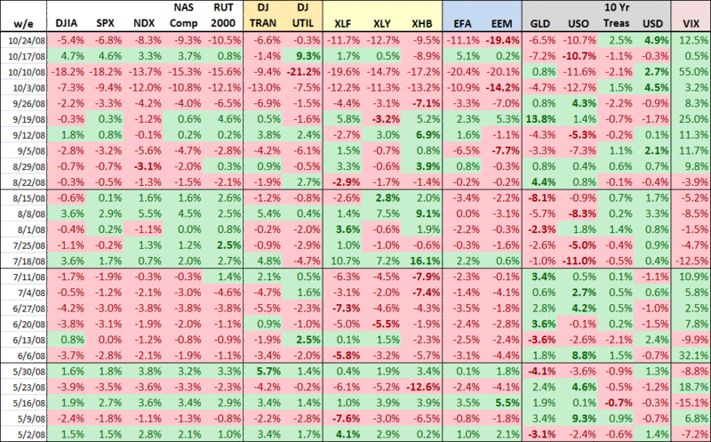
A Week By Week Look at the Past Six Months

The graphic below, which I usually reserve for the subscriber newsletter, shows a six month snapshot of the weekly performance of 17 indices and ETFs that I watch closely.

I am going to let this table go largely without comment, other than to note that I have bolded the largest percentage changes up and down (excluding the VIX) for each week and have grouped the weeks into four sets of 5-10 week chunks.

There are some amazing numbers in this graphic and some day when the VIX is at 14 and change, we can all look back at what was going on during this period and crack a small smile, knowing that we persevered.

[source: VIX and More]

1 comments:

Anonymous said...

funny that 'some day' could be next week, or 2 years from now, or 5+ years from now. the global markets, not just equities but commodities, credit markets, and FX are speaking with horrific telltale signs of something bad has terribly has gone wrong.

Jimmy

DISCLAIMER: "VIX®" is a trademark of Chicago Board Options Exchange, Incorporated. Chicago Board Options Exchange, Incorporated is not affiliated with this website or this website's owner's or operators. CBOE assumes no responsibility for the accuracy or completeness or any other aspect of any content posted on this website by its operator or any third party. All content on this site is provided for informational and entertainment purposes only and is not intended as advice to buy or sell any securities. Stocks are difficult to trade; options are even harder. When it comes to VIX derivatives, don't fall into the trap of thinking that just because you can ride a horse, you can ride an alligator. Please do your own homework and accept full responsibility for any investment decisions you make. No content on this site can be used for commercial purposes without the prior written permission of the author. Copyright © 2007-2023 Bill Luby. All rights reserved.
 
Web Analytics