A Global Indicator to Watch
One of the best features of StockCharts.com is that it allows you to keep track of ratios for just about any security you can think of. With the continued expansion of the reach of ETFs (monitored by Tom Lydon at ETFtrends.com, among others), the possibilities are growing rapidly, limited more by the lack of historical data for newly minted ETFs than anything else.
With all the talk of a Chinese bubble, there is no better time than the present to have one or more good global sentiment indicators so you can get a handle on whether you should be worried about the extent of speculative activity in Mexico, Malaysia, Brazil and perhaps China or whether you might be better off following the trends.
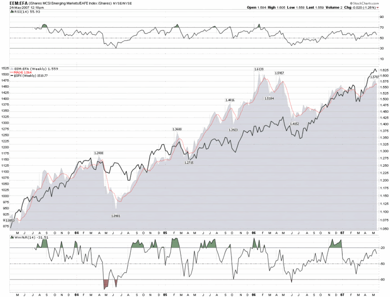
One ratio I have been looking at is that of emerging markets to developed markets. Two highly liquid ETFs that track these markets nicely are the iShares MSCI Emerging Markets Index (EEM) and the iShares MSCI EAFE Index Fund (EFA), where EAFE refers to Europe, Australasia and the
Since EEM first traded in April 2003 and EFA goes back to August 2001, our ratio chart is able to provide four years of combined data, which is a long time in ETF years.
In the chart below, the relative spikes in emerging markets generally provide an indication when speculative activity is getting out of hand and often provide advance warning for an upcoming drop in the SPX. I will leave it to readers to determine whether or not the extent of the correlation is worth tracking going forward. I am certainly going to keep an eye on it.


3 comments:
If anyone is having difficulty reading the graph, the original is here
From 27 Aug 2001 to last night, I see about a 4.6% correlation in daily return and 7% correlation in weekly return.
If you look at lagged day, correlation it's a little weaker at 3%. For the lagged week(EFA return this week vs SPY return next week), the correlation is negative, but this perhaps gets into frequency amplitude differences between the US market and global market.
Anyway, I very much agree that it is a good warning indicator for percentile returns or maybe some percentage above moving average, but just letting you know that I don't find impressive correlations in my return data.
-Michael J Bommarito II
You might also be interested in a recent calculation I ran on the best and worst ETFs and CEFs for VIX exposure.
-Michael J Bommarito II
Post a Comment