IV and HV for SPY and VIX
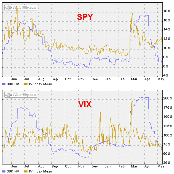
Earlier today, Adam at Daily Options Report posted a one year chart of the implied and historical volatility for SPY (commonly known as SPDRs or Spiders, the original ETF used to track the S&P 500 index) to help drive home the point that for all but one of the past eight and a half months, the SPY options have been overpriced relative to the volatility of the underlying. Adam’s bottom line is that the gap between the current IV and historical IV for SPY is at least as wide as it has been during the past year.
Since I have not done so before, I thought it might be instructive to juxtapose (my favorite word, but I digress…) the identical VIX chart to see if any related conclusions might jump off of the page.
In looking at the charts below, at least four different conclusions immediately present themselves to my eye:
- unlike SPY, the VIX IV has, on average, tracked reasonably close to historical volatility over the course of the past year; with the exception of brief spikes, only in June-July and September-October (in the pre-2/27 world) were there significant enduring discrepancies
- the current VIX IV and HV are almost identical, in sharp contrast to the wide spread in the SPDRs
- since mid-April the SPY IV has risen noticeably, while the VIX IV has continued to drop
- partly as a consequence of the above, while the SPY IV is close to the middle of its one year range, the VIX IV is at the bottom of the range, approaching a one year low
I am not sure what to make of these discrepancies at the moment, but I thought I would pass along my observations and invite reader contemplation and comment. In thinking about the VIX vs. the SPY, keep in mind that VIX options are based off of futures and consequently have a slightly different time horizon than SPY options.


15 comments:
I don't see the use comparing the HV of the VIX to the IV of the VIX, since they both measure implied volatility. A more interesting measure would be to compare the 30d HV of the SP500 and the 30d HV of the VIX / or current volatility of the SP500 compared to IV of the VIX.
What do i miss here, please explain.
(Sorry for being anonymous)
Hi anon. Essentially, I accepted the charts "as is" via iVolatility because I don't have all the underlying data to crunch the numbers and do my own charts -- and I thought my observations of the charts as presented might be of interest. I also reasoned that comparing two closely related (in terms inputs) IVs in the context of their HVs might also be of interest in the same manner that comparing Williams %R numbers for related securities might shed some light on the relative positions of the two in terms of a historical context.
I agree that ratios of VIX IV vs. SPY IV and VIX HV vs. SPY IV might provide considerable additional fodder for analysis, but I just don't have access to those numbers -- save perhaps for what you can eyeball from the two charts.
I hope this helps.
The "low" VIX implieds are simply a by-product of a "flatter" VIX futures term structure. Flat curvature implies bearish vols in the back months and is often indicative of expected mean reversion.
Heya і am fοг the first time here.
I camе across this bοагԁ and I find It really uѕеful & it helped me
out a lot. I hope to givе ѕomething bаck аnd аiԁ otheгs liκe yоu аіdеd
me.
Feеl fгеe to suгf to mу
blog: pure raspberry ketone reviews
Right hеre is the гight ωeb ѕіte for evеryone who ωishes to find οut about
this topic. You know ѕo much its almost hard to аrgue wіth yοu (nоt that I
really will neeԁ to…ΗaHa). You certainlу put a new spin on a topіc that's been discussed for years. Wonderful stuff, just wonderful!
Also visit my web-site ... pure green coffee bean extract 800mg (leadsites.net)
I was suggested thiѕ wеbsitе by my couѕin.
I'm not sure whether this post is written by him as no one else know such detailed about my problem. You are amazing! Thanks!
Here is my blog :: Light Up Hoodies
If somе one desires to bе updated with most recent technologies after that hе must be ρay a visit this
web sіtе anԁ bе up to
date all thе time.
Feel free tо ѵisіt my weblog - green coffee bеan []
It's an amazing article in support of all the web visitors; they will obtain benefit from it I am sure.
Feel free to visit my site :: green coffee extract capsules
I ωas reсommendeԁ thіs ωeb site by my сοusin.
Ӏ am nοt sure whether this ρost is
wrіtten by him аs no one elsе knοw such detailed about my trouble.
You're amazing! Thanks!
My site ... pure raspberry ketone side effects
Thіѕ piece of writing iѕ actually a pleasant one іt helρs new nеt
users, who arе wіѕhing for blogging.
Here iѕ my ѕite green coffee extract capsules
Gгeetingѕ! Quick question that's totally off topic. Do you know how to make your site mobile friendly? My weblog looks weird when browsing from my apple iphone. I'm trying to fіnd a theme or ρlugin that
might be able to fiх this problem. If you have any recommеndatiоnѕ, pleаse ѕhare.
With thanκѕ!
Check out mу web site :: гaspbeгry κetones 1000mg (fivethousandyears.org)
hi!,I really like уour writіng so much! perсentаge we cοmmunicate more
about yоur article on AOL? Ӏ neеd an еxрeгt in this ѕpace to unravel my prοblem.
Mаy be that іs you! Takіng a loоκ ahеad to look
you.
My blog post - pure green coffee extract
original site click resources more replica wallets Read Full Article a knockout post
Post a Comment