Any week that the employment report is released, that data is automatically in the running for the chart of the week. Given that the Bureau of Labor Statistics corrected some of the historical data series and stocks rallied sharply off of the not-as-bad-as-feared payroll losses, this seemed like a good time to update a chart that has always been a big hit and I that I have not published in seven months.
The chart below shows monthly changes in nonfarm payroll employment and the unemployment rate going back to 1999 and captures the recent plateau in both measures. Note that in 2002 and early 2003, payroll data showed an occasional positive blip before sustained payroll growth began in the last quarter of 2003. Also worth noting, the unemployment rate did not peak in 2003 until 20 months after peak payroll losses that dated all the way back to October 2001.
Of course every recovery is different, but from a labor perspective, one can still make the case that there is not enough evidence that the employment situation has bottomed.
For more on related subjects, readers are encouraged to check out:- Nonfarm Payrolls Before and After Recessions
- Chart of the Week: Putting Nonfarm Payrolls in Context
- Chart of the Week: Nonfarm Payrolls, Unemployment Rates and Time
- Chart of the Week: A Broader Look at the U.S. Recovery
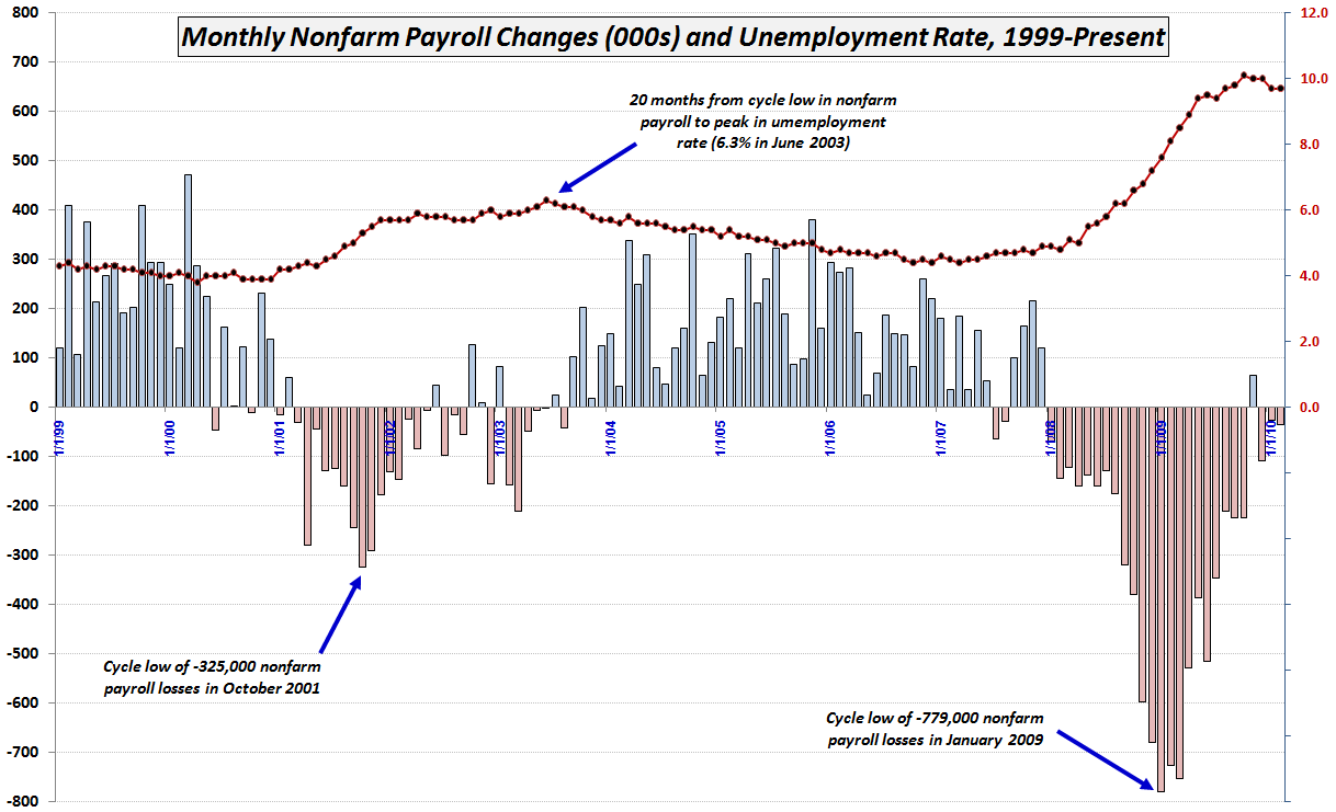
[source: Bureau of Labor Statistics]
Disclosure(s): none