Today I am concluding my presentation of some of the charts I received as entries in last week’s chart of the week contest.
The chart below comes from Dan Glynn, who offered the following commentary:
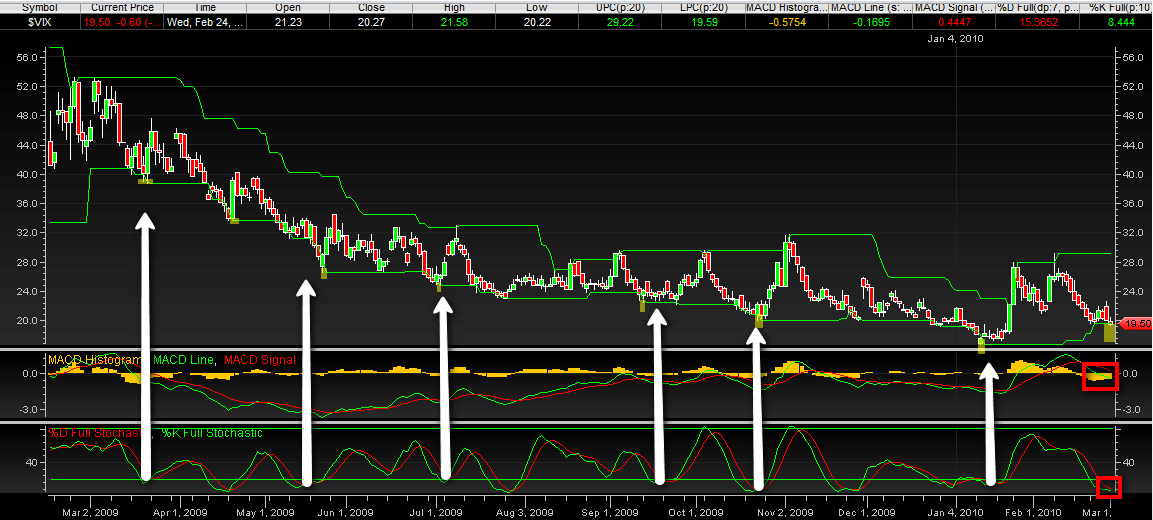
“This is just a simple one year chart of the VIX in a price channel with MACD and stochastic indicators. Every time the VIX has broken the price channel lower line (highlighted) there has been a reversal, even in this lengthy downtrend. In addition, I have white arrows pointing from where the stochastic lines were crossing. This either coincided with the channel break or was slightly before or after. I also red boxed the most recent MACD bars, which are getting shorter. [Finally,] the distance between the last price line break and the most recent shows the most X-axis (vertical) distance [of] any other consecutive price line breaks throughout the year.”
The original version of the chart, which is larger and easier to read, can be found here.
Thanks again to all who sent in charts. This was a lot of fun for me and I will definitely do it again.
For more on related subjects, readers are encouraged to check out:
- Annotated VIX Downtrend Symmetry Channel
- Correlation of VIX and “VIX Index” Searches on Google
- Chart of the Week: Total Put to Call Ratio
[source: Dan Glynn]
Disclosure(s): none