As a full-time investor and part-time blogger, I have a weakness for web sites that focus on ETFs, volatility and charts – three of the subjects I feature prominently in this space. For this reason, I was excited when ETFreplay.com appeared on the scene earlier this year specializing in ETFs, offering some unique and compelling graphics, and demonstrating an interest in volatility.
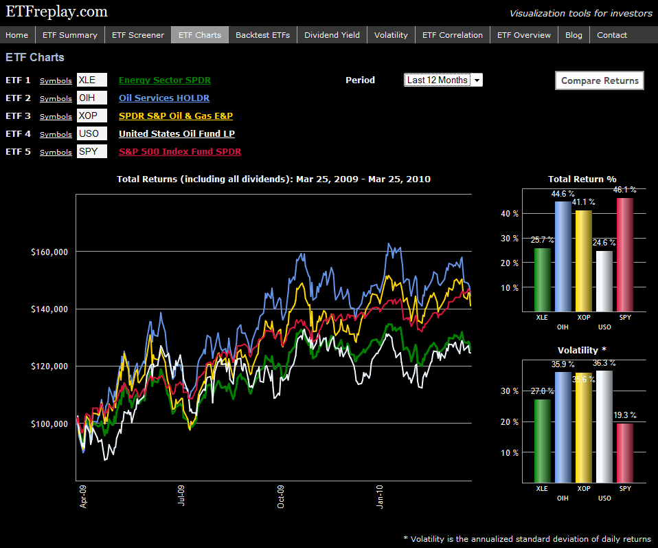
The site is still evolving, but is already a fun an informative destination, particularly for investors who are interested in ETFs. Some of the functionality currently offered includes screening, back testing, correlations, charting, etc. There is also a blog which provides graphics and commentary on a number of issues related to ETFs. The content is excellent, but the graphics are what inspired the tagline, “Visualization tools for investors.” I have included one example graphic below in which I decided to compare the performance and volatility of four popular energy ETFs (XLE, OIH, XOP and USO) relative to the S&P 500 ETF (SPY) over the course of the past year. I'll let the chart speak for itself.
In my opinion, there only a handful of top tier ETF web sites out there. While it may still be a little too early to add ETFreplay.com to that list, based on the speed at which the site is improving, I suspect it will not be long before that gap is closed.
For more on related subjects, readers are encouraged to check out:
[source: ETFreplay.com]
Disclosure(s): long XOP at time of writing