Tempting though it may be to slap up yet another chart of the financials (XLF), bank index (BKX) or one of the individual bank that seems to be floundering even more than its peers, this is what I did with Bank of America (BAC) in last week’s chart of the week. The story has not changed much this week, except that the picture has become even uglier.
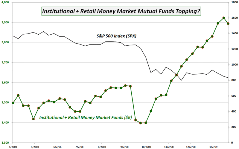
There may be a story developing, however, in terms of cash on the sidelines. According to data from the Investment Company Institute, cash in money market mutual funds jumped over 45% from August 2007 through last week, when it reached an all-time high. The chart below shows how cash on the sidelines has increased dramatically since last October, leaving less fuel to keep the S&P 500 index aloft. During the past week the ICI reported the first meaningful drop in money market mutual fund cash levels since September and also only the second time in 16 weeks that cash levels have dropped for institutional investors.
If the change in money market mutual fund levels from the past week is the first signs of a change in trend, then this will almost certainly have significant bullish implications for equities.
[source: Investment Company Institute, VIX and More]
Hi, Bill. I've always been a little skeptical of this data, particularly with respect to institutional MMMF assets. Some of those serve as collateral against futures and other derivatives, I think.
ReplyDeleteIf anyone reading this at your site knows better, I am open to correction.
the Friday XLF call option activity
ReplyDeleteseemed very large...
The most recent drop in money funds was at the same time as the biggest recent drop in the market, which was a doosy. How to explain that if this drop is to lead to a market rally?
ReplyDeleteGood points David, anon and JB.
ReplyDeleteThe correlation between institutional MMMF and institutional + retail MMMF over the course of the data series is in the range of -0.70 to -0.75. Of course single week discrepancies are difficult to explain, but the strong negative correlation appears to hold up nicely over longer periods.
I always have some difficulty in making the leap from correlation to causation, but I will incorporate this data into the blog on a regular basis going forward so we can all draw our own conclusions.
Cheers,
-Bill
Interesting chart... I note that the last two declines in money market funds has been coincidental with declines in the market, as this past week seems to also indicate. For some reason, could this be a bearish indicator vs. bullish?
ReplyDeleteNate
Question for you Bill - what's the source of data? I'd love to see some longer-range data on this...
ReplyDeleteNow let's throw some commitment of trader's and days-to-cover data ontop of that! Good sluething Bill!
ReplyDeleteGreat chart, thanks for the heads up.
ReplyDeleteThere are several other correlational indicators which have all improved these past few weeks. These indicators include the A2/P2 spread, M3 money supply, 10 year treasury yields, silver (which has been strongly correlated to SPX), BDI, and the ABX and CMBX indices.
I've collected charts of the above (along with a repost of your chart) here http://special----k.blogspot.com/2009/01/signs-of-improvement.html
Again, thank for the chart.
The data come from the Investment Company Institute, but a similar data set is also available from AMG Data Services.
ReplyDeleteUnfortunately, I do not have any historical data beyond what I included in the chart.
Cheers,
-Bill